border-bottom-left-radius
Baseline
広く利用可能
この機能は広く実装されており、多くのバージョンの端末やブラウザーで動作します。2015年7月以降、すべてのブラウザーで利用可能です。
border-bottom-left-radius は CSS のプロパティで、角の曲率を定義する楕円の半径 (または半長軸と半短軸の半径) を指定することで、要素の左下の角を丸めます。
試してみましょう
border-bottom-left-radius: 80px 80px;
border-bottom-left-radius: 250px 100px;
border-bottom-left-radius: 50%;
border-bottom-left-radius: 50%;
border: black 10px double;
background-clip: content-box;
<section class="default-example" id="default-example">
  <div class="transition-all" id="example-element">
    このボックスは左下が丸い角です。
  </div>
</section>
#example-element {
  width: 80%;
  height: 80%;
  display: flex;
  justify-content: center;
  flex-direction: column;
  background-color: #5b6dcd;
  color: white;
  padding: 10px;
}
構文
css
/* 角を円にする */
/* border-bottom-left-radius: 半径 */
border-bottom-left-radius: 3px;

/* パーセント値 */

/* ボックスが正方形ならば円、長方形ならば楕円 */
border-bottom-left-radius: 20%;

/* 上と同じ。水平方向 (width) および垂直方向 (height) の 20% */
border-bottom-left-radius: 20% 20%;

/* 水平方向 (width) の 20% および垂直方向 (height) の 10% */
border-bottom-left-radius: 20% 10%;

/* 角を楕円にする */
/* border-bottom-left-radius: 水平 垂直 */
border-bottom-left-radius: 0.5em 1em;

/* グローバル値 */
border-bottom-left-radius: inherit;
border-bottom-left-radius: initial;
border-bottom-left-radius: revert;
border-bottom-left-radius: revert-layer;
border-bottom-left-radius: unset;
値 1 つで指定する場合:
- 値は
<length>または<percentage>であり、境界の角に使用する円の半径を示します。
値 2 つで指定する場合:
- 最初の値は
<length>または<percentage>であり、境界の角に使用する楕円の水平の軌道長半径を示します。 - 最初の値は
<length>または<percentage>であり、境界の角に使用する楕円の垂直の軌道長半径を示します。
値
<length-percentage>-
円の半径または楕円の長半径および短半径を示します。絶対的な長さの場合は、 CSS の
<length>データ型で表現することができます。水平軸のパーセント値はボックスの幅、垂直軸のパーセント軸はボックスの高さに対する値です。負の数は無効です。
解説
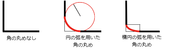
丸みは円または楕円にすることができ、値のうちの一つが 0 であれば、丸めは行われずに角は四角くなります。
背景は、画像または単色ですが、丸みがあっても境界で切り取られます。切り取られる正確な位置は、 background-clip プロパティの値で定義されます。
メモ:
このプロパティの値が border-bottom-left-radius プロパティの後の border-radius 一括指定プロパティで設定されなかった場合、このプロパティは一括指定プロパティによって初期値にリセットされます。
公式定義
| 初期値 | 0 |
|---|---|
| 適用対象 | すべての要素。ただし、ユーザーエージェントは border-collapse が collapse である場合にtable および inline-table 要素に適用する必要はない。内部表要素での動作は、今のところ未定義。。 ::first-letter にも適用されます。 |
| 継承 | なし |
| パーセント値 | 境界ボックスの対応する寸法に対する相対値 |
| 計算値 | 2つの絶対的な <length> または <percentage> 値 |
| アニメーションの種類 | length または パーセント値, calc(); |
形式文法
border-bottom-left-radius =
  <border-radius>

<border-radius> =
  <slash-separated-border-radius-syntax>  |
  <legacy-border-radius-syntax>

<slash-separated-border-radius-syntax> =
  <length-percentage [0,∞]> [ / <length-percentage [0,∞]> ]?

<legacy-border-radius-syntax> =
  <length-percentage [0,∞]>{1,2}

<length-percentage> =
  <length>      |
  <percentage>
例
円弧
単一の <length> 値は円弧を生成します。
css
div {
  border-bottom-left-radius: 40px;
  background-color: lightgreen;
  border: solid 1px black;
  width: 100px;
  height: 100px;
}
楕円弧
2 つの異なる <length> の値は楕円弧を生成します。
css
div {
  border-bottom-left-radius: 40px 20px;
  background-color: lightgreen;
  border: solid 1px black;
  width: 100px;
  height: 100px;
}
正方形の要素にパーセント値の半径
正方形の要素に単一の <percentage> 値を指定すると、円弧を生成します。
css
div {
  border-bottom-left-radius: 40%;
  background-color: lightgreen;
  border: solid 1px black;
  width: 100px;
  height: 100px;
}
長方形の要素にパーセント値の半径
正方形ではない要素に単一の <percentage> 値を指定すると、楕円弧を生成します。
css
div {
  border-bottom-left-radius: 40%;
  background-color: lightgreen;
  border: solid 1px black;
  width: 200px;
  height: 100px;
}
仕様書
| 仕様書 |
|---|
| CSS Backgrounds and Borders Module Level 3 # border-radius |