Using color wisely
Choosing the right colors for a website can be tricky, especially if you aren't well-grounded in art, design, or at least basic color theory. The wrong color choice can render your site unattractive, or worse, leave the content unreadable due to problems with contrast or conflicting colors. Using the wrong colors can result in your content being outright unusable by people with certain vision problems, particularly color blindness.
Finding the right colors
There are tools and processes available to help you pick a good color scheme. While they can't replace having a good designer helping you make these decisions, they can get you started.
Base color
The first step is to choose your base color. This color represents your website or its subject matter. Just as we associate green with the beverage Mountain Dew blue with the sky or the ocean, choosing an appropriate base color to represent your site is a good place to start. There are plenty of ways to select a base color; a few ideas include:
- A color that is naturally associated with the topic of your content, such as the existing color identified with a product or idea or a color representative of the emotion you wish to convey.
- A color that comes from imagery associated with your subject matter. If you're creating a website about a given item or product, choose a color that's physically present on that item.
- Browse websites that let you look at lots of existing color palettes and images to find inspiration.
Several useful browser extensions can help pick base colors. For example, the ColorZilla browser extension provides an eyedropper tool for picking colors from any webpage. It can also take averages of the colors of an area of a page.
An "average color" grab is useful because sometimes what may look like a solid block of color might actually be multiple related colors, such as grabbing the blue in a photograph of an ocean or the sky. A single pixel of blue selected from a photo may result in a color that looks out of place.
Fleshing out the palette
Once you have decided on your base color, the next step is to build a palette of appropriate colors to use alongside it. Several tools are available to apply color theory to your base color and output appropriate added colors. Online tools, like the free Adobe Color CC online color wheel can help you pick an accessible color palette.
Many of these tools can also apply filters to your palette so you can see what they look like to people with various forms of color blindness. See Color and accessibility for a brief explanation of why this matters.
When designing your palette, you'll probably also need to supplement it with some core neutral colors such as white (or nearly white), black (or nearly black), and one or more shades of gray.
Note: Usually, you are better off using the smallest number of colors possible. Using color to highlight important content rather than adding color to everything will have more impact and your content will be more readable.
Color theory resources
A full review of color theory is beyond the scope of this article, however, there are plenty of articles about color theory available. We found the following resources particularly useful:
- Color Science (Khan Academy in association with Pixar)
-
An online course that introduces concepts such as what color is, how it's perceived, and how to use colors to express ideas. Presented by Pixar artists and designers.
- Color theory on Wikipedia
-
Wikipedia's entry on color theory has great information from a technical perspective. It likely won't help your color selection process, but is still full of useful information.
Color and accessibility
Make sure your content is accessible. There are several ways color can create an accessibility problem. Improper or careless use of color can result in a website or app that a percentage of your target audience may not be able to use adequately, resulting in lost traffic, lost business, and possibly even a public relations problem or a lawsuit. So it's important to consider your use of color carefully.
It's important to understand color and luminance and to always consider color blindness and vestibular disorders. There are several kinds; the most common is red-green color blindness, which causes people to be unable to differentiate between the colors red and green. There are others, too, ranging from an inability to tell the difference between certain colors to the total inability to see color at all. There are even color and animation combinations that can lead your photosensitive users to experience seizures.
While higher color contrast is often a good thing when it comes to accessibility, when animating, especially rapidly, reducing color contrast on animating elements reduces seizure risk. If you include animations, use the prefers-reduced-motion @media query feature to reduce animations for users who have selected that preference.
That said, ensure you have enough color contrast between your background and foreground content to ensure legibility. Also, never use color as the only way to convey information. If, for example, you indicate the success of an operation with a green border around the associated UI element, and failure with a red border, users with red-green color blindness won't be able to use your site properly. Instead, use text and color indicators together to include those users. For example, a green check mark and a red cross mark would be better.
Palette design example
In this example, we will create an appropriate color palette for a website for a game that takes place on the planet Mars. A Google search for photos of Mars will output several color photos.
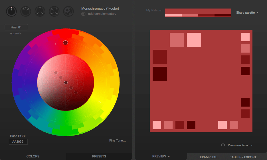
Use a color picker tool to select a color sample for the base color. For this example, we've selected #D79C7A, which is a rusty orange-red color. We can use Paletton to come up with the other colors for our palette. Upon opening Paletton, we see:
Next, we enter our color's hex code (D79C7A) into the "Base RGB" box at the bottom-left corner of the tool:
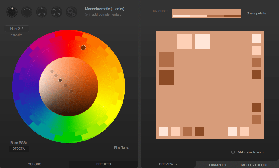
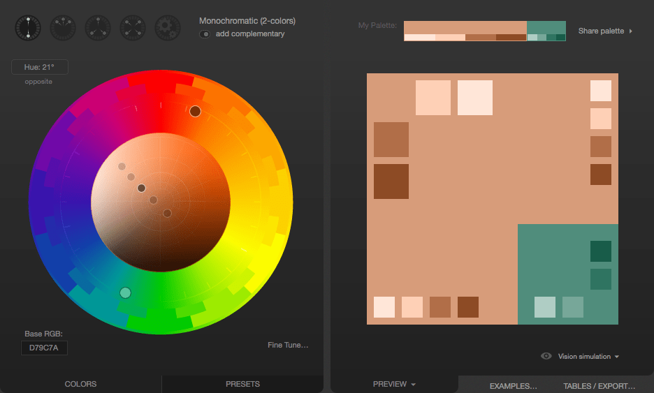
We now see a monochromatic palette based on the color we picked from the Mars photo. If you need related colors, these are likely good options. To find an accent color that pop alongside the base color, we click the "add complementary" toggle underneath the menu that lets you select the palette type. The default was "Monochromatic". Paletton computes an appropriate accent color; clicking on the accent color in the bottom-right corner tells us that this color is #508D7C.
If the proposed color doesn't work for your needs, you can change the color scheme. For example, if the proposed greenish-blue color doesn't work, select the Triad color scheme icon, which results in the following:
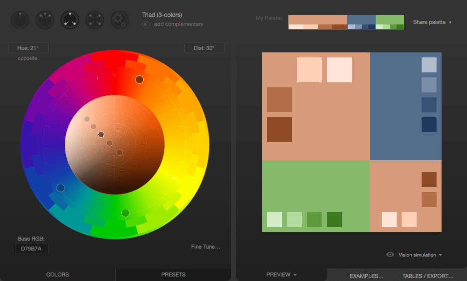
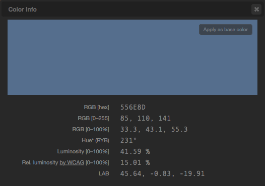
Click on the greyish blue in the top-right. The color is #556E8D. This can be used as an accent color to make things stand out, such as for headlines, tabs highlights, or other indicators on the site:
Now we have our base color and our accent. We also have a few complementary shades of both, which can be used to create gradients or as an accent color to indicate focus, such as for link hover states. The colors can be exported in several formats for you to use.
You should also select neutral colors. Find a color that provides enough contrast for your text to be crisp and readable while ensuring it isn't harsh for the eyes. If the contrast is too low, your text will be washed out by the background, leaving it unreadable, but if your contrast is too high, the user may find your site garish and unpleasant to look at.
Color, backgrounds, contrast, and printing
Your site may look very different when printed from what the user sees on their screen. When printing your page, the user may select to print in black and white only. Most browsers, by default, remove background colors and images when printing documents.
What matters most is usually the text itself, but if your background colors and images have been selected carefully and/or are crucial to the usefulness of the content, you can use the CSS print-color-adjust property to tell the browser that it should not make adjustments to the appearance of content.
The default value of print-color-adjust: economy, indicates that the browser is allowed to make appearance changes as it deems necessary to try to optimize the legibility and/or print economy of the content, given the type of output device the document is being drawn onto.
You can set print-color-adjust: exact to tell the browser that the element or elements on which you use it have been designed specifically to best work with the colors and images left as they are.
With this set, the browser won't tamper with the appearance of the element on which this value is applied, and will draw it as indicated by your CSS.
Note:
There is no guarantee, though, that print-color-adjust: exact will result in your CSS being used exactly as given.
If the browser provides user preferences to change the output (such as a "don't print backgrounds" checkbox in a print dialog box), that overrides the value of print-color-adjust.