<ratio>
Baseline
広く利用可能
*
この機能は広く実装されており、多くのバージョンの端末やブラウザーで動作します。2015年7月以降、すべてのブラウザーで利用可能です。
* この機能の一部は、対応レベルが異なる場合があります。
<ratio> は CSS のデータ型で、2 つの値の比例関係を表します。主にアスペクト比を表します。これは幅と高さの関係を表します。例えば、 <ratio> はメディアクエリー @media における aspect-ratio メディア特性の値として、コンテナークエリー @container における aspect-ratio サイズ特性の値として、 CSS aspect-ratio プロパティの値として使用します。
構文
<ratio> データ型は <number> に続くフォワードスラッシュ ('/', Unicode U+002F SOLIDUS) と 2 つ目の <number> から成ります。数字はどちらも正の値でなければなりません。スラッシュの前後のスペースは省略可能です。最初の数字は幅を表し、 2 つ目は高さを表します。また、値として単一の <number> を指定することもできます。
2 つの比率は、比率の分母の数値を用いて比較します。例えば、 16/16 は 16/9 よりも小さいです。なぜなら、前者は 1 に、後者は 1.7 にそれぞれ換算されるからです。これは、縦長の画面のアスペクト比は横長の画面よりも小さく、縦向き画像のアスペクト比は横向き画像よりも小さいということです。
一般的なアスペクト比
| 比率 | 用例 | |
|---|---|---|
4/3 または 1.33333 |
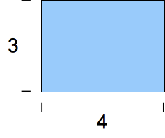 |
20 世紀における伝統的な TV 画面の形状です。 |
16/9 または 1.7777778 |
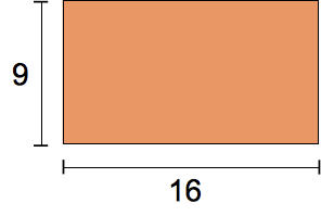 |
現代の「ワイド画面」の TV の形状です。 |
185/100 または 1.85 |
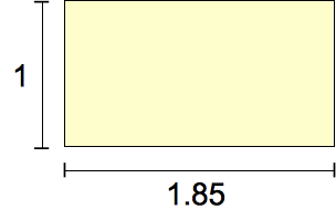 |
1960 年代から用いられている最も一般的な映画スクリーンの形状です。 |
239/100 または 2.39 |
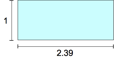 |
「ワイドスクリーン」、アナモルフィックな映画スクリーンの形状です。 |
形式文法
<ratio> =
  <number [0,∞]> [ / <number [0,∞]> ]?
例
メディアクエリーでの使用
css
@media screen and (aspect-ratio >= 16/9) {
  /* … */
}
@container サイズクエリーでの使用
css
@container (aspect-ratio > 1) and (width < 20em) {
  /* … */
}
CSS プロパティ値としての使用
css
.square {
  aspect-ratio: 1 / 1;
}
.circle {
  aspect-ratio: 1;
  border-radius: 50%;
}
.portrait {
  aspect-ratio: 5 / 7;
}
仕様書
| 仕様書 |
|---|
| CSS Values and Units Module Level 4 # ratio-value |
ブラウザーの互換性
関連情報
aspect-ratioメディア記述子- アスペクト比の理解
- CSS コンテナークエリーガイド
- コンテナーのサイズおよびスタイルクエリーの使用ガイド
- CSS メディアクエリーモジュール
- CSS コンテナーモジュール
- CSS ボックスサイズモジュール
- CSS 値と単位モジュール