border-bottom-left-radius
CSS 属性 border-bottom-left-radius 通过指定定义元素左下角曲率的椭圆的半径(或半长轴和半短轴的半径),对元素的左下角进行圆角处理。
尝试一下
border-bottom-left-radius: 80px 80px;
border-bottom-left-radius: 250px 100px;
border-bottom-left-radius: 50%;
border-bottom-left-radius: 50%;
border: black 10px double;
background-clip: content-box;
<section class="default-example" id="default-example">
  <div class="transition-all" id="example-element">
    这是一个左下角带有圆角的盒子。
  </div>
</section>
#example-element {
  width: 80%;
  height: 80%;
  display: flex;
  justify-content: center;
  flex-direction: column;
  background-color: #5b6dcd;
  color: white;
  padding: 10px;
}
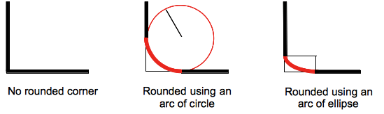
圆角可以是圆形或椭圆形,如果其中一个值为 0,则不进行圆角处理,角保持为直角。
背景(无论是图片还是颜色)都会被边框处裁剪,即便是圆角边框也不例外;裁剪的具体位置由 background-clip 属性的值来定义。
备注:如果 border-bottom-left-radius CSS 属性之后的元素的 border-radius 简写属性中未设置此属性值,该属性值将会被简写属性重置为其默认初始值。
语法
css
/* 角为圆形 */
/* border-bottom-left-radius: radius */
border-bottom-left-radius: 3px;

/* 百分比值 */

/* 如果盒子是正方形,则为圆形,如果盒子是矩形,则为椭圆形 */
border-bottom-left-radius: 20%;

/* 如上所述:分别是水平方向(宽度)和垂直方向(高度)的 20% */
border-bottom-left-radius: 20% 20%;

/* 水平方向(宽度)的 20% 和垂直方向(高度)的 10% */
border-bottom-left-radius: 20% 10%;

/* 角为椭圆形 */
/* border-bottom-left-radius: 水平 垂直 */
border-bottom-left-radius: 0.5em 1em;

/* 全局值 */
border-bottom-left-radius: inherit;
border-bottom-left-radius: initial;
border-bottom-left-radius: revert;
border-bottom-left-radius: revert-layer;
border-bottom-left-radius: unset;
只有一个值:
- 该值是一个
<length>或<percentage>,表示该角边框使用的圆半径。
只有两个值:
- 首项数值为
<length>或<percentage>,表示该角边框椭圆的水平半长轴尺寸。 - 第二个值为
<length>或<percentage>,表示该角边框椭圆的垂直半长轴尺寸。
值
<length-percentage>-
表示圆的半径尺寸或椭圆的半长轴和半短轴尺寸。作为绝对长度,它可以使用任何的 CSS
<length>数据类型进行表示。水平轴上的百分比是指盒子宽度的百分比,而垂直轴上的百分比是指盒子高度的百分比。负值是无效的。
形式定义
| 初始值 | 0 |
|---|---|
| 适用元素 | all elements; but User Agents are not required to apply to table and inline-table elements when border-collapse is collapse. The behavior on internal table elements is undefined for the moment.. It also applies to ::first-letter. |
| 是否是继承属性 | 否 |
| Percentages | refer to the corresponding dimension of the border box |
| 计算值 | two absolute <length>s or <percentage>s |
| 动画类型 | a length, percentage or calc(); |
形式语法
border-bottom-left-radius =
  <border-radius>

<border-radius> =
  <slash-separated-border-radius-syntax>  |
  <legacy-border-radius-syntax>

<slash-separated-border-radius-syntax> =
  <length-percentage [0,∞]> [ / <length-percentage [0,∞]> ]?

<legacy-border-radius-syntax> =
  <length-percentage [0,∞]>{1,2}

<length-percentage> =
  <length>      |
  <percentage>
示例
圆弧
单个 <length> 值产生一个圆弧。
css
div {
  border-bottom-left-radius: 40px;
  background-color: lightgreen;
  border: solid 1px black;
  width: 100px;
  height: 100px;
}
椭圆弧
两个不同的 <length> 值会产生一个椭圆弧。
css
div {
  border-bottom-left-radius: 40px 20px;
  background-color: lightgreen;
  border: solid 1px black;
  width: 100px;
  height: 100px;
}
具有百分比半径的正方形元素
具有单个 <percentage> 值的正方形元素将生成一个圆形的弧段。
css
div {
  border-bottom-left-radius: 40%;
  background-color: lightgreen;
  border: solid 1px black;
  width: 100px;
  height: 100px;
}
具有百分比半径的非正方形元素
单个 <percentage> 值的非正方形元素会产生一条椭圆弧。
css
div {
  border-bottom-left-radius: 40%;
  background-color: lightgreen;
  border: solid 1px black;
  width: 200px;
  height: 100px;
}
规范
| 规范 |
|---|
| CSS Backgrounds and Borders Module Level 3 # border-radius |