<ratio> CSS-Typ
Baseline
Weitgehend verfügbar
*
Diese Funktion ist gut etabliert und funktioniert auf vielen Geräten und in vielen Browserversionen. Sie ist seit Juli 2015 browserübergreifend verfügbar.
* Einige Teile dieser Funktion werden möglicherweise unterschiedlich gut unterstützt.
Der <ratio> CSS Datentyp beschreibt das proportionale Verhältnis zwischen zwei Werten. Er repräsentiert hauptsächlich das Seitenverhältnis, das die Breite zur Höhe in Beziehung setzt. Zum Beispiel wird <ratio> als Wert für das aspect-ratio Medienmerkmal in @media-Medienabfragen, das aspect-ratio Größenmerkmal in @container Container-Abfragen und als Wert für die CSS-Eigenschaft aspect-ratio verwendet.
Syntax
Der <ratio> Datentyp ist eine <number>, gefolgt von einem Schrägstrich ('/', Unicode U+002F SOLIDUS) und einer zweiten <number>. Beide Zahlen müssen positiv sein. Leerzeichen vor und nach dem Schrägstrich sind optional. Die erste Zahl repräsentiert die Breite, während die zweite die Höhe darstellt. Zusätzlich ist ein einzelnes <number> als Wert zulässig.
Zwei Verhältnisse werden durch den Vergleich der numerischen Werte ihrer Quotienten verglichen. Zum Beispiel ist 16/16 weniger als 16/9, da es sich zu 1 auflöst, während sich das zweite zu 1,7 auflöst. Dies bedeutet, dass das Seitenverhältnis eines hohen Bildschirms kleiner ist als das eines breiten Bildschirms und Porträtbilder kleinere Seitenverhältnisse haben als Landschaftsbilder.
Übliche Seitenverhältnisse
| Verhältnis | Nutzung | |
|---|---|---|
4/3 oder 1.33333 |
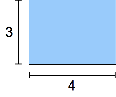 |
Traditionelles TV-Format im zwanzigsten Jahrhundert. |
16/9 oder 1.7777778 |
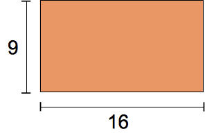 |
Modernes "Widescreen"-TV-Format. |
185/100 oder 1.85 |
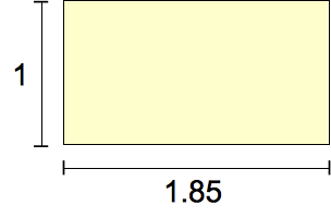 |
Das häufigste Filmformat seit den 1960er Jahren. |
239/100 oder 2.39 |
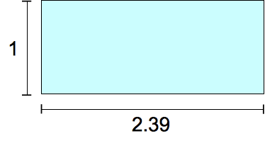 |
"Widescreen", anamorphes Filmformat. |
Formale Syntax
<ratio> =
  <number [0,∞]> [ / <number [0,∞]> ]?
Beispiele
Verwendung in einer Medienabfrage
@media screen and (aspect-ratio >= 16/9) {
  /* … */
}
Verwendung in einer @container-Größenabfrage
@container (aspect-ratio > 1) and (width < 20em) {
  /* … */
}
Verwendung als CSS-Eigenschaftswert
.square {
  aspect-ratio: 1 / 1;
}
.circle {
  aspect-ratio: 1;
  border-radius: 50%;
}
.portrait {
  aspect-ratio: 5 / 7;
}
Spezifikationen
| Spezifikation |
|---|
| CSS Values and Units Module Level 4 # ratio-value |
Browser-Kompatibilität
Siehe auch
aspect-ratioMediendeskriptor- Verstehen von Seitenverhältnissen
- CSS-Container-Abfragen Leitfaden
- Verwendung von Container-Größen- und Stilabfragen Leitfaden
- CSS-Medienabfragen Modul
- CSS-Enthaltung Modul
- CSS-Box-Sizing Modul
- CSS-Werte und -Einheiten Modul