<ratio>
语法
在媒体查询第 3 版中,<ratio> 数据类型由一个严格正整数 <integer> 后跟一个斜杠(“/”,Unicode U+002F SOLIDUS)以及第二个严格正整数 <integer> 组成。斜线前后的空格是可选的。第一个数字代表宽度,而第二个数字代表高度。
在媒体查询第 4 版中,<ratio> 数据类型已更新,现在由一个严格正整数 <number> 开头,后跟一个斜杠(“/”,Unicode U+002F SOLIDUS)和第二个严格正整数 <number>。此外,也允许使用单一的 <number> 值。
形式语法
<ratio> =
  <number [0,∞]> [ / <number [0,∞]> ]?
示例
在媒体查询中使用
css
@media screen and (min-aspect-ratio: 16/9) {
  /* … */
}
常见的纵横比
| Ratio | 说明 | |
|---|---|---|
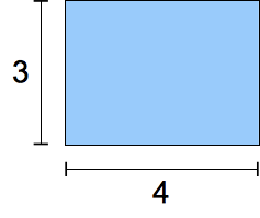 |
4/3 |
二十世纪的传统电视格式。 |
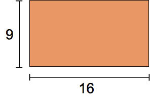 |
16/9 |
现代“宽屏”电视格式。 |
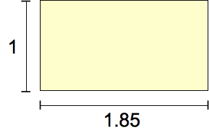 |
185/100 = 91/50 |
自 1960 年代以来最普遍的电影格式。 |
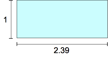 |
239/100 |
“宽屏”,失真电影格式。 |
规范
| 规范 |
|---|
| CSS Values and Units Module Level 4 # ratio-value |
浏览器兼容性
参见
aspect-ratio媒体特性