animation-timing-function CSS property
Baseline
Weitgehend verfügbar
Diese Funktion ist gut etabliert und funktioniert auf vielen Geräten und in vielen Browserversionen. Sie ist seit September 2015 browserübergreifend verfügbar.
Die animation-timing-function CSS-Eigenschaft legt fest, wie eine Animation während der Dauer jedes Zyklus fortschreitet.
Es ist oft praktisch, die Kurzschreibweise animation zu verwenden, um alle Animationseigenschaften auf einmal festzulegen.
Probieren Sie es aus
animation-timing-function: linear;
animation-timing-function: ease-in-out;
animation-timing-function: steps(5, end);
animation-timing-function: cubic-bezier(0.1, -0.6, 0.2, 0);
<section class="flex-column" id="default-example">
  <div class="animating" id="example-element"></div>
  <button id="play-pause">Play</button>
</section>
#example-element {
  animation-duration: 3s;
  animation-iteration-count: infinite;
  animation-name: slide;
  animation-play-state: paused;
  background-color: #1766aa;
  border-radius: 50%;
  border: 5px solid #333333;
  color: white;
  height: 150px;
  margin: auto;
  margin-left: 0;
  width: 150px;
}

#example-element.running {
  animation-play-state: running;
}

#play-pause {
  font-size: 2rem;
}

@keyframes slide {
  from {
    background-color: orange;
    color: black;
    margin-left: 0;
  }
  to {
    background-color: orange;
    color: black;
    margin-left: 80%;
  }
}
const el = document.getElementById("example-element");
const button = document.getElementById("play-pause");

button.addEventListener("click", () => {
  if (el.classList.contains("running")) {
    el.classList.remove("running");
    button.textContent = "Play";
  } else {
    el.classList.add("running");
    button.textContent = "Pause";
  }
});
Syntax
/* Keyword values */
animation-timing-function: ease;
animation-timing-function: ease-in;
animation-timing-function: ease-out;
animation-timing-function: ease-in-out;
animation-timing-function: linear;
animation-timing-function: step-start;
animation-timing-function: step-end;

/* cubic-bezier() function values */
animation-timing-function: cubic-bezier(0.42, 0, 1, 1); /* ease-in */
animation-timing-function: cubic-bezier(0, 0, 0.58, 1); /* ease-out */
animation-timing-function: cubic-bezier(0.42, 0, 0.58, 1); /* ease-in-out */

/* linear() function values */
animation-timing-function: linear(0, 0.25, 1);
animation-timing-function: linear(0 0%, 0.25 50%, 1 100%);
animation-timing-function: linear(0, 0.25 50% 75%, 1);
animation-timing-function: linear(0, 0.25 50%, 0.25 75%, 1);

/* steps() function values */
animation-timing-function: steps(4, jump-start);
animation-timing-function: steps(10, jump-end);
animation-timing-function: steps(20, jump-none);
animation-timing-function: steps(5, jump-both);
animation-timing-function: steps(6, start);
animation-timing-function: steps(8, end);

/* Multiple animations */
animation-timing-function: ease, step-start, cubic-bezier(0.1, 0.7, 1, 0.1);

/* Global values */
animation-timing-function: inherit;
animation-timing-function: initial;
animation-timing-function: revert;
animation-timing-function: revert-layer;
animation-timing-function: unset;
Werte
<easing-function>-
Die Easing-Funktion, die einer gegebenen Animation entspricht, wie durch
animation-namebestimmt.Die Nicht-Step-Schlüsselwortwerte (
ease,linear,ease-in-outusw.) repräsentieren jeweils kubische Bézier-Kurven mit festen Vier-Punkt-Werten, während dercubic-bezier()-Funktionswert nicht vordefinierte Werte spezifizieren lässt. Diesteps()-Easing-Funktion teilt die Eingabezeit in eine angegebene Anzahl gleich langer Intervalle. Ihre Parameter umfassen eine Anzahl von Schritten und eine Schrittposition.linear-
Entspricht
cubic-bezier(0.0, 0.0, 1.0, 1.0), animiert mit gleichmäßiger Geschwindigkeit. ease-
Entspricht
cubic-bezier(0.25, 0.1, 0.25, 1.0), der Standardwert, erhöht die Geschwindigkeit in der Mitte der Animation und verlangsamt sich am Ende wieder. ease-in-
Entspricht
cubic-bezier(0.42, 0, 1.0, 1.0), beginnt langsam, wobei die Geschwindigkeit des Übergangs der animierenden Eigenschaft zunimmt, bis sie abgeschlossen ist. ease-out-
Entspricht
cubic-bezier(0, 0, 0.58, 1.0), beginnt schnell, verlangsamt sich, während die Animation fortschreitet. ease-in-out-
Entspricht
cubic-bezier(0.42, 0, 0.58, 1.0), wobei die animierenden Eigenschaften langsam übergehen, beschleunigen und dann wieder langsamer werden. cubic-bezier(<number [0,1]> , <number> , <number [0,1]> , <number>)-
Eine vom Autor definierte kubische Bézier-Kurve, wobei die ersten und dritten Werte im Bereich von 0 bis 1 liegen müssen.
linear(<number> <percentage>{1,2}, …)-
Die Funktion interpoliert linear zwischen den bereitgestellten Easing-Stoppunkten. Ein Stoppunkt ist ein Paar aus einem Ausgabefortschritt und einem Eingabeprozentsatz. Der Eingabeprozentsatz ist optional und wird abgeleitet, wenn er nicht angegeben wird. Wenn kein Eingabeprozentsatz angegeben wird, werden die ersten und letzten Stoppunkte auf
0%und100%gesetzt, und die mittleren Stoppunkte erhalten Prozentsatzwerte, die durch lineare Interpolation zwischen den nächstgelegenen vorherigen und nächsten Punkten mit einem Prozentsatzwert abgeleitet werden. steps(<integer>, <step-position>)-
Zeigt eine Animationsiteration entlang n Stopps entlang des Übergangs an, wobei jeder Stopp für gleiche Zeitlängen angezeigt wird. Wenn n beispielsweise 5 ist, gibt es 5 Schritte. Ob die Animation vorübergehend bei 0%, 20%, 40%, 60% und 80% hält, auf den 20%, 40%, 60%, 80% und 100%, oder 5 Stopps zwischen den 0% und 100% entlang der Animation macht, oder 5 Stopps einschließlich der 0% und 100% Marken macht (auf den 0%, 25%, 50%, 75% und 100%) hängt davon ab, welche der folgenden Schrittpositionen verwendet wird:
jump-start-
Bezeichnet eine linksstetige Funktion, sodass der erste Sprung erfolgt, wenn die Animation beginnt.
jump-end-
Bezeichnet eine rechtsstetige Funktion, sodass der letzte Sprung erfolgt, wenn die Animation endet. Dies ist der Standardwert.
jump-none-
Es gibt keinen Sprung an beiden Enden, wodurch ein Schritt während der Interpolationsiteration effektiv entfernt wird. Stattdessen hält es sowohl bei der 0%-Marke als auch der 100%-Marke, jeweils für 1/n der Dauer.
jump-both-
Beinhaltet Pausen sowohl bei der 0% als auch bei der 100%-Marke und fügt effektiv einen Schritt während der Animationiteration hinzu.
start-
Entspricht
jump-start. end-
Entspricht
jump-end.
step-start-
Entspricht
steps(1, jump-start) step-end-
Entspricht
steps(1, jump-end)
Hinweis:
Wenn Sie mehrere durch Kommas getrennte Werte bei einer animation-* Eigenschaft angeben, werden sie in der Reihenfolge angewendet, in der die animation-names erscheinen. Für Situationen, in denen die Anzahl der Animationen und animation-* Eigenschaftswerte nicht übereinstimmen, siehe Festlegen mehrerer Animationseigenschaftswerte.
Hinweis:
animation-timing-function hat denselben Effekt bei der Erstellung von Scroll-gesteuerten CSS-Animationen wie bei regulären zeitbasierten Animationen.
Beschreibung
Easing-Funktionen können auf einzelne Keyframes in einer @keyframes-Regel spezifiziert werden. Wenn kein animation-timing-function auf einem Keyframe angegeben ist, wird der entsprechende Wert von animation-timing-function von dem Element verwendet, auf das die Animation angewendet wird.
Innerhalb eines Keyframes ist animation-timing-function ein at-rule-spezifischer Deskriptor, nicht die Eigenschaft mit demselben Namen. Das Timing wird nicht animiert. Vielmehr wird eine Easing-Funktion eines Keyframes auf einer Eigenschaft-für-Eigenschaft-Basis von dem Keyframe, auf dem sie angegeben ist, bis zum nächsten Keyframe, der diese Eigenschaft spezifiziert, oder bis zum Ende der Animation angewendet, wenn es keinen nachfolgenden Keyframe gibt, der diese Eigenschaft spezifiziert. Infolgedessen wird eine auf dem 100% oder to Keyframe spezifizierte animation-timing-function niemals verwendet.
Formale Definition
| Anfangswert | ease |
|---|---|
| Anwendbar auf | alle Elemente, ::before und ::after Pseudoelemente |
| Vererbt | Nein |
| Berechneter Wert | wie angegeben |
| Animationstyp | Not animatable |
Formale Syntax
animation-timing-function =
  <easing-function>#

<easing-function> =
  <linear-easing-function>        |
  <cubic-bezier-easing-function>  |
  <step-easing-function>

<linear-easing-function> =
  linear      |
  <linear()>

<cubic-bezier-easing-function> =
  ease              |
  ease-in           |
  ease-out          |
  ease-in-out       |
  <cubic-bezier()>

<step-easing-function> =
  step-start  |
  step-end    |
  <steps()>

<linear()> =
  linear( [ <number> && <percentage>{0,2} ]# )

<cubic-bezier()> =
  cubic-bezier( [ <number [0,1]> , <number> ]#{2} )

<steps()> =
  steps( <integer> , <step-position>? )

<integer> =
  <number-token>

<step-position> =
  jump-start  |
  jump-end    |
  jump-none   |
  jump-both   |
  start       |
  end
Beispiele
Alle Beispiele in diesem Abschnitt animieren die width- und background-color-Eigenschaften mehrerer <div>-Elemente mit unterschiedlichen animation-timing-function-Werten. Die Breite wird von 0 bis 100% animiert und die Hintergrundfarbe von Lime zu Magenta.
Beispiele für lineare Funktionen
Das Beispiel demonstriert die Effekte verschiedener linear()-Easing-Funktionswerte.
Das folgende Bild zeigt Graphen aller in diesem Beispiel verwendeten linear()-Funktionswerte. Der Eingabefortschritt (Zeit) wird auf der x-Achse und der Ausgabefortschritt auf der y-Achse dargestellt. Laut der Syntax reicht der Eingabefortschritt von 0 bis 100%, und die Ausgabe reicht von 0 bis 1.
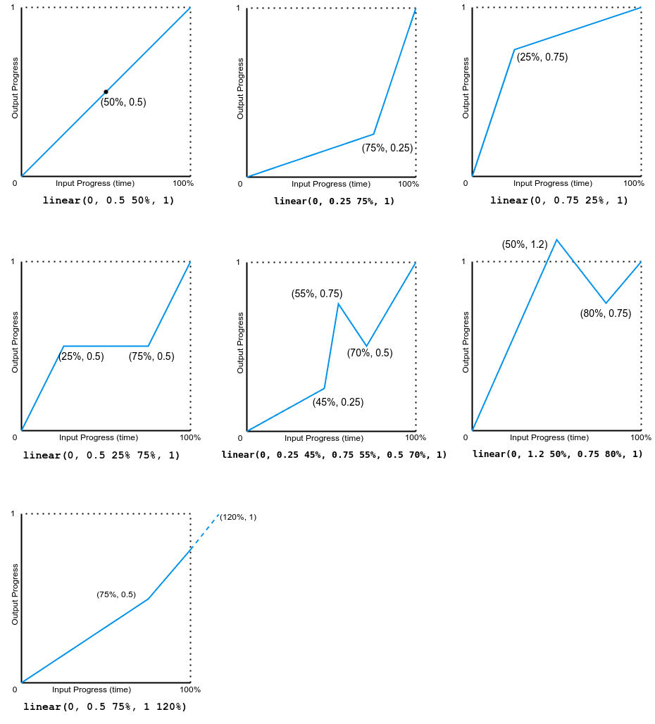
Beachten Sie, dass die Ausgabe vorwärts oder rückwärts gehen kann.
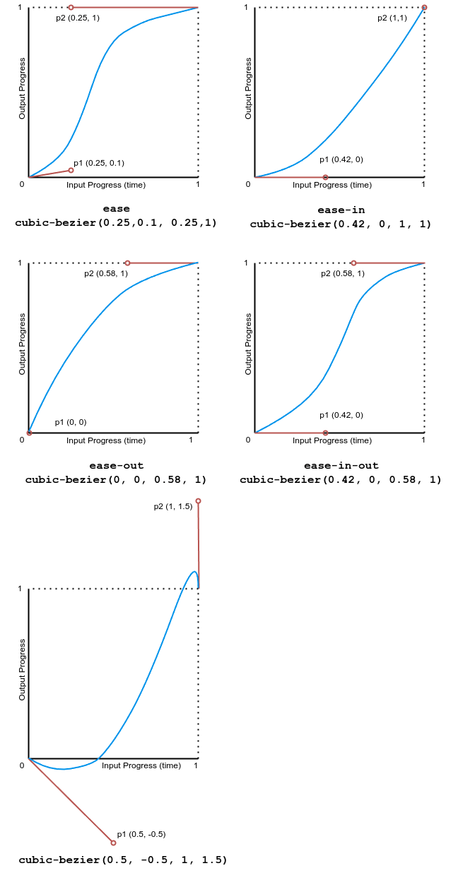
Kubische Bézier-Beispiele
Das Beispiel demonstriert die Effekte verschiedener Bézier-Kurven-Easing-Funktionen.
Das folgende Bild zeigt Graphen aller in diesem Beispiel verwendeten kubischen Bézier-Funktionswerte. Der Eingabefortschritt (Zeit) reicht von 0 bis 1 und der Ausgabefortschritt reicht von 0 bis 1.
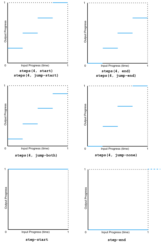
Schritt-Beispiele
Dieses Beispiel zeigt die Effekte mehrerer Schritt-Easing-Funktionswerte.
Das folgende Bild zeigt Graphen aller in diesem Beispiel verwendeten step()-Funktionswerte. Der Eingabefortschritt (Zeit) und der Ausgabefortschritt reichen von 0 bis 1.
Spezifikationen
| Spezifikation |
|---|
| CSS Animations Level 1 # animation-timing-function |
Browser-Kompatibilität
Siehe auch
- Verwendung von CSS-Animationen
<easing-function>- CSS Easing-Funktionen Modul
- JavaScript
AnimationEventAPI - Tool zur Erstellung kubischer Bézier-Kurven
- Andere verwandte Animationseigenschaften:
animation,animation-composition,animation-delay,animation-direction,animation-duration,animation-fill-mode,animation-iteration-count,animation-name,animation-play-state,animation-timeline