Using the CSS object-view-box property
The object-view-box property can be used to define a viewbox within replaced elements, enabling the display of just a section of the replaced content. The subsection of the element displayed can be presented as zoomed-in, zoomed-out, or at original size, while maintaining the content's intrinsic aspect ratio. In this guide, we examine this property, comparing it to the similar object-fit property, and explore its functionality through zooming in and out, as well as panning across an element.
Intrinsic size, extrinsic size, and object-fit
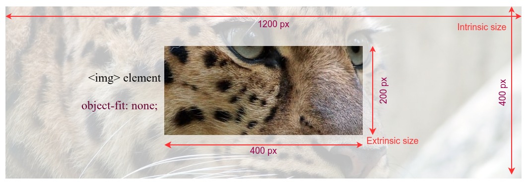
Every replaced elements has two sizes; an extrinsic size and an intrinsic size.
The extrinsic size is the dimension of the HTML element in which the content is rendered based on the box and visual formatting models. The box model and visual formatting model determine the size of rendered elements based on content, HTML attributes, CSS applied to the elements and their ancestors, and the viewport size.
The intrinsic size is the actual size of the content itself; the size the element is when no styles are applied and without any layout constraints. While the intrinsic and extrinsic sizes don't have to be the same, it is generally important to maintain a replaced element's intrinsic aspect ratio.
object-view-box versus object-fit
CSS has many sizing properties. When it comes to sizing replaced elements, the object-fit property enables us to control, to some extent, how replaced elements are rendered within a defined box. For example, in the following screenshot, a 1200 x 400 image is displayed using an <img> element. The <img> element is sized to 400 x 200. The image content is positioned using object-fit: none; declaration.
 The
The object-view-box property is more flexible than the object-fit property, and it is capable of doing more things. For example, it can be used to crop, zoom, and pan images. The property sets the viewable area (viewbox), which defines what part of the content to show and how to fit it inside the extrinsic size. The viewbox value contains a rectangle and its position relative to the intrinsic area of the content, but the physical size of the view box remains equal to the extrinsic size. The viewbox marks the area in the content to be displayed, and then the content area is transformed to match the extrinsic dimensions fitting into the HTML element.
In the following image, we have the same leopard picture in a 400 x 150 image element. However, this time we have used object-view-box property to crop the portion of the picture showing the leopard's eyes.
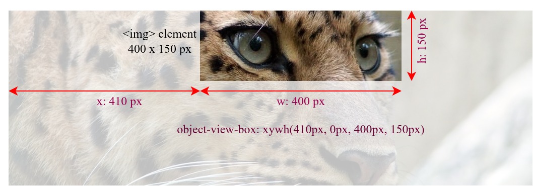
In this case, as the dimensions of the <img> element and the viewbox defined by the object-view-box property are the same, i.e., 400 x 150 pixels, the aspect ratios of both are the same, and the replaced element is neither scaled nor distorted.
Maintaining the same aspect ratio prevents image distortion. With object-view-box, we can accomplish various image operations while having different extrinsic and view box sizes, without distorting the replaced element as it scales up and down.
Zooming in and out
Reducing the viewbox size, the area of the replaced element that is displayed, increases the zoom-in effect, because smaller content is stretched to fit the HTML element's dimensions. Decreasing it gives it a zoom-out effect.
This example demonstrates using the object-view-box property to zoom a section of a replaced element in and out, within a statically sized HTML element. In this case, the eye of the leopard, within a very large image, serves as the focal point of the zoom effect.
HTML
We include an <img> element and a range <input> element, with an associated <label>. The natural dimensions, or intrinsic size, of the original leopard image are 1244px wide by 416px tall, with an aspect ratio of 3:1.
<img
  src="https://mdn.github.io/shared-assets/images/examples/leopard.jpg"
  alt="leopard" />
<p>
  <label for="box-size">Zoom-in: </label>
  <input type="range" id="box-size" min="115" max="380" value="150" />
</p>
<output></output>
CSS
We define a --box-size custom property, which is used as the height and width in the xywh() function, creating a square viewbox with an aspect ratio of 1:1. The view box's offset point, the focal point in our zoom effect, is set at 500px for the x coordinate and 30px for the y coordinate, which corresponds to the top-left corner of the leopard's right eye.
img {
  width: 350px;
  height: 350px;
  border: 2px solid red;

  --box-size: 150px;
  object-view-box: xywh(500px 30px var(--box-size) var(--box-size));
}
JavaScript
We add an event listener to the slider that updates the value of the --boxSize custom property when the user interacts with it. To increase the zoom-in effect when the slider is moved to the right, the slider's value is inverted by subtracting it from 500px, as reducing the view box size increases the zoom-in effect.
const img = document.querySelector("img");
const zoom = document.getElementById("box-size");
const output = document.querySelector("output");

function update() {
  const size = 500 - zoom.value;
  img.style.setProperty("--box-size", `${size}px`);
  output.innerText = `object-view-box: xywh(500px 30px ${size}px ${size}px);`;
}

zoom.addEventListener("input", update);
update();
Result
Move the slider to the right to increase the zoom-in effect and left to reduce it. The slider only affects the dimensions of the view box, while the x and y values, the origin point of the viewbox, remain constant. The size of the <img> element also remains constant.
Panning an image
We can create a panning effect by changing the coordinates of the view box window, the x and y components of the xywh() function, while keeping the size of the visible section constant. For example, by keeping the view box dimensions constant and changing only the horizontal position - the x parameter - we can create a horizontal panning effect.
Move the slider. Note how increasing and decreasing the x value of the xywh() function creates a panning effect.