<hue-interpolation-method> CSS type
Baseline
2024
Newly available
Since June 2024, this feature works across the latest devices and browser versions. This feature might not work in older devices or browsers.
The <hue-interpolation-method> CSS data type represents the algorithm used for interpolation between <hue> values.
The interpolation method specifies how to find a midpoint between two hue values based on a color wheel.
It is used as a component of the <color-interpolation-method> data type.
When interpolating <hue> values, the hue interpolation algorithm defaults to shorter.
Syntax
A <hue-interpolation-method> value consists of the name of a hue interpolation algorithm followed by a literal token hue:
shorter hue
longer hue
increasing hue
decreasing hue
Values
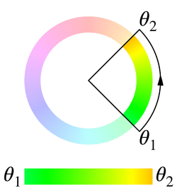
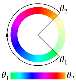
Any pair of hue angles correspond to two radii on the color wheel, which cut the circumference into two possible arcs for interpolation. Both arcs start at the first radius and end at the second radius, but one goes clockwise and the other goes counterclockwise.
Note: The following descriptions and illustrations are based on color wheels in which hue angles increase in a clockwise direction. Be aware that there are color wheels where an increase in angles will be a counterclockwise operation.
For a pair of hue angles θ1 and θ2 normalized to the range [0deg, 360deg), there are four algorithms to determine which arc is used when interpolating from θ1 to θ2:
shorter-
Use the shorter arc. When the two radii coincide, the arc degenerates to a single point. When both arcs have the same lengths:
- If
θ1 < θ2, use the clockwise arc; - If
θ1 > θ2, use the counterclockwise arc.
θ1 = 45deg,θ2 = 135degθ1 = 135deg,θ2 = 45deg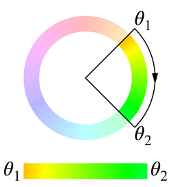
- If
longer-
Use the longer arc. When the two radii coincide:
- If
θ1 ≤ θ2, the arc becomes the full circumference with a clockwise orientation. - If
θ1 > θ2, the arc becomes the full circumference with a counterclockwise orientation.
When both arcs have the same lengths:
- If
θ1 < θ2, use the clockwise arc; - If
θ1 > θ2, use the counterclockwise arc.
θ1 = 45deg,θ2 = 135degθ1 = 135deg,θ2 = 45deg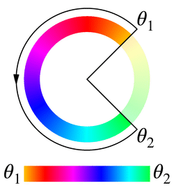
- If
increasing-
Use the clockwise arc. When the two radii coincide, the arc degenerates to a single point.
θ1 = 45deg,θ2 = 135degθ1 = 135deg,θ2 = 45deg decreasing-
Use the counterclockwise arc. When the two radii coincide, the arc degenerates to a single point.
θ1 = 45deg,θ2 = 135degθ1 = 135deg,θ2 = 45deg
As there are only two arcs to choose from, these algorithms are pairwise equivalent under certain circumstances. Specifically:
- If
0deg < θ2 - θ1 < 180degorθ2 - θ1 < -180deg,shorterandincreasingare equivalent, whereaslongeranddecreasingare equivalent. - If
-180deg < θ2 - θ1 < 0degorθ2 - θ1 > 180deg,shorteranddecreasingare equivalent, whereaslongerandincreasingare equivalent.
A notable feature of increasing and decreasing is that when the hue angle difference passes through 180deg during transition or animation, the arc will not flip to the other side like shorter and longer do.
Formal syntax
<hue-interpolation-method> =
  [ shorter | longer | increasing | decreasing ] hue
Examples
Comparing hue interpolation algorithms
The following example shows the effect of using different hue interpolation algorithms in a linear-gradient().
HTML
<div class="hsl">
  <p>HSL</p>
</div>
<div class="hsl-increasing">
  <p>HSL increasing</p>
</div>
<div class="hsl-decreasing">
  <p>HSL decreasing</p>
</div>
<div class="hsl-shorter">
  <p>HSL shorter</p>
</div>
<div class="hsl-longer">
  <p>HSL longer</p>
</div>
<div class="hsl-named">
  <p>HSL named</p>
</div>
<div class="hsl-named-longer">
  <p>HSL named (longer)</p>
</div>
CSS
.hsl {
  background: linear-gradient(
    to right in hsl,
    hsl(39deg 100% 50%),
    hsl(60deg 100% 50%)
  );
}
.hsl-increasing {
  background: linear-gradient(
    to right in hsl increasing hue,
    hsl(190deg 100% 50%),
    hsl(180deg 100% 50%)
  );
}
.hsl-decreasing {
  background: linear-gradient(
    to right in hsl decreasing hue,
    hsl(39deg 100% 50%),
    hsl(60deg 100% 50%)
  );
}
.hsl-shorter {
  background: linear-gradient(
    to right in hsl shorter hue,
    hsl(39deg 100% 50%),
    hsl(60deg 100% 50%)
  );
}
.hsl-longer {
  background: linear-gradient(
    to right in hsl longer hue,
    hsl(39deg 100% 50%),
    hsl(60deg 100% 50%)
  );
}
.hsl-named {
  background: linear-gradient(to right in hsl, orange, yellow);
}
.hsl-named-longer {
  background: linear-gradient(to right in hsl longer hue, orange, yellow);
}
Result
Specifications
| Specification |
|---|
| CSS Color Module Level 4 # hue-interpolation |
Browser compatibility
See also
<color-interpolation-method><hue>data type