Grid layout using line-based placement
In the basic concepts of grid layout guide, we took a brief look at positioning items on a grid using line numbers. In this guide, we will fully explore how this fundamental feature of the specification works.
Starting your exploration of grid with numbered lines is the most logical place to begin because when you use grid layout, you always have numbered lines. The lines are numbered for columns and rows, and are indexed from 1. Note that grid is indexed according to the writing mode of the document. In a left-to-right language, such as English, line 1 is on the left-hand side of the grid. If you are working in a right-to-left language, such as Arabic, then line 1 will be on the right-hand of the grid. We will learn more about the interaction between writing modes and grids in the grids, logical values, and writing modes guide.
A basic example
As a basic example, we create a grid with 3 column tracks and 3 row tracks. This gives us 4 lines in each dimension.
.wrapper {
  display: grid;
  grid-template-columns: repeat(3, 1fr);
  grid-template-rows: repeat(3, 100px);
}
Inside our grid container, we include four child elements.
<div class="wrapper">
  <div class="box1">One</div>
  <div class="box2">Two</div>
  <div class="box3">Three</div>
  <div class="box4">Four</div>
</div>
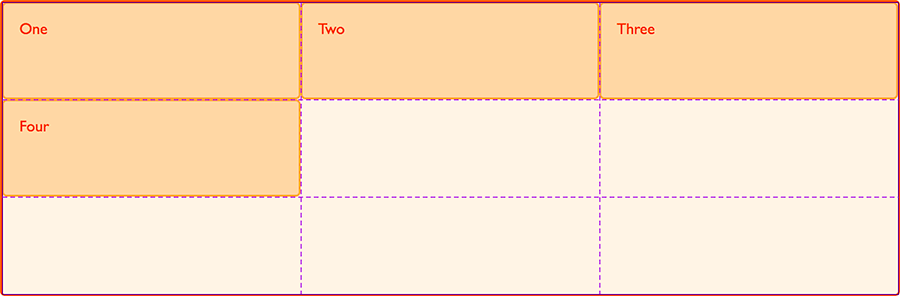
If we do not place these onto the grid in any way, they will lay out according to the auto-placement rules, one item in each of the first four cells. You can inspect the grid with your browser developer tools to see how the grid defines columns and rows.
Positioning items by line number
We can use line-based placement to control where these items sit on the grid. We can use the grid-column-start and grid-column-end properties to make the first item start on the far left of the grid and span a single column track. With grid-row-start and grid-row-end, we make the item start on the first row line at the top of the grid, and span to the fourth row line.
.box1 {
  grid-column-start: 1;
  grid-column-end: 2;
  grid-row-start: 1;
  grid-row-end: 4;
}
As you position some items, other items on the grid will continue to be laid out using the auto-placement rules. This behavior is explained in the Auto-placement in grid layout guide. For now, observe how the grid is laying out un-placed items into empty cells of the grid.
Addressing each item individually using the same properties but with different values, we place all four items, spanning row and column tracks.
<div class="wrapper">
  <div class="box1">One</div>
  <div class="box2">Two</div>
  <div class="box3">Three</div>
  <div class="box4">Four</div>
</div>
.box1 {
  grid-column-start: 1;
  grid-column-end: 2;
  grid-row-start: 1;
  grid-row-end: 4;
}
.box2 {
  grid-column-start: 3;
  grid-column-end: 4;
  grid-row-start: 1;
  grid-row-end: 3;
}
.box3 {
  grid-column-start: 2;
  grid-column-end: 3;
  grid-row-start: 1;
  grid-row-end: 2;
}
.box4 {
  grid-column-start: 2;
  grid-column-end: 4;
  grid-row-start: 3;
  grid-row-end: 4;
}
Note that we can leave cells empty if we wish. One of the very nice things about grid layout is the ability to have white space in our designs without any hacks.
The grid-column and grid-row shorthands
The previous example had quite a lot of code to position each item. It should come as no surprise to know there is a shorthand. The grid-column-start and grid-column-end properties can be combined into grid-column, grid-row-start and grid-row-end into grid-row. In this example, we replicate the above example using these shorthand properties:
<div class="wrapper">
  <div class="box1">One</div>
  <div class="box2">Two</div>
  <div class="box3">Three</div>
  <div class="box4">Four</div>
</div>
.box1 {
  grid-column: 1 / 2;
  grid-row: 1 / 4;
}
.box2 {
  grid-column: 3 / 4;
  grid-row: 1 / 3;
}
.box3 {
  grid-column: 2 / 3;
  grid-row: 1 / 2;
}
.box4 {
  grid-column: 2 / 4;
  grid-row: 3 / 4;
}
Default spans
In the above examples, we specified every end row and column line, in order to demonstrate the properties, however in practice if an item only spans one track you can omit the grid-column-end or grid-row-end value. Grid defaults to spanning one track.
Default spans with longhand placement
This means that our initial, long-hand, example would look like this:
<div class="wrapper">
  <div class="box1">One</div>
  <div class="box2">Two</div>
  <div class="box3">Three</div>
  <div class="box4">Four</div>
</div>
.box1 {
  grid-column-start: 1;
  grid-row-start: 1;
  grid-row-end: 4;
}
.box2 {
  grid-column-start: 3;
  grid-row-start: 1;
  grid-row-end: 3;
}
.box3 {
  grid-column-start: 2;
  grid-row-start: 1;
}
.box4 {
  grid-column-start: 2;
  grid-column-end: 4;
  grid-row-start: 3;
}
Default spans with shorthand placement
Our shorthand would look like the following code, with no forward slash and second value for the items spanning one track only.
<div class="wrapper">
  <div class="box1">One</div>
  <div class="box2">Two</div>
  <div class="box3">Three</div>
  <div class="box4">Four</div>
</div>
.box1 {
  grid-column: 1;
  grid-row: 1 / 4;
}
.box2 {
  grid-column: 3;
  grid-row: 1 / 3;
}
.box3 {
  grid-column: 2;
  grid-row: 1;
}
.box4 {
  grid-column: 2 / 4;
  grid-row: 3;
}
The grid-area property
We can take things a step further and define each area with a single property – grid-area. The order of the values for grid-area is as follows.
– grid-row-start
– grid-column-start
– grid-row-end
– grid-column-end
<div class="wrapper">
  <div class="box1">One</div>
  <div class="box2">Two</div>
  <div class="box3">Three</div>
  <div class="box4">Four</div>
</div>
.box1 {
  grid-area: 1 / 1 / 4 / 2;
}
.box2 {
  grid-area: 1 / 3 / 3 / 4;
}
.box3 {
  grid-area: 1 / 2 / 2 / 3;
}
.box4 {
  grid-area: 3 / 2 / 4 / 4;
}
This order of values for grid-area can seem a little strange — it is the opposite of the direction in which we specify margins and padding as a shorthand, for example. It may help to realize that this is due to CSS grid layout using the flow-relative directions defined in CSS writing modes. We explore how grids work with writing modes in grids, logical values, and writing modes. For now, consider the concept of four flow-relative directions:
block-startblock-endinline-startinline-end
We are working in English, a left-to-right language. Our block-start is the top row line of the grid container, block-end is the final row line of the container. Our inline-start is the left-hand column line as inline-start is always the point from which text would be written in the current writing mode, while inline-end is the final column line of our grid.
When we specify our grid area using the grid-area property we first define both start lines block-start and inline-start, then both end lines block-end and inline-end. This seems unusual at first as we are used to the physical properties of top, right, bottom, and left, but it makes more sense if you start to think of websites as being multi-directional in different writing modes.
Counting backwards
We can also count backwards from the block and inline ends of the grid, for English that would be the right-hand column line and final row line. The last lines of the explicit grid can be addressed as -1, and you can count back from there – so the second to last line is -2.
Do note that negative values are relevant only to the explicit grid. The final line is the final line of the grid defined by grid-template-columns and grid-template-rows, and does not take into account any rows or columns added in the implicit grid outside of that.
In this next example, we have flipped the layout we were working with by working from the right and bottom of our grid when placing the items.
<div class="wrapper">
  <div class="box1">One</div>
  <div class="box2">Two</div>
  <div class="box3">Three</div>
  <div class="box4">Four</div>
</div>
.box1 {
  grid-column-start: -1;
  grid-column-end: -2;
  grid-row-start: -1;
  grid-row-end: -4;
}
.box2 {
  grid-column-start: -3;
  grid-column-end: -4;
  grid-row-start: -1;
  grid-row-end: -3;
}
.box3 {
  grid-column-start: -2;
  grid-column-end: -3;
  grid-row-start: -1;
  grid-row-end: -2;
}
.box4 {
  grid-column-start: -2;
  grid-column-end: -4;
  grid-row-start: -3;
  grid-row-end: -4;
}
Stretching an item across the grid
Being able to address the start and end lines of the grid is useful as you can then stretch an item right across the grid with:
.item {
  grid-column: 1 / -1;
}
Gutters or Alleys
CSS grid includes the ability to add gutters between column and row tracks with the column-gap and row-gap properties, or gap shorthand.
Gaps only appear between tracks of the grid, they do not add space to the top and bottom, left or right of the container. We can add gaps to our earlier example by using these properties on the grid container.
<div class="wrapper">
  <div class="box1">One</div>
  <div class="box2">Two</div>
  <div class="box3">Three</div>
  <div class="box4">Four</div>
</div>
.box1 {
  grid-column: 1;
  grid-row: 1 / 4;
}
.box2 {
  grid-column: 3;
  grid-row: 1 / 3;
}
.box3 {
  grid-column: 2;
  grid-row: 1;
}
.box4 {
  grid-column: 2 / 4;
  grid-row: 3;
}
.wrapper {
  display: grid;
  grid-template-columns: repeat(3, 1fr);
  grid-template-rows: repeat(3, 100px);
  column-gap: 20px;
  row-gap: 1em;
}
The gap shorthand
The two properties can also be expressed as a shorthand, gap. If you only give one value for gap it will apply to both column and row gaps. If you specify two values, the first is used for row-gap and the second for column-gap.
.wrapper {
  display: grid;
  grid-template-columns: repeat(3, 1fr);
  grid-template-rows: repeat(3, 100px);
  gap: 1em 20px;
}
In terms of line-based positioning of items, the gap acts as if the line has gained extra width. Anything starting at that line starts after the gap and you cannot address the gap or place anything into it. If you want gutters that act more like regular tracks you can define a track for that purpose.
Using the span keyword
In addition to specifying the start and end lines by number, you can specify a start line and then the number of tracks you would like the area to span using the span keyword.
<div class="wrapper">
  <div class="box1">One</div>
  <div class="box2">Two</div>
  <div class="box3">Three</div>
  <div class="box4">Four</div>
</div>
.box1 {
  grid-column: 1;
  grid-row: 1 / span 3;
}
.box2 {
  grid-column: 3;
  grid-row: 1 / span 2;
}
.box3 {
  grid-column: 2;
  grid-row: 1;
}
.box4 {
  grid-column: 2 / span 2;
  grid-row: 3;
}
You can also use the span keyword in the value of grid-row-start/grid-row-end and grid-column-start/grid-column-end. The following two examples will create the same grid area. In the first we set the start row line, then the end line we specify that we want the area to cover 3 tracks. The area will start at line 1 and end 3 lines from line 1; that is, the area will end at line 4.
.box1 {
  grid-column-start: 1;
  grid-row-start: 1;
  grid-row-end: span 3;
}
In the second example, we specify the end row line we want the item to finish at and then set the start line as span 3. This means the item will need to span upwards from the specified row line. The area will start at line 4 and span 3 lines to line 1.
.box1 {
  grid-column-start: 1;
  grid-row-start: span 3;
  grid-row-end: 4;
}
To become familiar with line based positioning in grid, try to build a few common layouts by placing items onto grids with varying numbers of columns. Remember that if you do not place all of the items, any leftover items will be placed according to auto-placement rules. This may result in the layout you want, but if something is appearing somewhere unexpected, check that you have set a position for it.
Also, remember that items on the grid can overlap when you place them explicitly like this. Overlapping items can create some nice effects, however, you can also end up with incorrect overlapping if you specify the wrong start or end line. Inspecting grids with your browser developer tools can be very helpful for identifying such problems as you learn, especially if your grid is quite complicated.