Shapes from box values
A straightforward way to create a shape is to use a value from the CSS box model module. This article explains how to do this.
The <box-edge> box values allowable as a shape value are:
content-boxpadding-boxborder-boxmargin-box
The border-radius values are also supported. This means you can give an element a curved border, and flow your content around the created shape.
CSS box model
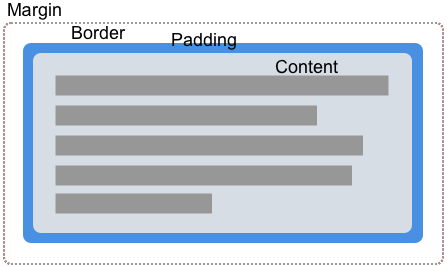
The values listed above correspond to the various parts of the CSS Box Model. A box in CSS has content, padding, border, and margin.

By using box values for shapes, we can wrap our content around the edges defined by these values. In each of the examples below, I am using an element that has padding, a border, and a margin defined so that you can see the different ways in which content will flow.
margin-box
The margin-box is the shape defined by the outside margin edge and includes the corner radius of the shape, should border-radius have been used in defining the element.
In the example below, we have a circular purple item which is a <div> with a height, width, and background color. The border-radius property has been used to create a circle by setting border-radius: 50%. As the element has a margin, you can see that the content is flowing around the circular shape and the margin applied to it.
<div class="box">
  <div class="shape"></div>
  <p>
    One November night in the year 1782, so the story runs, two brothers sat
    over their winter fire in the little French town of Annonay, watching the
    grey smoke-wreaths from the hearth curl up the wide chimney. Their names
    were Stephen and Joseph Montgolfier, they were papermakers by trade, and
    were noted as possessing thoughtful minds and a deep interest in all
    scientific knowledge and new discovery.
  </p>
</div>
body {
  font: 1.2em sans-serif;
}

.shape {
  background-color: rebeccapurple;
  height: 80px;
  width: 80px;
  padding: 20px;
  margin: 20px;
  border: 10px solid black;
  border-radius: 50%;
  float: left;
  shape-outside: margin-box;
}
border-box
The border-box value is the shape defined by the outside border edge. This shape follows all of the normal border radius shaping rules for the outside of the border. You still have a border, even if you have not used the CSS border property. In this case, it will be the same as padding-box, the shape defined by the outside padding edge.
In the example below, you can see how the text now follows the line created by the border. Change the border size, and the content will follow it.
body {
  font: 1.2em sans-serif;
}
.box {
  width: 70%;
}

.shape {
  background-color: rebeccapurple;
  height: 80px;
  width: 80px;
  padding: 20px;
  margin: 20px;
  border: 10px solid black;
  border-radius: 50%;
  float: left;
  shape-outside: border-box;
}
padding-box
The padding-box value defines the shape enclosed by the outside padding edge. This shape follows all of the normal border radius shaping rules for the inside of the border. If you have no padding then padding-box is the same as content-box.
body {
  font: 1.2em / 1.2 sans-serif;
}
.box {
  width: 70%;
}

.shape {
  background-color: rebeccapurple;
  height: 80px;
  width: 80px;
  padding: 20px;
  margin: 20px;
  border: 10px solid black;
  border-radius: 50%;
  float: left;
  shape-outside: padding-box;
}
content-box
The content-box value defines the shape enclosed by the outside content edge. Each corner radius of this box is the border-radius less the border-width and padding, or 0, whichever is larger. This means that it is impossible to have a negative value here.
body {
  font: 1.2em / 1.2 sans-serif;
}
.box {
  width: 70%;
}

.shape {
  background-color: rebeccapurple;
  height: 80px;
  width: 80px;
  padding: 20px;
  margin: 20px;
  border: 10px solid black;
  border-radius: 50%;
  float: left;
  shape-outside: content-box;
}
When to use box values
Using box values is a way to create shapes; however, this naturally works only with very basic shapes that can be defined using the border-radius property. The examples shown above show one such use case. You can create a circular shape using border-radius and then curve text around it.
With just this basic technique, you can create some interesting effects. In my final example of this section, I have floated two elements left and right, giving each a border radius of 100% in the direction closest to the text.
<div class="box">
  <div class="shape-left"></div>
  <div class="shape-right"></div>
  <p>
    One November night in the year 1782, so the story runs, two brothers sat
    over their winter fire in the little French town of Annonay, watching the
    grey smoke-wreaths from the hearth curl up the wide chimney. Their names
    were Stephen and Joseph Montgolfier, they were papermakers by trade, and
    were noted as possessing thoughtful minds and a deep interest in all
    scientific knowledge and new discovery.
  </p>
</div>
body {
  font: 1.2em / 1.5 sans-serif;
}

.box {
  text-align: justify;
}

.shape-left,
.shape-right {
  height: 100px;
  width: 100px;
}

.shape-left {
  margin: 0 20px 20px 0;
  border-bottom-right-radius: 100%;
  float: left;
  shape-outside: margin-box;
}
.shape-right {
  margin: 0 20px 20px;
  border-bottom-left-radius: 100%;
  float: right;
  shape-outside: margin-box;
}
For more complex shapes, you will need to use one of the basic shapes as a value, or define your shape from an image as covered in other guides in this section.