Ordering flex items
Layout methods such as flexbox and grid enable controlling the order of content. In this article, we will take a look at ways in which you can change the visual order of your content when using flexbox. We will also consider how reordering items impacts accessibility.
Reverse the display of the items
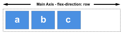
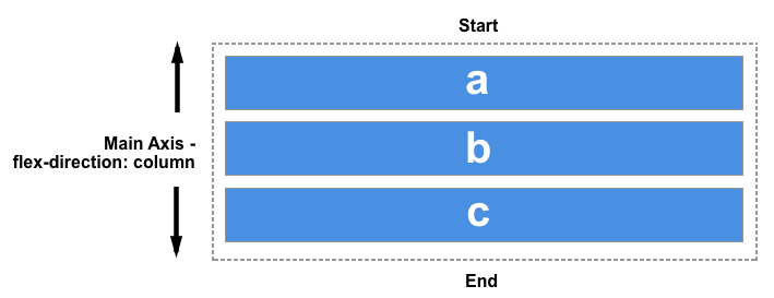
The flex-direction property can take one of four values:
rowcolumnrow-reversecolumn-reverse
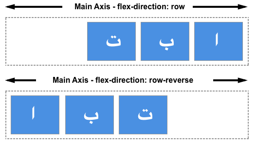
The first two values keep the items in the same order that they appear in the document source order and display them sequentially from the start line.
The second two values reverse the items by switching the start and end lines.
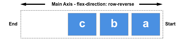
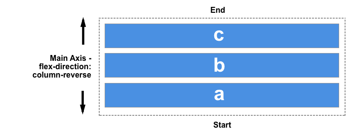
Remember that the start line relates to writing modes. The row-related examples above demonstrate how row and row-reverse work in a left-to-right language such as English. If you are working in a right-to-left language like Arabic then row would start on the right, row-reverse on the left.
This can seem like an easy way to display things in reverse order. However, you should be mindful that the items are only visually displayed in reverse order. The reordering capabilities of flex layout affect only the visual rendering. The tabbing order and speech order follow the order of the source code. This means that only the visual presentation changes; the source order remains the same, providing a different user experience for non-CSS UAs (think Siri or Alexa) and assistive technology users. If you change the order of a navigation bar, the tabbing order is still the document source order, not your visual order, which can be cognitively confusing.
If you are using a reverse value, or otherwise reordering your items, you should consider whether you should really be changing the logical order in the source.
The flexible box layout specification warns us not to use reordering as a way of fixing source issues:
"Authors must not use order or the *-reverse values of
flex-flow/flex-directionas a substitute for correct source ordering, as that can ruin the accessibility of the document."
As you tab from link to link in the live example below, the focus style is highlighted, demonstrating that changing the order of flex-items with flex-direction does not change the tabbing order, which will continue to follow the source code order.
<div class="box">
  <div><a href="#">One</a></div>
  <div><a href="#">Two</a></div>
  <div><a href="#">Three</a></div>
</div>
.box > * {
  border: 2px solid rgb(96 139 168);
  border-radius: 5px;
  background-color: rgb(96 139 168 / 0.2);
  padding: 10px;
}

.box > * a:focus {
  background-color: yellow;
  color: black;
}

.box {
  border: 2px dotted rgb(96 139 168);
  display: flex;
  flex-direction: row-reverse;
}
In the same way that changing the value of flex-direction does not change the tabbing order, changing this value does not change paint order. It is a visual reversal of the items only.
The order property
In addition to reversing the order in which flex items are visually displayed, you can target individual items and change where they appear in the visual order with the order property.
The order property is designed to lay the items out in ordinal groups. This means items are assigned an integer that represents their group. The items are then placed in the visual order according to that integer, lowest values first. If more than one item has the same integer value, then within that group the items are laid out as per source order.
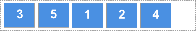
As an example, five flex items are assigned order values as follows:
- Source item 1:
order: 2 - Source item 2:
order: 3 - Source item 3:
order: 1 - Source item 4:
order: 3 - Source item 5:
order: 1
These items would be displayed on the page in the following order:
- Source item 3:
order: 1 - Source item 5:
order: 1 - Source item 1:
order: 2 - Source item 2:
order: 3 - Source item 4:
order: 3
Play around with the values in this live example below and see how that changes the order. Also, try changing flex-direction to row-reverse and see what happens — the start line is switched so the ordering begins from the opposite side.
<div class="box">
  <div><a href="#">1</a></div>
  <div><a href="#">2</a></div>
  <div><a href="#">3</a></div>
  <div><a href="#">4</a></div>
  <div><a href="#">5</a></div>
</div>
.box > * {
  border: 2px solid rgb(96 139 168);
  border-radius: 5px;
  background-color: rgb(96 139 168 / 0.2);
  padding: 10px;
}

.box {
  border: 2px dotted rgb(96 139 168);
  display: flex;
  flex-direction: row;
}
.box :nth-child(1) {
  order: 2;
}
.box :nth-child(2) {
  order: 3;
}
.box :nth-child(3) {
  order: 1;
}
.box :nth-child(4) {
  order: 3;
}
.box :nth-child(5) {
  order: 1;
}
Flex items have a default order value of 0. Therefore, items with an integer value greater than 0 will be displayed after any items that have not been given an explicit order value.
You can also use negative values with order, which can be quite useful. If you want to make one item display first and leave the order of all other items unchanged, you can give that item order of -1. As this is lower than 0, the item will always be displayed first.
In the live code example below, the items are laid out using flexbox. By changing which item has the class active assigned to it in the HTML, you can change which item displays first and therefore becomes full width at the top of the layout, with the other items displaying below it.
<div class="box">
  <div><a href="#">1</a></div>
  <div><a href="#">2</a></div>
  <div class="active"><a href="#">3</a></div>
  <div><a href="#">4</a></div>
  <div><a href="#">5</a></div>
</div>
* {
  box-sizing: border-box;
}

.box > * {
  border: 2px solid rgb(96 139 168);
  border-radius: 5px;
  background-color: rgb(96 139 168 / 0.2);
  padding: 10px;
}

.box {
  width: 500px;
  border: 2px dotted rgb(96 139 168);
  display: flex;
  flex-wrap: wrap;
  flex-direction: row;
}

.active {
  order: -1;
  flex: 1 0 100%;
}
The items are displayed in order-modified document order meaning the value of the order property is taken into account before the items are displayed.
Order also changes the paint order of the items; items with a lower value for order are painted first and items with a higher value for order painted afterwards.
The order property and accessibility
Use of the order property has the same implications for accessibility as changing the direction with flex-direction. Using order changes the order in which items are painted, and the order in which they appear visually. It does not change the sequential navigation order of the items. Therefore, if a user is using a keyboard to tab through the content on the page, they could find themselves jumping around your content in a very confusing way.
By tabbing around any of the live examples on this page, you can see how order is potentially creating a strange experience for anyone not using a pointing device like a mouse. To read more about this disconnect of visual order and logical order and some of the potential problems it raises for accessibility, see the following resources.
- Flexbox and the keyboard navigation disconnect via tink.uk (2016)
- HTML Source Order vs CSS Display Order via adrianroselli.com (2015)
- The Responsive Order Conflict for Keyboard Focus via alastairc.uk (2017)
Use cases for order
There are some use cases for which the fact that the logical and therefore reading order of flex items is separate from the visual order, is helpful. Used carefully, the order property can allow for some useful common patterns to be easily implemented.
You might have a design, perhaps a card that will display a news item. The heading of the news item is the key thing to highlight and would be the element that a user might jump to if they were tabbing between headings to find the content they wanted to read. The card also has a date; the finished design we want to create is something like this.
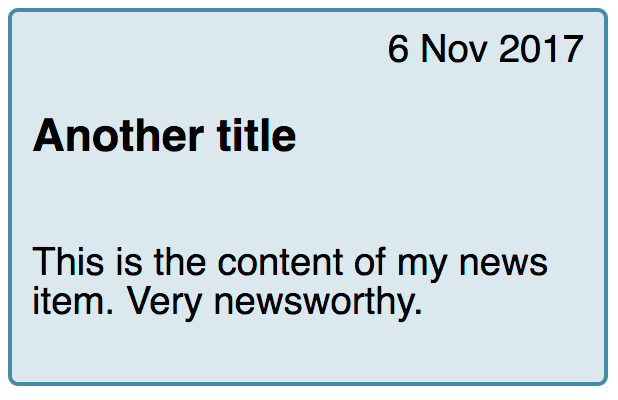
Visually, the date appears above the heading, in the source. However, if the card was read out by a screen reader I would prefer that the title was announced first and then the publication date. We can accomplish this with the order property.
The card is our flex container, with flex-direction set to column. We give the date an order of -1, placing it above the heading.
<div class="wrapper">
  <div class="card">
    <h3>News item title</h3>
    <div class="date">1 Nov 2017</div>
    <p>This is the content of my news item. Very newsworthy.</p>
  </div>
  <div class="card">
    <h3>Another title</h3>
    <div class="date">6 Nov 2017</div>
    <p>This is the content of my news item. Very newsworthy.</p>
  </div>
</div>
body {
  font-family: sans-serif;
}

.wrapper {
  display: flex;
  flex: 1 1 200px;
  gap: 1em;
}

.card {
  border: 2px solid rgb(96 139 168);
  border-radius: 5px;
  background-color: rgb(96 139 168 / 0.2);
  padding: 1em;
  display: flex;
  flex-direction: column;
}

.date {
  order: -1;
  text-align: right;
}
These small tweaks are the sort of cases where the order property makes sense. Keep the logical order the same as the reading and tab order of the document, and maintain that in the most accessible and structured fashion. Then use order for purely visual design tweaks. Don't reorder items that receive keyboard focus. Ensure you always test your content using only a keyboard rather than a mouse or a touchscreen; this will reveal if your development choices make it more complex to navigate the content.