Card
This pattern is a list of "card" components with optional footers. A card contains a title, an image, a description or other content, and an attribution or footer. Cards are generally displayed within a group or collection.
Requirements
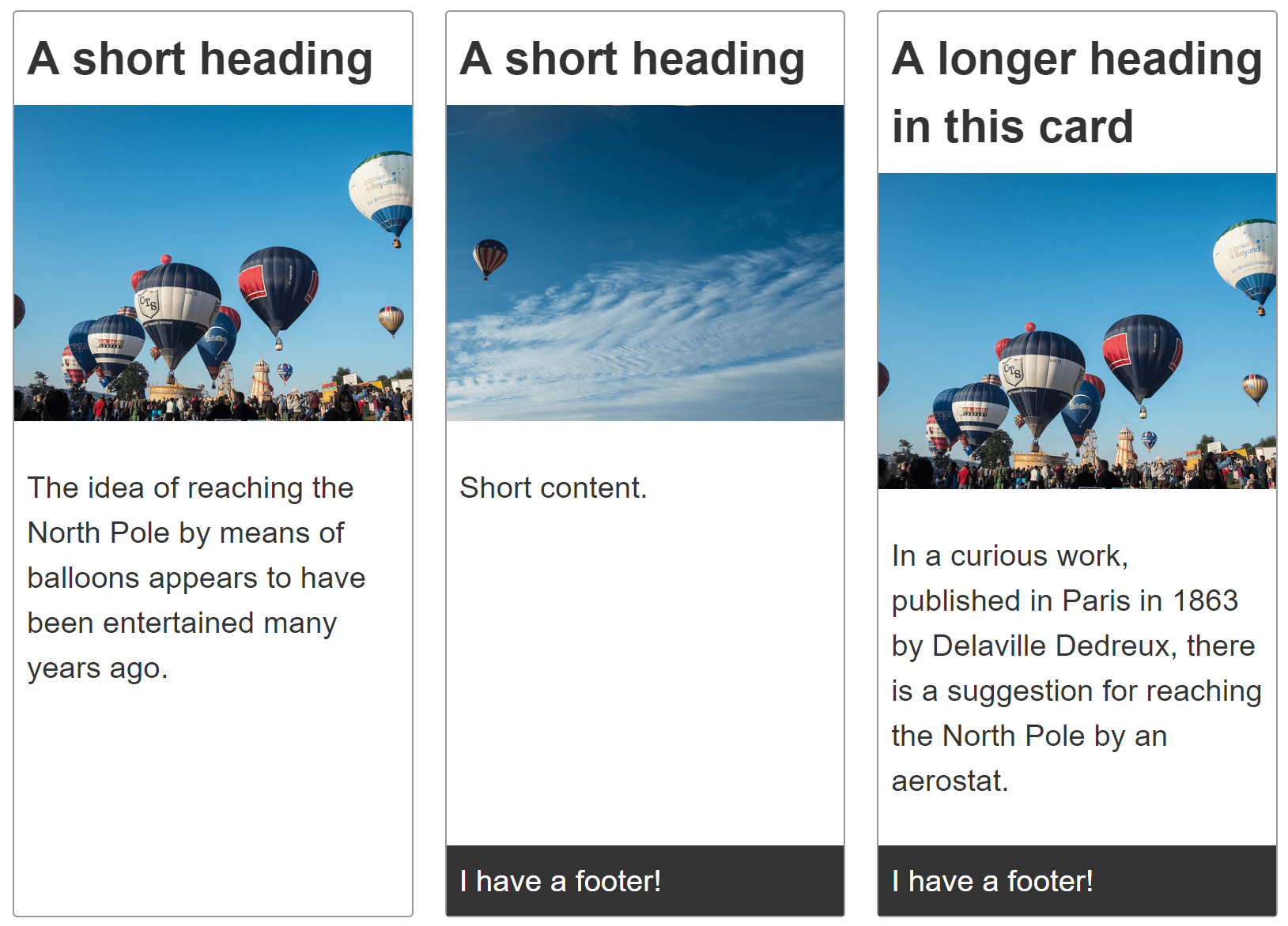
Create a group of cards, with each card component containing a heading, image, content, and, optionally, a footer.
Each card in the group of cards should be the same height. The optional card footer should stick to the bottom of the card.
The cards in the group should line up in two dimensions — both vertically and horizontally.
Recipe
Click "Play" in the code blocks below to edit the example in the MDN Playground:
<div class="cards">
  <article class="card">
    <header>
      <h2>A short heading</h2>
    </header>

    <img
      src="https://mdn.github.io/shared-assets/images/examples/balloons.jpg"
      alt="Hot air balloons" />
    <div class="content">
      <p>
        The idea of reaching the North Pole by means of balloons appears to have
        been entertained many years ago.
      </p>
    </div>
  </article>

  <article class="card">
    <header>
      <h2>A short heading</h2>
    </header>

    <img
      src="https://mdn.github.io/shared-assets/images/examples/balloons2.jpg"
      alt="Hot air balloons" />
    <div class="content">
      <p>Short content.</p>
    </div>
    <footer>I have a footer!</footer>
  </article>

  <article class="card">
    <header>
      <h2>A longer heading in this card</h2>
    </header>

    <img
      src="https://mdn.github.io/shared-assets/images/examples/balloons.jpg"
      alt="Hot air balloons" />
    <div class="content">
      <p>
        In a curious work, published in Paris in 1863 by Delaville Dedreux,
        there is a suggestion for reaching the North Pole by an aerostat.
      </p>
    </div>
    <footer>I have a footer!</footer>
  </article>
  <article class="card">
    <header>
      <h2>A short heading</h2>
    </header>

    <img
      src="https://mdn.github.io/shared-assets/images/examples/balloons2.jpg"
      alt="Hot air balloons" />
    <div class="content">
      <p>
        The idea of reaching the North Pole by means of balloons appears to have
        been entertained many years ago.
      </p>
    </div>
  </article>
</div>
body {
  font: 1.2em sans-serif;
}

img {
  max-width: 100%;
}

.cards {
  max-width: 700px;
  margin: 1em auto;

  display: grid;
  grid-template-columns: repeat(auto-fill, minmax(230px, 1fr));
  grid-gap: 20px;
}

.card {
  border: 1px solid #999999;
  border-radius: 3px;

  display: grid;
  grid-template-rows: max-content 200px 1fr;
}

.card img {
  object-fit: cover;
  width: 100%;
  height: 100%;
}

.card h2 {
  margin: 0;
  padding: 0.5rem;
}

.card .content {
  padding: 0.5rem;
}

.card footer {
  background-color: #333333;
  color: white;
  padding: 0.5rem;
}
Choices made
Each card is laid out using CSS grid layout despite the layout being one-dimensional. This enables the use of content sizing for the grid tracks. To set up a single-column grid we can use the following:
.card {
  display: grid;
  grid-template-rows: max-content 200px 1fr;
}
display: grid converts the element into a grid container. The three values of the grid-template-rows property divide the grid into a minimum of three rows, defining the height of the first three children of the card, in order.
Each card contains a <header>, <img>, and <div>, in that order, with some also containing a <footer>.
The heading row, or track, is set to max-content, which prevents it from stretching. The image track is set to 200 pixels tall. The third track, where the content lives, is set to 1fr. This means it will fill any additional space.
Any children beyond the three with explicitly defined sizes create rows in the implicit grid, which fits the content added to it. These are auto-sized by default. If a card contains a footer, it is auto-sized. The footer, when present, sticks to the bottom of the grid. The footer is auto-sized to fit its content; the content <div> then stretches take up any additional space.
The following ruleset creates the grid of cards:
.cards {
  display: grid;
  grid-template-columns: repeat(auto-fill, minmax(230px, 1fr));
  gap: 20px;
}
The grid-template-columns property defines the widths of the grid columns. In this case, we set the grid to auto-fill, with repeated columns that are minimally 230px but allowed to grow to fill the available space. The gap property sets a gap of 20px between adjacent rows and adjacent columns.
Note: The various elements in separate cards do not align with each other, as each card is an independent grid. Lining up the components in each card with the same components in adjacent cards can be done with subgrid.
Alternative methods
Flexbox can also be used to lay out each card. With flexbox, the dimensions of each card's rows are set with the flex property on each row, rather than on the card container.
With flexbox, the dimensions of the flex items are defined on the children rather than the parent. Whether you choose to use grid or flexbox depends on your preference, whether you prefer controlling the tracks from the container or prefer adding rules to the items.
We chose grid for the cards as, generally, you want cards to be lined up both vertically and horizontally. Additionally, lining up the components within each card to the components of adjacent cards can be done with subgrid. Flex has no hack-free equivalent to subgrid.
Accessibility concerns
Depending on the content of your card, there may be things you could or should do to enhance accessibility. See Inclusive components: Card by Heydon Pickering, for a very detailed explanation of these issues.