Propriété CSS animation-timing-function
Baseline
Large disponibilité
Cette fonctionnalité est bien établie et fonctionne sur de nombreux appareils et versions de navigateurs. Elle est disponible sur tous les navigateurs depuis septembre 2015.
La propriété CSS animation-timing-function définit la façon dont une animation progresse pendant la durée de chaque cycle.
Il est souvent pratique d'utiliser la propriété raccourcie animation pour définir toutes les propriétés d'animation en une seule fois.
Exemple interactif
animation-timing-function: linear;
animation-timing-function: ease-in-out;
animation-timing-function: steps(5, end);
animation-timing-function: cubic-bezier(0.1, -0.6, 0.2, 0);
<section class="flex-column" id="default-example">
  <div class="animating" id="example-element"></div>
  <button id="play-pause">Lecture</button>
</section>
#example-element {
  animation-duration: 3s;
  animation-iteration-count: infinite;
  animation-name: slide;
  animation-play-state: paused;
  background-color: #1766aa;
  border-radius: 50%;
  border: 5px solid #333333;
  color: white;
  height: 150px;
  margin: auto;
  margin-left: 0;
  width: 150px;
}

#example-element.running {
  animation-play-state: running;
}

#play-pause {
  font-size: 2rem;
}

@keyframes slide {
  from {
    background-color: orange;
    color: black;
    margin-left: 0;
  }
  to {
    background-color: orange;
    color: black;
    margin-left: 80%;
  }
}
const el = document.getElementById("example-element");
const button = document.getElementById("play-pause");

button.addEventListener("click", () => {
  if (el.classList.contains("running")) {
    el.classList.remove("running");
    button.textContent = "Lecture";
  } else {
    el.classList.add("running");
    button.textContent = "Pause";
  }
});
Syntaxe
/* Valeurs avec un mot-clé */
animation-timing-function: ease;
animation-timing-function: ease-in;
animation-timing-function: ease-out;
animation-timing-function: ease-in-out;
animation-timing-function: linear;
animation-timing-function: step-start;
animation-timing-function: step-end;

/* Valeurs de la fonction cubic-bezier() */
animation-timing-function: cubic-bezier(0.42, 0, 1, 1); /* ease-in */
animation-timing-function: cubic-bezier(0, 0, 0.58, 1); /* ease-out */
animation-timing-function: cubic-bezier(0.42, 0, 0.58, 1); /* ease-in-out */

/* Valeurs de la fonction linear() */
animation-timing-function: linear(0, 0.25, 1);
animation-timing-function: linear(0 0%, 0.25 50%, 1 100%);
animation-timing-function: linear(0, 0.25 50% 75%, 1);
animation-timing-function: linear(0, 0.25 50%, 0.25 75%, 1);

/* Valeurs de la fonction steps() */
animation-timing-function: steps(4, jump-start);
animation-timing-function: steps(10, jump-end);
animation-timing-function: steps(20, jump-none);
animation-timing-function: steps(5, jump-both);
animation-timing-function: steps(6, start);
animation-timing-function: steps(8, end);

/* Animations multiples */
animation-timing-function: ease, step-start, cubic-bezier(0.1, 0.7, 1, 0.1);

/* Valeurs globales */
animation-timing-function: inherit;
animation-timing-function: initial;
animation-timing-function: revert;
animation-timing-function: revert-layer;
animation-timing-function: unset;
Valeurs
<easing-function>-
La fonction d'assouplissement qui correspond à une animation donnée, telle que définie par
animation-name.Les valeurs des mots-clés en dehors des étapes (
ease,linear,ease-in-out, etc.) représentent des courbes de Bézier cubiques avec des valeurs fixes en quatre points, tandis que la valeur de la fonctioncubic-bezier()permet de définir des valeurs qui ne sont pas prédéfinies. La fonction d'assouplissementsteps()divise le temps d'entrée en un nombre défini d'intervalles de longueur égale. Ces paramètres comprennent un nombre d'étapes et la position d'étape.linear-
Égal à
cubic-bezier(0.0, 0.0, 1.0, 1.0), anime à vitesse constante. ease-
Égal à
cubic-bezier(0.25, 0.1, 0.25, 1.0), valeur par défaut, accélère vers le milieu de l'animation, puis ralentit à la fin. ease-in-
Égal à
cubic-bezier(0.42, 0, 1.0, 1.0), commence lentement, la vitesse de la transition augmente jusqu'à la fin. ease-out-
Égal à
cubic-bezier(0, 0, 0.58, 1.0), commence rapidement puis ralentit jusqu'à la fin de l'animation. ease-in-out-
Égal à
cubic-bezier(0.42, 0, 0.58, 1.0), les propriétés animées commencent lentement, accélèrent, puis ralentissent à nouveau. cubic-bezier(<number [0,1]> , <number> , <number [0,1]> , <number>)-
Une courbe de Bézier cubique définie par l'auteur·ice, où la première et la troisième valeur doivent être comprises entre 0 et 1.
linear(<number> <percentage>{1,2}, …)-
La fonction interpole linéairement entre les points d'arrêt d'assouplissement fournis. Un point d'arrêt est un couple composé d'une progression de sortie et d'un pourcentage d'entrée. Le pourcentage d'entrée est optionnel et est déduit s'il n'est pas précisé. Si aucun pourcentage d'entrée n'est fourni, alors les premier et dernier points d'arrêt sont fixés à
0%et100%respectivement, et les points d'arrêt intermédiaires reçoivent des valeurs de pourcentage obtenues par interpolation linéaire entre les points précédents et suivants les plus proches qui possèdent une valeur de pourcentage. steps(<integer>, <step-position>)-
Affiche une itération d'animation en n étapes le long de la transition, chaque étape ayant la même durée. Par exemple, si n vaut 5, il y a 5 étapes. Selon la position d'étape choisie, l'animation marque une pause temporaire à 0%, 20%, 40%, 60% et 80%, ou à 20%, 40%, 60%, 80% et 100%, ou effectue 5 étapes entre 0% et 100%, ou inclut aussi les marques 0%, 25%, 50%, 75% et 100% :
jump-start-
Fonction continue à gauche, le premier saut a lieu au début de l'animation.
jump-end-
Fonction continue à droite, le dernier saut a lieu à la fin de l'animation. C'est la valeur par défaut.
jump-none-
Aucun saut ni au début ni à la fin, ce qui retire une étape lors de l'itération. L'animation reste à 0% puis à 100%, chacun pendant 1/n de la durée.
jump-both-
Comprend des pauses aux marques 0% et 100%, ce qui ajoute une étape pendant l'itération de l'animation.
start-
Identique à
jump-start. end-
Identique à
jump-end.
step-start-
Équivalent à
steps(1, jump-start) step-end-
Équivalent à
steps(1, jump-end)
Note :
Lorsque vous indiquez plusieurs valeurs séparées par des virgules sur une propriété animation-*, elles sont appliquées aux animations dans l'ordre dans lequel les animation-name apparaissent. Pour les situations où le nombre d'animations et de valeurs de propriété animation-* ne correspond pas, voir Définir plusieurs valeurs de propriété d'animation.
Note :
animation-timing-function a le même effet lors de la création d'animations CSS pilotées par le défilement que pour les animations classiques basées sur le temps.
Description
Il est possible de définir des fonctions d'assouplissement sur des images clés (keyframes en anglais) individuelles dans une règle @keyframes. Si aucune animation-timing-function n'est définie sur une image clé, la valeur correspondante de animation-timing-function de l'élément auquel l'animation est appliquée est utilisée pour cette image clé.
Dans une image clé, animation-timing-function est un descripteur spécifique à la règle, et non la propriété du même nom. Le minutage n'est pas animé. Au contraire, la fonction d'assouplissement d'une image clé est appliquée propriété par propriété, de l'image clé sur laquelle elle est définie jusqu'à la prochaine image clé définissant cette propriété, ou jusqu'à la fin de l'animation s'il n'y a pas d'image clé suivante définissant cette propriété. Par conséquent, une animation-timing-function définie sur l'image clé 100% ou to ne sera jamais utilisée.
Définition formelle
| Valeur initiale | ease |
|---|---|
| Applicabilité | tous les éléments, ainsi que les pseudo-éléments ::before et ::after |
| Héritée | non |
| Valeur calculée | comme défini |
| Type d'animation | Non animable |
Syntaxe formelle
animation-timing-function =
  <easing-function>#

<easing-function> =
  <linear-easing-function>        |
  <cubic-bezier-easing-function>  |
  <step-easing-function>

<linear-easing-function> =
  linear      |
  <linear()>

<cubic-bezier-easing-function> =
  ease              |
  ease-in           |
  ease-out          |
  ease-in-out       |
  <cubic-bezier()>

<step-easing-function> =
  step-start  |
  step-end    |
  <steps()>

<linear()> =
  linear( [ <number> && <percentage>{0,2} ]# )

<cubic-bezier()> =
  cubic-bezier( [ <number [0,1]> , <number> ]#{2} )

<steps()> =
  steps( <integer> , <step-position>? )

<integer> =
  <number-token>

<step-position> =
  jump-start  |
  jump-end    |
  jump-none   |
  jump-both   |
  start       |
  end
Exemples
Tous les exemples de cette section animent les propriétés width et background-color de plusieurs éléments <div> avec différentes valeurs de animation-timing-function. La largeur est animée de 0 à 100%, et la couleur de fond est animée de vert clair à magenta.
Exemples de la fonction linear
Cet exemple montre les effets de différentes valeurs de la fonction d'assouplissement linear().
L'image suivante montre les graphiques de toutes les valeurs de la fonction linear() utilisées dans cet exemple. La progression d'entrée (le temps) est représentée sur l'axe des abscisses (x) et la progression de sortie sur l'axe des ordonnées (y). Selon la syntaxe, la progression d'entrée varie de 0 à 100%, et la sortie varie de 0 à 1.
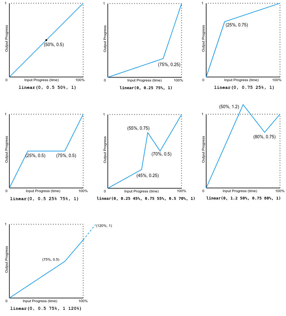
Notez que la sortie peut aller vers l'avant ou vers l'arrière.
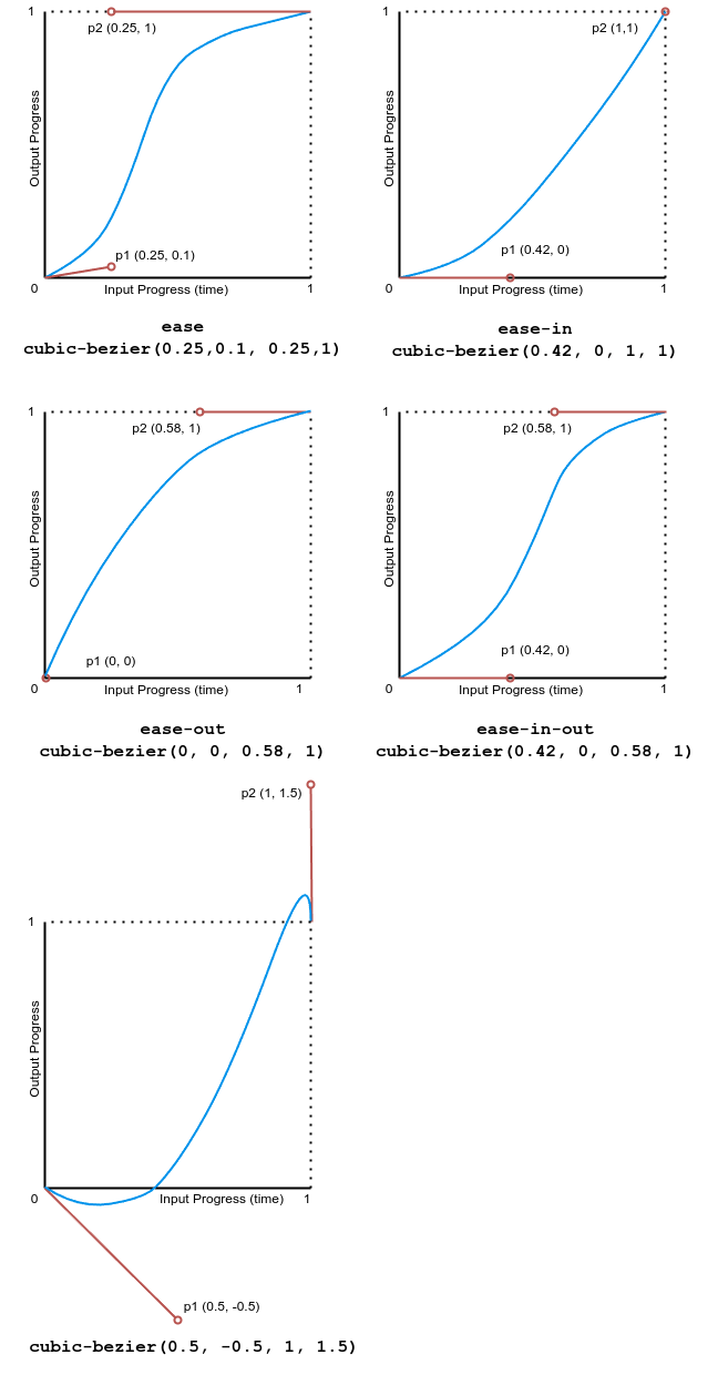
Exemples avec Cubic-Bézier
Cet exemple montre les effets de différentes fonctions d'assouplissement de courbe de Bézier.
L'image suivante montre les graphiques de toutes les valeurs de la fonction cubic bézier utilisées dans cet exemple. La progression d'entrée (le temps) varie de 0 à 1 et la progression de sortie varie de 0 à 1.
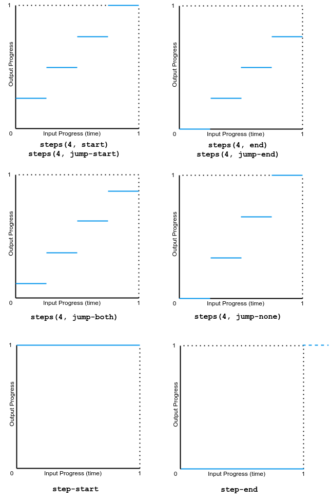
Exemples d'étape
Cet exemple montre les effets de plusieurs valeurs de la fonction d'assouplissement steps.
L'image suivante montre les graphiques de toutes les valeurs de la fonction step() utilisées dans cet exemple. La progression d'entrée (le temps) et la progression de sortie varient de 0 à 1.
Spécifications
| Spécification |
|---|
| CSS Animations Level 1 # animation-timing-function |
Compatibilité des navigateurs
Voir aussi
- Utiliser les animations CSS
- La propriété
<easing-function> - Le module des fonctions d'assouplissement CSS
- L'interface API
AnimationEvent - Outil de génération de courbes de Bézier (angl.)
- Les autres propriétés d'animation associées :
animation,animation-composition,animation-delay,animation-direction,animation-duration,animation-fill-mode,animation-iteration-count,animation-name,animation-play-state,animation-timeline