Relationship of grid layout to other layout methods
CSS grid layout is designed to work alongside other parts of CSS, as part of a complete system for doing the layout. This guide explains how grid layout fits together with other techniques.
Grid and flexbox
The basic difference between CSS grid layout and CSS flexbox layout is that flexbox was designed for layout in one dimension - either a row or a column. Grid was designed for two-dimensional layout - rows, and columns at the same time. The two specifications both use CSS box alignment features. If you have already learned how to use flexbox, the similarities should help you get to grips with grid.
One-dimensional versus two-dimensional layout
A basic example can demonstrate the difference between one- and two-dimensional layouts.
In this first example, we use flexbox to lay out a set of boxes. We have five child items in our container, and we have given the flex properties values so that they can grow and shrink from a flex-basis of 150 pixels.
We also set the flex-wrap property to wrap, so that if the space in the container becomes too narrow to maintain the flex basis, items will wrap onto a new row.
<div class="wrapper">
  <div>One</div>
  <div>Two</div>
  <div>Three</div>
  <div>Four</div>
  <div>Five</div>
</div>
.wrapper {
  width: 500px;
  display: flex;
  flex-wrap: wrap;
}
.wrapper > div {
  flex: 1 1 150px;
}
In the image, you can see that two items have wrapped onto a new line. These items are sharing the available space and not lining up underneath the items above. This is because when you wrap flex items, each new row (or column when working by column) is an independent flex line in the flex container. Space distribution happens across the flex line.
A common question then is how to make those items line up. This is where you want a two-dimensional layout method: You want to control the alignment by row and column, and this is where grid comes in.
The same layout with CSS grids
In this next example, we create the same layout using grid. This time we have three 1fr column tracks. We do not need to set anything on the items themselves; they will lay themselves out one into each cell of the created grid. As you can see, they stay in a strict grid, lining up in rows and columns. With five items, we get a gap on the end of row two.
<div class="wrapper">
  <div>One</div>
  <div>Two</div>
  <div>Three</div>
  <div>Four</div>
  <div>Five</div>
</div>
.wrapper {
  display: grid;
  grid-template-columns: repeat(3, 1fr);
}
An important question to ask yourself when deciding between grid or flexbox is:
- Do we only need to control the layout by row or column? If yes, use flexbox.
- Do we need to control the layout by row and column? If yes, use grid layout.
Content out or layout in?
In addition to the one-dimensional versus two-dimensional distinction, there is another way to decide if you should use flexbox or grid for a layout. Flexbox works from the content out. An ideal use case for flexbox is when you have a set of items and want to space them out evenly in a container. You let the size of the content decide how much individual space each item takes up. If the items wrap onto a new line, they will work out their spacing based on their size and the available space on that line.
Grid works from the layout in. When you use CSS grid layout you create a layout and then you place items into it, or you allow the auto-placement rules to place the items into the grid cells according to that strict grid. It is possible to create tracks that respond to the size of the content, however, they will also change the entire track.
If you are using flexbox and find yourself disabling some of the flexibility, you probably need to use CSS grid layout. For example, if you are setting a width on a flex item to make it line up with other items in a row above, a grid is likely a better choice.
Box alignment
Most grid alignment features were originally defined in the CSS flexible box layout. These features provided proper alignment control for the first time and enabled centering a box on the page. Flex items can stretch to the height of the flex container, meaning that equal height columns were possible. These properties are now defined in the CSS box alignment module, and are used in multiple layout modes, including grid layout.
We will be taking a proper look at Aligning items in CSS grid layout later. For now, here is a comparison between examples of flexbox and grid.
In the first example, which uses flexbox, we have a container with three items inside. The container's min-height is set, so it defines the height of the flex container. We have set align-items on the flex container to flex-end so the items will line up at the end of the flex container. We have also set the align-self property on box1 so it will override the default and stretch to the height of the container and on box2 so it aligns to the start of the flex container.
<div class="wrapper">
  <div class="box1">One</div>
  <div class="box2">Two</div>
  <div class="box3">Three</div>
</div>
.wrapper {
  display: flex;
  align-items: flex-end;
  min-height: 200px;
}
.box1 {
  align-self: stretch;
}
.box2 {
  align-self: flex-start;
}
Alignment in CSS grids
This example uses a grid to create the same layout. We use the box alignment properties as they apply to a grid layout. We align to start and end. (We could have used the <content-position> synonyms flex-start and flex-end.) In the case of a grid layout, we are aligning the items inside their grid area. In this case that is a single grid cell, but it could be an area made up of several grid cells.
<div class="wrapper">
  <div class="box1">One</div>
  <div class="box2">Two</div>
  <div class="box3">Three</div>
</div>
.wrapper {
  display: grid;
  grid-template-columns: repeat(3, 1fr);
  align-items: end;
  grid-auto-rows: 200px;
}
.box1 {
  align-self: stretch;
}
.box2 {
  align-self: start;
}
The fr unit and flex-basis
We have already seen how the fr unit works to assign a proportion of available space in the grid container to our grid tracks. The fr unit, when combined with the minmax() function can give us very similar behavior to the flex properties in flexbox while still enabling the creation of a layout in two dimensions.
If we look back at the example where we demonstrated the difference between one and two-dimensional layouts, you can see there is a difference between the way that the two layouts work responsively. With the flex layout, if we drag our window wider and smaller, the flexbox does a nice job of adjusting the number of items in each row according to the available space. If we have a lot of space all five items can fit on one row. If we have a very narrow container we may only have space for one.
In comparison, the grid version always has three column tracks. The tracks themselves will grow and shrink, but there are always three since we asked for three when defining our grid.
Auto-filling grid tracks
We can use grid to create a similar effect to flexbox, while still keeping the content arranged in strict rows and columns, by creating our track listing using repeat notation and the auto-fill and auto-fit properties.
In this next example, we have used the auto-fill keyword in place of an integer in the repeat notation and set the track listing to 200 pixels. This means that grid will create as many 200 pixels column tracks as will fit in the container.
<div class="wrapper">
  <div>One</div>
  <div>Two</div>
  <div>Three</div>
</div>
.wrapper {
  display: grid;
  grid-template-columns: repeat(auto-fill, 200px);
}
A flexible number of tracks
This isn't quite the same as flexbox. In the flexbox example, the items are larger than the 200 pixel basis before wrapping. We can achieve the same in grid by combining auto-fit and the minmax() function.
In this example, we create auto filled tracks with minmax. We want our tracks to be a minimum of 200 pixels, so we set the maximum to be 1fr. Once the browser has worked out how many times 200 pixels will fit into the container–also taking account of grid gaps–it will treat the 1fr maximum as an instruction to share out the remaining space between the items.
<div class="wrapper">
  <div>One</div>
  <div>Two</div>
  <div>Three</div>
</div>
.wrapper {
  display: grid;
  grid-template-columns: repeat(auto-fit, minmax(200px, 1fr));
}
With grid layout, we can create a grid with a dynamic number of flexible tracks and have the items laid out on the grid aligned by rows and columns.
Grid and absolutely positioned elements
Grid interacts with absolutely positioned elements, which can be useful if you want to position an item inside a grid or grid area. The specification defines the behavior when a grid container is a containing block and a parent of the absolutely positioned item.
A grid container as containing block
To make the grid container a containing block, you need to add the position property to the container with a value of relative, just as you would make a containing block for any other absolutely positioned items. Once you have done this, if you give a grid item position: absolute it will take as its containing block the grid container or, if the item also has a grid position, the area of the grid it is placed into.
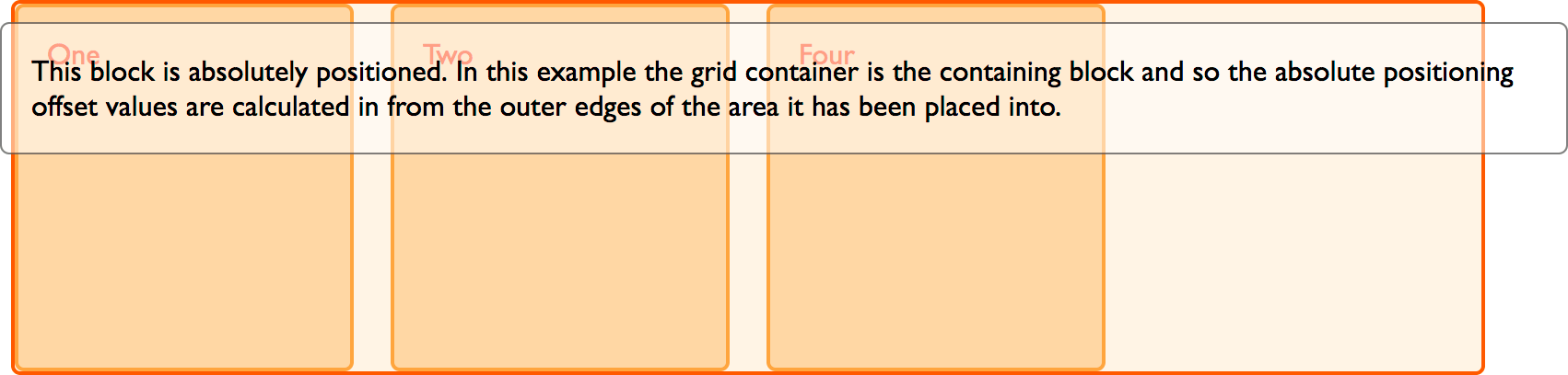
In the below example we have a wrapper containing four child items. Item three is absolutely positioned and also placed on the grid using line-based placement. The grid container has position: relative and so becomes the positioning context of this item.
<div class="wrapper">
  <div class="box1">One</div>
  <div class="box2">Two</div>
  <div class="box3">
    This block is absolutely positioned. In this example the grid container is
    the containing block and so the absolute positioning offset values are
    calculated in from the outer edges of the area it has been placed into.
  </div>
  <div class="box4">Four</div>
</div>
.wrapper {
  display: grid;
  grid-template-columns: repeat(4, 1fr);
  grid-auto-rows: 200px;
  gap: 20px;
  position: relative;
}
.box3 {
  grid-column-start: 2;
  grid-column-end: 4;
  grid-row-start: 1;
  grid-row-end: 3;
  position: absolute;
  top: 40px;
  left: 40px;
}
You can see that the item is taking the area from grid column line 2 to 4, and starting after line 1. Then it is offset in that area using the top and left properties. However, it has been taken out of flow as is usual for absolutely positioned items and so the auto-placement rules now place items into the same space. The item also doesn't cause the additional row to be created to span to row line 3.
If we remove position: absolute from the rules for .box3, you can see how it would display without the positioning.
A grid container as parent
If the absolutely positioned child has a grid container as a parent but that container does not create a new positioning context, then it is taken out of flow as in the previous example. The positioning context is the element the absolutely positioned element is positioned relative to. The positioning context will be whatever element creates a positioning context as is common to other layout methods. In our case, if we remove position: relative from the wrapper above, positioning context is from the viewport, as shown in this image.
Once again, the item no longer participates in the grid layout in terms of sizing or when other items are auto-placed.
With a grid area as the parent
If the absolutely positioned item is nested inside a grid area, then you can create a positioning context on that area. In this example, we have our grid as before, but this time we have nested an item inside .box3 of the grid.
We have given .box3 position relative and then positioned the sub-item with the offset properties. In this case, the positioning context is the grid area.
<div class="wrapper">
  <div class="box1">One</div>
  <div class="box2">Two</div>
  <div class="box3">
    Three
    <div class="abspos">
      This block is absolutely positioned. In this example the grid area is the
      containing block and so the absolute positioning offset values are
      calculated in from the outer edges of the grid area.
    </div>
  </div>
  <div class="box4">Four</div>
</div>
.wrapper {
  display: grid;
  grid-template-columns: repeat(4, 1fr);
  grid-auto-rows: 200px;
  gap: 20px;
}
.box3 {
  grid-column-start: 2;
  grid-column-end: 4;
  grid-row-start: 1;
  grid-row-end: 3;
  position: relative;
}
.abspos {
  position: absolute;
  top: 40px;
  left: 40px;
  background-color: rgb(255 255 255 / 50%);
  border: 1px solid rgb(0 0 0 / 50%);
  color: black;
  padding: 10px;
}
Grid and display: contents
A final interaction worth noting is the interaction between CSS grid layout and display: contents, defined in the CSS display module. When the display property is set to contents, the element itself does not generate any boxes, but its children and pseudo-elements still generate boxes as normal. This means that, for the purposes of box generation and layout, the element is treated as if it had been replaced with its children and pseudo-elements in the document tree.
If you set an item to display: contents, the box it would normally create disappears and the boxes of the child elements appear as if they have risen up a level. This means that children of a grid item can become grid items. Sound odd? Here is an example.
Grid layout with nested child elements
In this example, first item of our grid is set to span all three column tracks. It contains three nested items. As these items are not direct children, they don't become part of the grid layout and so display using regular block layout.
<div class="wrapper">
  <div class="box box1">
    <div class="nested">a</div>
    <div class="nested">b</div>
    <div class="nested">c</div>
  </div>
  <div class="box box2">Two</div>
  <div class="box box3">Three</div>
  <div class="box box4">Four</div>
  <div class="box box5">Five</div>
</div>
.wrapper {
  display: grid;
  grid-template-columns: repeat(3, 1fr);
  grid-auto-rows: minmax(100px, auto);
}
.box1 {
  grid-column-start: 1;
  grid-column-end: 4;
}
Using display: contents
If we now add display: contents to the rules for box1, the box for that item vanishes and the sub-items now become grid items and lay themselves out using the auto-placement rules.
<div class="wrapper">
  <div class="box box1">
    <div class="nested">a</div>
    <div class="nested">b</div>
    <div class="nested">c</div>
  </div>
  <div class="box box2">Two</div>
  <div class="box box3">Three</div>
  <div class="box box4">Four</div>
  <div class="box box5">Five</div>
</div>
.wrapper {
  display: grid;
  grid-template-columns: repeat(3, 1fr);
  grid-auto-rows: minmax(100px, auto);
}
.box1 {
  grid-column-start: 1;
  grid-column-end: 4;
  display: contents;
}
This can be a way to get items nested into the grid to act as if they are part of the grid. You can also use display: contents in a similar way with flexbox to enable nested items to become flex items.
As you can see from this guide, CSS grid layout is just one part of your toolkit. Don't be afraid to mix it with other methods of doing layout to get the different effects you need.