radial-gradient() CSS function
Baseline
Widely available
*
This feature is well established and works across many devices and browser versions. It’s been available across browsers since July 2015.
* Some parts of this feature may have varying levels of support.
The radial-gradient() CSS function creates an image consisting of a progressive transition between two or more colors that radiate from an origin. Its shape may be a circle or an ellipse. The function's result is an object of the <gradient> data type, which is a special kind of <image>.
Try it
background: radial-gradient(#e66465, #9198e5);
background: radial-gradient(closest-side, #3f87a6, #ebf8e1, #f69d3c);
background: radial-gradient(
  circle at 100%,
  #333333,
  #333333 50%,
  #eeeeee 75%,
  #333333 75%
);
background:
  radial-gradient(ellipse at top, #e66465, transparent),
  radial-gradient(ellipse at bottom, #4d9f0c, transparent);
<section class="display-block" id="default-example">
  <div id="example-element"></div>
</section>
#example-element {
  min-height: 100%;
}
Syntax
/* A gradient with a single color of red */
radial-gradient(red)

/* A gradient at the center of its container,
   starting red, changing to blue, and finishing green */
radial-gradient(circle at center, red 0, blue, green 100%)

/* hsl color space with longer hue interpolation */
radial-gradient(circle at center in hsl longer hue, red 0, blue, green 100%)
A radial gradient is specified by indicating the center of the gradient (where the 0% ellipse will be) and the size and shape of the ending shape (the 100% ellipse).
Values
<position>-
The position of the gradient, interpreted in the same way as
background-positionortransform-origin. If unspecified, it defaults tocenter. <ending-shape>-
The gradient's ending-shape. The value can be
circle(meaning that the gradient's shape is a circle with a constant radius) orellipse(meaning that the shape is an axis-aligned ellipse). If unspecified, it defaults toellipse. <size>-
Determines the size of the gradient's ending shape. If omitted it defaults to farthest-corner. It can be given explicitly or by keyword. For the purpose of the keyword definitions, consider the gradient box edges as extending infinitely in both directions, rather than being finite line segments.
Both circle and ellipse gradients accept the following keywords for their
<size>:Keyword Description closest-sideThe gradient's ending shape meets the side of the box closest to its center (for circles) or meets both the vertical and horizontal sides closest to the center (for ellipses). closest-cornerThe gradient's ending shape is sized so that it exactly meets the closest corner of the box from its center. farthest-sideSimilar to closest-side, except the ending shape is sized to meet the side of the box farthest from its center (or vertical and horizontal sides).farthest-cornerThe default value, the gradient's ending shape is sized so that it exactly meets the farthest corner of the box from its center. If
<ending-shape>is specified ascircle, the size may be given explicitly as a<length>, which provides an explicit circle radius. Negative values are invalid.If
<ending-shape>is specified asellipse, the size may be given as a<length-percentage>with two values to provide an explicit ellipse size. The first value represents the horizontal radius and the second is the vertical radius. Percentage values are relative to the corresponding dimension of the gradient box. Negative values are invalid.When the
<ending-shape>keyword is omitted, the gradient shape is determined by the size given. One<length>value provides a circle, while two values in<length-percentage>units provide an ellipse. A single<percentage>value is not valid. <linear-color-stop>-
A color-stop's
<color>value, followed by one or two optional stop positions (either a<percentage>or a<length>along the gradient's axis). A percentage of0%, or a length of0, represents the center of the gradient; the value100%represents the intersection of the ending shape with the virtual gradient ray. Percentage values in between are linearly positioned on the gradient ray. Including two stop positions is equivalent to declaring two color stops with the same color at the two positions. <color-hint>-
The color-hint is an interpolation hint defining how the gradient progresses between adjacent color stops. The length defines at which point between two color stops the gradient color should reach the midpoint of the color transition. If omitted, the midpoint of the color transition is the midpoint between two color stops.
Description
As with any gradient, a radial gradient has no intrinsic dimensions; i.e., it has no natural or preferred size, nor a preferred ratio. Its concrete size will match the size of the element it applies to.
To create a radial gradient that repeats so as to fill its container, use the repeating-radial-gradient() function instead.
Because <gradient>s belong to the <image> data type, they can only be used where <image>s can be used. For this reason, radial-gradient() won't work on background-color and other properties that use the <color> data type.
Composition of a radial gradient
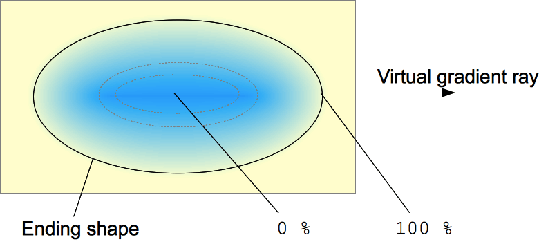
A radial gradient is defined by a center point, an ending shape, and two or more color-stop points.
To create a smooth gradient, the radial-gradient() function draws a series of concentric shapes radiating out from the center to the ending shape (and potentially beyond). The ending shape may be either a circle or an ellipse.
Color-stop points are positioned on a virtual gradient ray that extends horizontally from the center towards the right. Percentage-based color-stop positions are relative to the intersection between the ending shape and this gradient ray, which represents 100%. Each shape is a single color determined by the color on the gradient ray it intersects.
Formal syntax
<radial-gradient()> =
  radial-gradient( [ <radial-gradient-syntax> ] )

<radial-gradient-syntax> =
  [ [ [ <radial-shape> || <radial-size> ]? [ at <position> ]? ] || <color-interpolation-method> ]? , <color-stop-list>

<radial-shape> =
  circle   |
  ellipse

<radial-size> =
  <radial-extent>               |
  <length [0,∞]>                |
  <length-percentage [0,∞]>{2}

<position> =
  <position-one>   |
  <position-two>   |
  <position-four>

<color-interpolation-method> =
  in [ <rectangular-color-space> | <polar-color-space> <hue-interpolation-method>? | <custom-color-space> ]

<color-stop-list> =
  <linear-color-stop> , [ <linear-color-hint>? , <linear-color-stop> ]#?

<radial-extent> =
  closest-corner   |
  closest-side     |
  farthest-corner  |
  farthest-side

<length-percentage> =
  <length>      |
  <percentage>

<position-one> =
  left                 |
  center               |
  right                |
  top                  |
  bottom               |
  x-start              |
  x-end                |
  y-start              |
  y-end                |
  block-start          |
  block-end            |
  inline-start         |
  inline-end           |
  <length-percentage>

<position-two> =
  [ left | center | right | x-start | x-end ] && [ top | center | bottom | y-start | y-end ]  |
  [ left | center | right | x-start | x-end | <length-percentage> ] [ top | center | bottom | y-start | y-end | <length-percentage> ]  |
  [ block-start | center | block-end ] && [ inline-start | center | inline-end ]  |
  [ start | center | end ]{2}

<position-four> =
  [ [ left | right | x-start | x-end ] <length-percentage> ] && [ [ top | bottom | y-start | y-end ] <length-percentage> ]  |
  [ [ block-start | block-end ] <length-percentage> ] && [ [ inline-start | inline-end ] <length-percentage> ]  |
  [ [ start | end ] <length-percentage> ]{2}

<rectangular-color-space> =
  srgb               |
  srgb-linear        |
  display-p3         |
  display-p3-linear  |
  a98-rgb            |
  prophoto-rgb       |
  rec2020            |
  lab                |
  oklab              |
  <xyz-space>

<polar-color-space> =
  hsl    |
  hwb    |
  lch    |
  oklch

<hue-interpolation-method> =
  [ shorter | longer | increasing | decreasing ] hue

<custom-color-space> =
  <dashed-ident>

<linear-color-stop> =
  <color> <color-stop-length>?

<linear-color-hint> =
  <length-percentage>

<xyz-space> =
  xyz      |
  xyz-d50  |
  xyz-d65

<color-stop-length> =
  <length-percentage>{1,2}
Examples
Basic gradient
.radial-gradient {
  background-image: radial-gradient(cyan 0%, transparent 20%, salmon 40%);
}
Non-centered gradient
.radial-gradient {
  background-image: radial-gradient(
    farthest-corner at 40px 40px,
    #ff3355 0%,
    #4433ee 100%
  );
}
Interpolating with hue
In this example for interpolation, hsl color system is being used and hue is being interpolated.
.shorter {
  background-image: radial-gradient(
    circle at center in hsl shorter hue,
    red,
    blue
  );
}

.longer {
  background-image: radial-gradient(
    circle at center in hsl longer hue,
    red,
    blue
  );
}
The box on the left uses shorter interpolation, meaning the color goes straight from red to blue using the shorter arc on color wheel. The box on the right uses longer interpolation, meaning the color goes from red to blue using the longer arc, traversing through greens, yellows, and oranges.
More radial-gradient examples
Please see Using CSS gradients for more examples.
Specifications
| Specification |
|---|
| CSS Images Module Level 3 # radial-gradients |