Aligning items in CSS grid layout
CSS grid layout implements CSS box alignment, which is the same standard flexbox uses for aligning items in its flex container. The alignment module details how alignment should work in all the layout methods.
In this guide, we look at how the box alignment properties are used to align items in grid layout.
You may notice similarities to how these properties and values work in flexbox. Due to grid being two-dimensional and flexbox one-dimensional, there are some small differences that you should watch out for. For this reason, we will start by looking at the two axes that we deal with when aligning things in a grid.
The two axes of a grid layout
When working with grid layout you have two axes available to align things against – the block axis and the inline axis. The block axis is the axis upon which blocks are laid out in block layout. If you have two paragraphs on your page they display one below the other, so it is this direction we describe as the block axis.
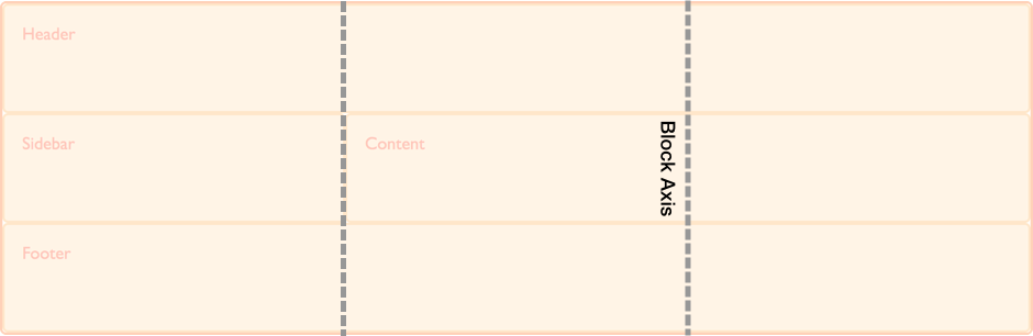
The inline axis runs across the block axis, it is the direction in which text in regular inline flow runs.
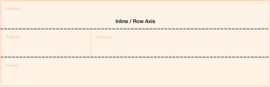
We are able to align the content inside grid areas, and the grid tracks themselves on these two axes.
Aligning items on the block axis
The align-self and align-items properties control alignment on the block axis. When we use these properties, we are changing the alignment of the item within the grid area you have placed it.
Using align-items
In the following example, we have four grid areas within our grid. We can use the align-items property on the grid container, to align the items using normal, stretch, or <self-position> or <baseline-position> values:
normalstretchstartendcenterbaselinefirst baselinelast baselineauto(align-selfonly)
The default value is normal, which resolves to stretch for grid containers.
.wrapper {
display: grid;
grid-template-columns: repeat(8, 1fr);
gap: 10px;
grid-auto-rows: 100px;
grid-template-areas:
"a a a a b b b b"
"a a a a b b b b"
"c c c c d d d d"
"c c c c d d d d";
align-items: start;
}
.item1 {
grid-area: a;
}
.item2 {
grid-area: b;
}
.item3 {
grid-area: c;
}
.item4 {
grid-area: d;
}
<div class="wrapper">
<div class="item1">Item 1</div>
<div class="item2">Item 2</div>
<div class="item3">Item 3</div>
<div class="item4">Item 4</div>
</div>
Keep in mind that once you set align-items: start, the height of each child <div> will be determined by the contents of the <div>. This is in contrast to omitting align-items completely, in which case the height of each <div> stretches to fill its grid area.
The align-items property sets the align-self property for all of the child grid items. This means that you can set the property individually, by using align-self directly on a grid item.
Using align-self
In this next example, we are using the align-self property, to demonstrate the different alignment values. The first area is showing the default behavior of align-self, which in this case resolves to stretch. The second item, has an align-self value of start, the third end and the fourth center.
.wrapper {
display: grid;
grid-template-columns: repeat(8, 1fr);
gap: 10px;
grid-auto-rows: 100px;
grid-template-areas:
"a a a a b b b b"
"a a a a b b b b"
"c c c c d d d d"
"c c c c d d d d";
}
.item1 {
grid-area: a;
}
.item2 {
grid-area: b;
align-self: start;
}
.item3 {
grid-area: c;
align-self: end;
}
.item4 {
grid-area: d;
align-self: center;
}
<div class="wrapper">
<div class="item1">Item 1</div>
<div class="item2">Item 2</div>
<div class="item3">Item 3</div>
<div class="item4">Item 4</div>
</div>
Items with an intrinsic aspect ratio
The default behavior for align-self is to inherit from the grid container's align-items property, for which the normal default is to stretch, except for items which have an intrinsic aspect ratio, in this case they behave as start. The reason for this, is that if items with an aspect ratio are made to stretch, they would be distorted.
Justifying items on the inline axis
Whereas align-items and align-self align items on the block axis, justify-items and justify-self align items on the inline axis. The values you can choose from are similar to the normal, stretch, <self-position> and <baseline-position> values of the align-self property, along with left and right. Values include:
normalstartendleftrightcenterstretchbaselinefirst baselinelast baselineauto(justify-selfonly)
You can see the same example as used for align-items, below. This time, we are applying the justify-self property.
Once again, the default is stretch other than for items with an intrinsic aspect ratio. This means that grid items will cover their grid area by default, unless you change the alignment. In this example, the first item demonstrates the default stretch alignment value:
.wrapper {
display: grid;
grid-template-columns: repeat(8, 1fr);
gap: 10px;
grid-auto-rows: 100px;
grid-template-areas:
"a a a a b b b b"
"a a a a b b b b"
"c c c c d d d d"
"c c c c d d d d";
}
.item1 {
grid-area: a;
}
.item2 {
grid-area: b;
justify-self: start;
}
.item3 {
grid-area: c;
justify-self: end;
}
.item4 {
grid-area: d;
justify-self: center;
}
<div class="wrapper">
<div class="item1">Item 1</div>
<div class="item2">Item 2</div>
<div class="item3">Item 3</div>
<div class="item4">Item 4</div>
</div>
As with align-self and align-items, you can apply justify-items to the grid container to set a justify-self value for all the grid items within the container.
Note:
The justify-self and justify-items properties are not implemented in flexbox. This is due to the one-dimensional nature of flexbox, and that there may be multiple items along the axis, making it impossible to justify a single item. To align items along the main, inline axis in flexbox you use the justify-content property.
Shorthand properties
The place-items property is shorthand for align-items and justify-items.
The place-self property is shorthand for align-self and justify-self.
Center an item in the area
By combining the align and justify properties we can easily center an item inside a grid area.
.wrapper {
display: grid;
grid-template-columns: repeat(4, 1fr);
gap: 10px;
grid-auto-rows: 200px;
grid-template-areas:
". a a ."
". a a .";
}
.item1 {
grid-area: a;
align-self: center;
justify-self: center;
}
<div class="wrapper">
<div class="item1">Item 1</div>
</div>
Aligning the grid tracks on the block axis
If you have a situation where your grid tracks use an area that is smaller than the grid container you can align the grid tracks themselves inside that container. The align-content aligns the tracks on the block axis and justify-content aligns on the inline axis. As with the *-items and *-item properties, the place-content property is shorthand for align-content and justify-content.
The values for align-content, justify-content and place-content all include the <content-distribution> and <content-position> values. The align-content property also accepts <baseline-position> values and, like the other justify-* properties, justify-content also accepts left and right.
Valid keywords for place-content include:
normalstartendcenterstretchspace-aroundspace-betweenspace-evenlybaselinefirst baselinelast baselineleftright
The align-content property is applied to the grid container as it works on the entire grid.
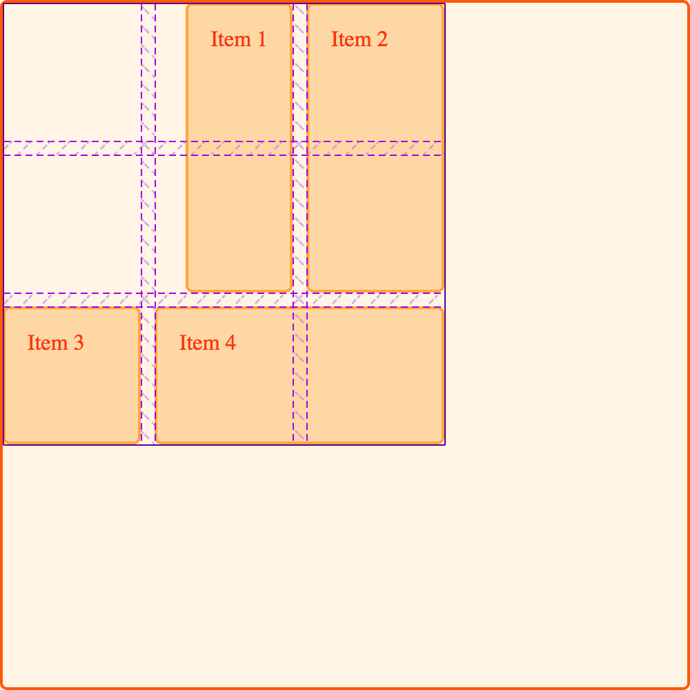
Default alignment
In this example, the 500px by 500px grid container has three row and three column 100px tracks with a 10px gutter. This means there is space inside the grid container in both the block and inline directions.
By default, our grid tracks are in the top left corner of the grid, aligned against the start grid lines, as the default behavior in grid layout is start:
* {
  box-sizing: border-box;
}

.wrapper {
  border: 2px solid #f76707;
  border-radius: 5px;
  background-color: #fff4e6;
}

.wrapper > div {
  border: 2px solid #ffa94d;
  border-radius: 5px;
  background-color: #ffd8a8;
  padding: 1em;
  color: #d9480f;
}
.wrapper {
display: grid;
grid-template-columns: repeat(3, 100px);
grid-template-rows: repeat(3, 100px);
height: 500px;
width: 500px;
gap: 10px;
grid-template-areas:
"a a b"
"a a b"
"c d d";
}
.item1 {
grid-area: a;
}
.item2 {
grid-area: b;
}
.item3 {
grid-area: c;
}
.item4 {
grid-area: d;
}
<div class="wrapper">
  <div class="item1">Item 1</div>
  <div class="item2">Item 2</div>
  <div class="item3">Item 3</div>
  <div class="item4">Item 4</div>
</div>
Setting align-content: end
Using the same CSS and HTML, in this example we add align-content with a value of end to the container, so the tracks all move to the end line of the grid container in the block dimension:
.wrapper {
align-content: end;
}
Setting align-content: space-between
We can also apply the <content-distribution> space distribution values of space-between, space-around, space-evenly, and stretch. In this example, we set align-content, which aligns the tracks on the block axis, to space-between, which spaces out the tracks:
.wrapper {
align-content: space-between;
}
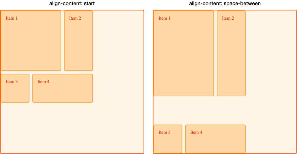
If an item spans more than one grid track, using a space distribution value will likely cause items on your grid to become larger because the space that's added between the tracks is added to the spanning item. Therefore, if you use these values, make sure the content of the tracks can cope with the extra space or that you have used alignment properties on the items, so they move to the start or end rather than stretch.
In the below image, we placed the grid with two different align-content values to compare start and space-between. You can see how the first two items, which span two row tracks, have taken on extra height in the space-between example as they gain the space that exists because of the free space that was distributed between the three rows:
Justifying the grid tracks on the inline axis
We can use justify-content to perform the same type of alignment on the inline axis that we used align-content for in the block axis.
Using the same example, we set justify-content to space-around. This once again causes tracks which span more than one column track to gain extra space:
.wrapper {
align-content: space-between;
justify-content: space-around;
}
Alignment and auto margins
Another way to align items inside their area is to use auto margins. If you have ever centered a layout in the viewport, or any block level element within its parent, you may have done so by setting the right and left margin of element you wanted to center to auto. The auto margin absorbs all of the available space. Setting the margin to auto on both sides pushes the block-level element into the middle as both margins attempt to take all of the space.
In this next example, item 1 has its margin-left property set to auto. This pushes the content over to the right side of the area, as the auto margin takes up the available space that remained after space needed for the content has been assigned:
.wrapper {
display: grid;
grid-template-columns: repeat(3, 100px);
grid-template-rows: repeat(3, 100px);
height: 500px;
width: 500px;
gap: 10px;
grid-template-areas:
"a a b"
"a a b"
"c d d";
}
.item1 {
grid-area: a;
margin-left: auto;
}
.item2 {
grid-area: b;
}
.item3 {
grid-area: c;
}
.item4 {
grid-area: d;
}
<div class="wrapper">
  <div class="item1">Item 1</div>
  <div class="item2">Item 2</div>
  <div class="item3">Item 3</div>
  <div class="item4">Item 4</div>
</div>
Use the grid inspector in your browser developer tools to see how the item is aligned:
Alignment and writing modes
All these examples were in English, a left-to-right language. This means that our start lines are top and left of our grid when thinking in physical directions.
CSS grid layout and CSS box alignment work with writing modes in CSS. When displaying a right to left language, such as Arabic, the start of the grid is the top right, so the default of justify-content: start would be for grid tracks to start on the right-hand side of the grid.
Setting physical properties, such as setting auto margins using margin-right or margin-left, or absolutely positioning items using the top, right, bottom, and left offsets, does not honor writing modes. In the grids, logical values, and writing modes guide, we will look further into this interaction between CSS grid layout, box alignment and writing modes. This will be important to understand, if you develop sites that are then displayed in multiple languages, or if you want to mix languages or writing modes in a design.