Aligning items in a flex container
One of the reasons flexbox is so useful is that it enables proper alignment, including providing a quick method of vertically centering elements. In this guide, we will take a thorough look at how the alignment and justification properties work in flexbox.
Using alignment in flexbox
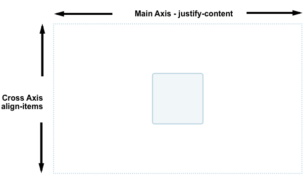
Flexbox provides several properties to control alignment and spacing, with align-items and justify-content being fundamental for centering elements. To center an element, we use the align-items property to align the item on the cross axis, which in this case is the block axis running vertically. We use justify-content to align the item on the main axis, which in this case is the inline axis running horizontally.
Change the size of the container or nested element in the code example below. The nested element always remains centered.
<div class="box">
  <div></div>
</div>
.box {
  display: flex;
  align-items: center;
  justify-content: center;
  border: 2px dotted rgb(96 139 168);
}

.box div {
  width: 100px;
  height: 100px;
  border: 2px solid rgb(96 139 168);
  border-radius: 5px;
  background-color: rgb(96 139 168 / 0.2);
}
Properties for controlling alignment in flexbox
The properties we will look at in this guide are as follows.
justify-content: Controls the alignment of all items on the main axis.align-items: Controls the alignment of all items on the cross axis.align-self: Controls the alignment of an individual flex item on the cross axis.align-content: Controls the space between flex lines on the cross axis.gap,column-gap, androw-gap: Used to create gaps or gutters between flex items.
We will also discover how auto margins can be used for alignment in flexbox.
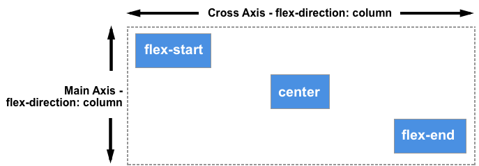
Aligning items on the cross axis
The align-items property, set on the flex container, and the align-self property, set on flex items, control the alignment of flex items on the cross axis. The cross axis runs down the columns if flex-direction is row and along the rows if flex-direction is column.
In this basic flex example, we're using cross-axis alignment. When we add display: flex to a container, the child items become flex items arranged in a row. By default, they will all stretch to match the height of the tallest item, as that item defines the height of the items on the cross axis. If the flex container has a height set, the items will stretch to that height, regardless of how much content is in each item.
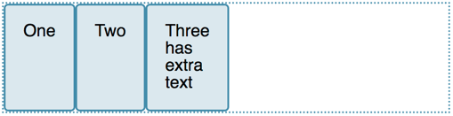
The reason the items become the same height is that the initial value of align-items, the property that controls alignment on the cross axis, is set to stretch.
We can use other values to control how the items align:
align-items: stretchalign-items: flex-startalign-items: flex-endalign-items: startalign-items: endalign-items: centeralign-items: baselinealign-items: first baselinealign-items: last baseline
In the example below, the value of align-items is stretch. Try the other values and see how the items align against each other in the flex container.
<div class="box">
  <div>One</div>
  <div>Two</div>
  <div>Three <br />has <br />extra <br />text</div>
</div>
.box {
  border: 2px dotted rgb(96 139 168);
  display: flex;
  align-items: stretch;
}

.box div {
  width: 100px;
  background-color: rgb(96 139 168 / 0.2);
  border: 2px solid rgb(96 139 168);
  border-radius: 5px;
}
Aligning one item with align-self
The align-items property sets the align-self property on all of the flex items as a group. This means you can explicitly declare the align-self property to target a single item. The align-self property accepts all of the same values as align-items, plus a value of auto, which resets the value to that defined on the flex container.
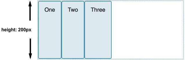
In this next live example, the flex container has align-items: flex-start, which means the items are all aligned to the start of the cross axis. Using the first-child selector, the first item is set to align-self: stretch. Another item with the selected class has align-self: center set. Change the value of align-items or change the values of align-self on the individual items to see how this works.
<div class="box">
  <div>One</div>
  <div>Two</div>
  <div class="selected">Three</div>
  <div>Four</div>
</div>
.box {
  border: 2px dotted rgb(96 139 168);
  display: flex;
  align-items: flex-start;
  height: 200px;
}
.box div {
  background-color: rgb(96 139 168 / 0.2);
  border: 2px solid rgb(96 139 168);
  border-radius: 5px;
  padding: 20px;
}
.box > *:first-child {
  align-self: stretch;
}
.box .selected {
  align-self: center;
}
Changing the main axis
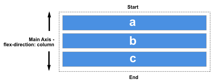
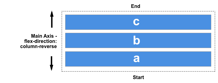
Thus far, we have looked at alignment behavior when the flex-direction defaults to row while working in a language written top to bottom, with a horizontal main axis and vertical cross axis.
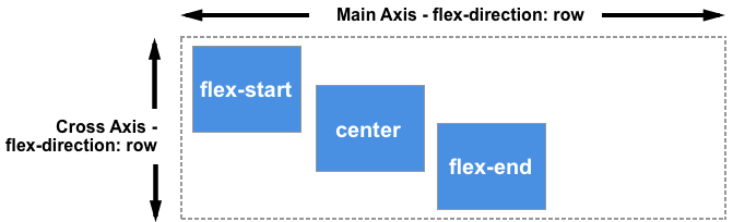
Keeping the same writing mode, when the flex-direction is changed to column, the align-items and align-self properties will align the items to the left and right instead of top and bottom; these properties are still aligning items along the cross axis, but the cross axis is now horizontal!
You can try this out in the example below, which has a flex container with flex-direction: column yet otherwise is exactly the same as the previous example.
<div class="box">
  <div>One</div>
  <div>Two</div>
  <div class="selected">Three</div>
  <div>Four</div>
</div>
.box {
  border: 2px dotted rgb(96 139 168);
  display: flex;
  flex-direction: column;
  align-items: flex-start;
  width: 200px;
}
.box div {
  background-color: rgb(96 139 168 / 0.2);
  border: 2px solid rgb(96 139 168);
  border-radius: 5px;
  padding: 20px;
}
.box > *:first-child {
  align-self: stretch;
}
.box .selected {
  align-self: center;
}
Aligning content on the cross axis with the align-content property
So far, we have focused on aligning items or individual items inside the area defined by a flex container containing a single line of flex items. When flex items are allowed to wrap across multiple lines, the align-content property can be used to control the distribution of space between the lines, also known as packing flex lines.
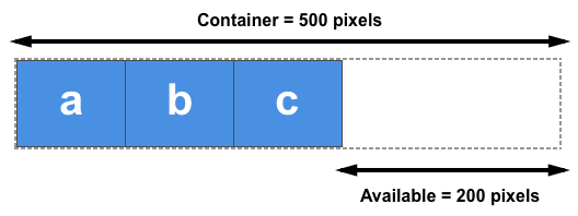
For align-content to have an effect, the cross axis dimension (the height in this case) of the flex container must be greater than needed to display the items. It then works on all the items as a set. The align-content values dictate what happens with the extra available space and the alignment of the entire set of items within it.
The align-content property takes the following values:
align-content: flex-startalign-content: flex-endalign-content: startalign-content: endalign-content: centeralign-content: space-betweenalign-content: space-aroundalign-content: space-evenlyalign-content: stretchalign-content: normal(behaves asstretch)align-content: baselinealign-content: first baselinealign-content: last baseline
In the live example below, the flex container has a height of 400 pixels, which is more than needed to display our items. The value of align-content is space-between, which means that the available space is shared out between the flex lines, which are placed flush with the start and end of the container on the cross axis.
Try out the other values to see how the align-content property works.
<div class="box">
  <div>One</div>
  <div>Two</div>
  <div>Three</div>
  <div>Four</div>
  <div>Five</div>
  <div>Six</div>
  <div>Seven</div>
  <div>Eight</div>
</div>
.box {
  width: 450px;
  border: 2px dotted rgb(96 139 168);
  display: flex;
  flex-wrap: wrap;
  height: 300px;
  align-content: space-between;
}

.box > * {
  padding: 20px;
  border: 2px solid rgb(96 139 168);
  border-radius: 5px;
  background-color: rgb(96 139 168 / 0.2);
  flex: 1 1 100px;
}

.box div {
  background-color: rgb(96 139 168 / 0.2);
  border: 2px solid rgb(96 139 168);
  border-radius: 5px;
  padding: 20px;
}
Once again we can switch our flex-direction to column in order to see how this property behaves when we are working by column. As before, we need enough space in the cross axis to have some free space after displaying all of the items.
<div class="box">
  <div>One</div>
  <div>Two</div>
  <div>Three</div>
  <div>Four</div>
  <div>Five</div>
  <div>Six</div>
  <div>Seven</div>
  <div>Eight</div>
</div>
.box {
  display: flex;
  flex-wrap: wrap;
  flex-direction: column;
  width: 400px;
  height: 300px;
  align-content: space-between;
  border: 2px dotted rgb(96 139 168);
}

.box > * {
  padding: 20px;
  border: 2px solid rgb(96 139 168);
  border-radius: 5px;
  background-color: rgb(96 139 168 / 0.2);
  flex: 1 1 100px;
}

.box div {
  background-color: rgb(96 139 168 / 0.2);
  border: 2px solid rgb(96 139 168);
  border-radius: 5px;
  padding: 20px;
}
Aligning content on the main axis
Now that we have seen how alignment works on the cross axis, we can take a look at the main axis. Here we only have one property available to us — justify-content. This is because we are only dealing with items as a group on the main axis. With justify-content we control what happens with available space, should there be more space than is needed to display the items.
In our initial example with display: flex on the container, the items display as a row and all line up at the start of the container. This is due to the initial value of justify-content being normal, which behaves as start. Any available space is placed at the end of the items.
The baseline values aren't relevant in this dimension. Otherwise, the justify-content property accepts the same values as align-content.
justify-content: flex-startjustify-content: flex-endjustify-content: startjustify-content: endjustify-content: leftjustify-content: rightjustify-content: centerjustify-content: space-betweenjustify-content: space-aroundjustify-content: space-evenlyjustify-content: stretch(behaves as start)justify-content: normal(behaves as stretch, which behaves as start)
In the example below, the value of justify-content is space-between. The available space after displaying the items is distributed between the items. The left and right item line up flush with the start and end.
<div class="box">
  <div>One</div>
  <div>Two</div>
  <div>Three</div>
  <div>Four</div>
</div>
.box {
  display: flex;
  justify-content: space-between;
  border: 2px dotted rgb(96 139 168);
}

.box > * {
  padding: 20px;
  border: 2px solid rgb(96 139 168);
  border-radius: 5px;
  background-color: rgb(96 139 168 / 0.2);
}
If the main axis is in the block direction because flex-direction is set to column, then justify-content will distribute space between items in that dimension as long as there is space in the flex container to distribute.
<div class="box">
  <div>One</div>
  <div>Two</div>
  <div>Three</div>
  <div>Four</div>
</div>
.box {
  display: flex;
  flex-direction: column;
  justify-content: space-between;
  height: 300px;
  border: 2px dotted rgb(96 139 168);
}

.box > * {
  padding: 20px;
  border: 2px solid rgb(96 139 168);
  border-radius: 5px;
  background-color: rgb(96 139 168 / 0.2);
}
Alignment and writing modes
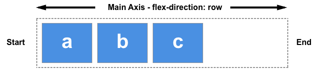
Remember that with all of these alignment methods, the values of start and end are writing mode-aware. If the value of justify-content is start and the writing mode is left-to-right, as in English, the items will align starting at the left side of the container.
However if the writing mode is right-to-left as in Arabic, the items will line up starting at the right side of the container.
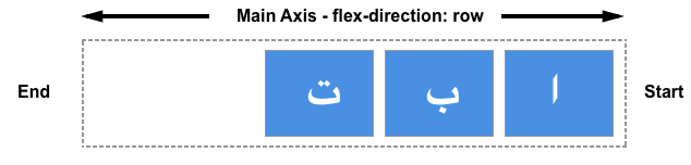
The live example below has the direction property set to rtl to force a right-to-left flow for our items. You can remove this, or change the values of justify-content to see how flexbox behaves when the start of the inline direction is on the right.
<div class="box">
  <div>One</div>
  <div>Two</div>
  <div>Three</div>
  <div>Four</div>
</div>
.box {
  direction: rtl;
  display: flex;
  justify-content: flex-end;
  border: 2px dotted rgb(96 139 168);
}

.box > * {
  padding: 20px;
  border: 2px solid rgb(96 139 168);
  border-radius: 5px;
  background-color: rgb(96 139 168 / 0.2);
}
Alignment and flex-direction
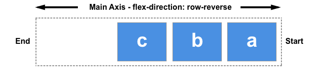
The direction of flex-start of the line will also change if you change the flex-direction property — for example, using row-reverse instead of row. The directions of start and end are unaffected by flex-direction changes.
In this next example, flex-direction: row-reverse and justify-content: flex-end define the direction and location of the items within the flex container. In a left to right language, the items line up on the left. Try changing flex-direction: row-reverse to flex-direction: row. You will see that the items now move to the right-hand side, and the visual order of the items is reversed.
<div class="box">
  <div>One</div>
  <div>Two</div>
  <div>Three</div>
  <div>Four</div>
</div>
.box {
  display: flex;
  flex-direction: row-reverse;
  justify-content: flex-end;
  border: 2px dotted rgb(96 139 168);
}

.box > * {
  padding: 20px;
  border: 2px solid rgb(96 139 168);
  border-radius: 5px;
  background-color: rgb(96 139 168 / 0.2);
}
While this may all seem a little confusing, the rule to remember is that unless you do something to change it, flex items lay themselves out in the direction that words are laid out in the language of your document along the inline, row axis. flex-start will be where the beginning of a sentence of text would start.

You can switch them to display in the block direction for the language of your document by selecting flex-direction: column. Then, start and flex-start will be where the top of your first paragraph of text would start.
If you change flex-direction to one of the reverse values, they will lay themselves out from the end axis and in the reverse order to the way words are written in the language of your document. Then, flex-start will change to the end of that axis — so to the location where your lines would wrap if working in rows, or at the end of your last paragraph of text in the block direction.
Using auto margins for main axis alignment
We don't have a justify-items or justify-self property available to us on the main axis as our items are treated as a group on that axis. However it is possible to do some individual alignment in order to separate an item or a group of items from others by using auto margins along with flexbox.
A common pattern is a navigation bar where some key items are aligned to the right, with the main group on the left. You might think that this should be a use case for a justify-self property. However, consider the image below. As an example, take the following image with three items on one side and two on the other. If justify-self were to work on flex items and was set on item d, it would also change the alignment of item e that follows, which may or may not be what is intended.
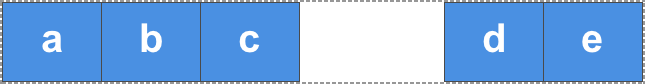
Instead, the d item can be pushed over using CSS margins.
In this live example, item 4 is separated from the first three items by setting margin-left to auto, which consumes all the space it can in its axis. This is how centering a block with margin auto left and right works. Each side tries to take as much space as it can, and so the block is pushed into the middle.
In this live example, the flex items are arranged in a row with the basic flex values, and the class push, set on the fourth item, applies margin-left: auto to that item. Try removing the class on the fourth item or adding the class to a different item to see how it works.
<div class="box">
  <div>One</div>
  <div>Two</div>
  <div>Three</div>
  <div class="push">Four</div>
  <div>Five</div>
</div>
.box {
  display: flex;
  border: 2px dotted rgb(96 139 168);
}

.box > * {
  padding: 20px;
  border: 2px solid rgb(96 139 168);
  border-radius: 5px;
  background-color: rgb(96 139 168 / 0.2);
}
.push {
  margin-left: auto;
}
Creating gaps between items
To create a gap between flex items, use the gap, column-gap, and row-gap properties. The column-gap property creates gaps between items in a row. The row-gap property creates gaps between flex lines when you have flex-wrap set to wrap.
The gap property is a shorthand that sets both row-gap and column-gap.
The gaps between flex items or flex lines depend on the direction. If the flex-direction property creates rows, the first value defines the gap between flex lines, and the second value defines the gap between items within each line. With columns (when flex-direction is set to column or column-reverse), the first value defines the gap between flex items, and the second value defines the gaps between flex lines.
<div class="box">
  <div>One</div>
  <div>Two</div>
  <div>Three</div>
  <div>Four</div>
  <div>Five</div>
  <div>Six</div>
</div>
.box {
  display: flex;
  flex-wrap: wrap;
  row-gap: 10px;
  column-gap: 2em;
  border: 2px dotted rgb(96 139 168);
}

.box > * {
  flex: 1;
  padding: 20px;
  border: 2px solid rgb(96 139 168);
  border-radius: 5px;
  background-color: rgb(96 139 168 / 0.2);
}