Grid template areas
In the grid layout using line-based placement guide, we looked at grid lines and how to position items against those lines. When you use CSS grid layout, you always have lines, and this can be a straightforward way to place items on your grid. However, there is an alternate method to use for positioning items on the grid which you can use alone or in combination with line-based placement. This method involves placing our items using named template areas. You will see very quickly why we sometimes call this the ascii-art method of grid layout!
Naming a grid area
You have already encountered the grid-area property. This is the property that can take as a value all four of the lines used to position a grid area.
.box1 {
  grid-area: 1 / 1 / 4 / 2;
}
What we are doing here when defining all four lines, is defining the area by specifying the lines that enclose that area.
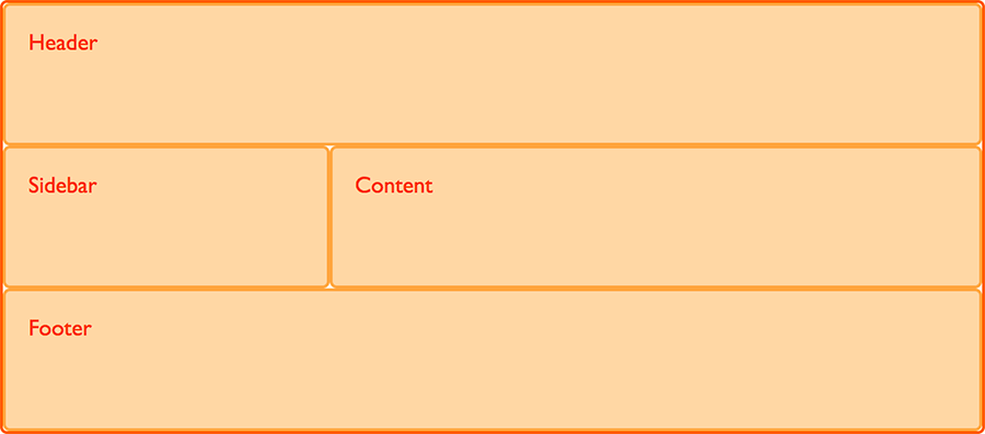
We can also define an area by giving it a name and then specify the location of that area in the value of the grid-template-areas property. You can choose what you would like to name your area. For example, if we wish to create the layout shown below we can identify four main areas.
- a header
- a footer
- a sidebar
- the main content
With the grid-area property we can assign each of these areas a name. By itself, this does not create any layout. Rather, it provides named areas to use in a layout.
.header {
  grid-area: hd;
}
.footer {
  grid-area: ft;
}
.content {
  grid-area: main;
}
.sidebar {
  grid-area: sd;
}
Having defined these names, we then create the layout. This time, instead of placing items using line numbers specified on the items themselves, we create the whole layout on the grid container. Here we create a 9-column grid and specify that the hd and ft areas span all 9 columns, while sd spans three and main spans six. Each area spans only one row.
.wrapper {
  display: grid;
  grid-template-columns: repeat(9, 1fr);
  grid-auto-rows: minmax(100px, auto);
  grid-template-areas:
    "hd hd hd hd   hd   hd   hd   hd   hd"
    "sd sd sd main main main main main main"
    "ft ft ft ft   ft   ft   ft   ft   ft";
}
<div class="wrapper">
  <div class="header">Header</div>
  <div class="sidebar">Sidebar</div>
  <div class="content">Content</div>
  <div class="footer">Footer</div>
</div>
Using this method we do not need to specify anything at all on the individual grid items, everything happens on our grid container. We can see the layout described as the value of the grid-template-areas property.
Leaving a grid cell empty
We have completely filled our grid with areas in this example, leaving no white space. However you can leave grid cells empty with this method of layout. To leave a cell empty use the full stop character, .. If we want to only display the footer directly under the main content we would need to leave the three cells underneath the sidebar empty.
.header {
  grid-area: hd;
}
.footer {
  grid-area: ft;
}
.content {
  grid-area: main;
}
.sidebar {
  grid-area: sd;
}
.wrapper {
  display: grid;
  grid-template-columns: repeat(9, 1fr);
  grid-auto-rows: minmax(100px, auto);
  grid-template-areas:
    "hd hd hd hd   hd   hd   hd   hd   hd"
    "sd sd sd main main main main main main"
    ".  .  .  ft   ft   ft   ft   ft   ft";
}
<div class="wrapper">
  <div class="header">Header</div>
  <div class="sidebar">Sidebar</div>
  <div class="content">Content</div>
  <div class="footer">Footer</div>
</div>
In order to make the layout neater we can use multiple . characters. As long as there is at least one white space between the full stops it will be counted as one cell. For a complex layout there is a benefit to having the rows and columns neatly aligned. It means that you can actually see, right there in the CSS, what this layout looks like.
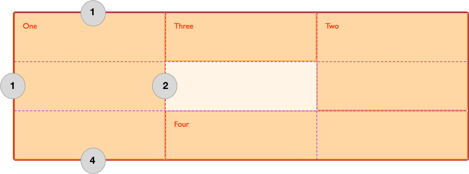
Spanning multiple cells
In our example, each area spans multiple grid cells and we achieve this by repeating the name of that grid area multiple times with white space between. You can add extra white space to keep your columns neatly lined up in the value of grid-template-areas. You can see that we have done this so that the hd and ft areas line up with main.
The area that you create by chaining the area names must be rectangular, at this point there is no way to create an L-shaped area. The specification does note that a future level might provide this functionality. You can however span rows just as easily as columns. For example we could make our sidebar span down to the end of the footer by replacing the . with sd.
.header {
  grid-area: hd;
}
.footer {
  grid-area: ft;
}
.content {
  grid-area: main;
}
.sidebar {
  grid-area: sd;
}
.wrapper {
  display: grid;
  grid-template-columns: repeat(9, 1fr);
  grid-auto-rows: minmax(100px, auto);
  grid-template-areas:
    "hd hd hd hd   hd   hd   hd   hd   hd"
    "sd sd sd main main main main main main"
    "sd sd sd  ft  ft   ft   ft   ft   ft";
}
The value of grid-template-areas must show a complete grid, otherwise it is invalid (and the property is ignored). This means that you must have the same number of cells for each row, if empty with a full stop character demonstrating that the cell is to be left empty. You will also create an invalid grid if your areas are not rectangular.
Redefining the grid using media queries
As our layout is now contained in one part of the CSS, we can make changes for different breakpoints in one location in our codebase. You can do this by redefining the grid, the position of items on the grid, or both at once.
When doing this, define the names for your areas outside of any media queries. That way the content area would always be called main no matter where on the grid it is placed.
For our layout above, we might like to have a very basic layout at narrow widths, defining a single column grid and stacking our four items into four rows.
.header {
  grid-area: hd;
}
.footer {
  grid-area: ft;
}
.content {
  grid-area: main;
}
.sidebar {
  grid-area: sd;
}

.wrapper {
  display: grid;
  grid-auto-rows: minmax(100px, auto);
  grid-template-columns: 1fr;
  grid-template-areas:
    "hd"
    "main"
    "sd"
    "ft";
}
We can then redefine that layout inside media queries to go to our two columns layout, and perhaps take it to a three column layout if the available space is even wider. Note that for the wide layout, we keep the nine-column track grid, redefining where items are placed using grid-template-areas.
@media (width >= 30em) {
  .wrapper {
    grid-template-columns: repeat(9, 1fr);
    grid-template-areas:
      "hd hd hd hd   hd   hd   hd   hd   hd"
      "sd sd sd main main main main main main"
      "sd sd sd  ft  ft   ft   ft   ft   ft";
  }
}
@media (width >= 60em) {
  .wrapper {
    grid-template-areas:
      "hd hd hd   hd   hd   hd   hd   hd hd"
      "sd sd main main main main main ft ft";
  }
}
Using grid-template-areas for UI elements
Many of the grid examples you will find online assume you are using grid for whole page layouts; however, grid can be just as useful for laying out small sections. Using grid-template-areas can be especially nice as it allows you to visualize what your element looks like in the code.
Media object example
As an example, we can create a "media object". This is a component with space for an image or other media on one side and content on the other. The image might be displayed on the right or left of the box.
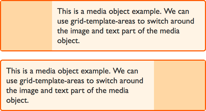
Our grid is a two-column track grid, with the column for the image sized at 1fr and the text 3fr. If you wanted a fixed width image area, then you could set the image column as a pixel width, and assign the text area 1fr. A single column track of 1fr would then take up the rest of the space.
We give the image area a grid area name of img and the text area content, then we can lay those out using the grid-template-areas property.
* {
  box-sizing: border-box;
}

.media {
  border: 2px solid #f76707;
  border-radius: 5px;
  background-color: #fff4e6;
  max-width: 400px;
  display: grid;
  grid-template-columns: 1fr 3fr;
  grid-template-areas: "img content";
  margin-bottom: 1em;
}

.media .image {
  grid-area: img;
  background-color: #ffd8a8;
}

.media .text {
  grid-area: content;
  padding: 10px;
}
<div class="media">
  <div class="image"></div>
  <div class="text">
    This is a media object example. We can use grid-template-areas to switch
    around the image and text part of the media object.
  </div>
</div>
Displaying the image on the other side of the box
We might want to be able to display our box with the image the other way around. To do this, we redefine the grid to put the 1fr track last, and flip the values in grid-template-areas.
* {
  box-sizing: border-box;
}

.media {
  border: 2px solid #f76707;
  border-radius: 5px;
  background-color: #fff4e6;
  max-width: 400px;
  display: grid;
  grid-template-columns: 1fr 3fr;
  grid-template-areas: "img content";
  margin-bottom: 1em;
}

.media.flipped {
  grid-template-columns: 3fr 1fr;
  grid-template-areas: "content img";
}

.media .image {
  grid-area: img;
  background-color: #ffd8a8;
}

.media .text {
  grid-area: content;
  padding: 10px;
}
<div class="media flipped">
  <div class="image"></div>
  <div class="text">
    This is a media object example. We can use grid-template-areas to switch
    around the image and text part of the media object.
  </div>
</div>
Grid definition shorthands
Having looked at various ways of placing items on our grids and many of the properties used to define grid, this is a good time to take a look at a couple of shorthands that are available for defining the grid and many things about it all in one line of CSS.
These can quickly become difficult to read for other developers, or even your future self. However they are part of the specification and it is likely you will come across them in examples or in use by other developers, even if you choose not to use them.
Before using any shorthand it is worth remembering that shorthands not only enable the setting of many properties in one go, but they also reset everything that you do not (or cannot) set in the shorthand to their initial values. Therefore if you use a shorthand, be aware that it may reset things you have applied elsewhere.
The two shorthands for the grid container are the explicit grid shorthand grid-template and the grid definition shorthand grid .
grid-template
The grid-template shorthand property sets the following longhand properties:
The property is referred to as the explicit grid shorthand because it sets values that you control when you define an explicit grid, and not those that impact any implicit row or column tracks that might be created.
The following code creates a layout using grid-template that is the same as the layout created earlier in this guide.
.wrapper {
  display: grid;
  grid-template:
    "hd hd hd hd   hd   hd   hd   hd   hd" minmax(100px, auto)
    "sd sd sd main main main main main main" minmax(100px, auto)
    "ft ft ft ft   ft   ft   ft   ft   ft" minmax(100px, auto)
    / 1fr 1fr 1fr 1fr 1fr 1fr 1fr 1fr 1fr;
}
The first value is our grid-template-areas value but we also declare the size of the row at the end of each row. This is what the minmax(100px, auto) is doing.
Then after grid-template-areas we have a forward slash, after that is an explicit track listing of column tracks.
grid
The grid shorthand goes a step further and also sets properties used by the implicit grid. So you will be setting:
grid-template-rowsgrid-template-columnsgrid-template-areasgrid-auto-rowsgrid-auto-columnsgrid-auto-flow
You can use this syntax in the exact same way as the grid-template shorthand. Just be aware that when doing so you will reset the other values set by the property.
.wrapper {
  display: grid;
  grid:
    "hd hd hd hd   hd   hd   hd   hd   hd" minmax(100px, auto)
    "sd sd sd main main main main main main" minmax(100px, auto)
    "ft ft ft ft   ft   ft   ft   ft   ft" minmax(100px, auto)
    / 1fr 1fr 1fr 1fr 1fr 1fr 1fr 1fr 1fr;
}
We will revisit the other functionality offered by this shorthand when we take a look at auto-placement in grid layout and the grid-auto-flow property.
Next steps
If you've been working along the grid guides, you should be in a position to create grid layouts using line-based placement or named template areas. Now let's take a look at creating grid layouts using named grid lines.