Subgrid
Baseline
Widely available
This feature is well established and works across many devices and browser versions. It’s been available across browsers since September 2023.
The CSS grid layout module includes a subgrid value for grid-template-columns and grid-template-rows. This guide details what subgrid does and gives some use cases and design patterns that the feature solves.
Introduction to subgrid
When you add display: grid to a grid container, only the direct children become grid items, which can then be placed on the grid you created. The children of these items display in normal flow.
You can "nest" grids by making a grid item a grid container. These grids, however, are independent of the parent grid and of each other, meaning that they do not take their track sizing from the parent grid. This makes it difficult to line nested grid items up with the main grid.
If you set the value subgrid on grid-template-columns, grid-template-rows or both, instead of creating a new track listing, the nested grid uses the tracks defined on the parent.
For example, if you use grid-template-columns: subgrid and the nested grid spans three column tracks of the parent, the nested grid will have three column tracks of the same size as the parent grid. While gaps are inherited, they can be overridden with a different gap value. Line names can be passed from the parent into the subgrid, and the subgrid can also declare its own line names.
Subgrid for columns
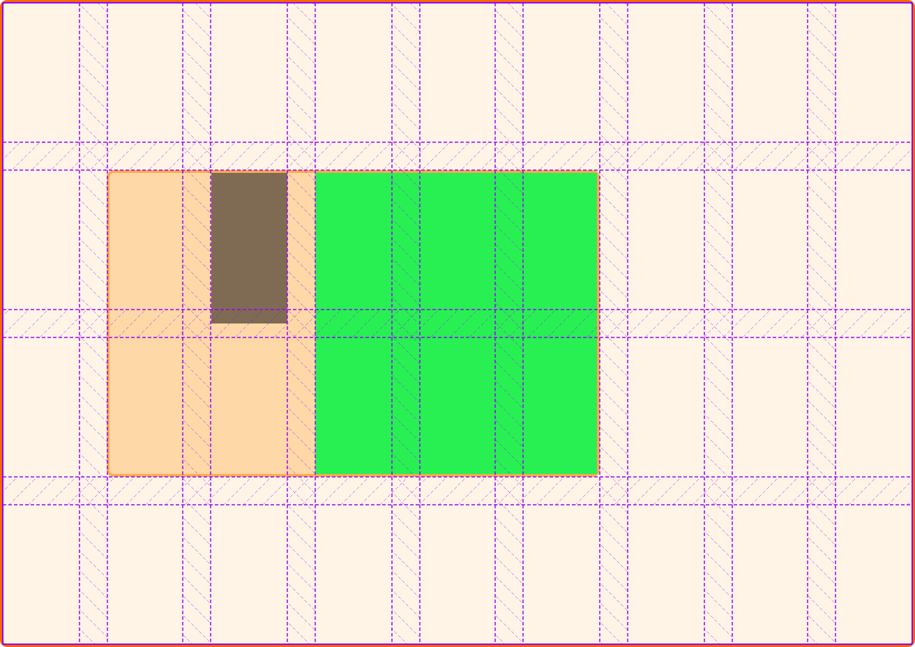
In the example below, the grid layout has nine 1fr column tracks and four rows that are a minimum of 100px tall.
The .item is placed between column lines 2 to 7 and rows 2 to 4. This grid item is itself specified as a grid using display: grid and then defined as a subgrid by giving it column tracks that are a subgrid (grid-template-columns: subgrid) and normally defined rows. The subgrid has five-column tracks as it spans five column tracks.
Because the .item is a subgrid, even though the .subitem is not a direct child of the outer .grid, it can be placed on that outer grid, with its columns aligned with the outer grid's columns. The rows are not a subgrid, so behave as a nested grid normally does. The grid area on the parent expands to be large enough for this nested grid.
<div class="grid">
  <div class="item">
    <div class="subitem"></div>
  </div>
</div>
.grid {
  display: grid;
  grid-template-columns: repeat(9, 1fr);
  grid-template-rows: repeat(4, minmax(100px, auto));
}

.item {
  display: grid;
  grid-column: 2 / 7;
  grid-row: 2 / 4;
  grid-template-columns: subgrid;
  grid-template-rows: repeat(3, 80px);
}

.subitem {
  grid-column: 3 / 6;
  grid-row: 1 / 3;
}
Note that line numbering restarts inside the subgrid — column line 1, when inside the subgrid, is the first line of the subgrid. The subgridded element doesn't inherit the line numbers of the parent grid. This means that you can safely lay out a component that may be placed in different positions on the main grid, knowing that the line numbers on the component will always be the same.
Subgrid for rows
This example uses the same HTML as above, but here the subgrid is applied as the value of grid-template-rows instead, with explicitly defined column tracks. In this case, the column tracks behave as a regular nested grid, but the rows are tied to the two tracks that the .item spans.
.grid {
display: grid;
grid-template-columns: repeat(9, 1fr);
grid-template-rows: repeat(4, minmax(100px, auto));
}
.item {
display: grid;
grid-column: 2 / 7;
grid-row: 2 / 4;
grid-template-columns: repeat(3, 1fr);
grid-template-rows: subgrid;
}
.subitem {
grid-column: 2 / 4;
grid-row: 1 / 3;
}
A subgrid in both dimensions
In this example, both rows and columns are defined as a subgrid, tying the subgrid to the parent grid's tracks in both dimensions.
.grid {
display: grid;
grid-template-columns: repeat(9, 1fr);
grid-template-rows: repeat(4, minmax(100px, auto));
}
.item {
display: grid;
grid-column: 2 / 7;
grid-row: 2 / 4;
grid-template-columns: subgrid;
grid-template-rows: subgrid;
}
.subitem {
grid-column: 3 / 6;
grid-row: 1 / 3;
}
No implicit grid in a subgridded dimension
If you need to autoplace items and do not know how many items you will have, take care when creating a subgrid, as it will prevent additional rows from being created to hold those items.
Take a look at the next example — it uses the same parent and child grid as in the example above. There are twelve items inside the subgrid trying to autoplace themselves into ten grid cells. As the subgrid is on both dimensions, there is nowhere for the extra two items to go, so they go into the last track of the grid. This is the behavior defined in the specification.
<div class="grid">
<div class="item">
<div class="subitem">1</div>
<div class="subitem">2</div>
<div class="subitem">3</div>
<div class="subitem">4</div>
<div class="subitem">5</div>
<div class="subitem">6</div>
<div class="subitem">7</div>
<div class="subitem">8</div>
<div class="subitem">9</div>
<div class="subitem">10</div>
<div class="subitem">11</div>
<div class="subitem">12</div>
</div>
</div>
.grid {
display: grid;
grid-template-columns: repeat(9, 1fr);
grid-template-rows: repeat(4, minmax(100px, auto));
}
.item {
display: grid;
grid-column: 2 / 7;
grid-row: 2 / 4;
grid-template-columns: subgrid;
grid-template-rows: subgrid;
}
By removing the grid-template-rows value, the regular creation of implicit tracks is enabled, creating as many rows as required. These won't line up with the tracks of the parent.
<div class="grid">
<div class="item">
<div class="subitem">1</div>
<div class="subitem">2</div>
<div class="subitem">3</div>
<div class="subitem">4</div>
<div class="subitem">5</div>
<div class="subitem">6</div>
<div class="subitem">7</div>
<div class="subitem">8</div>
<div class="subitem">9</div>
<div class="subitem">10</div>
<div class="subitem">11</div>
<div class="subitem">12</div>
</div>
</div>
.grid {
display: grid;
grid-template-columns: repeat(9, 1fr);
grid-template-rows: repeat(4, minmax(100px, auto));
}
.item {
display: grid;
grid-column: 2 / 7;
grid-row: 2 / 4;
grid-template-columns: subgrid;
grid-auto-rows: minmax(100px, auto);
}
The gap properties and subgrid
Any gap, column-gap, or row-gap values specified on the parent are passed into the subgrid, creating the same spacing between tracks as the parent. This default behavior can be overridden by applying gap-* properties on the subgrid container.
In this example, the parent grid has a gap of 20px for rows and columns and the subgrid has row-gap set to 0.
<div class="grid">
<div class="item">
<div class="subitem"></div>
<div class="subitem2"></div>
</div>
</div>
.grid {
display: grid;
grid-template-columns: repeat(9, 1fr);
grid-template-rows: repeat(4, minmax(100px, auto));
gap: 20px;
}
.item {
display: grid;
grid-column: 2 / 7;
grid-row: 2 / 4;
grid-template-columns: subgrid;
grid-template-rows: subgrid;
row-gap: 0;
}
.subitem {
grid-column: 3 / 6;
grid-row: 1 / 3;
}
.subitem2 {
background-color: rgb(0 0 0 / 0.5);
grid-column: 2;
grid-row: 1;
}
If you inspect this in your developer tools grid inspector, you will note that the subgrid line is at the center of the gap. Setting the gap to 0 acts in a similar way to applying a negative margin to an element, giving the space from the gap back to the item.
Named grid lines
When using CSS grid, you can name lines on your grid and then position items based on those names rather than the line number. The line names on the parent grid are passed into the subgrid, and you can place items using them. In the example below, the named lines of the parent col-start and col-end are used to place the subitem.
<div class="grid">
  <div class="item">
    <div class="subitem"></div>
  </div>
</div>
.grid {
display: grid;
grid-template-columns: 1fr 1fr 1fr [col-start] 1fr 1fr 1fr [col-end] 1fr 1fr 1fr;
grid-template-rows: repeat(4, minmax(100px, auto));
gap: 20px;
}
.item {
display: grid;
grid-column: 2 / 7;
grid-row: 2 / 4;
grid-template-columns: subgrid;
grid-template-rows: subgrid;
}
.subitem {
grid-column: col-start / col-end;
grid-row: 1 / 3;
}
You can also specify line names on the subgrid. This is achieved by adding a list of line names enclosed in square brackets after the subgrid keyword. For example, if you have four lines in your subgrid, to name them all, you could use the syntax grid-template-columns: subgrid [line1] [line2] [line3] [line4]
Lines specified on the subgrid are added to any lines specified on the parent, so you can use either or both. In this example, one item is placed below using the parent lines and one using the subgrid lines.
<div class="grid">
  <div class="item">
    <div class="subitem"></div>
    <div class="subitem2"></div>
  </div>
</div>
.grid {
  display: grid;
  grid-template-columns: 1fr 1fr 1fr [col-start] 1fr 1fr 1fr [col-end] 1fr 1fr 1fr;
  grid-template-rows: repeat(4, minmax(100px, auto));
  gap: 20px;
}

.item {
  display: grid;
  grid-column: 2 / 7;
  grid-row: 2 / 4;
  grid-template-columns: subgrid [sub-a] [sub-b] [sub-c] [sub-d] [sub-e] [sub-f];
  grid-template-rows: subgrid;
}

.subitem {
  grid-column: col-start / col-end;
  grid-row: 1 / 3;
}

.subitem2 {
  background-color: rgb(0 0 0 / 0.5);
  grid-column: sub-b / sub-d;
  grid-row: 1;
}
Using subgrids
A subgrid acts very similarly to any nested grid; the only difference is that the track sizing of the subgrid is set on the parent grid. As with any nested grid, however, the size of the content in the subgrid can change the track sizing, assuming a track sizing method is used that allows content to affect the size. In such a case, auto-sized row tracks will grow to fit content in the main grid and content in the subgrid.
As the subgrid value acts in much the same way as a regular nested grid, it is easy to switch between the two. For example, if you realize that you need an implicit grid for rows, you would need to remove the subgrid value of grid-template-rows and perhaps give a value for grid-auto-rows to control the implicit track sizing.
Specifications
| Specification |
|---|
| CSS Grid Layout Module Level 2 # subgrids |
Browser compatibility
See also
- Video: Laying out forms using subgrid (2019)
- Video: Don't wait to use subgrid for better card layouts (2019)
- Video: Hello subgrid! presentation from CSSConf.eu (2019)