Typical use cases of flexbox
In this guide, we will take a look at some of the common use cases for flexbox — those places where flexbox makes more sense than another layout method.
Why choose flexbox?
Flexbox is generally the right CSS layout solution when you want to lay out a collection of items in one dimension or control the spacing between items. In this guide, we'll look at some of the typical use cases of flexbox.
Navigation
A common pattern for navigation is to have a list of items displayed as a horizontal bar. It's probably the most common of flexbox examples, and could be considered an ideal flexbox use case.
When we have a set of items that we want to display horizontally, we may well end up with additional space. We need to decide what to do with that space, and have a couple of options. We either display the space outside of the items — therefore spacing them out with white space between or around them — or we absorb the extra space inside the items and therefore need a method of allowing the items to grow and take up this space.
Space distributed outside the items
To distribute the space between or around the items, we use the alignment properties in flexbox, and the justify-content property. You can read more about this property in Aligning items in a flex container, which deals with aligning items on the main axis.
In this example, we display the items at their natural size and use justify-content: space-between to space the items equally. You can change how the space is distributed using the space-around or space-evenly values. You could also use start to put the space at the end of the items, end to place it before them, or center to center the navigation items.
<nav>
  <ul>
    <li><a href="#">Page 1</a></li>
    <li><a href="#">Page 2</a></li>
    <li><a href="#">Page 3 is longer</a></li>
    <li><a href="#">Page 4</a></li>
  </ul>
</nav>
nav {
  border: 2px solid #eeeeee;
}

nav a {
  text-decoration: none;
  color: black;
  border: 2px solid rgb(96 139 168);
  border-radius: 5px;
  background-color: rgb(96 139 168 / 0.2);
  padding: 10px;
  display: block;
}

nav ul {
  list-style: none;
  margin: 0;
  padding: 0;
  display: flex;
  justify-content: space-between;
}
Space distributed within the items
A different pattern for navigation would be to distribute the available space within the items themselves, rather than create space between them. The flex properties allow items to grow and shrink in proportion to one another as described in Controlling ratios of flex items along the main axis.
If you wanted to respect the size property of your navigation items but have the available space shared out equally among them, you might use flex: auto, which is the shorthand for flex: 1 1 auto — all items grow and shrink from a flex-basis of auto. This would mean that the longer item would have more space because it started from a larger size, even though the same amount of available space is assigned to it as the others.
In the live example below try changing flex: auto to flex: 1. This shorthand for flex: 1 1 0 causes all of the items to become the same width, as they are working from a flex-basis of 0, allowing all of the space to be distributed evenly.
<nav>
  <ul>
    <li><a href="#">Page 1</a></li>
    <li><a href="#">Page 2</a></li>
    <li><a href="#">Page 3 is longer</a></li>
    <li><a href="#">Page 4</a></li>
  </ul>
</nav>
nav {
  border: 2px solid #eeeeee;
}
nav ul {
  list-style: none;
  margin: 0;
  padding: 0;
  display: flex;
}

nav a {
  text-decoration: none;
  color: black;
  border: 2px solid rgb(96 139 168);
  border-radius: 5px;
  background-color: rgb(96 139 168 / 0.2);
  padding: 10px;
  display: block;
}

nav li {
  flex: auto;
}
Split navigation
Another way to align items on the main axis is to use auto margins. This enables the design pattern of a navigation bar where one group of items are aligned left and another group aligned right. Here we are using the auto margins technique described in Using auto margins for main axis alignment.
The items are aligned on the main axis with normal, which behaves as start, as this is the initial behavior of flexbox. The gap property creates gaps between items. And we are aligning the last item to the right by giving it a margin-left value of auto. You can move the class from one item to another to change where the split happens.
<nav>
  <ul>
    <li><a href="#">Page 1</a></li>
    <li><a href="#">Page 2</a></li>
    <li><a href="#">Page 3 is longer</a></li>
    <li class="push-right"><a href="#">Page 4</a></li>
  </ul>
</nav>
nav {
  border: 2px solid #eeeeee;
}

nav a {
  text-decoration: none;
  color: black;
  border: 2px solid rgb(96 139 168);
  border-radius: 5px;
  background-color: rgb(96 139 168 / 0.2);
  padding: 10px;
  display: block;
}

nav ul {
  list-style: none;
  margin: 0;
  padding: 0;
  display: flex;
  gap: 20px;
}

.push-right {
  margin-left: auto;
}
Center item
A long-standing joke among developers is that the hardest problem in web design is vertical centering. Vertically centering content is very straightforward with flexbox alignment properties, as the following live example shows.
Click "Play" and try changing the alignment, for example aligning the item to the start with start or end with end:
<div class="box">
  <div></div>
</div>
.box {
  height: 300px;
  border: 2px dotted rgb(96 139 168);
  display: flex;
  align-items: center;
  justify-content: center;
}

.box div {
  border: 2px solid rgb(96 139 168);
  border-radius: 5px;
  background-color: rgb(96 139 168 / 0.2);
  width: 100px;
  height: 100px;
}
With CSS box alignment properties, you can vertically center an element inside another without flexbox. In the example above, try removing the flex properties from the box and adding align-content: center. Then add margin: auto to the element you want to horizontally center.
Card layout pushing footer down
Whether you use flexbox or grid to lay out a list of card components, these layout methods only work on direct children of the flex or grid component. This means that if you have variable amounts of content, the card will stretch to the height of the grid area or flex container. Any content inside uses regular block layout, meaning that on a card with less content the footer will rise up to the bottom of the content rather than stick to the bottom of the card.
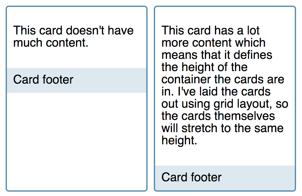
Flexbox solves this. We make the card a flex container, with flex-direction: column. We then set the content area to flex: 1, which is the shorthand for flex: 1 1 0 — the item can grow and shrink from a flex basis of 0. As this is the only item that can grow, it takes up all available space in the flex container and pushes the footer to the bottom. If you remove the flex property from the live example you will see the footer moves up to sit directly under the content.
<div class="cards">
  <div class="card">
    <div class="content">
      <p>This card doesn't have much content.</p>
    </div>
    <footer>Card footer</footer>
  </div>
  <div class="card">
    <div class="content">
      <p>
        This card has a lot more content which means that it defines the height
        of the container the cards are in. I've laid the cards out using grid
        layout, so the cards themselves will stretch to the same height.
      </p>
    </div>
    <footer>Card footer</footer>
  </div>
</div>
body {
  font-family: sans-serif;
}
.cards {
  display: grid;
  grid-template-columns: repeat(auto-fill, minmax(200px, 1fr));
  grid-gap: 10px;
}

.card {
  border: 2px solid rgb(96 139 168);
  border-radius: 5px;
  display: flex;
  flex-direction: column;
}

.card .content {
  padding: 10px;
  flex: 1 1 auto;
}

.card footer {
  background-color: rgb(96 139 168 / 0.2);
  padding: 10px;
}
Media objects
The media object — an image or other media element with some descriptive text side-by-side — is a common pattern in web design. Media objects should be able to be flipped — moving the image from one side to the other.
This pattern is used for comments and other places where images are placed next to their descriptions. We can use flexbox to allow the part of the media object containing the image to take its sizing information from the image with the content of the media object flexing to take up the remaining space.
In this example, the media object is aligned to flex-start and the .content is set to grow, with the grow factor set to 1. These properties are the same as those used for our column layout card pattern above.
<div class="media">
  <div class="image">
    <img
      alt="A colorful balloon against a blue sky"
      src="https://mdn.github.io/shared-assets/images/examples/balloon.jpg" />
  </div>
  <div class="content">
    This is the content of my media object. Items directly inside the flex
    container will be aligned to flex-start.
  </div>
</div>
img {
  max-width: 100%;
  display: block;
}

.media {
  border: 2px dotted rgb(96 139 168);
  display: flex;
  align-items: flex-start;
}

.media .content {
  flex: 1;
  padding: 10px;
}
Some things that you might want to try in this live example relate to the different ways you might want to constrain the media object in your design.
To prevent the image from growing too large, you should add a max-width to the image. As that side of the media object uses the initial values of flexbox, it can shrink, but not grow, and uses a flex-basis of auto. Any width or max-width applied to the image will become the flex-basis.
.image img {
  max-width: 100px;
}
You could also allow both sides to grow and shrink in proportion. If you set both sides to flex: 1, they will grow and shrink from a flex-basis of 0, so you will end up with two equal-sized columns. You could either take the content as a guide and set both to flex: auto, in which case they would grow and shrink from the size of the content or any size applied directly to the flex items such as a width on the image.
.media .content {
  flex: 1;
  padding: 10px;
}

.image {
  flex: 1;
}
You could also give each side different flex-grow factors, for example setting the side with the image to flex: 1 and the content side to flex: 3. This will mean they use a flex-basis of 0 but distribute that space at different rates according to the flex-grow factor you have assigned. The flex properties we use to do this are described in detail in the guide Controlling ratios of flex items along the main axis.
.media .content {
  flex: 3;
  padding: 10px;
}

.image {
  flex: 1;
}
Flipping the media object
To switch the display of the media object and have the image on the right and content on the left, we set the flex-direction property to row-reverse.
In this example, we added a flipped class next to the media class. Remove the class from the HTML to see how the display changes.
<div class="media flipped">
  <div class="image">
    <img
      alt="A colorful balloon against a blue sky"
      src="https://mdn.github.io/shared-assets/images/examples/balloon.jpg" />
  </div>
  <div class="content">
    This is the content of my media object. Items directly inside the flex
    container will be aligned to flex-start.
  </div>
</div>
img {
  max-width: 100%;
  display: block;
}

.media {
  border: 2px dotted rgb(96 139 168);
  display: flex;
  align-items: flex-start;
}

.flipped {
  flex-direction: row-reverse;
}

.media .content {
  flex: 1;
  padding: 10px;
}
Form controls
Flexbox is particularly useful when it comes to styling form controls. Forms have several small elements that we typically want to align with each other. A common pattern is to have a <label> and <input> pair combined with a <button>, perhaps for a search form or a newsletter sign-up form where you want your visitor to enter their email address.
Flexbox makes this type of layout achievable with just a few declarations. The <label>, <input> and <button> are contained in a wrapper that is set to display: flex. The flex properties allow the <input> field to grow, while the button and label do not grow. The text input field will grow and shrink depending on the space available.
<form class="example">
  <div class="wrapper">
    <label for="text">Label</label>
    <input id="text" type="text" />
    <input type="submit" value="Send" />
  </div>
</form>
* {
  font: 1.1em sans-serif;
}

.wrapper {
  display: flex;
  border: 1px solid rgb(96 139 168);
}
.wrapper > * {
  padding: 10px;
  border: none;
  color: white;
}
.wrapper > input[type="text"] {
  background-color: rgb(96 139 168 / 0.5);
  border-right: 1px solid rgb(96 139 168);
  flex: 1 1 auto;
}
.wrapper input[type="submit"] {
  background-color: rgb(96 139 168);
  color: white;
}
.wrapper label {
  background-color: #666666;
}
Patterns like this can make it easier to create a library of form elements for your design, which easily accommodate additional elements being added. You are taking advantage of the flexibility of flexbox by mixing items that do not grow with those that do.
Conclusion
While exploring the above patterns, you have hopefully started to see how you can think through the best way to use flexbox to achieve the result that you want. Quite often you have more than one choice. Mix items that cannot stretch with those that can, use the content to inform the size, or allow flexbox to share out space in proportion. It's up to you.
Think about the best way to present the content that you have and then see how flexbox or other layout methods can help you achieve it.