格線佈局的基本概念
CSS 格線佈局介紹了二維的 CSS 格線系統。格線可以用來佈置頁面的主要區域、或小型用戶介面。本文介紹 CSS 格線 Level 1 規範的其中一部份。這份概觀顯示的某些功能,將在教學的其他部份詳細解釋。
什麽是格線?
格線是一組水平線和垂直線的交叉集合(intersecting set):一個定義為行(row),另一個定義為列(column)。你可以讓各元素依照行列的規則放到各格線上。CSS 格線佈局具有以下特點:
固定和靈活的軌道尺寸
你可以給各格線指定一個固定的軌道大小,例如像素(pixel)。這樣就能把格線設為指定的像素,以貼近你期望的排版。也可以創建一個使用百分比、或是新的 fr 單位之格線。fr 單位就是為了格線布局而生。
單元佈置
你可以在格線使用行號、名字、目標區域,讓各單元放到精確的位置。格線也有控制非明式(explicit)單元的布局演算法。
Creation of additional tracks to hold content
你可以按照需求,定義明式格線、也可以處理沒有指定的格線、還可以增加額外的行(row)與列(column)。如果需要「盡可能地放進容器容得了的列」之類的也辦得到。
控制對齊
格線也包含了依序對齊的功能,以便控制各格線內的各單元、還有整個格線要如何對齊。
Control of overlapping content
數個單位也能被放進 grid cell、或是區域的一部分相互重疊。我們可以透過 z-index 控制該分層。
格線是個強大的規範、它在與諸如彈性盒子之類的 CSS 結合時,也有助於用 CSS 建立前所尚未有的排版。一切都建立要從建立格線容器(grid container)開始。
格線容器
我們會宣告 display: grid 或 display: inline-grid 來給一個元素建立格線容器(grid container)。宣告以後,該元素的所有直接子元素會變成格線單位(grid item)
本例中,我有個稱作 wrapper class 的 div,裡面有五個元素。
<div class="wrapper">
  <div>One</div>
  <div>Two</div>
  <div>Three</div>
  <div>Four</div>
  <div>Five</div>
</div>
接著我讓 .wrapper 變成格線容器(grid container)。
.wrapper {
  display: grid;
}
在它下面的直接子元素,現在都是格線單元了。從網路瀏覽器來看,各單元變成格線的前後,似乎沒什麼不同,因為目前格線只有建立一個格線列,來放所有的格線單元。這時候,你會發現格線檢測器相當好用。如果在 Firefox 檢查這個示例的格線,你會發現在 grid 值旁邊,有一個小圖標。點選這個小圖標,瀏覽器視窗的元素,就會被一個圖層覆蓋。
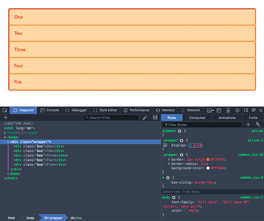
在理解並與 CSS 格線共事時,這個工具能幫你視覺化理解,格線到底怎麼做動的。
如果要開始把做得更像格線,我們還需要多寫個 column track。
格線軌道(Grid Track)
我們在格線裡透過 grid-template-columns 與 grid-template-rows 屬性定義了行與列。它們也定義了格線軌道。格線軌道是在格線的兩個欄位之間的空隙。下圖就會看到軌道的高亮:就在格線裡面的第一行。
I can add to our earlier example by adding the grid-template-columns property, then defining the size of the column tracks.
I have now created a grid with three 200-pixel-wide column tracks. The child items will be laid out on this grid one in each grid cell.
<div class="wrapper">
  <div>One</div>
  <div>Two</div>
  <div>Three</div>
  <div>Four</div>
  <div>Five</div>
</div>
.wrapper {
  display: grid;
  grid-template-columns: 200px 200px 200px;
}
fr 單位
格線軌道可以使用任何單位定義,不過格線引入了額外的單位,以助於建立有彈性的格線軌道。新的單位 fr 代表格線容器內,可用空間的分塊(fraction)。接下來的格線定義,會建立三個同等、且能依照可用空間縮放的長度軌道。
<div class="wrapper">
  <div>One</div>
  <div>Two</div>
  <div>Three</div>
  <div>Four</div>
  <div>Five</div>
</div>
.wrapper {
  display: grid;
  grid-template-columns: 1fr 1fr 1fr;
}
接著下例將創建有一個 2fr 的軌道,接著還有兩個 1fr 的軌道。可用空間會因此被分為四塊:其中兩塊給第一個軌道、剩下兩塊給兩個軌道各一個。
.wrapper {
  display: grid;
  grid-template-columns: 2fr 1fr 1fr;
}
最後,我們會把分塊與絕對大小做結合。第一個軌道有 500 像素,這個固定的寬度,會因此從可用空間先割一塊出去。接下來的空間會被劃分為三塊,並按比例指派給剩下的彈性軌道。
.wrapper {
  display: grid;
  grid-template-columns: 500px 1fr 2fr;
}
Track listings with repeat() notation
含有許多軌道的格線能用 repeat() 標記,以使軌道透過迴圈表列數次。以下面為例:
.wrapper {
  display: grid;
  grid-template-columns: 1fr 1fr 1fr;
}
這可以寫成:
.wrapper {
  display: grid;
  grid-template-columns: repeat(3, 1fr);
}
重複標記是軌道表列一部分。下例中,我們建立了有 20 像素的軌道,接著重複 1fr 軌道六次,最後以 20 像素的軌道做結。
.wrapper {
  display: grid;
  grid-template-columns: 20px repeat(6, 1fr) 20px;
}
重複標記使用軌道表列,因此可以用它來建立重複的模式。下個例子的格線,會包含十個軌道:也就是 1fr 後面有 2fr 的軌道,並重複五次。
.wrapper {
  display: grid;
  grid-template-columns: repeat(5, 1fr 2fr);
}
明式與暗式格線
在建立上例格線的時候,我們用 grid-template-columns 屬性指定了列軌道,但格線自己也建立了一行。相較於使用 grid-template-columns 或 grid-template-rows 屬性的明式格線(explicit grid),這幾行就屬於暗式格線(implicit grid)。
你也能在暗式格線內透過 grid-auto-rows 與 grid-auto-columns 屬性,給軌道定義一套大小。
下例將使用 grid-auto-rows 以確保由暗式格線建立的軌道,高度都會是 200 像素。
<div class="wrapper">
  <div>One</div>
  <div>Two</div>
  <div>Three</div>
  <div>Four</div>
  <div>Five</div>
</div>
.wrapper {
  display: grid;
  grid-template-columns: repeat(3, 1fr);
  grid-auto-rows: 200px;
}
軌道縮放與 minmax()
在設定顯式格線或希望自動給軌道一個最小尺寸,但也要確保它們擴展以適應任何添加的內容——像是希望某行不能小於 100 像素以避免跑版,但如果內容高度超過 300 像素,該行就要拉到那麼高。
針對這個情境,格線提供了 minmax() 函式。本例中,我針對 grid-auto-rows 指定了 minmax() 的數值。它會指定高度最小要 100 像素,最大則是 auto。auto 意味著大小會檢查內容大小,並適配這一行 cell 內最高項目的高度。
.wrapper {
  display: grid;
  grid-template-columns: repeat(3, 1fr);
  grid-auto-rows: minmax(100px, auto);
}
<div class="wrapper">
  <div>One</div>
  <div>
    Two
    <p>I have some more content in.</p>
    <p>This makes me taller than 100 pixels.</p>
  </div>
  <div>Three</div>
  <div>Four</div>
  <div>Five</div>
</div>
Grid Lines
It should be noted that when we define a grid we define the grid tracks, not the lines. Grid then gives us numbered lines to use when positioning items. In our three column, two row grid we have four column lines.
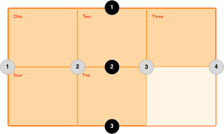
Lines are numbered according to the writing mode of the document. In a left-to-right language, line 1 is on the left-hand side of the grid. In a right-to-left language, it is on the right-hand side of the grid. Lines can also be named, and we will look at how to do this in a later guide in this series.
Positioning items against lines
We will be exploring line based placement in full detail in a later article, the following example demonstrates doing this in a simple way. When placing an item we target the line – rather than the track.
In the following example I am placing the first two items on our three column track grid, using the grid-column-start, grid-column-end, grid-row-start and grid-row-end properties. Working from left to right, the first item is placed against column line 1, and spans to column line 4, which in our case is the far right line on the grid. It begins at row line 1 and ends at row line 3, therefore spanning two row tracks.
The second item starts on grid column line 1, and spans one track. This is the default so I do not need to specify the end line. It also spans two row tracks from row line 3 to row line 5. The other items will place themselves into empty spaces on the grid.
<div class="wrapper">
  <div class="box1">One</div>
  <div class="box2">Two</div>
  <div class="box3">Three</div>
  <div class="box4">Four</div>
  <div class="box5">Five</div>
</div>
.wrapper {
  display: grid;
  grid-template-columns: repeat(3, 1fr);
  grid-auto-rows: 100px;
}
.box1 {
  grid-column-start: 1;
  grid-column-end: 4;
  grid-row-start: 1;
  grid-row-end: 3;
}
.box2 {
  grid-column-start: 1;
  grid-row-start: 3;
  grid-row-end: 5;
}
Don't forget that you can use the Grid Inspector in Firefox Developer Tools to see how the items are positioned against the lines of the grid.
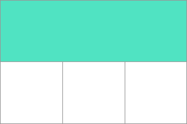
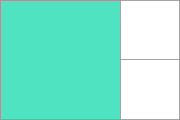
Grid Cells
A grid cell is the smallest unit on a grid, conceptually it is like a table cell. As we saw in our earlier examples, once a grid is defined on a parent the child items will lay themselves out once in each cell of the defined grid. In the below image I have highlighted the first cell of the grid.
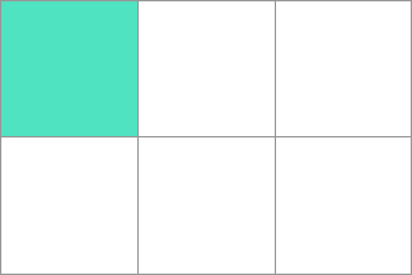
Grid areas
Items can span one or more cells both by row or by column, and this creates a grid area. Grid areas have to be rectangular – it isn't possible to create an L-shaped area for example. The highlighted grid area spans two row and two column tracks.
Gutters
Gutters or alleys between grid cells can be created using the grid-column-gap and grid-row-gap properties, or the shorthand grid-gap. In the below example I am creating a 10-pixel gap between columns and a 1em gap between rows.
.wrapper {
  display: grid;
  grid-template-columns: repeat(3, 1fr);
  grid-column-gap: 10px;
  grid-row-gap: 1em;
}
<div class="wrapper">
  <div>One</div>
  <div>Two</div>
  <div>Three</div>
  <div>Four</div>
  <div>Five</div>
</div>
Any space used by gaps will be accounted for before space is assigned to flexible length fr tracks, and gaps act for sizing purposes like a regular grid track, however you cannot place anything into a gap. In terms of line-based positioning, the gap acts like a fat line.
Nesting grids
A grid item can become a grid container. In the following example I have the three-column grid created earlier, with our two positioned items. In this case the first item has some sub-items. As these items are not direct children of the grid they do not participate in grid layout and so display in normal document flow.
<div class="wrapper">
  <div class="box box1">
    <div class="nested">a</div>
    <div class="nested">b</div>
    <div class="nested">c</div>
  </div>
  <div class="box box2">Two</div>
  <div class="box box3">Three</div>
  <div class="box box4">Four</div>
  <div class="box box5">Five</div>
</div>
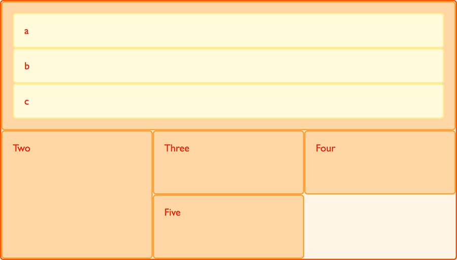
If I set box1 to display: grid I can give it a track definition and it too will become a grid, the items then lay out on this new grid.
.box1 {
  grid-column-start: 1;
  grid-column-end: 4;
  grid-row-start: 1;
  grid-row-end: 3;
  display: grid;
  grid-template-columns: repeat(3, 1fr);
}
In this case the nested grid has no relationship to the parent. As you can see in the example it has not inherited the grid-gap of the parent and the lines in the nested grid do not align to the lines in the parent grid.
Subgrid
In the level 1 grid specification there is a feature called subgrid which would let us create nested grids that use the track definition of the parent grid.
備註:Subgrids are not yet implemented in any browsers, and the specification is subject to change.
In the current specification, we would edit the above nested grid example to use display: subgrid rather than display: grid, then remove the track definition. The nested grid will use the parent grid tracks to lay out items.
It should be noted that the nested grid is in both dimensions—rows and columns. There is no concept of the implicit grid working with subgrids. This means you need to ensure that the parent grid has enough row and column tracks for all the subitems.
.box1 {
  grid-column-start: 1;
  grid-column-end: 4;
  grid-row-start: 1;
  grid-row-end: 3;
  display: subgrid;
}
Layering items with z-index
Grid items can occupy the same cell. If we return to our example with items positioned by line number, we can change this to make two items overlap.
<div class="wrapper">
  <div class="box box1">One</div>
  <div class="box box2">Two</div>
  <div class="box box3">Three</div>
  <div class="box box4">Four</div>
  <div class="box box5">Five</div>
</div>
.wrapper {
  display: grid;
  grid-template-columns: repeat(3, 1fr);
  grid-auto-rows: 100px;
}
.box1 {
  grid-column-start: 1;
  grid-column-end: 4;
  grid-row-start: 1;
  grid-row-end: 3;
}
.box2 {
  grid-column-start: 1;
  grid-row-start: 2;
  grid-row-end: 4;
}
The item box2 is now overlapping box1, it displays on top as it comes later in the source order.
Controlling the order
We can control the order in which items stack up by using the z-index property - just as with positioned items. If we give box2 a lower z-index than box1 it will display below box1 in the stack.
.wrapper {
  display: grid;
  grid-template-columns: repeat(3, 1fr);
  grid-auto-rows: 100px;
}
.box1 {
  grid-column-start: 1;
  grid-column-end: 4;
  grid-row-start: 1;
  grid-row-end: 3;
  z-index: 2;
}
.box2 {
  grid-column-start: 1;
  grid-row-start: 2;
  grid-row-end: 4;
  z-index: 1;
}
下一步
In this article we have had a very quick look through the Grid Layout Specification. Have a play with the code examples, and then move onto the next part of this guide where we will really start to dig into the detail of CSS Grid Layout.