align-content
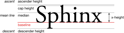
Baseline
Widely available
*
This feature is well established and works across many devices and browser versions. It’s been available across browsers since 2015년 9월.
* Some parts of this feature may have varying levels of support.
CSS align-content 속성은 콘텐츠 사이와 콘텐츠 주위 빈 공간을 플렉스 박스'의 교차축 또는 그리드의 블록 축을 따라 배치하는 방식을 결정합니다.
아래의 대화형 예제는 그리드 레이아웃을 사용해 이 속성의 값을 시연합니다.
시도해 보기
align-content: start;
align-content: center;
align-content: space-between;
align-content: space-around;
<section class="default-example" id="default-example">
  <div class="example-container">
    <div class="transition-all" id="example-element">
      <div>One</div>
      <div>Two</div>
      <div>Three</div>
    </div>
  </div>
</section>
#example-element {
  border: 1px solid #c5c5c5;
  display: grid;
  grid-template-columns: 60px 60px;
  grid-auto-rows: 40px;
  column-gap: 10px;
  height: 180px;
}

#example-element > div {
  background-color: rgba(0, 0, 255, 0.2);
  border: 3px solid blue;
}
이 속성은 한 줄로만 이루어진 플렉스 컨테이너에는 아무 효과도 없습니다(flex-wrap: nowrap 등).
Syntax
/* Basic positional alignment */
/* align-content does not take left and right values */
align-content: center; /* Pack items around the center */
align-content: start; /* Pack items from the start */
align-content: end; /* Pack items from the end */
align-content: flex-start; /* Pack flex items from the start */
align-content: flex-end; /* Pack flex items from the end */
/* Normal alignment */
align-content: normal;
/* Baseline alignment */
align-content: baseline;
align-content: first baseline;
align-content: last baseline;
/* Distributed alignment */
align-content: space-between; /* Distribute items evenly
                                 The first item is flush with the start,
                                 the last is flush with the end */
align-content: space-around; /* Distribute items evenly
                                 Items have a half-size space
                                 on either end */
align-content: space-evenly; /* Distribute items evenly
                                 Items have equal space around them */
align-content: stretch; /* Distribute items evenly
                                 Stretch 'auto'-sized items to fit
                                 the container */
/* Overflow alignment */
align-content: safe center;
align-content: unsafe center;
/* Global values */
align-content: inherit;
align-content: initial;
align-content: revert;
align-content: unset;
값
start-
플렉스/그리드 항목을 한 덩어리로 뭉쳐서 정렬 컨테이너 교차축의 시작 모서리에 배치합니다.
end-
플렉스/그리드 항목을 한 덩어리로 뭉쳐서 정렬 컨테이너 교차축의 끝 모서리에 배치합니다.
flex-start-
플렉스 항목을 한 덩어리로 뭉치고, 플렉스 컨테이너의 교차 시작점에 따라 정렬 컨테이너 모서리에 배치합니다. 플렉스 레이아웃 항목에만 적용됩니다. 플렉스 컨테이너의 자식이 아닌 항목에 대해서는
start로 취급합니다. flex-end-
플렉스 항목을 한 덩어리로 뭉치고, 플렉스 컨테이너의 교차 끝점에 따라 정렬 컨테이너 모서리에 배치합니다. 플렉스 레이아웃 항목에만 적용됩니다. 플렉스 컨테이너의 자식이 아닌 항목에 대해서는
end로 취급합니다. center-
플렉스/그리드 항목을 한 덩어리로 뭉쳐서 정렬 컨테이너 교차축의 중앙에 배치합니다.
normal-
align-content를 지정하지 않았을 때처럼, 플렉스/그리드 항목을 한 덩어리로 뭉쳐서 기본 위치에 배치합니다. baseline,first baseline,last baseline-
첫 번째 또는 마지막 기준선에 대해 명시합니다. 박스의 첫 번째 또는 마지막 기준선 집합을 기준선을 공유하는 모든 박스의 첫 번째 또는 마지막 기준선과 정렬합니다.
first baseline의 대체 정렬은start,last baseline의 대체 정렬은end입니다. space-between-
정렬 컨테이너의 교차축을 따라 항목을 고르게 배치합니다. 이웃한 항목간의 거리가 동일해집니다. 첫 항목은 정렬 컨테이너 교차축의 시작점에, 마지막 항목은 정렬 컨테이너 교차축의 종료점에 붙입니다.
space-around-
정렬 컨테이너의 교차축을 따라 항목을 고르게 배치합니다. 이웃한 항목간의 거리가 동일해집니다. 첫 항목 이전 여백과 마지막 항목 이후 여백은 각 항목간 거리의 절반이 됩니다.
space-evenly-
정렬 컨테이너의 교차축을 따라 항목을 고르게 배치합니다. 이웃한 항목간의 거리, 첫 항목 이전 여백, 마지막 항목 이후 여백이 모두 같아집니다.
stretch-
모든 항목의 교차축 방향 크기의 합이 정렬 컨테이너보다 작은 경우, 모든
auto크기의 항목이 동일(비례하지 않음)하게 커져서 정렬 컨테이너의 교차축 방향을 가득 채웁니다. 단, 항목에 지정한max-height/max-width등의 크기 제한은 준수합니다. safe-
정렬 키워드와 함께 사용합니다. 주어진 키워드로 인해 항목이 정렬 컨테이너 밖으로 오버플로하게 되어 데이터가 유실될 수 있으면 항목 정렬에
start를 대신 사용합니다. unsafe-
정렬 키워드와 함께 사용합니다. 컨테이너와 항목의 상대적 크기 및 오버플로로 인한 데이터 유실에 상관하지 않고 주어진 정렬을 준수합니다.
형식 정의
| 초기값 | normal |
|---|---|
| 적용대상 | Block-containers, multi-column containers, flex containers |
| 상속 | no |
| 계산 값 | as specified |
| Animation type | discrete |
형식 구문
align-content =
  normal                                   |
  <baseline-position>                      |
  <content-distribution>                   |
  <overflow-position>? <content-position>

<baseline-position> =
  [ first | last ]?  &&
  baseline

<content-distribution> =
  space-between  |
  space-around   |
  space-evenly   |
  stretch

<overflow-position> =
  unsafe  |
  safe

<content-position> =
  center      |
  start       |
  end         |
  flex-start  |
  flex-end
예제
CSS
#container {
  height: 200px;
  width: 240px;
  align-content: center; /* Can be changed in the live sample */
  background-color: #8c8c8c;
}
.flex {
  display: flex;
  flex-wrap: wrap;
}
.grid {
  display: grid;
  grid-template-columns: repeat(auto-fill, 50px);
}
div > div {
  box-sizing: border-box;
  border: 2px solid #8c8c8c;
  width: 50px;
  display: flex;
  align-items: center;
  justify-content: center;
}
#item1 {
  background-color: #8cffa0;
  min-height: 30px;
}
#item2 {
  background-color: #a0c8ff;
  min-height: 50px;
}
#item3 {
  background-color: #ffa08c;
  min-height: 40px;
}
#item4 {
  background-color: #ffff8c;
  min-height: 60px;
}
#item5 {
  background-color: #ff8cff;
  min-height: 70px;
}
#item6 {
  background-color: #8cffff;
  min-height: 50px;
  font-size: 30px;
}
select {
  font-size: 16px;
}
.row {
  margin-top: 10px;
}
HTML
<div id="container" class="flex">
  <div id="item1">1</div>
  <div id="item2">2</div>
  <div id="item3">3</div>
  <div id="item4">4</div>
  <div id="item5">5</div>
  <div id="item6">6</div>
</div>

<div class="row">
  <label for="display">display: </label>
  <select id="display">
    <option value="flex">flex</option>
    <option value="grid">grid</option>
  </select>
</div>

<div class="row">
  <label for="values">align-content: </label>
  <select id="values">
    <option value="normal">normal</option>
    <option value="stretch">stretch</option>
    <option value="flex-start">flex-start</option>
    <option value="flex-end">flex-end</option>
    <option value="center" selected>center</option>
    <option value="space-between">space-between</option>
    <option value="space-around">space-around</option>
    <option value="space-evenly">space-evenly</option>

    <option value="start">start</option>
    <option value="end">end</option>
    <option value="left">left</option>
    <option value="right">right</option>

    <option value="baseline">baseline</option>
    <option value="first baseline">first baseline</option>
    <option value="last baseline">last baseline</option>

    <option value="safe center">safe center</option>
    <option value="unsafe center">unsafe center</option>
    <option value="safe right">safe right</option>
    <option value="unsafe right">unsafe right</option>
    <option value="safe end">safe end</option>
    <option value="unsafe end">unsafe end</option>
    <option value="safe flex-end">safe flex-end</option>
    <option value="unsafe flex-end">unsafe flex-end</option>
  </select>
</div>
결과
명세
| Specification |
|---|
| CSS Box Alignment Module Level 3 # align-justify-content |
| CSS Flexible Box Layout Module Level 1 # align-content-property |
브라우저 호환성
같이 보기
- CSS Flexbox Guide: Basic Concepts of Flexbox
- CSS Flexbox Guide: Aligning items in a flex container
- CSS Grid Guide: Box alignment in CSS Grid layouts
- CSS Box Alignment