Aligning Items in a Flex Container
Uma das razões pela qual flexbox rapidamente despertou interesse dos desenvolvedores web é que ela trouxe capacidade de alinhamento apropriada para web pela primeira vez. Tem capacidade de alinhamento vertical apropriada, e assim finalmente podemos de modo fácil centralizar uma caixa. Neste guia, veremos detalhadamente como as propriedades de alinhamento e justificação funcionam no Flexbox.
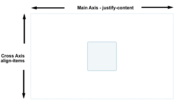
Para centralizar nossa caixa nós usamos a propriedade align-items para alinhar nosso item no eixo transversal, que neste caso é o eixo do bloco indo verticalmente. Nós usamos justify-content para alinhar o item no eixo principal, que neste caso é o eixo indo horizontalmente.
Você pode dar uma olhada no código deste exemplo abaixo. Altere o tamanho do container ou elemento aninhado e o elemento aninhado sempre permanece centralizado.
Propriedades que controlam o alinhamento
As propriedades que nós veremos neste guia são as seguintes.
justify-content— controla o alinhamento de todos os itens no eixo principal.align-items— controla o alinhamento de todos os itens no eixo transversal.align-self— controla o alinhamento individual de um item no eixo transversal.align-content— descrito na especificação como "packing flex lines"; controla o espaço entre as linhas no eixo transversal.
Nós também descobriremos como margens automáticas podem ser utilizadas para o alinhamento no flexbox.
Nota: The alignment properties in Flexbox have been placed into their own specification — CSS Box Alignment Level 3. It is expected that this spec will ultimately supersede the properties as defined in Flexbox Level One.
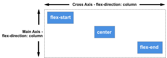
The Cross Axis
As propriedades align-items e align-self controlam o alinhamento dos nossos itens no eixo transversal, em colunas se flex-direction é row e entre linhas se flex-direction é column.
Nós estamos usando o alinhamento transversal na maioria dos exemplos. Se adicionarmos display: flex para um contêiner, todos os itens filhos se tornam itens flexíveis organizados em uma linha. Todos irão se esticar para serem tão altos quanto o item mais alto, pois este item define a altura dos itens no eixo transversal. Se o seu contêiner possui uma altura definida, então os itens se estenderão para esta altura, independemente da quantidade de conteúdo que está dentro deste item.
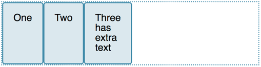
A razão pela qual os itens passam a ter a mesma altura é que o valor inicial do align-items, a propriedade que controla o alinhamento do eixo transversal, está definida como stretch.
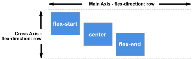
Nós podemos usar outros valores para controlar como os itens se alinham:
align-items: flex-startalign-items: flex-endalign-items: centeralign-items: stretchalign-items: baseline
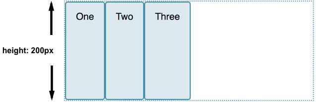
No exemplo abaixo, o valor do align-items está definido como stretch. Tente outros valores e veja como todos os itens se alinham no contêiner.
Alinhando um item com align-self
A propriedade align-items adiciona a propriedade align-self em todos os itens flex como um grupo. Ou seja, você pode explicitamente declarar a propriedade align-self para impactar um único item. A propriedade align-self aceita todos os mesmo valores que align-items mais o valor auto, que irá resetar o valor que está configurado no container flex.
Neste próximo exemplo, o container flex possui align-items: flex-start, que implica em todos os itens estarem alinhados ao início do eixo transversal. Foquei no primeiro item usando o seletor first-child e configurei este item para align-self: stretch; outro item foi selecionado usando a classe selected e align-self: center. Você pode mudar o valor do align-items ou mudar o valor do align-self para focar em itens individuais para ver como funciona.
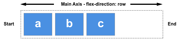
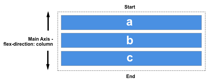
Changing the main axis
So far we have looked at the behaviour when our flex-direction is row, and while working in a language written top to bottom. This means that the main axis runs along the row horizontally, and our cross axis alignment moves the items up and down.
If we change our flex-direction to column, align-items and align-self will align the items to the left and right.
You can try this out in the example below, which has a flex container with flex-direction: column yet otherwise is exactly the same as the previous example.
Aligning content on the cross axis — the align-content property
So far we have been aligning the items, or an individual item inside the area defined by the flex-container. If you have a wrapped multiple-line flex container then you might also want to use the align-content property to control the distribution of space between the rows. In the specification this is described as packing flex lines.
For align-content to work you need more height in your flex container than is required to display the items. It then works on all the items as a set, and dictates what happens with that free space, and the alignment of the entire set of items within it.
The align-content property takes the following values:
align-content: flex-startalign-content: flex-endalign-content: centeralign-content: space-betweenalign-content: space-aroundalign-content: stretchalign-content: space-evenly(not defined in the Flexbox specification)
In the live example below, the flex container has a height of 400 pixels, which is more than needed to display our items. The value of align-content is space-between, which means that the available space is shared out between the flex lines, which are placed flush with the start and end of the container on the cross axis.
Try out the other values to see how the align-content property works.
Once again we can switch our flex-direction to column in order to see how this property behaves when we are working by column. As before, we need enough space in the cross axis to have some free space after displaying all of the items.
Nota:
the value space-evenly is not defined in the flexbox specification and is a later addition to the Box Alignment specification. Browser support for this value is not as good as that of the values defined in the flexbox spec.
See the documentation for justify-content on MDN for more details on all of these values and browser support.
Aligning content on the main axis
Now that we have seen how alignment works on the cross axis, we can take a look at the main axis. Here we only have one property available to us — justify-content. This is because we are only dealing with items as a group on the main axis. With justify-content we control what happens with available space, should there be more space than is needed to display the items.
In our initial example with display: flex on the container, the items display as a row and all line up at the start of the container. This is due to the initial value of justify-content being flex-start. Any available space is placed at the end of the items.
The justify-content property accepts the same values as align-content.
justify-content: flex-startjustify-content: flex-endjustify-content: centerjustify-content: space-betweenjustify-content: space-aroundjustify-content: stretchjustify-content: space-evenly(not defined in the Flexbox specification)
In the example below, the value of justify-content is space-between. The available space after displaying the items is distributed between the items. The left and right item line up flush with the start and end.
If the main axis is in the block direction because flex-direction is set to column, then justify-content will distribute space between items in that dimension as long as there is space in the flex container to distribute.
Alignment and Writing Modes
Remember that with all of these alignment methods, the values of flex-start and flex-end are writing mode-aware. If the value of justify-content is start and the writing mode is left-to-right as in English, the items will line up starting at the left side of the container.
However if the writing mode is right-to-left as in Arabic, the items will line up starting at the right side of the container.
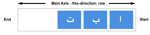
The live example below has the direction property set to rtl to force a right-to-left flow for our items. You can remove this, or change the values of justify-content to see how flexbox behaves when the start of the inline direction is on the right.
Alignment and flex-direction
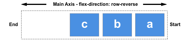
The start line will also change if you change the flex-direction property — for example using row-reverse instead of row.
In this next example I have items laid out with flex-direction: row-reverse and justify-content: flex-end. In a left to right language the items all line up on the left. Try changing flex-direction: row-reverse to flex-direction: row. You will see that the items now move to the right hand side.
While this may all seem a little confusing, the rule to remember is that unless you do something to change it, flex items lay themselves out in the direction that words are laid out in the language of your document along the inline, row axis. flex-start will be where the start of a sentence of text would begin.

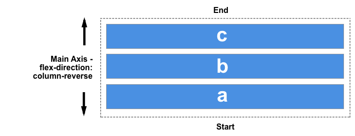
You can switch them to display in the block direction for the language of your document by selecting flex-direction: column. Then flex-start will then be where the top of your first paragraph of text would start.
If you change flex-direction to one of the reverse values, then they will lay themselves out from the end axis and in the reverse order to the way words are written in the language of your document. flex-start will then change to the end of that axis — so to the location where your lines would wrap if working in rows, or at the end of your last paragraph of text in the block direction.
Using auto margins for main axis alignment
We don't have a justify-items or justify-self property available to us on the main axis as our items are treated as a group on that axis. However it is possible to do some individual alignment in order to separate an item or a group of items from others by using auto margins along with flexbox.
A common pattern is a navigation bar where some key items are aligned to the right, with the main group on the left. You might think that this should be a use case for a justify-self property, however consider the image below. I have three items on one side and two on the other. If I were able to use justify-self on item d, it would also change the alignment of item e that follows, which may or may not be my intention.
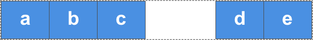
Instead we can target item 4 and separate it from the first three items by giving it a margin-left value of auto. Auto margins will take up all of the space that they can in their axis — it is how centering a block with margin auto left and right works. Each side tries to take as much space as it can, and so the block is pushed into the middle.
In this live example, I have flex items arranged simply into a row with the basic flex values, and the class push has margin-left: auto. You can try removing this, or adding the class to another item to see how it works.
Future alignment features for Flexbox
At the beginning of this article I explained that the alignment properties currently contained in the Level 1 flexbox specification are also included in Box Alignment Level 3, which may well extend these properties and values in the future. We have already seen one place where this has happened, with the introduction of the space-evenly value for align-content and justify-content properties.
The Box Alignment module also includes other methods of creating space between items, such as the column-gap and row-gap feature as seen in CSS Grid Layout. The inclusion of these properties in Box Alignment means that in future we should be able to use column-gap and row-gap in flex layouts too, and in Firefox 63 you will find the first browser implementation of the gap properties in flex layout.
My suggestion when exploring flexbox alignment in depth is to do so alongside looking at alignment in Grid Layout. Both specifications use the alignment properties as detailed in the Box Alignment specification. You can see how these properties behave when working with a grid in the MDN article Box Alignment in Grid Layout, and I have also compared how alignment works in these specifications in my Box Alignment Cheatsheet.