border-top-right-radius
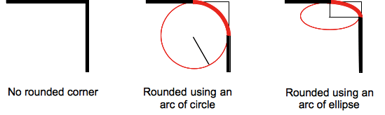
border-top-right-radius 属性设置元素的右上角弧形,这个圆弧可能是一个椭圆,或者其中一个值是 0 的话,就是没有圆弧,换句话就是说拐角是方形的。
一个背景通常以一张图片或者颜色开始,在边框处被剪切,更甚至就是一个圆形;剪切的额外定位通过一个 CSS 属性"background-clip"来定义。
备注:在 border-top-radius-radiu 属性值之后,如果作用在一个元素上没有设置“border-radius”简写属性,那么这个属性值就会通过简写属性重新设置成它的初始值。
语法
css
/* the corner is a circle */
/* border-top-right-radius: radius */
border-top-right-radius: 3px;

/* the corner is an ellipse */
/* border-top-right-radius: horizontal vertical */
border-top-right-radius: 0.5em 1em;

border-top-right-radius: inherit;

/* Global values */
border-top-right-radius: inherit;
border-top-right-radius: initial;
border-top-right-radius: revert;
border-top-right-radius: revert-layer;
border-top-right-radius: unset;
之上:
- radius
-
这是一个
<length>或<percentage>,标志着圆的半径在这个拐角用作边框。 - horizontal
-
这是一个
<length>或<percentage>,标志着椭圆的水平半长轴在这个拐角被用作边框。 - vertical
-
这是一个
<length>或<percentage>,标志着椭圆的垂直半长轴在这个拐角被用作边框。
属性值
形式定义
| 初始值 | 0 |
|---|---|
| 适用元素 | all elements; but User Agents are not required to apply to table and inline-table elements when border-collapse is collapse. The behavior on internal table elements is undefined for the moment.. It also applies to ::first-letter. |
| 是否是继承属性 | 否 |
| Percentages | refer to the corresponding dimension of the border box |
| 计算值 | two absolute <length>s or <percentage>s |
| 动画类型 | a length, percentage or calc(); |
形式语法
border-top-right-radius =
  <border-radius>

<border-radius> =
  <slash-separated-border-radius-syntax>  |
  <legacy-border-radius-syntax>

<slash-separated-border-radius-syntax> =
  <length-percentage [0,∞]> [ / <length-percentage [0,∞]> ]?

<legacy-border-radius-syntax> =
  <length-percentage [0,∞]>{1,2}

<length-percentage> =
  <length>      |
  <percentage>
示例
| 实例 | 代码 |
|---|---|
圆形的弧被用作边框
|
|
椭圆的弧被用作边框
|
|
盒子是方形,圆形的弧被用作边框
|
|
盒子不是方形,椭圆的弧被用作边框
|
|
背景颜色在边框处剪切
|
规范
| 规范 |
|---|
| CSS Backgrounds and Borders Module Level 3 # propdef-border-top-right-radius |
浏览器兼容性
参见
边框半径相关的 CSS 属性:CSS 速记 border-radius, 其他角的属性:border-top-left-radius, border-bottom-right-radius和 border-bottom-left-radius。