transform-function
<transform-function> CSS 数据类型用于对元素的显示做变换。通常,这种变换可以由矩阵表示,并且可以使用每个点上的矩阵乘法来确定所得到的图像。
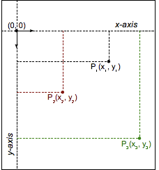
2D 图形 的坐标系统
笛卡尔坐标
在笛卡尔坐标系中,每个 欧氏空间 里的点都由横坐标和纵坐标这两个值来确定。在 CSS(和大部分的计算机图形学)中,原点 (0, 0) 在元素的左上角。每个点都使用数学上的向量符号 (x,y) 来描述。
示例
变换函数对比
以下示例提供了一个由 DOM 元素和变换创建的 3D 立方体,以及一个选择菜单,允许你选择不同的变换函数来变换立方体。因此,你可以比较不同变换类型的效果。
选择一个选项,将变换应用到立方体上;2 秒后,立方体会恢复到初始状态。立方体的初始状态使用了 transform3d() 以进行略微的旋转,以便你查看每一个变换的效果。
HTML
html
<main>
  <section id="example-element">
    <div class="face front">1</div>
    <div class="face back">2</div>
    <div class="face right">3</div>
    <div class="face left">4</div>
    <div class="face top">5</div>
    <div class="face bottom">6</div>
  </section>

  <div class="select-form">
    <label for="transfunction">选择变换函数</label>
    <select id="transfunction">
      <option selected>选择函数</option>
      <option>rotate(360deg)</option>
      <option>rotateX(360deg)</option>
      <option>rotateY(360deg)</option>
      <option>rotateZ(360deg)</option>
      <option>rotate3d(1, 1, 1, 90deg)</option>
      <option>scale(1.5)</option>
      <option>scaleX(1.5)</option>
      <option>scaleY(1.5)</option>
      <option>scaleZ(1.5)</option>
      <option>scale3d(1, 1.5, 1.5)</option>
      <option>skew(17deg, 13deg)</option>
      <option>skewX(17deg)</option>
      <option>skewY(17deg)</option>
      <option>translate(100px, 100px)</option>
      <option>translateX(100px)</option>
      <option>translateY(100px)</option>
      <option>translateZ(100px)</option>
      <option>translate3d(50px, 50px, 50px)</option>
      <option>perspective(200px)</option>
      <option>matrix(1, 2, -1, 1, 80, 80)</option>
      <option>matrix3d(1,0,0,0,0,1,3,0,0,0,1,0,50,100,0,1.1)</option>
    </select>
  </div>
</main>
CSS
css
main {
  width: 400px;
  height: 200px;
  padding: 50px;
  background-image: linear-gradient(135deg, white, cyan, white);
}

#example-element {
  width: 100px;
  height: 100px;
  transform-style: preserve-3d;
  transition: transform 1.5s;
  transform: rotate3d(1, 1, 1, 30deg);
}

.face {
  display: flex;
  align-items: center;
  justify-content: center;
  width: 100%;
  height: 100%;
  position: absolute;
  backface-visibility: inherit;
  font-size: 60px;
  color: #fff;
}

.front {
  background: rgba(90, 90, 90, 0.7);
  transform: translateZ(50px);
}

.back {
  background: rgba(0, 210, 0, 0.7);
  transform: rotateY(180deg) translateZ(50px);
}

.right {
  background: rgba(210, 0, 0, 0.7);
  transform: rotateY(90deg) translateZ(50px);
}

.left {
  background: rgba(0, 0, 210, 0.7);
  transform: rotateY(-90deg) translateZ(50px);
}

.top {
  background: rgba(210, 210, 0, 0.7);
  transform: rotateX(90deg) translateZ(50px);
}

.bottom {
  background: rgba(210, 0, 210, 0.7);
  transform: rotateX(-90deg) translateZ(50px);
}

.select-form {
  margin-top: 50px;
}
JavaScript
js
const selectElem = document.querySelector("select");
const example = document.querySelector("#example-element");

selectElem.addEventListener("change", () => {
  if (selectElem.value === "Choose a function") {
    return;
  } else {
    example.style.transform = `rotate3d(1, 1, 1, 30deg) ${selectElem.value}`;
    setTimeout(() => {
      example.style.transform = "rotate3d(1, 1, 1, 30deg)";
    }, 2000);
  }
});
结果
规范
| 规范 |
|---|
| CSS Transforms Module Level 1 # transform-functions |
| CSS Transforms Module Level 2 # transform-functions |