Example
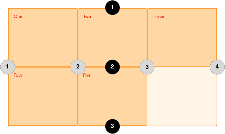
In the following example there is a grid with three column tracks and two row tracks. This gives us 4 column lines and 3 row lines.
<div class="wrapper">
  <div>One</div>
  <div>Two</div>
  <div>Three</div>
  <div>Four</div>
  <div>Five</div>
</div>
.wrapper {
  display: grid;
  grid-template-columns: repeat(3, 1fr);
  grid-template-rows: 100px 100px;
}
Lines can be addressed using their line number. In a left-to-right language such as English, column line 1 will be on the left of the grid, row line 1 on the top. Lines numbers respect the writing mode of the document and so in a right-to-left language for example, column line 1 will be on the right of the grid. The image below shows the line numbers of the grid, assuming the language is left-to-right.
Lines are also created in the implicit grid when implicit tracks are created to hold content positioned outside of the explicit grid, however these lines cannot be addressed by a number.
Placing items onto the grid by line number
Having created a grid, you can place items onto the grid by line number. In the following example the item is positioned from column line 1 to column line 3, and from row line 1 to row line 3.
<div class="wrapper">
  <div class="item">Item</div>
</div>
.wrapper {
  display: grid;
  grid-template-columns: repeat(3, 1fr);
  grid-template-rows: 100px 100px;
}
.item {
  grid-column-start: 1;
  grid-column-end: 3;
  grid-row-start: 1;
  grid-row-end: 3;
}
Naming lines
The lines created in the explicit grid can be named, by adding the name in square brackets before or after the track sizing information. When placing an item, you can then use these names instead of the line number, as demonstrated below.
<div class="wrapper">
  <div class="item">Item</div>
</div>
.wrapper {
  display: grid;
  grid-template-columns: [col1-start] 1fr [col2-start] 1fr [col3-start] 1fr [cols-end];
  grid-template-rows: [row1-start] 100px [row2-start] 100px [rows-end];
}
.item {
  grid-column-start: col1-start;
  grid-column-end: col3-start;
  grid-row-start: row1-start;
  grid-row-end: rows-end;
}