Challenge: A mobile-first layout
After you're done with this challenge, you can move on to learning about implementing dynamic behavior with JavaScript.
Starting point
We are going to get you to solve this challenge in your local development environment; ideally, you'll want to view the example in a full browser window to make sure the layout features are working as expected.
-
Create a new folder on your computer called
mobile-first-challenge. -
Inside the folder, create an
index.htmlfile and paste the following content into it:html<!doctype html> <html lang="en-US"> <head> <meta charset="utf-8" /> <title>RWD Task</title> <link href="style.css" rel="stylesheet" type="text/css" /> <script defer src="script.js"></script> </head> <body> <header> <div class="logo">My exciting website!</div> <button aria-label="Open menu">☰</button> </header> <main class="grid"> <nav> <ul> <li><a href="#">Home</a></li> <li><a href="#">Blog</a></li> <li><a href="#">About us</a></li> <li><a href="#">Our history</a></li> <li><a href="#">Contacts</a></li> </ul> </nav> <article> <h1>An Exciting Blog Post</h1> <img src="images/square6.jpg" alt="placeholder" class="feature" /> <p> Veggies es bonus vobis, proinde vos postulo essum magis kohlrabi welsh onion daikon amaranth tatsoi tomatillo melon azuki bean garlic. </p> <p> Turnip greens yarrow ricebean rutabaga endive cauliflower sea lettuce kohlrabi amaranth water spinach avocado daikon napa asparagus winter purslane kale. Celery potato scallion desert raisin horseradish spinach carrot soko. Lotus root water spinach fennel kombu maize bamboo shoot green bean swiss chard seakale pumpkin onion chickpea gram corn pea. Brussels sprout coriander water chestnut gourd swiss chard wakame kohlrabi beetroot carrot watercress. Corn amaranth salsify bunya nuts nori azuki bean chickweed potato bell pepper artichoke. </p> <p> Gumbo beet greens corn soko endive gumbo gourd. Parsley shallot courgette tatsoi pea sprouts fava bean collard greens dandelion okra wakame tomato. Dandelion cucumber earthnut pea peanut soko zucchini. </p> <p> Nori grape silver beet broccoli kombu beet greens fava bean potato quandong celery. Bunya nuts black-eyed pea prairie turnip leek lentil turnip greens parsnip. Sea lettuce lettuce water chestnut eggplant winter purslane fennel azuki bean earthnut pea sierra leone bologi leek soko chicory celtuce parsley jícama salsify. </p> <p> Celery quandong swiss chard chicory earthnut pea potato. Salsify taro garlic gram celery wattle seed collard greens nori. Grape wattle seed kombu beetroot horseradish carrot squash brussels sprout chard. </p> <p> Veggies es bonus vobis, proinde vos postulo essum magis kohlrabi welsh onion daikon amaranth tatsoi tomatillo melon azuki bean garlic. </p> <p> Turnip greens yarrow ricebean rutabaga endive cauliflower sea lettuce kohlrabi amaranth water spinach avocado daikon napa asparagus winter purslane kale. Celery potato scallion desert raisin horseradish spinach carrot soko. Lotus root water spinach fennel kombu maize bamboo shoot green bean swiss chard seakale pumpkin onion chickpea gram corn pea. Brussels sprout coriander water chestnut gourd swiss chard wakame kohlrabi beetroot carrot watercress. Corn amaranth salsify bunya nuts nori azuki bean chickweed potato bell pepper artichoke. </p> </article> <aside> <h2>Photography</h2> <ul class="photos"> <li><img src="images/square1.jpg" alt="placeholder" /></li> <li><img src="images/square2.jpg" alt="placeholder" /></li> <li><img src="images/square3.jpg" alt="placeholder" /></li> <li><img src="images/square4.jpg" alt="placeholder" /></li> <li><img src="images/square5.jpg" alt="placeholder" /></li> </ul> </aside> </main> </body> </html> -
Inside the folder, create a
style.cssfile and paste the following content into it:css/* General styles */ * { box-sizing: border-box; } body { background-color: white; color: #333333; margin: 0; font: 1.2em / 1.6 sans-serif; padding: 0 20px 20px 20px; } img { display: block; border: 1px solid black; } /* Mobile layout */ header { padding: 50px 0; display: flex; gap: 20px; justify-content: space-between; align-items: center; } .logo { font-size: 200%; } button { font-size: 250%; border: 0; background: none; cursor: pointer; } button:hover, button:focus { text-shadow: 0 0 2px black; } nav { position: fixed; inset: 10%; background-color: white; display: none; } nav ul { margin: 0; padding: 0; list-style: none; text-align: center; height: 100%; display: flex; gap: 10px; flex-direction: column; } nav li { flex: 1; } nav a { display: flex; justify-content: center; align-items: center; font-size: 150%; width: 100%; height: 100%; background-color: black; color: white; text-decoration: none; } nav a:hover, nav a:focus { font-weight: bold; } .photos { list-style: none; margin: 0; padding: 0; display: grid; gap: 5px; grid-template-columns: 1fr 1fr; } .feature { width: 200px; float: left; margin: 8px 30px 20px 0; } -
Inside the folder, create a
script.jsfile and paste the following content into it:jsconst btn = document.querySelector("button"); const nav = document.querySelector("nav"); function showNav() { nav.style.display = "block"; } function hideNav() { nav.style.display = "none"; } function hideNavEsc(e) { if (e.key === "Escape") { nav.style.display = "none"; } } function handleEventListeners() { if (matchMedia("(width > 800px)").matches) { btn.removeEventListener("click", showNav); nav.removeEventListener("click", hideNav); document.body.removeEventListener("keydown", hideNavEsc); if (nav.style.display === "none") { nav.style.display = "block"; } } else { btn.addEventListener("click", showNav); nav.addEventListener("click", hideNav); document.body.addEventListener("keydown", hideNavEsc); if (nav.style.display === "block") { nav.style.display = "none"; } } } handleEventListeners(); window.addEventListener("resize", handleEventListeners); -
Inside the folder, create a subfolder called
imagesand save the following image files inside it: -
Save your files and load
index.htmlin a browser, ready to test. The starting point of the page should look something like this when viewed in a narrow viewport: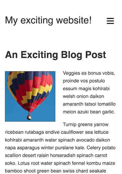
Project brief
The content provided for this example is the same as the content from the previous challenge, Fundamental layout comprehension, with some minor structural differences. It also has a mostly complete layout from the beginning, although as you may have noticed from checking it out, it looks terrible in a widescreen viewport!
This is because we've provided you with a mobile layout to begin with. Note how the navigation menu is accessed by pressing the "hamburger menu" icon, and can be dismissed by clicking a menu item or pressing the Esc key. This functionality is handled using JavaScript, and only works when the viewport is less than 800px wide so that it doesn't interfere with the wider-screen layouts you'll be implementing.
Specifically, we want you to implement two layouts: the first one triggers when the width is more than 800px, and the second triggers at above 1300px. We'll also get you to fix a couple of issues with the existing code and implement some additional features.
Fixing a couple of display issues
First of all, you'll need to solve a couple of problems that we've left in the starting template.
- At the moment, your layouts won't display properly in mobile browsers. Add a tag to the
<head>of your<html>document to fix this. - With the browser window set to a narrow width, look at the bottom of the page — you'll see that the photo gallery is not displaying properly because the photographs are breaking out of their containers. Add a declaration to your CSS file to fix this.
Creating the middle layout
The middle layout needs to be applied to the page above a viewport width of 800px. Follow these steps to complete the layout:
- Hide the menu
<button>and show the<nav>. We only want to use the hide/show menu in the mobile layout. - Change the positioning of the
<nav>so that, instead of sitting over the top of most of the content, it sits at the top of the site, just below the "My exciting website!" logo. We also want it to stick to the top of the viewport once the content has scrolled up that far. - The navigation list items are currently displaying in a column. For this layout, you instead want them to display as a row across the entire screen.
- Adjust the
<a>elements inside the list items to give them10pxof top and bottom padding, and a smaller font size (say100%). - The
<nav>,<article>, and<aside>elements are all children of the<main>element. We'd like you to lay them out as a grid, using named grid template areas, in the following structure:┌----------------------------------------┐ | <nav> | ├------------------------------┬---------┤ | <article> | <aside> | | | |
The<article>element should have a width three times that of the<aside>element; both elements should sit on the same row. The<nav>element should be on a separate row above the other two elements and span all the available width. We'd also like you to include a gap of20pxbetween the different grid items.
Creating the widescreen layout
The widescreen layout needs to be applied to the page above a viewport width of 1300px. Follow these steps to complete the layout:
- Change the grid layout you implemented for the middle layout to a different one, again using named grid template areas. This time, the structure should be like this:
┌--------┬------------------------------┬---------┐
| <nav>  |           <article>          | <aside> |
|        |                              |         |
This time, all three elements are on the same row. The<nav>and<aside>elements should take up the same width; the<article>element should be three times the width of the other two. - The navigation list items are displaying in a row as a result of the middle layout; for the widescreen layout to work, you'll need to adjust the list styling so that the list items display in a column again, like they did in the mobile layout.
- The list items currently have a
flexvalue of1, meaning that they'll stretch to fill the entire height of the column. Adjust this property value so that the nav items are only as tall as their content and the setpadding.
Implementing responsive typography
We want you to adjust the styling of the <h1> and <h2> elements so that they:
- Have their top and bottom
marginremoved so they fit more snugly with the content above and below. - Change their size responsively as the viewport is widened or narrowed, while still being zoomable. You should choose appropriate units so that the headings fill up the available space nicely without breaking onto multiple lines.
Adjusting the layout for print
Add a style block that removes the <button> and <nav> elements from the layout when you are printing the page.
Hints and tips
- You don't need to edit the JavaScript to complete this challenge.
- There are a few ways to achieve some of the tasks in the project brief, and there often isn't a single right or wrong way to do things. Try a few different approaches and see what works best. Make notes as you experiment.
- Sometimes, a property value set for a previous layout will cause problems with subsequent layouts. Some of the skill with responsive design is knowing when to unset or override previously-set property values.
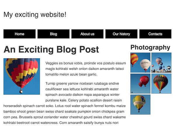
Example
The following screenshot shows what the finished middle layout should look like:
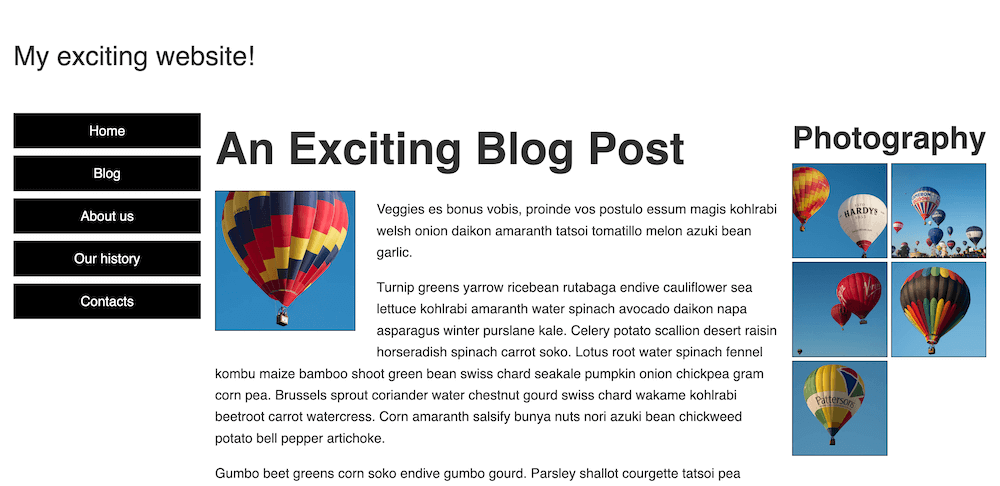
The following screenshot shows what the finished widescreen layout should look like:
Click here to show a possible solution
To cause the layouts to display properly in mobile browsers, you need to add a viewport <meta> tag inside the <head> of the HTML document:
<meta name="viewport" content="width=device-width, initial-scale=1" />
The finished CSS should look something like this:
/* General styles */

* {
  box-sizing: border-box;
}

body {
  background-color: white;
  color: #333333;
  margin: 0;
  font: 1.2em / 1.6 sans-serif;
  padding: 0 20px 20px 20px;
}

img {
  display: block;
  border: 1px solid black;
  /* Solution: Stop the photographs from breaking out of
  their containers */
  max-width: 100%;
}

/* Mobile layout */

header {
  padding: 50px 0;
  display: flex;
  gap: 20px;
  justify-content: space-between;
  align-items: center;
}

.logo {
  font-size: 200%;
}

button {
  font-size: 250%;
  border: 0;
  background: none;
  cursor: pointer;
}

button:hover,
button:focus {
  text-shadow: 0 0 2px black;
}

nav {
  position: fixed;
  inset: 10%;
  background-color: white;
  display: none;
}

nav ul {
  margin: 0;
  padding: 0;
  list-style: none;
  text-align: center;
  height: 100%;
  display: flex;
  gap: 10px;
  flex-direction: column;
}

nav li {
  flex: 1;
}

nav a {
  display: flex;
  justify-content: center;
  align-items: center;
  font-size: 150%;
  width: 100%;
  height: 100%;
  background-color: black;
  color: white;
  text-decoration: none;
}

nav a:hover,
nav a:focus {
  font-weight: bold;
}

.photos {
  list-style: none;
  margin: 0;
  padding: 0;
  display: grid;
  gap: 5px;
  grid-template-columns: 1fr 1fr;
}

.feature {
  width: 200px;
  float: left;
  margin: 8px 30px 20px 0;
}

/* Solution: Creating the middle layout (breakpoint: 800px) */

@media (width > 800px) {
  /* Sort out navigation styling for middle breakpoint */
  button {
    display: none;
  }

  nav {
    display: block;
    inset: unset;
    position: sticky;
    top: 0;
  }

  nav ul {
    flex-direction: row;
  }

  nav a {
    font-size: 100%;
    padding: 10px 0;
  }

  /* Create grid layout for middle breakpoint */

  nav {
    grid-area: nav;
  }

  article {
    grid-area: main;
  }

  aside {
    grid-area: photos;
  }

  .grid {
    display: grid;
    grid-template-columns: 3fr 1fr;
    grid-template-areas:
      "nav nav"
      "main photos";
    gap: 20px;
  }
}

/* Solution: Creating the widescreen layout (breakpoint: 1300px) */

@media (width > 1300px) {
  .grid {
    grid-template-columns: 1fr 3fr 1fr;
    grid-template-areas: "nav main photos";
  }

  nav ul {
    flex-direction: column;
  }

  nav li {
    flex: unset;
  }
}

/* 4. Solution: Implementing responsive typography */

h1 {
  font-size: calc(1.3rem + 3vw);
  margin: 0;
}

h2 {
  font-size: calc(1rem + 2vw);
  margin: 0;
}

/* 5. Solution: Adjusting the layout for print */

@media print {
  nav,
  button {
    display: none;
  }
}