Challenge: Typesetting a community school homepage
In this challenge, we'll test your understanding of the text styling techniques we've covered throughout this module — by getting you to typeset a community school's homepage. You might just have some fun along the way.
Starting point
You'll solve this challenge on your local development environment; ideally, you'll want to view the example in a full browser window to make sure you are going in the right direction.
-
Create a new folder on your computer called
typesetting-challenge. -
Inside the folder, create an
index.htmlfile and paste the following content into it:html<!doctype html> <html lang="en-US"> <head> <meta charset="utf-8" /> <meta name="viewport" content="width=device-width" /> <title>St Huxley's Community College</title> <link href="style.css" type="text/css" rel="stylesheet" /> </head> <body> <header> <h1>St Huxley's Community College</h1> </header> <main> <section> <h2>Brave new world</h2> <p> It's a brave new world out there. Our children are being put in increasingly more competitive situations as they move through the different stages of their life with <a href="https://en.wikipedia.org/wiki/Examination">examinations</a >, <a href="https://en.wikipedia.org/wiki/Jobs">jobs</a>, <a href="https://en.wikipedia.org/wiki/Career">careers</a>, and other life choices. Having the wrong mindset or making the wrong choices can lead to problems at all stages. </p> <p> As concerned parents, guardians, or carers, you will no doubt want to give your children the best possible start in life — and you've come to the right place. </p> <h2>The best start in life</h2> <p> At St. Huxley's, we pride ourselves in not only giving our students a top-quality education, but also giving them the <a href="https://en.wikipedia.org/wiki/Society">societal</a> and <a href="https://en.wikipedia.org/wiki/Emotion">emotional</a> intelligence they need to win big in the future. We not only excel at subjects such as genetics, data mining, and chemistry, but we also include compulsory lessons in: </p> <ul> <li>Emotional resilience</li> <li>Critical thinking</li> <li>Judgement</li> <li>Assertion</li> <li>Focus and resolve</li> </ul> <p> If you are interested, then don't hesitate to get in touch; we'd love to hear from you: </p> <ol> <li> <a href="#">Call</a> or <a href="#">Email</a> us for more information. </li> <li> <a href="#">Ask for a brochure</a>, which includes a signup form. </li> <li><a href="#">Book a visit</a>!</li> </ol> </section> <aside> <h2>Top courses</h2> <ul> <li><a href="#">Genetic engineering</a></li> <li><a href="#">Organic Chemistry</a></li> <li><a href="#">Pharmaceuticals</a></li> <li><a href="#">Behavioral science</a></li> <li><a href="#">Biochemistry</a></li> <li><a href="#">Data mining</a></li> <li><a href="#">Computer security</a></li> <li><a href="#">Bioinformatics</a></li> <li><a href="#">Cybernetics</a></li> </ul> <p><a href="#">See all...</a></p> </aside> <nav> <ul> <li><a href="#">Home</a></li> <li><a href="#">Finding us</a></li> <li><a href="#">Courses</a></li> <li><a href="#">Staff</a></li> <li><a href="#">Media</a></li> <li><a href="#">Prospectus</a></li> </ul> </nav> </main> <footer> <p>© 2025 St Huxley's Community College</p> </footer> </body> </html> -
Inside the folder, create a
style.cssfile and paste the following content into it:css/* General setup */ * { box-sizing: border-box; } body { margin: 0 auto; padding: 0 20px; min-width: 980px; max-width: 1400px; } /* Layout */ main { display: grid; grid-template-columns: 5fr 2fr 2fr; gap: 40px; padding: 20px 0; } /* header and footer */ header { border-bottom: 5px solid #aa6666; } footer { border-top: 5px solid #aa6666; } footer p { text-align: center; } -
Download the
external-link-52.pngicon and save it in the folder at the same level as the code files. -
Save your files and load
index.htmlin a browser ready to test.
Project brief
You've been provided with some HTML for the homepage of an imaginary community college, plus some CSS that lays out the content into three columns and provides some other rudimentary styling. You need to add rules to the bottom of the CSS file to solve the challenges described in the following sections.
Apply fonts to the page
- Choose heading and body fonts to apply to the page:
- Because this is a college, the fonts should give the site a fairly serious, trustworthy feel. A serif site-wide font for the general body text coupled with a heavy/slab font for the headings would work.
- It is your choice whether you want to use an online font service like Google Fonts to access the fonts, or download font files locally to your project. Whatever you choose, make your fonts available to your page. If you choose to use local font files, use a suitable service to generate bulletproof
@font-facecode for them.
- Apply your body font to the whole page, and your heading font to your headings.
General text styling
- Give your headings and other element types appropriate font-sizes defined using a suitable relative unit.
- Give your body text a suitable
line-height. - Center your top level heading on the page.
- Remove the bottom margin from your second-level headings.
- Give your headings and body text some
letter-spacingto make them not too squashed, and allow the letters to breathe a bit. - Give the first paragraph after each heading in the
<section>a little bit of text-indentation, say2rem.
Link styling
- Give the link, visited, focus, and hover states some colors that go with the color of the horizontal bars at the top and bottom of the page.
- Make it so that links are underlined by default, but when you hover or focus them the underline disappears.
- Remove the default focus outline from ALL the links on the page.
- Make it so that external links have the external link icon inserted to the right of them, at a suitable size.
List styling
- Make sure the spacing of your lists and list items works well with the styling of the overall page. Each list should have the same
line-heightand top and bottom margin as the paragraphs. - Give your list items appropriate bullet styles for the design of the page. It is up to you whether you choose a custom bullet image or something else.
Navigation menu styling
Style your navigation menu so that it harmonizes with the page. We'll leave this largely up to you, but here are some tips/suggestions:
- Make the links look like buttons, which are as wide as the column they are in, and tall enough that the nav items fill a decent amount of space.
- Apply the same font to your nav link text as you applied to your headings.
- Make sure the hit area of each link is expanded to fill the entirety of its parent list item.
- Center the text inside each link.
- Uppercase the text (using CSS, not by editing the HTML!)
Hints and tips
- You don't need to edit the HTML for this exercise, unless required to apply the fonts to the page.
Example
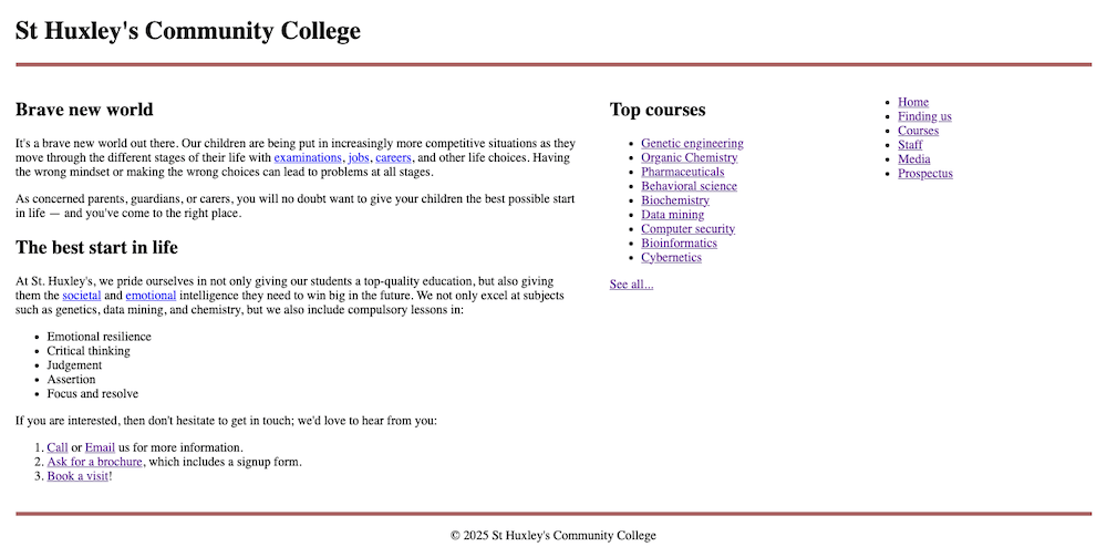
The following screenshot show what the page looks like to begin with:

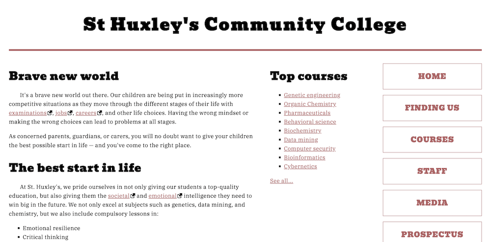
The following screenshot, on the other hand, shows an example of what the finished design could look like:

Click here to show a possible solution
Our finished CSS looks like so:
/* Solution: Apply fonts to the page */

@import "https://fonts.googleapis.com/css2?family=Bevan:ital@0;1&family=IBM+Plex+Serif:ital,wght@0,100;0,200;0,300;0,400;0,500;0,600;0,700;1,100;1,200;1,300;1,400;1,500;1,600;1,700&display=swap";

html {
  font-family: "IBM Plex Serif", serif;
}

h1,
h2 {
  font-family: "Bevan", serif;
}

/* General setup */

* {
  box-sizing: border-box;
}

body {
  margin: 0 auto;
  padding: 0 20px;
  min-width: 980px;
  max-width: 1400px;
}

/* Layout */

main {
  display: grid;
  grid-template-columns: 5fr 2fr 2fr;
  gap: 40px;
  padding: 20px 0;
}

/* Header and footer */

header {
  border-bottom: 5px solid #aa6666;
}

footer {
  border-top: 5px solid #aa6666;
}

footer p {
  text-align: center;
}

/* Solution: General text styling */

h1 {
  font-size: 3rem;
  text-align: center;
  letter-spacing: 3px;
}

h2 {
  font-size: 2rem;
  margin-bottom: 0;
  letter-spacing: 1px;
}

section h2 + p {
  text-indent: 2rem;
}

p,
li {
  line-height: 1.6;
  letter-spacing: 0.5px;
}

/* Solution: Link styling */

a {
  outline: none;
}

a[href*="http"] {
  padding-right: 16px;
  background: url("external-link-52.png") no-repeat right center;
  background-size: 14px 14px;
}

a:link,
a:visited {
  color: #aa6666;
}

a:focus,
a:hover {
  text-decoration: none;
  color: #773333;
}

/* Solution: List styling */

ul,
ol {
  margin: 1rem 0;
}

ul {
  list-style-type: square;
}

ol {
  list-style-type: lower-roman;
}

/* Solution: Navigation menu styling */

nav ul {
  padding-left: 0;
}

nav li {
  list-style-type: none;
  margin-bottom: 1rem;
}

nav li a {
  font-family: "Bevan", serif;
  text-decoration: none;
  display: inline-block;
  width: 100%;
  line-height: 3.5;
  text-transform: uppercase;
  text-align: center;
  letter-spacing: 1px;
  font-size: 1.3rem;
  font-weight: bold;
  border: 1px solid #aa6666;
}

nav li a:focus,
nav li a:hover {
  color: white;
  background: #aa6666;
}

nav li a:active {
  color: white;
  background: black;
}