theme
| Type | Object |
|---|---|
| Mandatory | No |
| Manifest version | 2 or higher |
| Example |
json |
Use the theme key to define a static theme to apply to Firefox. When provided alone, this defines the theme used when Firefox is using either the light or dark color schemes. If the dark_theme key is provided, this key provides the theme used when Firefox is using the light color scheme.
Note:
If you want to include a theme with an extension, please see the theme API.
Note: Since May 2019, themes need to be signed to be installed (Firefox bug 1545109). See Signing and distributing your add-on for more details.
Image formats
The following image formats are supported in all theme image properties:
- JPEG
- PNG
- APNG
- SVG (animated SVG is supported from Firefox 59)
- GIF (animated GIF isn't supported)
Syntax
The theme key is an object that takes the following properties:
| Name | Type | Description |
|---|---|---|
images |
Object |
Optional as of Firefox 60. Mandatory before Firefox 60.
A JSON object whose properties represent the images to display in
various parts of the browser. See
|
colors |
Object |
Mandatory
A JSON object whose properties represent the colors of various parts
of the browser. See |
properties |
Object |
Optional
This object has properties that affect how the
|
images
All URLs are relative to the manifest.json file and cannot reference an external URL.
Images should be 200 pixels high to ensure they always fill the header space vertically.
| Name | Type | Description |
|---|---|---|
theme_frame |
String or Object |
A foreground image (defined by the path to an image asset packaged in the extension) or CSS gradient to be added to the header area and anchored to the upper right corner of the header area. CSS gradients are supported from Firefox 153. Note: Chrome anchors the image to the top left of the header and if the image doesn't fill the header area tile the image. Optional in desktop Firefox 60 onwards. |
additional_backgrounds |
Array of String or Object |
Warning: The
An array of additional background items, each being either the path to an image asset packaged in the extension or CSS gradient, to be added to
the header area and displayed behind the
Optional
By default, all items are anchored to the upper right corner of the
header area, but their alignment, repeat, and size behavior, and the
area of the browser window they are drawn in, can be controlled by
As additional background items display behind the |
CSS gradient syntax
A CSS gradient is specified as an object in the form { "GRADIENT_TYPE": "GRADIENT_PARAMS" }, where:
GRADIENT_TYPEis one of:linear-gradientradial-gradientconic-gradientrepeating-linear-gradientrepeating-radial-gradientrepeating-conic-gradient
GRADIENT_PARAMScontains the parameters for that CSS gradient function, as described in CSS gradient values.
colors
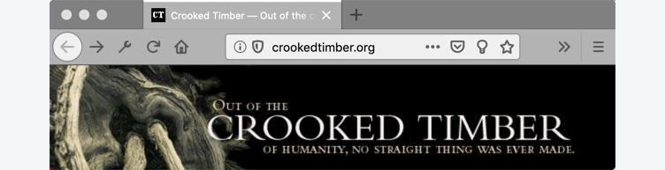
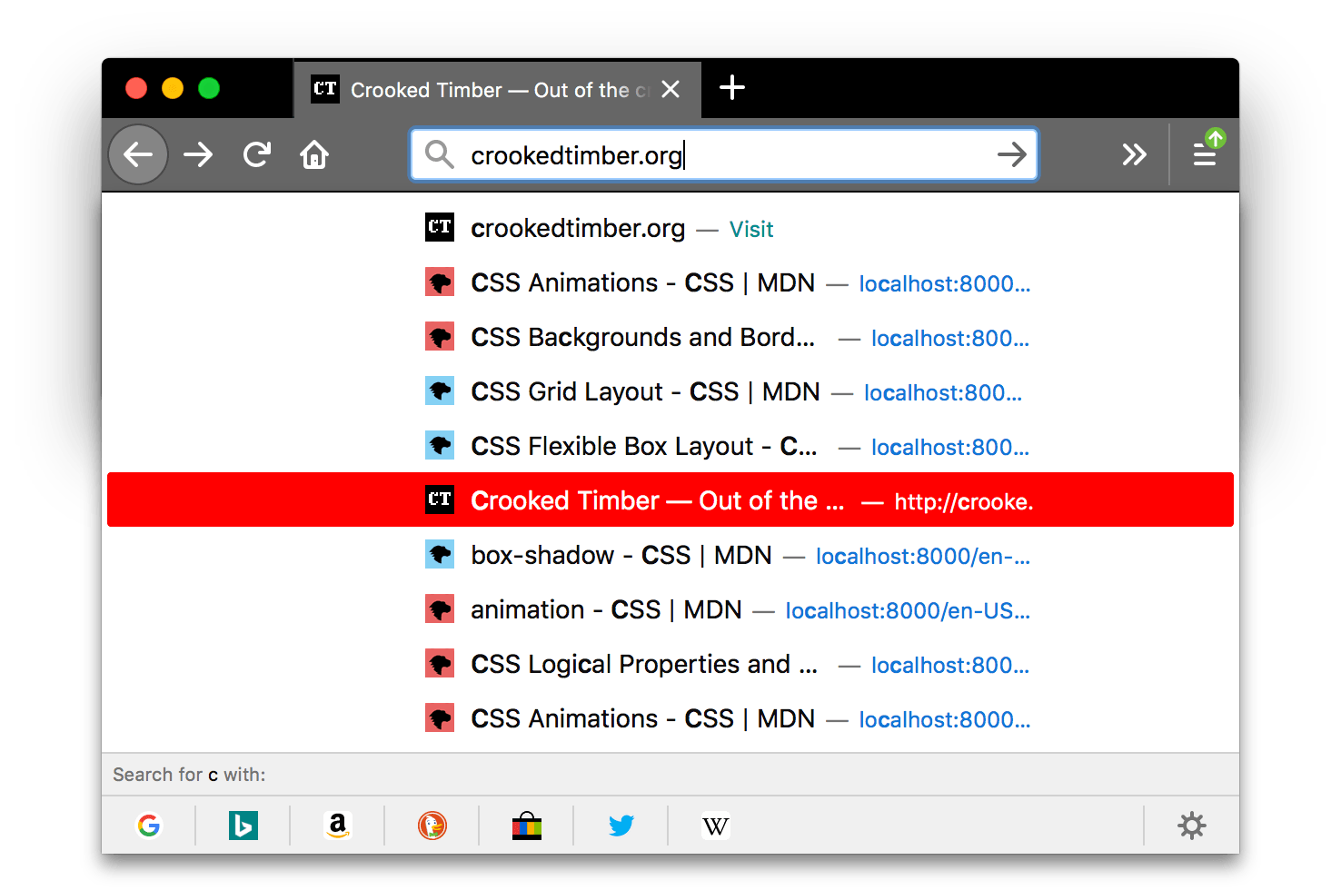
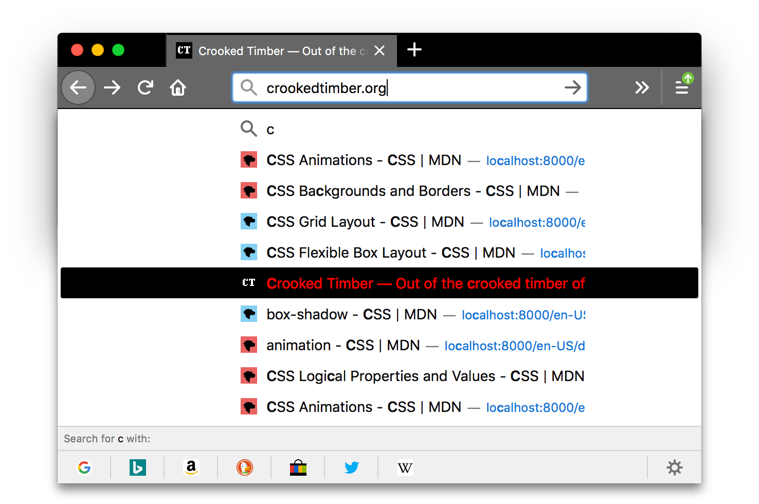
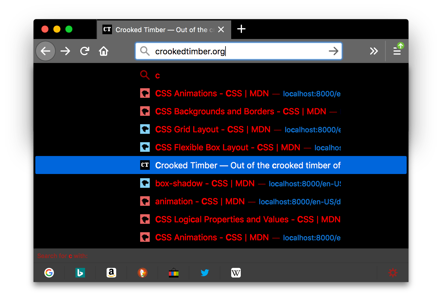
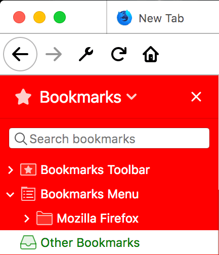
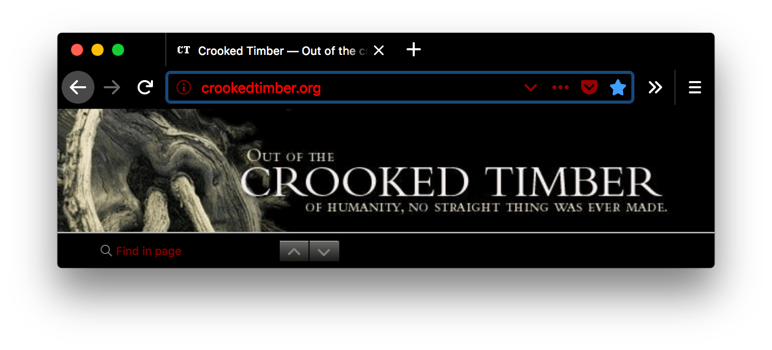
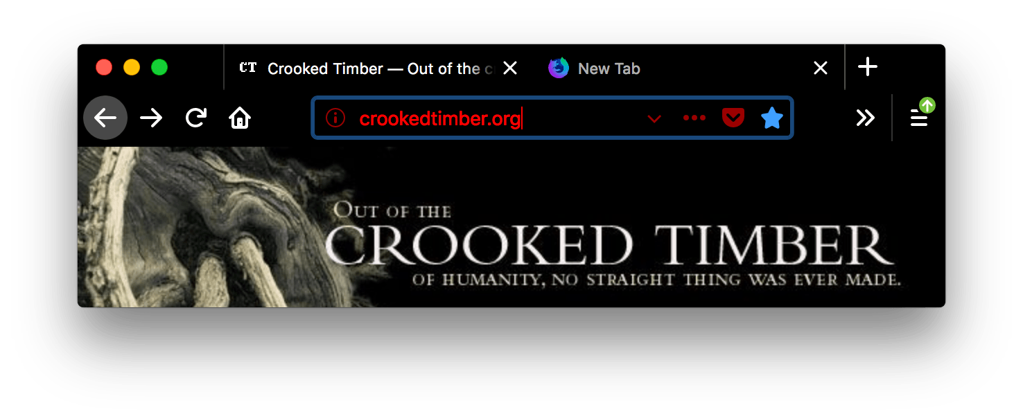
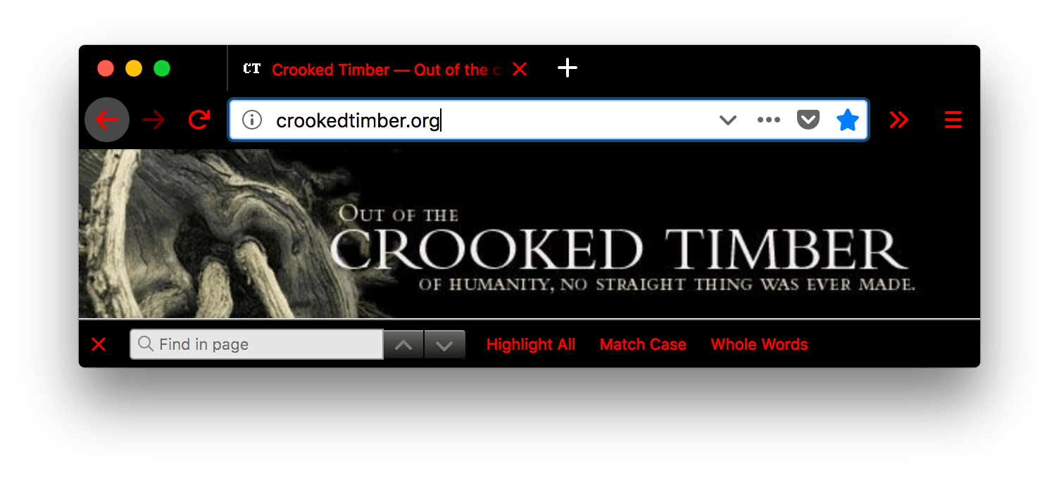
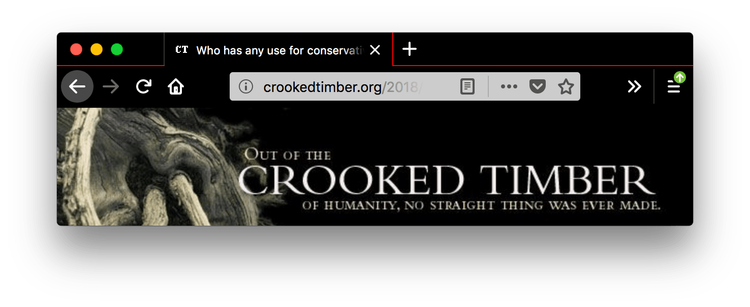
These properties define the colors used for different parts of the browser. They are all optional. How these properties affect the Firefox UI is shown here:
|
|
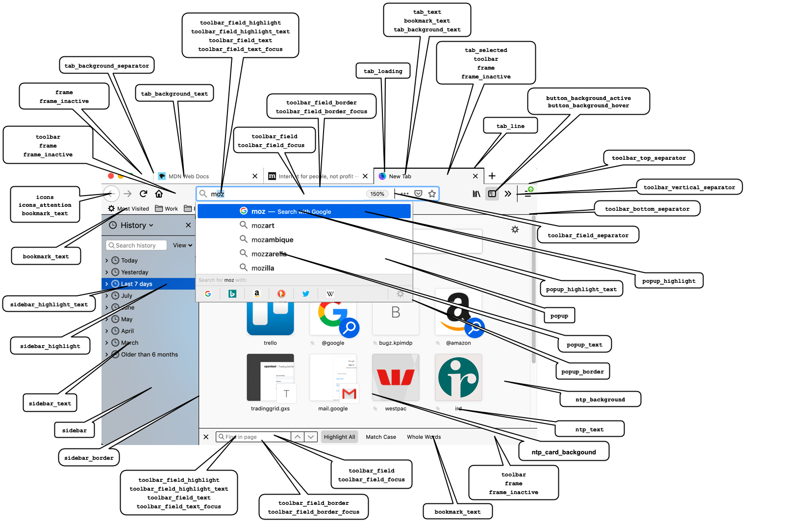
Note: Where a component is affected by multiple color properties, the properties are listed in order of precedence.
All these properties can be specified as either a string containing any valid CSS color string (including hexadecimal), or an RGB array, such as "tab_background_text": [ 107 , 99 , 23 ].
| Name | Description |
|---|---|
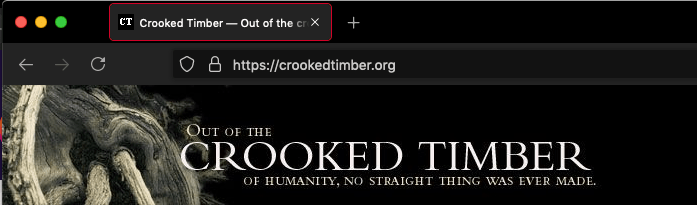
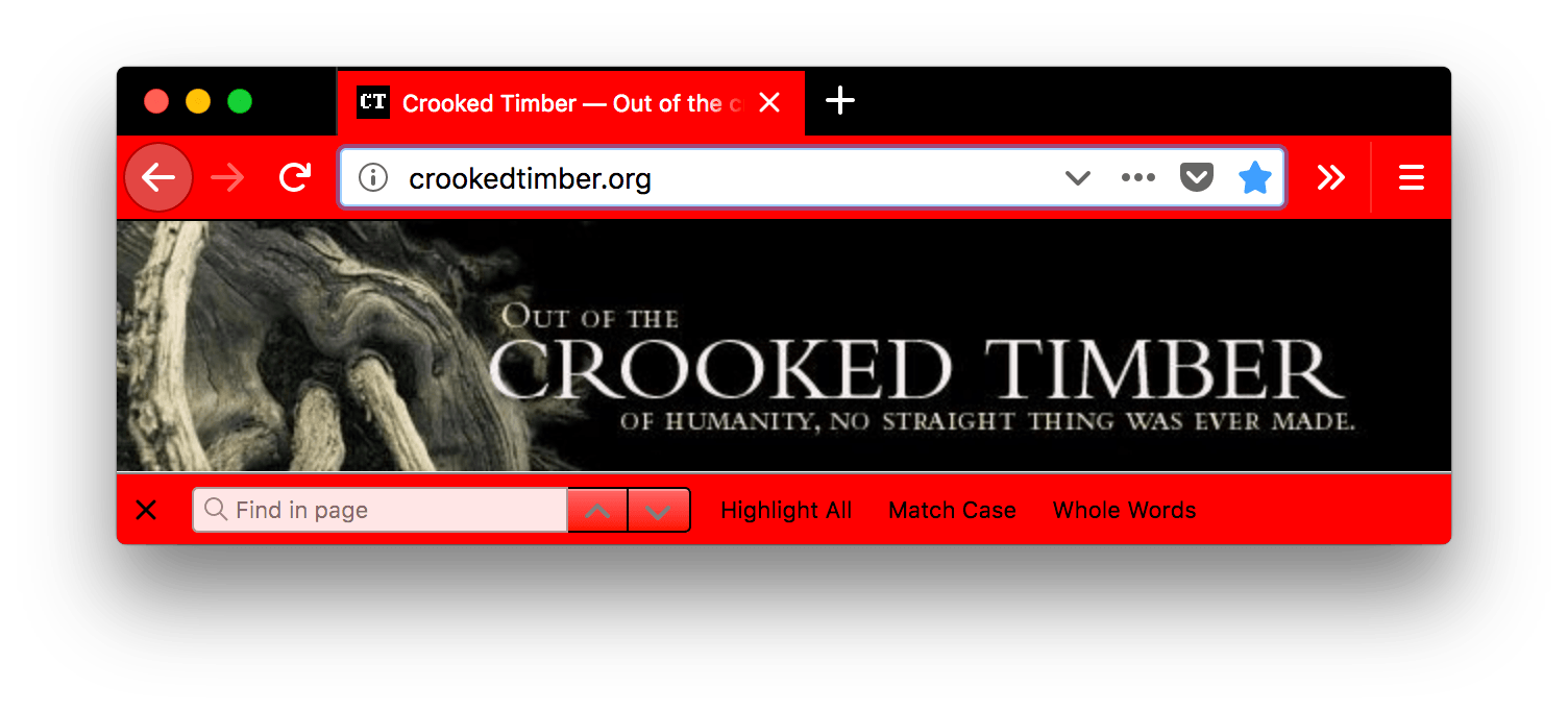
bookmark_text |
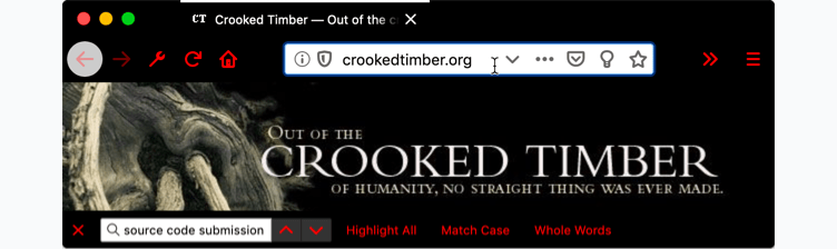
The color of text and icons in the bookmark and find bars. Also, if
Note: Ensure any color used contrasts well with
those used in
Where See examplejson
|
button_background_active |
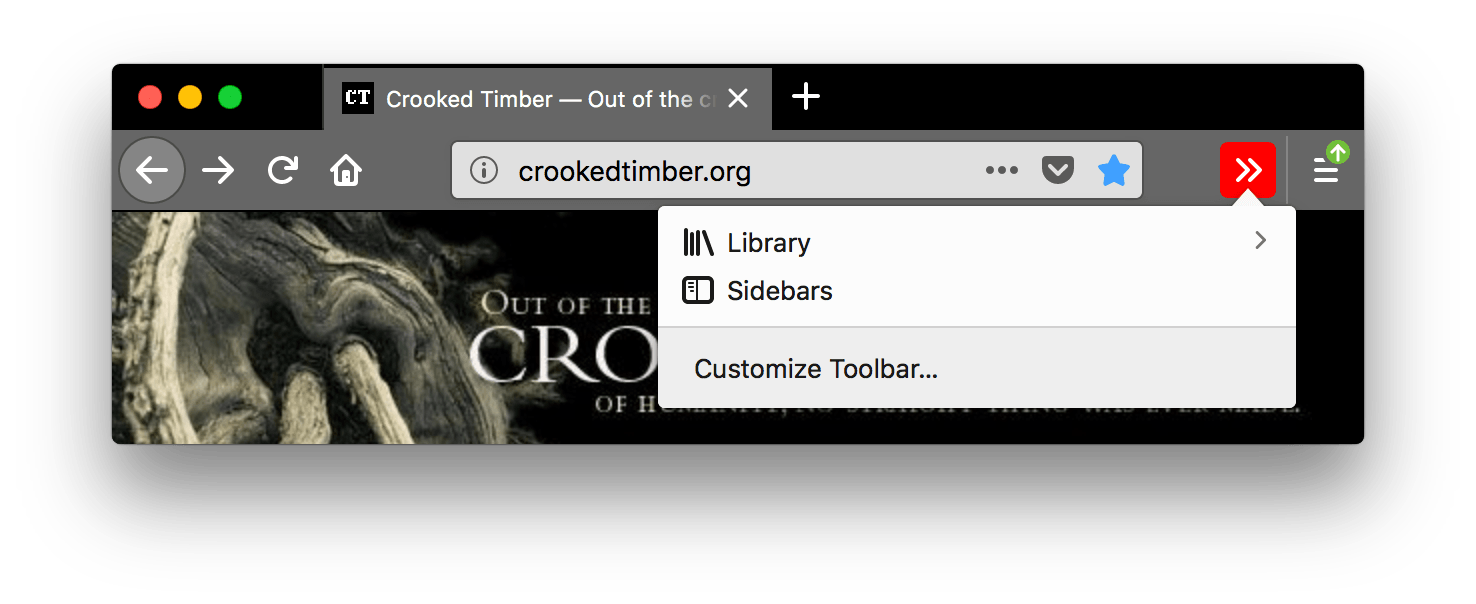
The color of the background of the pressed toolbar buttons. See examplejson
|
button_background_hover |
The color of the background of the toolbar buttons on hover. See examplejson
|
icons |
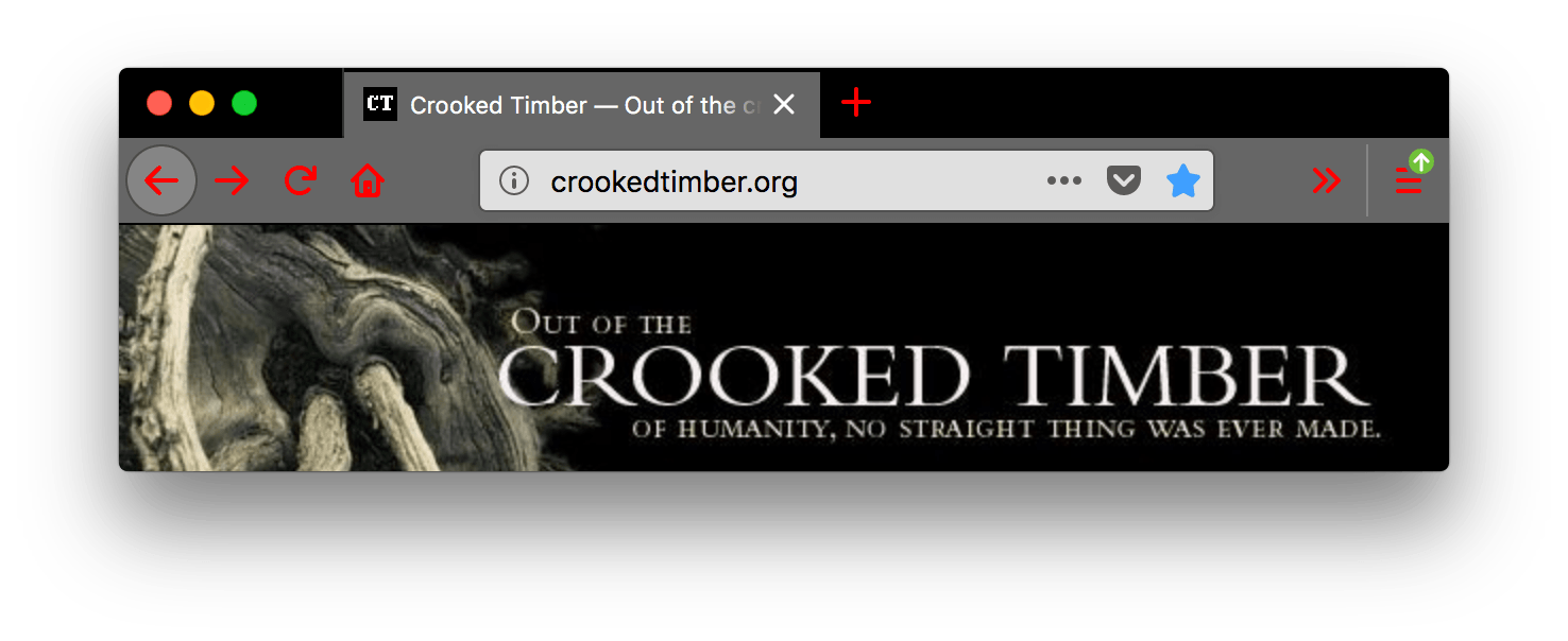
The color of toolbar icons, excluding those in the find toolbar.
Note: Ensure the color used contrasts well with
those used in See examplejson
|
icons_attention |
The color of toolbar icons in attention state such as the starred bookmark icon or finished download icon.
Note: Ensure the color used contrasts well with
those used in See examplejson
|
frame |
The color of the header area background, displayed in the part of the
header not covered or visible through the items specified in
See examplejson
|
frame_inactive |
The color of the header area background when the browser window is
inactive, displayed in the part of the header not covered or visible
through the items specified in See examplejson
|
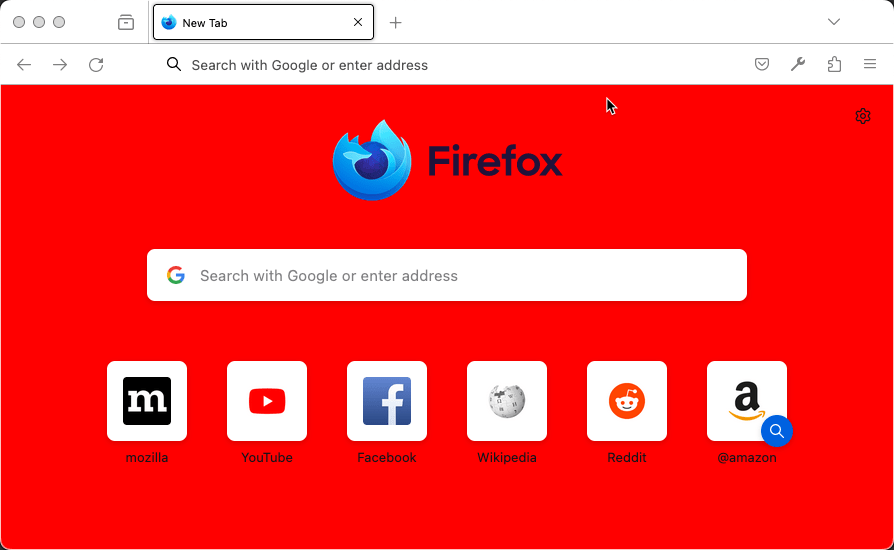
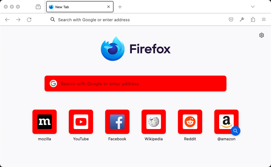
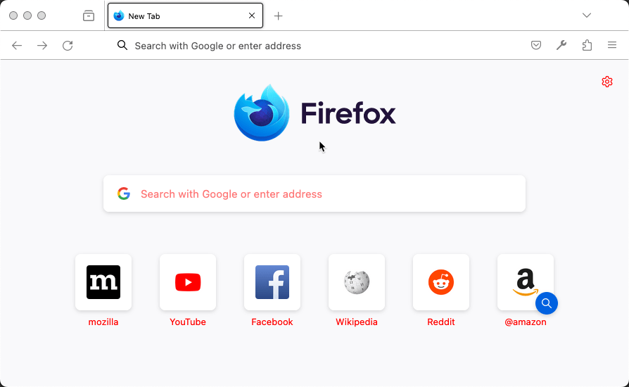
ntp_background |
The new tab page background color. See examplejson
|
ntp_card_background |
The new tab page card background color. See examplejson
|
ntp_text |
The new tab page text color.
Note: Ensure the color used contrasts well with
that used in See examplejson
|
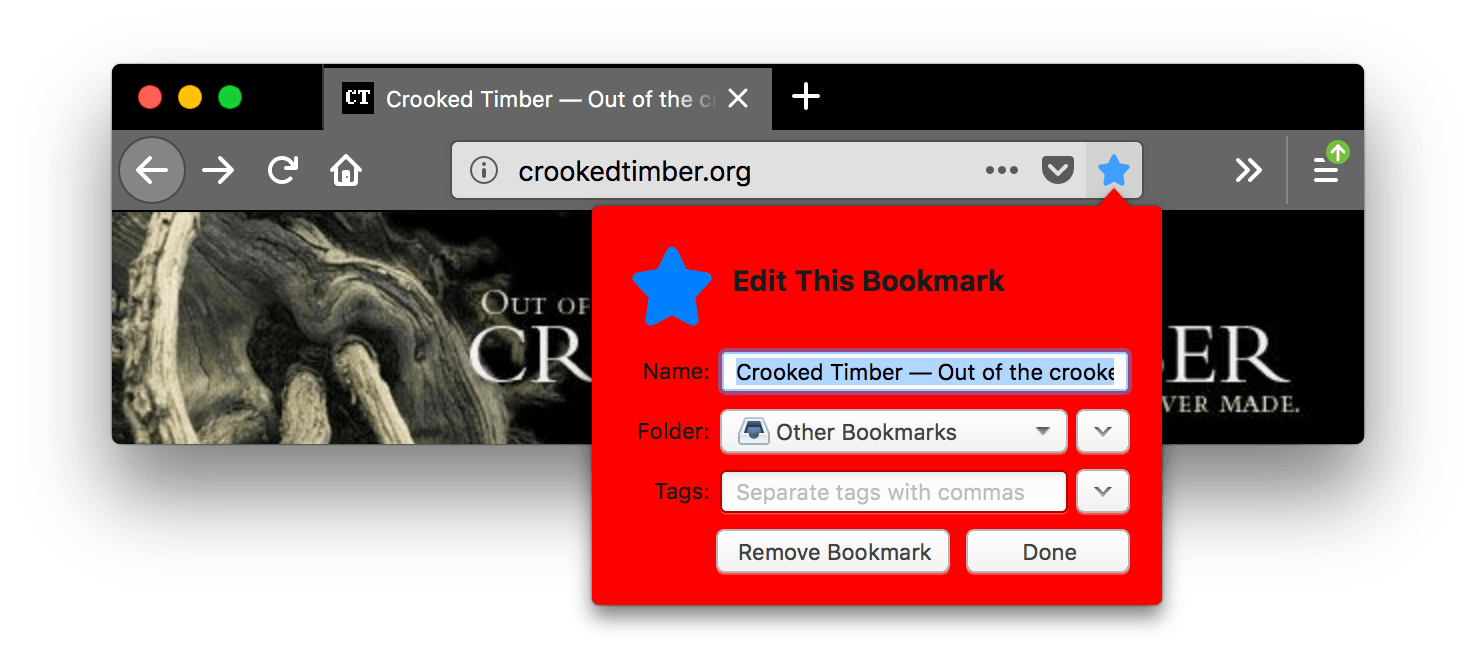
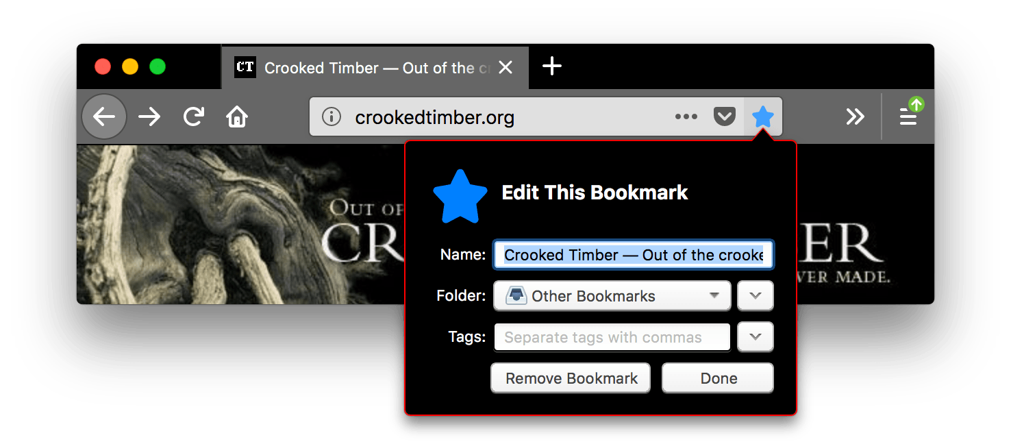
popup |
The background color of popups (such as the URL bar dropdown and the arrow panels). See examplejson
|
popup_border |
The border color of popups. See examplejson
|
popup_highlight |
The background color of items highlighted using the keyboard inside popups (such as the selected URL bar dropdown item).
Note: It's recommended to define
See examplejson
|
popup_highlight_text |
The text color of items highlighted inside popups.
Note: Ensure the color used contrasts well with
that used in See examplejson
|
popup_text |
The text color of popups.
Note: Ensure the color used contrasts well with
that used in See examplejson
|
sidebar |
The background color of the sidebar. See examplejson
|
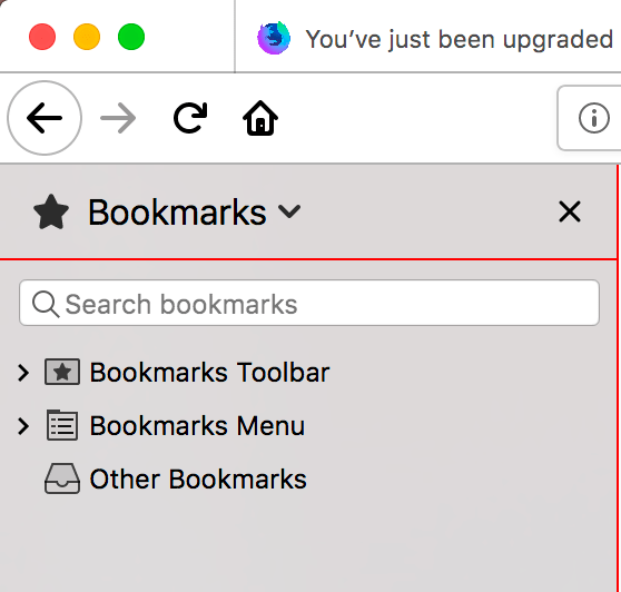
sidebar_border |
The border and splitter color of the browser sidebar See examplejson
|
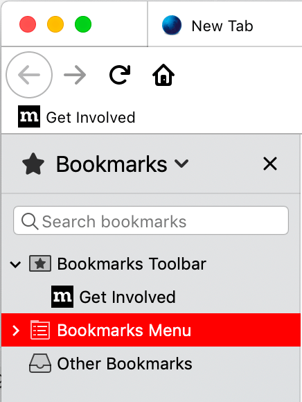
sidebar_highlight |
The background color of highlighted rows in built-in sidebars See examplejson
|
sidebar_highlight_text |
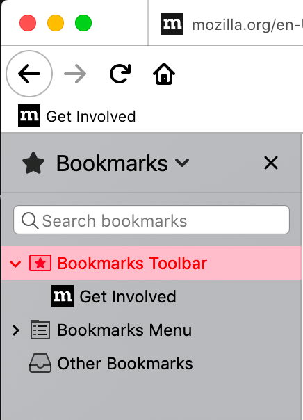
The text color of highlighted rows in sidebars.
Note: Ensure the color used contrasts well with
that used in See examplejson
|
sidebar_text |
The text color of sidebars.
Note: Ensure the color used contrasts well with
that used in See examplejson
|
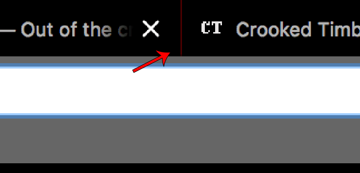
tab_background_separator
|
Warning: The color of the vertical separator of the background tabs. See examplejson
|
tab_background_text |
The color of the text displayed in the inactive page tabs. If
Note: Ensure the color used contrasts well with
those used in See examplejson
|
tab_line |
The color of the selected tab line. See examplejson
|
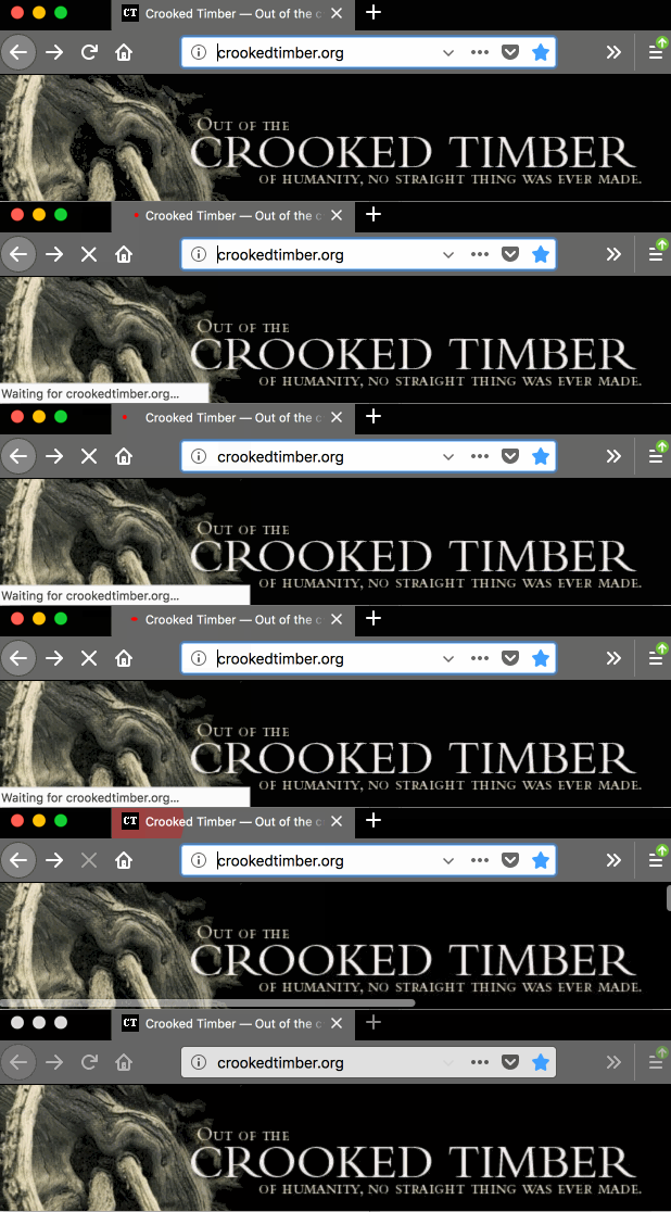
tab_loading |
The color of the tab loading indicator and the tab loading burst. See examplejson
|
tab_selected |
The background color of the selected tab. When not in use selected tab
color is set by See examplejson
|
tab_text |
From Firefox 59, it represents the text color for the selected tab. If
Note: Ensure the color used contrasts well with
those used in See examplejson
|
toolbar |
The background color for the navigation bar, the bookmarks bar, and the selected tab. This also sets the background color of the "Find" bar. See examplejson
|
toolbar_bottom_separator |
The color of the line separating the bottom of the toolbar from the region below. See examplejson
|
toolbar_field |
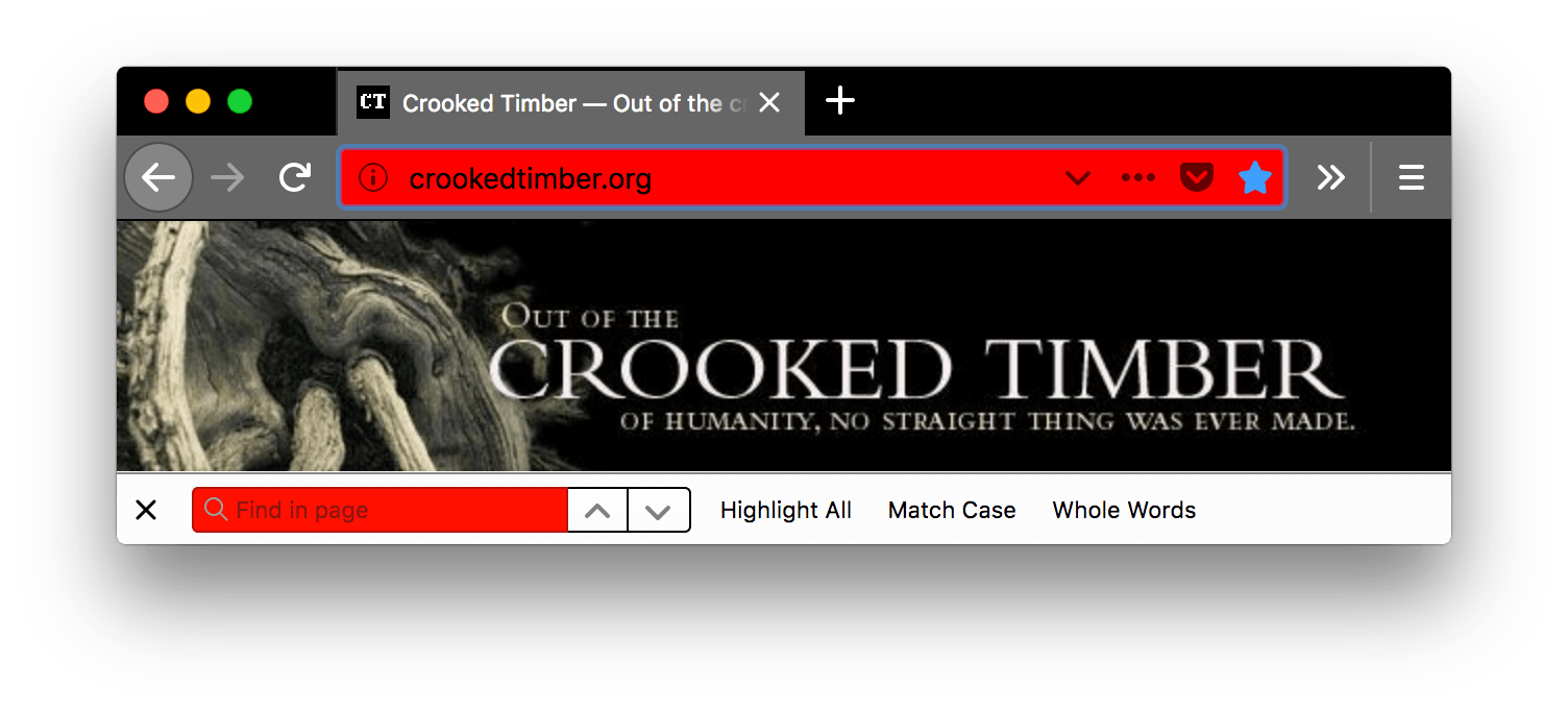
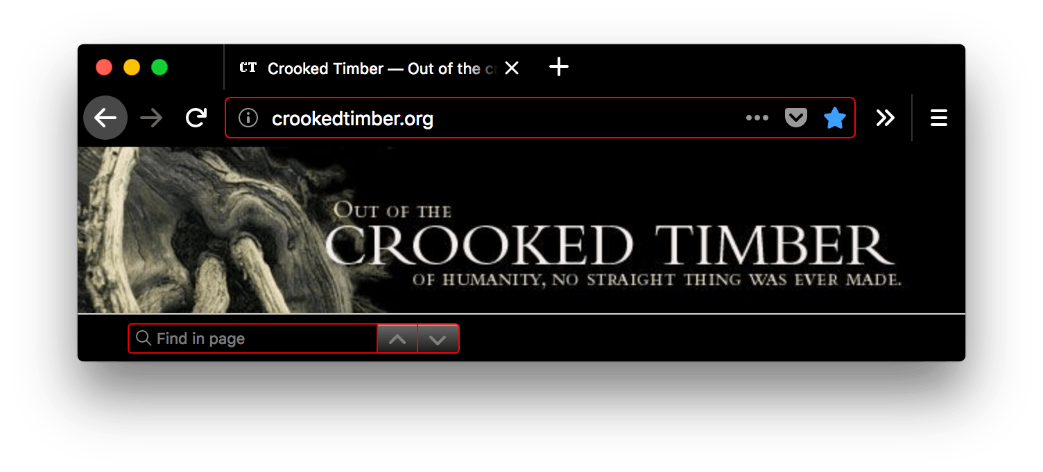
The background color for fields in the toolbar, such as the URL bar. This also sets the background color of the Find in page field. See examplejson
|
toolbar_field_border |
The border color for fields in the toolbar. This also sets the border color of the Find in page field. See examplejson
|
toolbar_field_border_focus |
The focused border color for fields in the toolbar. See examplejson
|
toolbar_field_focus |
The focused background color for fields in the toolbar, such as the URL bar. See examplejson
|
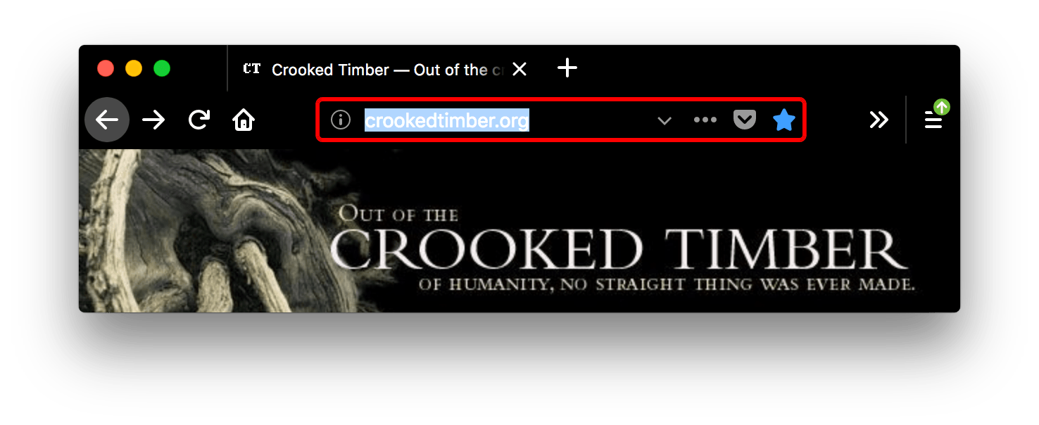
toolbar_field_highlight |
The background color used to indicate the current selection of text in
the URL bar (and the search bar, if it's configured to be separate).
See examplejson
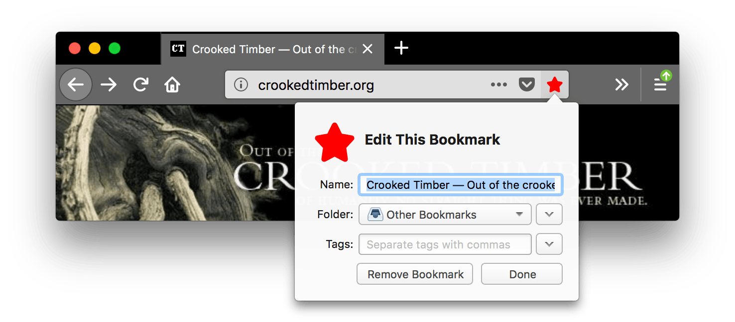
Here, the |
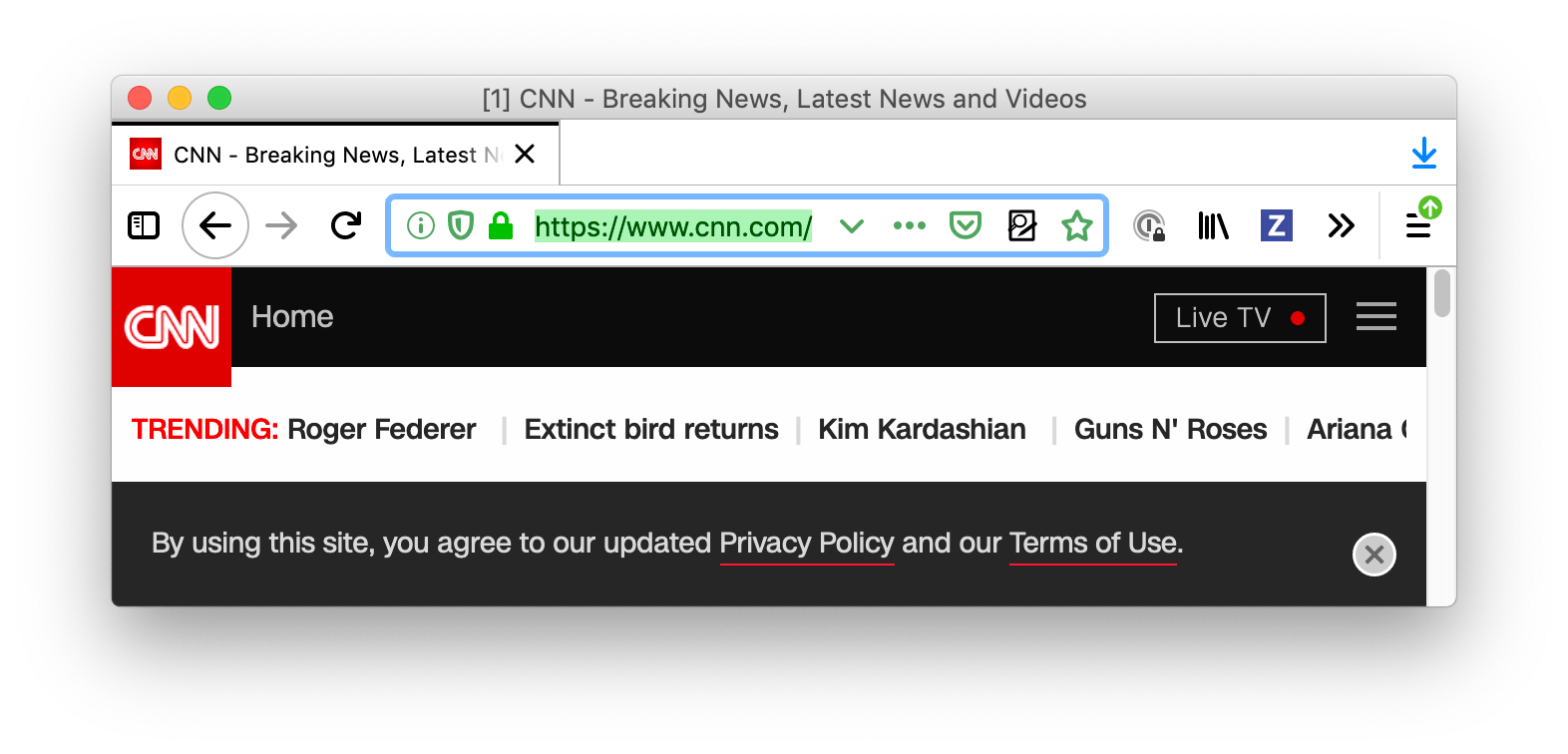
toolbar_field_highlight_text |
The color used to draw text that's currently selected in the URL bar (and the search bar, if it's configured to be separate box).
Note: Ensure the color used contrasts well with
those used in See examplejson
Here, the |
toolbar_field_separator |
Warning:
The color of separators inside the URL bar. In Firefox 58 this was
implemented as See examplejson
In this screenshot, |
toolbar_field_text |
The color of text in fields in the toolbar, such as the URL bar. This also sets the color of text in the Find in page field.
Note: Ensure the color used contrasts well with
those used in See examplejson
|
toolbar_field_text_focus |
The color of text in focused fields in the toolbar, such as the URL bar.
Note: Ensure the color used contrasts well with
those used in See examplejson
|
toolbar_text |
The color of toolbar text. This also sets the color of text in the "Find" bar.
Note: For compatibility with Chrome, use the alias
See examplejson
|
toolbar_top_separator |
The color of the line separating the top of the toolbar from the region above. See examplejson
|
toolbar_vertical_separator |
The color of the separator in the bookmarks toolbar. In Firefox 58, it corresponds to the color of separators inside the URL bar. See examplejson
|







Aliases
Additionally, this key accepts various properties that are aliases for one of the properties above. These are provided for compatibility with Chrome. If an alias is given, and the non-alias version is also given, then the value will be taken from the non-alias version.
| Name | Alias for |
|---|---|
bookmark_text |
toolbar_text |
properties
| Name | Type | Description |
|---|---|---|
additional_backgrounds_alignment |
|
Optional
An array of enumeration values defining the alignment of the
corresponding
If the array contains fewer items than the If not specified, defaults to |
additional_backgrounds_tiling |
|
Optional
An array of enumeration values defining how the corresponding
If the array contains fewer items than the If not specified, defaults to |
additional_backgrounds_size |
|
Optional
An array of values defining the size of the corresponding
If the array contains fewer items than the If not specified, defaults to |
backgrounds_area |
|
Optional Determines the area of the browser window where the theme's background images and gradients are drawn. Options include:
If not specified, defaults to |
color_scheme |
|
Optional Determines which color scheme is applied to the chrome (for example, context menus) and content (for example, built-in pages and the preferred color scheme for web pages). Options include:
If not specified, defaults to |
content_color_scheme |
|
Optional
Determines which color scheme is applied to the content (for example, built-in pages and
preferred color scheme for web pages). Overrides
If not specified, defaults to |
Examples
A basic theme must define an image to add to the header, the accent color to use in the header, and the color of text used in the header:
"theme": {
  "images": {
    "theme_frame": "images/sun.jpg"
  },
  "colors": {
    "frame": "#CF723F",
    "tab_background_text": "black"
  }
}
Multiple items can be used to fill the header. Before Firefox version 60, use a blank or transparent header image to gain control over the placement of each additional item:
 "theme": {
   "images": {
     "additional_backgrounds": [ "images/left.png", "images/middle.png", "images/right.png"]
   },
   "properties": {
     "additional_backgrounds_alignment": [ "left top", "top", "right top"]
   },
   "colors": {
     "frame": "blue",
     "tab_background_text": "white"
   }
 }
You can also fill the header with a repeated image, or images, in this case a single image anchored in the middle top of the header and repeated across the rest of the header:
 "theme": {
   "images": {
     "additional_backgrounds": [ "images/logo.png"]
   },
   "properties": {
     "additional_backgrounds_alignment": [ "top" ],
     "additional_backgrounds_tiling": [ "repeat"  ]
   },
   "colors": {
     "frame": "green",
     "tab_background_text": "black"
   }
 }
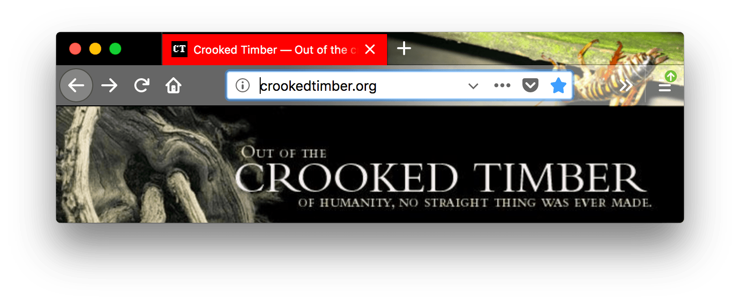
The following example uses most of the different values for theme.colors:
  "theme": {
    "images": {
      "theme_frame": "weta.png"
    },

    "colors": {
       "frame": "darkgreen",
       "tab_background_text": "white",
       "toolbar": "blue",
       "bookmark_text": "cyan",
       "toolbar_field": "orange",
       "toolbar_field_border": "white",
       "toolbar_field_text": "green",
       "toolbar_top_separator": "red",
       "toolbar_bottom_separator": "white",
       "toolbar_vertical_separator": "white"
    }
  }
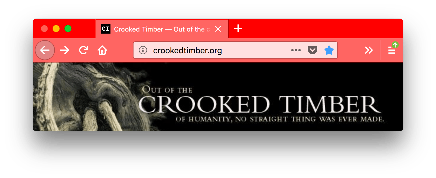
It will give you a browser that looks like this:

In this screenshot, "toolbar_vertical_separator" is the white vertical line in the URL bar dividing the Reader Mode icon from the other icons.
This example (Firefox 153+) mixes image backgrounds with a CSS linear gradient:
"theme": {
  "images": {
    "additional_backgrounds": [
      "background-image1.svg",
      "background-image2.svg",
      { "linear-gradient": "to bottom, #FF6BBA -20%, #FFC999 50%" }
    ]
  },
  "properties": {
    "additional_backgrounds_alignment": ["right top", "left top", "right top"],
    "additional_backgrounds_tiling": ["no-repeat", "no-repeat", "repeat-x"],
    "additional_backgrounds_size": ["auto", "auto", "auto 144px"]
  }
}
This results in:
background-image1.svgdisplaying at the top right, at its natural size.background-image2.svgdisplaying at the top left, at its natural size.- The
linear-gradientdisplaying from the top right, tiled horizontally across the header (repeat-x), and sized to 144px tall (width is automatic). The gradient transitions from pink (#FF6BBA) at the top to peach (#FFC999) at the bottom.
This example (Firefox 156+) restricts the background gradient to the horizontal toolbars at the top of the window, so that it doesn't extend behind the sidebar or vertical tabs. Without backgrounds_area, the "right top" alignment causes Firefox to draw the gradient in the whole window:
"theme": {
  "images": {
    "additional_backgrounds": [
      { "linear-gradient": "to bottom, rgb(255, 0, 128), rgb(0, 128, 255)" }
    ]
  },
  "colors": {
    "frame": "#000080",
    "tab_background_text": "#ffffff"
  },
  "properties": {
    "additional_backgrounds_alignment": ["right top"],
    "additional_backgrounds_tiling": ["no-repeat"],
    "additional_backgrounds_size": ["100% 100%"],
    "backgrounds_area": "top_toolbars"
  }
}
With backgrounds_area set to "top_toolbars", the sidebar uses the frame color. Changing backgrounds_area to "window" draws the gradient across the whole window instead, including behind the sidebar.
Browser compatibility
Chrome compatibility
In Chrome:
-
colors/toolbar_textisn't used, usecolors/bookmark_textinstead. -
images/theme_frameanchors the image to the top left of the header and if the image doesn't fill the header area tile the image. -
all colors must be specified as an array of RGB values, like this:
json"theme": { "colors": { "frame": [255, 0, 0], "tab_background_text": [0, 255, 0], "bookmark_text": [0, 0, 255] } }From Firefox 59 onward, both the array form and the CSS color form are accepted for all properties. Before that,
colors/frameandcolors/tab_background_textrequired the array form, while other properties required the CSS color form.