Grundlegende native Formularsteuerungen
Im vorherigen Artikel haben wir ein funktionales Webformularbeispiel markiert und dabei einige Formularsteuerelemente und gemeinsame Strukturelemente eingeführt und uns auf bewährte Methoden zur Barrierefreiheit konzentriert. Als nächstes werden wir uns die Funktionalität der verschiedenen Formularsteuerelemente oder Widgets im Detail ansehen — wir betrachten alle verschiedenen Optionen, die zur Erfassung unterschiedlicher Datentypen zur Verfügung stehen. In diesem speziellen Artikel befassen wir uns mit dem ursprünglichen Satz von Formularsteuerelementen, die seit den Anfängen des Webs in allen Browsern verfügbar sind.
| Voraussetzungen: | Ein grundlegendes Verständnis von HTML. |
|---|---|
| Ziel: | Detailliertes Verständnis des ursprünglichen Satzes von nativen Formular-Widgets, die in Browsern zur Datenerfassung verfügbar sind, und deren Implementierung in HTML. |
Sie haben bereits einige Formularelemente kennengelernt, darunter <form>, <fieldset>, <legend>, <textarea>, <label>, <button>, und <input>. Dieser Artikel behandelt:
- Die allgemeinen Eingabetypen button, checkbox, file, hidden, image, password, radio, reset, submit, und text.
- Einige der Attribute, die allen Formularsteuerelementen gemeinsam sind.
Hinweis:
Wir behandeln zusätzliche, leistungsstärkere Formularsteuerelemente in den nächsten beiden Artikeln. Wenn Sie eine umfassendere Referenz möchten, sollten Sie unsere HTML-Formular-Elementreferenz und insbesondere unsere umfangreiche <input> Typenreferenz konsultieren.
Texteingabefelder
Text-<input> Felder sind die grundlegendsten Formular-Widgets. Sie sind eine sehr praktische Möglichkeit, dem Benutzer die Eingabe beliebiger Daten zu ermöglichen, und wir haben bereits einige einfache Beispiele gesehen.
Hinweis: HTML-Textformulareingabefelder sind einfache reine Texteingabesteuerungen. Das bedeutet, dass Sie sie nicht verwenden können, um formatierte Texteingabe (fett, kursiv, etc.) durchzuführen. Alle Rich-Text-Editoren, denen Sie begegnen, sind benutzerdefinierte Widgets, die mit HTML, CSS und JavaScript erstellt wurden.
Alle grundlegenden Textsteuerungen teilen einige gemeinsame Verhaltensweisen:
- Sie können als
readonly(der Benutzer kann den Eingabewert nicht ändern, aber er wird trotzdem mit den restlichen Formulardaten gesendet) oderdisabled(der Eingabewert kann nicht geändert werden und wird nie mit den restlichen Formulardaten gesendet) markiert werden. - Sie können einen
placeholderhaben; dies ist der Text, der innerhalb des Texteingabefeldes erscheint und verwendet werden sollte, um kurz den Zweck der Box zu beschreiben. - Sie können in der
size(der physische Größe der Box) und demmaxlength(die maximale Anzahl von Zeichen, die in die Box eingegeben werden können) eingeschränkt werden. - Sie können von der Rechtschreibprüfung profitieren (unter Verwendung des
spellcheckAttributs).
Hinweis:
Das <input> Element ist einzigartig unter HTML-Elementen, da es viele Formen annehmen kann, abhängig vom Wert seines type Attributs. Es wird verwendet, um die meisten Arten von Formular-Widgets zu erstellen, einschließlich einzeiliger Textfelder, Zeit- und Datumssteuerungen, Steuerelemente ohne Texteingabe wie Kontrollkästchen, Optionsfelder und Farbauswähler sowie Schaltflächen.
Einzeilige Textfelder
Ein einzeiliges Textfeld wird erstellt, indem man ein <input> Element verwendet, dessen type Attributwert auf text gesetzt wird, oder indem man das type Attribut ganz weglässt (text ist der Standardwert). Der Wert text für dieses Attribut ist auch der Fallback-Wert, falls der von Ihnen angegebene Wert für das type Attribut vom Browser nicht erkannt wird (zum Beispiel, wenn Sie type="color" angeben und der Browser keine nativen Farbwähler unterstützt).
Hinweis: Sie können Beispiele für alle einzeiligen Textfeldtypen auf GitHub unter single-line-text-fields.html finden (sehen Sie es auch live).
Hier ist ein einfaches Beispiel für ein einzeiliges Textfeld:
<input type="text" id="comment" name="comment" value="I'm a text field" />
Einzeilige Textfelder haben nur eine wahre Beschränkung: Wenn Sie Text mit Zeilenumbrüchen eingeben, entfernt der Browser diese Zeilenumbrüche, bevor die Daten an den Server gesendet werden.
Der folgende Screenshot zeigt ein Texteingabefeld in den Standard-, Fokussierungs- und deaktivierten Zuständen. Die meisten Browser zeigen den Fokussierungszustand mit einem Fokusring um das Steuerelement an, und den deaktivierten Zustand mit grauem Text oder einem verblassten/halbtransparenten Steuerelement.
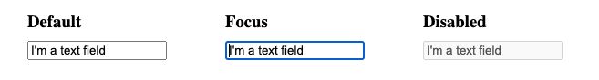
Die in diesem Dokument verwendeten Screenshots wurden im Chrome-Browser auf macOS aufgenommen. Es kann kleinere Abweichungen in diesen Feldern/Schaltflächen in verschiedenen Browsern geben, aber die grundlegende Hervorhebungstechnik bleibt ähnlich.
Hinweis:
Wir besprechen Werte für das type Attribut, die spezifische Validierungsbeschränkungen einschließlich von Eingabetypen für Farbe, E-Mail und URL erzwingen, im nächsten Artikel, Die HTML5-Eingabetypen.
Passwortfeld
Einer der ursprünglichen Eingabetypen war der password Eingabetexttyp:
<input type="password" id="pwd" name="pwd" />
Der folgende Screenshot zeigt ein Passwort-Eingabefeld, in dem jedes Eingabezeichen als Punkt dargestellt wird.

Der password Wert setzt keine speziellen Beschränkungen des eingegebenen Textes, aber er verdeckt den eingegebenen Wert im Feld (z.B. mit Punkten oder Sternchen), sodass andere ihn nicht leicht lesen können.
Beachten Sie, dass dies nur eine Benutzeroberflächenfunktion ist; es sei denn, Sie senden Ihr Formular sicher, es wird im Klartext gesendet, was schlecht für die Sicherheit ist — eine böswillige Partei könnte Ihre Daten abfangen und Passwörter, Kreditkartendetails oder was auch immer Sie eingereicht haben, stehlen. Der beste Weg, um Benutzer davor zu schützen, ist, alle Seiten, die Formulare beinhalten, über eine sichere Verbindung zu hosten (d.h. an einer https:// Adresse), sodass die Daten vor dem Senden verschlüsselt werden.
Browser erkennen die Sicherheitsimplikationen beim Senden von Formulardaten über eine unsichere Verbindung und haben Warnungen, um Benutzer von der Nutzung unsicherer Formulare abzuhalten. Weitere Informationen zu Firefox-Implementierungen finden Sie unter Unsichere Passwörter.
Versteckter Inhalt
Ein weiteres ursprüngliches Texteingabesteuerungsfeld ist der hidden Eingabetyp. Dieser wird verwendet, um ein Formularelement zu erstellen, das unsichtbar für den Benutzer ist, aber dennoch zusammen mit den restlichen Formulardaten an den Server gesendet wird, sobald es eingereicht wird — zum Beispiel könnten Sie einen Zeitstempel an den Server senden wollen, der angibt, wann eine Bestellung aufgegeben wurde. Da es versteckt ist, kann der Benutzer den Wert weder sehen noch absichtlich bearbeiten, es wird niemals den Fokus erhalten, und ein Bildschirmleser wird es ebenfalls nicht bemerken.
<input type="hidden" id="timestamp" name="timestamp" value="1286705410" />
Wenn Sie solch ein Element erstellen, müssen Sie seine name und value Attribute festlegen. Der Wert kann dynamisch über JavaScript gesetzt werden. Der hidden Eingabetyp sollte kein zugehöriges Label haben.
Andere Texteingabetypen, wie search, url, und tel, werden im nächsten Tutorial behandelt, HTML5 Eingabetypen.
Auswählbare Elemente: Kontrollkästchen und Optionsfelder
Auswählbare Elemente sind Steuerelemente, deren Zustand Sie durch Klicken auf sie oder ihre zugehörigen Labels ändern können. Es gibt zwei Arten von auswählbaren Elementen: das Kontrollkästchen und den Optionsschalter. Beide verwenden das checked Attribut, um anzugeben, ob das Widget standardmäßig ausgewählt ist oder nicht.
Es ist zu beachten, dass diese Widgets nicht genau wie andere Formularelemente verhalten. Bei den meisten Formularelementen werden, sobald das Formular abgeschickt wird, alle Widgets mit einem name Attribut gesendet, auch wenn kein Wert ausgefüllt wurde. Im Falle auswählbarer Elemente werden ihre Werte nur gesendet, wenn sie ausgewählt sind. Wenn sie nicht ausgewählt sind, wird nichts gesendet, nicht einmal ihr Name. Wenn sie ausgewählt sind, aber keinen Wert haben, wird der Name mit einem Wert von on gesendet.
Hinweis: Sie können die Beispiele aus diesem Abschnitt auf GitHub unter checkable-items.html finden (sehen Sie es auch live).
Für maximale Benutzerfreundlichkeit/Barrierefreiheit wird empfohlen, jede Liste verwandter Elemente in einem <fieldset> zu umgeben, mit einer <legend> die eine allgemeine Beschreibung der Liste bereitstellt. Jedes einzelne Paar von <label>/<input> Elementen sollte in einem eigenen Listenelement (oder ähnlichem) enthalten sein. Das zugehörige <label> wird in der Regel unmittelbar vor oder nach dem Optionsfeld oder Kontrollkästchen platziert, wobei die Anweisungen für die Gruppe von Optionsfeldern oder Kontrollkästchen in der Regel der Inhalt der <legend> ist. Siehe die oben verlinkten Beispiele für strukturelle Beispiele.
Kontrollkästchen
Ein Kontrollkästchen wird mit dem <input> Element erstellt, dessen type Attribut auf den Wert checkbox gesetzt ist.
<input type="checkbox" id="questionOne" name="subscribe" value="yes" checked />
Verwandte Kontrollkästchen sollten dasselbe name Attribut verwenden. Wenn das checked Attribut enthalten ist, wird das Kontrollkästchen automatisch aktiviert, wenn die Seite geladen wird. Durch Klicken auf das Kontrollkästchen oder dessen zugehöriges Label wird das Kontrollkästchen ein- oder ausgeschaltet.
<fieldset>
  <legend>Choose all the vegetables you like to eat</legend>
  <ul>
    <li>
      <label for="carrots">Carrots</label>
      <input
        type="checkbox"
        id="carrots"
        name="vegetable"
        value="carrots"
        checked />
    </li>
    <li>
      <label for="peas">Peas</label>
      <input type="checkbox" id="peas" name="vegetable" value="peas" />
    </li>
    <li>
      <label for="cabbage">Cabbage</label>
      <input type="checkbox" id="cabbage" name="vegetable" value="cabbage" />
    </li>
  </ul>
</fieldset>
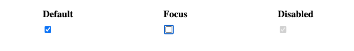
Der folgende Screenshot zeigt Kontrollkästchen im Standard-, Fokussierungs- und deaktivierten Zustand. Kontrollkästchen im Standard- und deaktivierten Zustand erscheinen angekreuzt, wohingegen im Fokussierungszustand das Kontrollkästchen abgehakt ist, mit einem Fokusring darum.
Hinweis:
Alle Kontrollkästchen und Optionsschalter mit dem Attribut checked beim Laden entsprechen der :default Pseudo-Klasse, auch wenn sie nicht mehr angekreuzt sind. Alle, die momentan angekreuzt sind, entsprechen der :checked Pseudo-Klasse.
Aufgrund der Ein-Aus-Natur von Kontrollkästchen werden Kontrollkästchen als Umschaltknöpfe betrachtet, wobei viele Entwickler und Designer die Standard-Kontrollkästchen-Stil anpassen, um Knöpfe zu erstellen, die wie Umschalter aussehen. Sie können ein Beispiel in Aktion hier sehen, (siehe auch den Quellcode).
Optionsfeld
Ein Optionsfeld wird mit dem <input> Element erstellt, dessen type Attribut auf den Wert radio gesetzt ist:
<input type="radio" id="soup" name="meal" value="soup" checked />
Mehrere Optionsfelder können miteinander verbunden werden. Wenn sie denselben Wert für ihr name Attribut haben, werden sie als im selben Button-Gruppe betrachtet. Nur ein Button in einer bestimmten Gruppe kann gleichzeitig markiert sein; dies bedeutet, dass, wenn einer von ihnen markiert wird, alle anderen automatisch ihrer Markierung beraubt werden. Wenn das Formular gesendet wird, wird nur der Wert des markierten Optionsfeldes gesendet. Wenn keiner von ihnen markiert ist, gilt die ganze Gruppe von Optionsfeldern als in einem unbekannten Zustand und kein Wert wird mit dem Formular gesendet. Sobald eines der Optionsfelder in einer gleichnamigen Gruppe von Buttons markiert ist, ist es dem Benutzer nicht mehr möglich, alle Buttons abzumarkieren, ohne das Formular zurückzusetzen.
<fieldset>
  <legend>What is your favorite meal?</legend>
  <ul>
    <li>
      <label for="soup">Soup</label>
      <input type="radio" id="soup" name="meal" value="soup" checked />
    </li>
    <li>
      <label for="curry">Curry</label>
      <input type="radio" id="curry" name="meal" value="curry" />
    </li>
    <li>
      <label for="pizza">Pizza</label>
      <input type="radio" id="pizza" name="meal" value="pizza" />
    </li>
  </ul>
</fieldset>
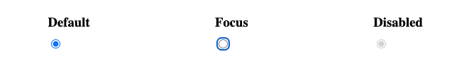
Der folgende Screenshot zeigt die Standard- und deaktivierten Optionsfelder im markierten Zustand, zusammen mit einem fokussierten Optionsfeld im unmarkierten Zustand.
Tatsächliche Schaltflächen
Das Optionsfeld ist trotz seines Namens eigentlich keine Schaltfläche; lassen Sie uns weitergehen und uns die eigentlichen Schaltflächen ansehen! Es gibt drei Eingabetypen, die Schaltflächen erzeugen:
submit-
Sendet die Formulardaten an den Server. Bei
<button>Elementen führt das Weglassen destypeAttributs (oder ein ungültigertypeWert) zu einer Submit-Schaltfläche. reset-
Setzt alle Formular-Widgets auf ihre Standardwerte zurück.
-
Schaltflächen, die keine automatische Wirkung haben, aber mit JavaScript-Code angepasst werden können.
Dann haben wir auch das <button> Element selbst. Dieses kann ein type Attribut mit dem Wert submit, reset oder button annehmen, um das Verhalten der drei oben genannten <input> Typen nachzuahmen. Der Hauptunterschied zwischen den beiden ist, dass eigentliche <button> Elemente viel einfacher zu stylen sind.
<input type="submit" value="Submit this form" />
<input type="reset" value="Reset this form" />
<input type="button" value="Do Nothing without JavaScript" />

<button type="submit">Submit this form</button>
<button type="reset">Reset this form</button>
<button type="button">Do Nothing without JavaScript</button>
Hinweis:
Der image Eingabetyp wird ebenfalls als Schaltfläche gerendert. Wir werden das später ebenfalls behandeln.
Hinweis: Sie können die Beispiele aus diesem Abschnitt auf GitHub unter button-examples.html finden (sehen Sie es auch live).
Unten können Sie Beispiele für jeden <input> Schaltflächentyp finden, zusammen mit dem äquivalenten <button> Typ.
submit
<button type="submit">This is a <strong>submit button</strong></button>

<input type="submit" value="This is a submit button" />
reset
<button type="reset">This is a <strong>reset button</strong></button>

<input type="reset" value="This is a reset button" />
anonym
<button type="button">This is an <strong>anonymous button</strong></button>

<input type="button" value="This is an anonymous button" />
Schaltflächen verhalten sich immer gleich, egal ob Sie ein <button> Element oder ein <input> Element verwenden. Wie Sie aus den Beispielen sehen können, erlauben <button> Elemente die Verwendung von HTML in ihrem Inhalt, der zwischen den öffnenden und schließenden <button> Tags eingefügt wird. <input> Elemente hingegen sind Void-Elemente; ihr angezeigter Inhalt wird innerhalb des value Attributs eingefügt und akzeptiert daher nur einfachen Text als Inhalt.
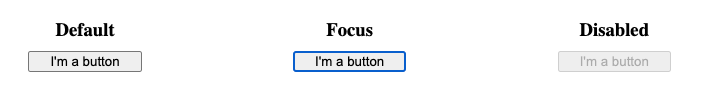
Der folgende Screenshot zeigt eine Schaltfläche in den Standard-, Fokussierungs- und deaktivierten Zuständen. Im Fokussierungszustand gibt es einen Fokusring um die Schaltfläche und im deaktivierten Zustand ist die Schaltfläche ausgegraut.
Bildschaltfläche
Die Bildschaltfläche wird genau wie ein <img> Element gerendert, außer dass, wenn der Benutzer darauf klickt, sie sich wie eine Submit-Schaltfläche verhält.
Eine Bildschaltfläche wird mit einem <input> Element erstellt, dessen type Attribut auf den Wert image gesetzt ist. Dieses Element unterstützt genau denselben Satz von Attributen wie das <img> Element, sowie alle von anderen Formularschaltflächen unterstützten Attribute.
<input type="image" alt="Click me!" src="my-img.png" width="80" height="30" />
Wenn die Bildschaltfläche verwendet wird, um das Formular zu senden, übermittelt diese Steuerung nicht ihren Wert — stattdessen werden die X- und Y-Koordinaten des Klicks auf das Bild übermittelt (die Koordinaten beziehen sich auf das Bild, was bedeutet, dass die obere linke Ecke des Bildes die Koordinate (0, 0) darstellt). Die Koordinaten werden als zwei Schlüssel/Wert-Paare gesendet:
- Der X-Wert-Schlüssel ist der Wert des
nameAttributs, gefolgt von der Zeichenfolge ".x". - Der Y-Wert-Schlüssel ist der Wert des
nameAttributs, gefolgt von der Zeichenfolge ".y".
Also zum Beispiel, wenn Sie auf das Bild an der Koordinate (123, 456) klicken und es über die get Methode gesendet wird, sehen Sie die Werte, die an die URL wie folgt angehängt werden:
http://foo.com?pos.x=123&pos.y=456
Dies ist eine sehr bequeme Möglichkeit, eine "Hot Map" zu erstellen. Wie diese Werte gesendet und abgerufen werden, wird im Artikel Versenden von Formulardaten detailliert beschrieben.
Dateiwähler
Es gibt einen letzten <input> Typ, der uns im frühen HTML antizipiert wurde: den Eingabetyp für Dateien. Formulare können Dateien an einen Server senden (diese spezielle Aktion wird ebenfalls im Artikel Versenden von Formulardaten detailliert beschrieben). Das Dateiauswahl-Widget kann verwendet werden, um eine oder mehrere Dateien zum Senden auszuwählen.
Um ein Dateiauswahl-Widget zu erstellen, verwenden Sie das <input> Element, dessen type Attribut auf file gesetzt ist. Die Arten von Dateien, die akzeptiert werden, können mit dem accept Attribut eingeschränkt werden. Wenn Sie dem Benutzer außerdem erlauben möchten, mehr als eine Datei auszuwählen, können Sie dies durch Hinzufügen des multiple Attributs tun.
Beispiel
In diesem Beispiel wird ein Dateiwähler erstellt, der grafische Bilddateien anfordert. Der Benutzer darf in diesem Fall mehrere Dateien auswählen.
<input type="file" name="file" id="file" accept="image/*" multiple />
Auf einigen mobilen Geräten kann der Dateiauswahl von den Fotos, Videos und Audio, die direkt durch die Kamera und das Mikrofon des Geräts aufgenommen wird, zugegriffen werden, indem Aufnahmeinformationen zum accept Attribut hinzugefügt werden, wie folgt:
<input type="file" accept="image/*;capture=camera" />
<input type="file" accept="video/*;capture=camcorder" />
<input type="file" accept="audio/*;capture=microphone" />
Der folgende Screenshot zeigt das Dateiauswahl-Widget in den Standard-, Fokus- und deaktivierten Zuständen, wenn keine Datei ausgewählt ist.

Gemeinsame Attribute
Viele der Elemente, die zur Definition von Formularsteuerelementen verwendet werden, haben einige ihrer eigenen spezifischen Attribute. Es gibt jedoch eine Reihe von Attributen, die allen Formularelementen gemeinsam sind. Sie haben einige davon bereits kennengelernt, aber unten ist eine Liste dieser gemeinsamen Attribute als Referenz:
| Attributname | Standardwert | Beschreibung |
|---|---|---|
autofocus
|
false | Dieses Boolean-Attribut erlaubt Ihnen anzugeben, dass das Element automatisch den Eingabefokus haben sollte, wenn die Seite geladen wird. Nur ein formularassoziiertes Element in einem Dokument kann dieses Attribut spezifizieren. |
disabled
|
false |
Dieses Boolean-Attribut gibt an, dass der Benutzer nicht mit dem Element interagieren kann.
Wenn dieses Attribut nicht spezifiziert ist, übernimmt das Element seine Einstellung von dem enthaltenden Element, zum Beispiel <fieldset>;
wenn es kein enthaltendes Element mit dem `disabled` Attribut gibt, dann ist das Element aktiviert.
|
form
|
Das <form> Element, mit dem das Widget assoziiert ist, wird verwendet, wenn es nicht innerhalb dieses Formulars verschachtelt ist.
Der Wert des Attributs muss das id Attribut eines <form> Elements im selben Dokument sein.
Dies ermöglicht es Ihnen, ein Formularsteuerelement mit einem Formular zu assoziieren, mit dem es außerhalb des Formulars ist, selbst wenn es sich innerhalb eines anderen Formularelements befindet.
|
|
name
|
Der Name des Elements; dieser wird mit den Formulardaten übermittelt. | |
value
|
Der anfängliche Wert des Elements. |
Testen Sie Ihre Fähigkeiten!
Sie haben das Ende dieses Artikels erreicht, aber können Sie sich an die wichtigsten Informationen erinnern? Sie können einige weitere Tests finden, um zu überprüfen, ob Sie diese Informationen behalten haben, bevor Sie weitermachen — siehe Testen Sie Ihre Fähigkeiten: Grundlegende Steuerelemente.