Document and website structure
HTML 不僅能夠定義網頁的單獨部分(例如「段落」或「圖片」),還可以使用區塊級元素(例如「標題欄」、「導覽選單」、「主內容列」)來定義網站中的複合區域。本文將探討如何規劃基本的網站結構,並根據規劃的結構來編寫 HTML。
| 預備知識: | Basic HTML familiarity, as covered in Getting started with HTML. HTML text formatting, as covered in HTML text fundamentals. How hyperlinks work, as covered in Creating hyperlinks. |
|---|---|
| 學習目標: | 學習使用語義標籤來建立文本,建置簡單的網站結構。 |
文本的基本組成
網頁有各式各樣的外觀,但是除了全螢幕影片、遊戲或藝術作品頁面外,都傾向於使用類似的標準元件:
- 頁首:
-
通常橫跨於整個頁面頂部有一個大標題。這是網站的主要資訊,通常存在於所有網頁。
- 導覽列:
-
指向網站各個主要區段的超連結。通常用選單按鈕、連結或頁簽來表示。類似於頁首,導航列通常應在所有網頁之間保持一致,否則會讓用戶感到疑惑,甚至無所適從。許多 web 設計人員認為導航列是頁首的一部分,而不是獨立的元件,但這並非絕對;還有人認為,兩者獨立可以提供更好的無障礙訪問特性,因為螢幕可以更清晰地分辨二者。
- 主要內容:
-
中心的大部分區域是當前網頁大多數的獨有內容,例如影片、文章、地圖、新聞等。這些內容是網站的一部分,且會因頁面而異。
- 側邊攔:
-
一些外圍資訊、連結、引用、廣告等。通常與主內容相關(例如一個新聞頁面上,側邊欄可能包含作者資訊或相關文章連結)。
- 頁尾:
-
橫跨頁面底部的狹長區域。和頁首一樣,頁尾是放置共用資訊(比如版權聲明或聯繫方式)的,一般使用較小字體,且通常為次要內容。還可以通過提供快速訪問連結來進行SEO 。
一個「典型的網站」可能會這樣佈局:
用於構造內容的 HTML
上面顯示的簡單範例並不美觀,但對於說明典型的網站佈局範例來說是非常好的。 有些網站上有更多欄,有些則複雜得多,但是你知道了。 使用正確的 CSS,你幾乎可以使用任何元素來包裹不同的部分,並使其看起來像你想要的樣子,但是如前所述,我們需要遵守語義並將正確的元素用於正確的運行。
這是因為視覺效果並不能說明整個故事。 We use color and font size to draw sighted users' attention to the most useful parts of the content, like the navigation menu and related links, but what about visually impaired people for example, who might not find concepts like "pink" and "large font" very useful?
備註:Colorblind people represent around 4% of the world population or, to put it another way, approximately 1 in every 12 men and 1 in every 200 women are colorblind. Blind and visually impaired people represent roughly 4-5% of the world population (in 2012 there were 285 million such people in the world, while the total population was around 7 billion).
In your HTML code, you can mark up sections of content based on their functionality — you can use elements that represent the sections of content described above unambiguously, and assistive technologies like screenreaders can recognise those elements and help with tasks like "find the main navigation", or "find the main content." As we mentioned earlier in the course, there are a number of consequences of not using the right element structure and semantics for the right job.
To implement such semantic mark up, HTML provides dedicated tags that you can use to represent such sections, for example:
Active learning: exploring the code for our example
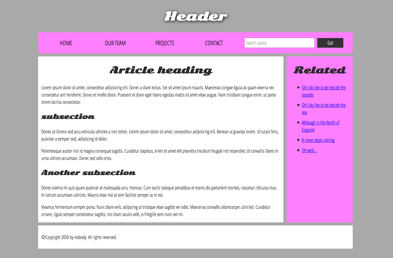
Our example seen above is represented by the following code (you can also find the example in our GitHub repository). We'd like you to look at the example above, and then look over the listing below to see what parts make up what section of the visual.
<!doctype html>
<html>
  <head>
    <meta charset="utf-8" />

    <title>My page title</title>
    <link
      href="https://fonts.googleapis.com/css?family=Open+Sans+Condensed:300|Sonsie+One"
      rel="stylesheet"
      type="text/css" />
    <link rel="stylesheet" href="style.css" />

    <!-- the below three lines are a fix to get HTML5 semantic elements working in old versions of Internet Explorer-->
    <!--[if lt IE 9]>
      <script src="https://cdnjs.cloudflare.com/ajax/libs/html5shiv/3.7.3/html5shiv.js"></script>
    <![endif]-->
  </head>

  <body>
    <!-- Here is our main header that is used across all the pages of our website -->

    <header>
      <h1>Header</h1>
    </header>

    <nav>
      <ul>
        <li><a href="#">Home</a></li>
        <li><a href="#">Our team</a></li>
        <li><a href="#">Projects</a></li>
        <li><a href="#">Contact</a></li>
      </ul>

      <!-- A Search form is another commmon non-linear way to navigate through a website. -->

      <form>
        <input type="search" name="q" placeholder="Search query" />
        <input type="submit" value="Go!" />
      </form>
    </nav>

    <!-- Here is our page's main content -->
    <main>
      <!-- It contains an article -->
      <article>
        <h2>Article heading</h2>

        <p>
          Lorem ipsum dolor sit amet, consectetur adipisicing elit. Donec a diam
          lectus. Set sit amet ipsum mauris. Maecenas congue ligula as quam
          viverra nec consectetur ant hendrerit. Donec et mollis dolor. Praesent
          et diam eget libero egestas mattis sit amet vitae augue. Nam tincidunt
          congue enim, ut porta lorem lacinia consectetur.
        </p>

        <h3>Subsection</h3>

        <p>
          Donec ut librero sed accu vehicula ultricies a non tortor. Lorem ipsum
          dolor sit amet, consectetur adipisicing elit. Aenean ut gravida lorem.
          Ut turpis felis, pulvinar a semper sed, adipiscing id dolor.
        </p>

        <p>
          Pelientesque auctor nisi id magna consequat sagittis. Curabitur
          dapibus, enim sit amet elit pharetra tincidunt feugiat nist imperdiet.
          Ut convallis libero in urna ultrices accumsan. Donec sed odio eros.
        </p>

        <h3>Another subsection</h3>

        <p>
          Donec viverra mi quis quam pulvinar at malesuada arcu rhoncus. Cum
          soclis natoque penatibus et manis dis parturient montes, nascetur
          ridiculus mus. In rutrum accumsan ultricies. Mauris vitae nisi at sem
          facilisis semper ac in est.
        </p>

        <p>
          Vivamus fermentum semper porta. Nunc diam velit, adipscing ut
          tristique vitae sagittis vel odio. Maecenas convallis ullamcorper
          ultricied. Curabitur ornare, ligula semper consectetur sagittis, nisi
          diam iaculis velit, is fringille sem nunc vet mi.
        </p>
      </article>

      <!-- the aside content can also be nested within the main content -->
      <aside>
        <h2>Related</h2>

        <ul>
          <li><a href="#">Oh I do like to be beside the seaside</a></li>
          <li><a href="#">Oh I do like to be beside the sea</a></li>
          <li><a href="#">Although in the North of England</a></li>
          <li><a href="#">It never stops raining</a></li>
          <li><a href="#">Oh well...</a></li>
        </ul>
      </aside>
    </main>

    <!-- And here is our main footer that is used across all the pages of our website -->

    <footer>
      <p>©Copyright 2050 by nobody. All rights reversed.</p>
    </footer>
  </body>
</html>
Take some time to look over the code and understand it — the comments inside the code should also help you to understand it. We aren't asking you to do much else in this article, because the key to understanding document layout is writing a sound HTML structure, and then laying it out with CSS. We'll wait for this until you start to study CSS layout as part of the CSS topic.
HTML layout elements in more detail
It's good to understand the overall meaning of all the HTML sectioning elements in detail — this is something you'll work on gradually as you start to get more experience with web development. You can find a lot of detail by reading our HTML element reference. For now, these are the main definitions that you should try to understand:
<main>is for content unique to this page. Use<main>only once per page, and put it directly inside<body>. Ideally this shouldn't be nested within other elements.<article>encloses a block of related content that makes sense on its own without the rest of the page (e.g., a single blog post).<section>is similar to<article>, but it is more for grouping together a single part of the page that constitutes one single piece of functionality (e.g., a mini map, or a set of article headlines and summaries). It's considered best practice to begin each section with a heading; also note that you can break<article>s up into different<section>s, or<section>s up into different<article>s, depending on the context.<aside>contains content that is not directly related to the main content but can provide additional information indirectly related to it (glossary entries, author biography, related links, etc.).<header>represents a group of introductory content. If it is a child of<body>it defines the global header of a webpage, but if it's a child of an<article>or<section>it defines a specific header for that section (try not to confuse this with titles and headings).<nav>contains the main navigation functionality for the page. Secondary links, etc., would not go in the navigation.<footer>represents a group of end content for a page.
Non-semantic wrappers
Sometimes you'll come across a situation where you can't find an ideal semantic element to group some items together or wrap some content. Sometimes you might want to just group a set of elements together to affect them all as a single entity with some CSS or JavaScript. For cases like these, HTML provides the <div> and <span> elements. You should use these preferably with a suitable class attribute, to provide some kind of label for them so they can be easily targeted.
<span> is an inline non-semantic element, which you should only use if you can't think of a better semantic text element to wrap your content, or don't want to add any specific meaning. For example:
<p>
  The King walked drunkenly back to his room at 01:00, the beer doing nothing to
  aid him as he staggered through the door
  <span class="editor-note"
    >[Editor's note: At this point in the play, the lights should be down
    low]</span
  >.
</p>
In this case, the editor's note is supposed to merely provide extra direction for the director of the play; it is not supposed to have extra semantic meaning. For sighted users, CSS would perhaps be used to distance the note slightly from the main text.
<div> is a block level non-semantic element, which you should only use if you can't think of a better semantic block element to use, or don't want to add any specific meaning. For example, imagine a shopping cart widget that you could choose to pull up at any point during your time on an e-commerce site:
<div class="shopping-cart">
  <h2>Shopping cart</h2>
  <ul>
    <li>
      <p>
        <a href=""><strong>Silver earrings</strong></a
        >: $99.95.
      </p>
      <img src="../products/3333-0985/thumb.png" alt="Silver earrings" />
    </li>
    <li>...</li>
  </ul>
  <p>Total cost: $237.89</p>
</div>
This isn't really an <aside>, as it doesn't necessarily relate to the main content of the page (you want it viewable from anywhere). It doesn't even particularly warrant using a <section>, as it isn't part of the main content of the page. So a <div> is fine in this case. We've included a heading as a signpost to aid screenreader users in finding it.
警告:Divs are so convenient to use that it's easy to use them too much. As they carry no semantic value, they just clutter your HTML code. Take care to use them only when there is no better semantic solution and try to reduce their usage to the minimum otherwise you'll have a hard time updating and maintaining your documents.
Line breaks and horizontal rules
Two elements that you'll use occasionally and will want to know about are <br> and <hr>:
<br>: the line break element
<br> creates a line break in a paragraph; it is the only way to force a rigid structure in a situation where you want a series of fixed short lines, such as in a postal address or a poem. For example:
<p>
  There once was a man named O'Dell<br />
  Who loved to write HTML<br />
  But his structure was bad, his semantics were sad<br />
  and his markup didn't read very well.
</p>
Without the <br> elements, the paragraph would just be rendered in one long line (as we said earlier in the course, HTML ignores most whitespace); with <br> elements in the code, the markup renders like this:
<hr>: the thematic break element
<hr> elements create a horizontal rule in the document that denotes a thematic change in the text (such as a change in topic or scene). Visually it just looks like a horizontal line. As an example:
<p>
  Ron was backed into a corner by the marauding netherbeasts. Scared, but
  determined to protect his friends, he raised his wand and prepared to do
  battle, hoping that his distress call had made it through.
</p>
<hr />
<p>
  Meanwhile, Harry was sitting at home, staring at his royalty statement and
  pondering when the next spin off series would come out, when an enchanted
  distress letter flew through his window and landed in his lap. He read it
  hazily and sighed; "better get back to work then", he mused.
</p>
Would render like this:
Planning a simple website
Once you've planned out the structure of a simple webpage, the next logical step is to try to work out what content you want to put on a whole website, what pages you need, and how they should be arranged and link to one another for the best possible user experience. This is called Information architecture. In a large, complex website, a lot of planning can go into this process, but for a simple website of a few pages, this can be fairly simple, and fun!
- Bear in mind that you'll have a few elements common to most (if not all) pages — such as the navigation menu, and the footer content. If your site is for a business, for example, it's a good idea to have your contact information available in the footer on each page. Note down what you want to have common to every page.

- Next, draw a rough sketch of what you might want the structure of each page to look like (it might look like our simple website above). Note what each block is going to be.

- Now, brainstorm all the other (not common to every page) content you want to have on your website — write a big list down.

- Next, try to sort all these content items into groups, to give you an idea of what parts might live together on different pages. This is very similar to a technique called Card sorting.

- Now try to sketch a rough sitemap — have a bubble for each page on your site, and draw lines to show the typical workflow between pages. The homepage will probably be in the center, and link to most if not all of the others; most of the pages in a small site should be available from the main navigation, although there are exceptions. You might also want to include notes about how things might be presented.

Active learning: create your own sitemap
Try carrying out the above exercise for a website of your own creation. What would you like to make a site about?
備註:Save your work somewhere; you might need it later on.
Test your skills!
You've reached the end of this article, but can you remember the most important information? You can find a detailed assessment that tests these skills at the end of the module; see Structuring a page of content. We'd advise going through the next article in the series first and not just skipping to it though!
Summary
At this point you should have a better idea about how to structure a web page/site. In the last article of this module, we'll study how to debug HTML.
See also
- Using HTML sections and outlines: Advanced guide to HTML5 semantic elements and the HTML5 outline algorithm.