Beginning our React todo list
Let's say that we've been tasked with creating a proof-of-concept in React – an app that allows users to add, edit, and delete tasks they want to work on, and also mark tasks as complete without deleting them. This article will walk you through the basic structure and styling of such an application, ready for individual component definition and interactivity, which we'll add later.
Note: If you need to check your code against our version, you can find a finished version of the sample React app code in our todo-react repository. For a running live version, see https://mdn.github.io/todo-react/.
| Prerequisites: |
Familiarity with the core HTML, CSS, and JavaScript languages, knowledge of the terminal/command line. |
|---|---|
| Objective: |
To introduce our todo list case study, and get the basic
App structure and styling in place.
|
Our app's user stories
In software development, a user story is an actionable goal from the perspective of the user. Defining user stories before we begin our work will help us focus our work. Our app should fulfill the following stories:
As a user, I can
- read a list of tasks.
- add a task using the mouse or keyboard.
- mark any task as completed, using the mouse or keyboard.
- delete any task, using the mouse or keyboard.
- edit any task, using the mouse or keyboard.
- view a specific subset of tasks: All tasks, only the active task, or only the completed tasks.
We'll tackle these stories one-by-one.
Pre-project housekeeping
Vite has given us some code that we won't be using at all for our project. The following terminal commands will delete it to make way for our new project. Make sure you're starting in the app's root directory!
# Move into the src directory
cd src
# Delete the App.css file and the React logo provided by Vite
rm App.css assets/react.svg
# Empty the contents of App.jsx and index.css
echo -n > App.jsx && echo -n > index.css
# Move back up to the root of the project
cd ..
Note: If you stopped your server to do the terminal tasks mentioned above, you'll have to start it again using npm run dev.
Project starter code
As a starting point for this project, we're going to provide two things: an App() function to replace the one you just deleted, and some CSS to style your app.
The JSX
Copy the following snippet to your clipboard, then paste it into App.jsx:
function App(props) {
  return (
    <div className="todoapp stack-large">
      <h1>TodoMatic</h1>
      <form>
        <h2 className="label-wrapper">
          <label htmlFor="new-todo-input" className="label__lg">
            What needs to be done?
          </label>
        </h2>
        <input
          type="text"
          id="new-todo-input"
          className="input input__lg"
          name="text"
          autoComplete="off"
        />
        <button type="submit" className="btn btn__primary btn__lg">
          Add
        </button>
      </form>
      <div className="filters btn-group stack-exception">
        <button type="button" className="btn toggle-btn" aria-pressed="true">
          <span className="visually-hidden">Show </span>
          <span>all</span>
          <span className="visually-hidden"> tasks</span>
        </button>
        <button type="button" className="btn toggle-btn" aria-pressed="false">
          <span className="visually-hidden">Show </span>
          <span>Active</span>
          <span className="visually-hidden"> tasks</span>
        </button>
        <button type="button" className="btn toggle-btn" aria-pressed="false">
          <span className="visually-hidden">Show </span>
          <span>Completed</span>
          <span className="visually-hidden"> tasks</span>
        </button>
      </div>
      <h2 id="list-heading">3 tasks remaining</h2>
      <ul
        role="list"
        className="todo-list stack-large stack-exception"
        aria-labelledby="list-heading">
        <li className="todo stack-small">
          <div className="c-cb">
            <input id="todo-0" type="checkbox" defaultChecked />
            <label className="todo-label" htmlFor="todo-0">
              Eat
            </label>
          </div>
          <div className="btn-group">
            <button type="button" className="btn">
              Edit <span className="visually-hidden">Eat</span>
            </button>
            <button type="button" className="btn btn__danger">
              Delete <span className="visually-hidden">Eat</span>
            </button>
          </div>
        </li>
        <li className="todo stack-small">
          <div className="c-cb">
            <input id="todo-1" type="checkbox" />
            <label className="todo-label" htmlFor="todo-1">
              Sleep
            </label>
          </div>
          <div className="btn-group">
            <button type="button" className="btn">
              Edit <span className="visually-hidden">Sleep</span>
            </button>
            <button type="button" className="btn btn__danger">
              Delete <span className="visually-hidden">Sleep</span>
            </button>
          </div>
        </li>
        <li className="todo stack-small">
          <div className="c-cb">
            <input id="todo-2" type="checkbox" />
            <label className="todo-label" htmlFor="todo-2">
              Repeat
            </label>
          </div>
          <div className="btn-group">
            <button type="button" className="btn">
              Edit <span className="visually-hidden">Repeat</span>
            </button>
            <button type="button" className="btn btn__danger">
              Delete <span className="visually-hidden">Repeat</span>
            </button>
          </div>
        </li>
      </ul>
    </div>
  );
}

export default App;
Now open index.html and change the <title> element's text to TodoMatic. This way, it will match the <h1> at the top of our app.
<title>TodoMatic</title>
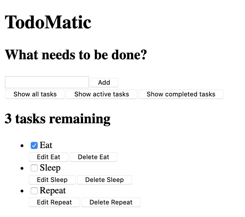
When your browser refreshes, you should see something like this:
It's ugly, and doesn't function yet, but that's okay — we'll style it in a moment. First, consider the JSX we have, and how it corresponds to our user stories:
- We have a
<form>element, with an<input type="text">for writing out a new task, and a button to submit the form. - We have an array of buttons that will be used to filter our tasks.
- We have a heading that tells us how many tasks remain.
- We have our 3 tasks, arranged in an unordered list. Each task is a list item (
<li>), and has buttons to edit and delete it and a checkbox to check it off as done.
The form will allow us to make tasks; the buttons will let us filter them; the heading and list are our way to read them. The UI for editing a task is conspicuously absent for now. That's okay – we'll write that later.
Accessibility features
You may notice some unusual markup here. For example:
<button type="button" className="btn toggle-btn" aria-pressed="true">
  <span className="visually-hidden">Show </span>
  <span>all</span>
  <span className="visually-hidden"> tasks</span>
</button>
Here, aria-pressed tells assistive technology (like screen readers) that the button can be in one of two states: pressed or unpressed. Think of these as analogs for on and off. Setting a value of "true" means that the button is pressed by default.
The class visually-hidden has no effect yet, because we have not included any CSS. Once we have put our styles in place, though, any element with this class will be hidden from sighted users and still available to assistive technology users — this is because these words are not needed by sighted users; they are there to provide more information about what the button does for assistive technology users that do not have the extra visual context to help them.
Further down, you can find our <ul> element:
<ul
  role="list"
  className="todo-list stack-large stack-exception"
  aria-labelledby="list-heading">
  …
</ul>
The role attribute helps assistive technology explain what kind of element a tag represents. A <ul> is treated like a list by default, but the styles we're about to add will break that functionality. This role will restore the "list" meaning to the <ul> element. If you want to learn more about why this is necessary, you can check out Scott O'Hara's article, "Fixing Lists".
The aria-labelledby attribute tells assistive technologies that we're treating our list heading as the label that describes the purpose of the list beneath it. Making this association gives the list a more informative context, which could help assistive technology users better understand the list's purpose.
Finally, the labels and inputs in our list items have some attributes unique to JSX:
<input id="todo-0" type="checkbox" defaultChecked />
<label className="todo-label" htmlFor="todo-0">
  Eat
</label>
The defaultChecked attribute in the <input /> tag tells React to check this checkbox initially. If we were to use checked, as we would in regular HTML, React would log some warnings into our browser console relating to handling events on the checkbox, which we want to avoid. Don't worry too much about this for now — we will cover this later on when we get to using events.
The htmlFor attribute corresponds to the for attribute used in HTML. We cannot use for as an attribute in JSX because for is a reserved word, so React uses htmlFor instead.
A note on boolean attributes in JSX
The defaultChecked attribute in the previous section is a boolean attribute – an attribute whose value is either true or false. Like in HTML, a boolean attribute is true if it's present and false if it's absent; the assignment on the right-hand side of the expression is optional. You can explicitly set its value by passing it in curly braces – for example, defaultChecked={true} or defaultChecked={false}.
Because JSX is JavaScript, there's a gotcha to be aware of with boolean attributes: writing defaultChecked="false" will set a string value of "false" rather than a boolean value. Non-empty strings are truthy, so React will consider defaultChecked to be true and check the checkbox by default. This is not what we want, so we should avoid it.
If you'd like, you can practice writing boolean attributes with another attribute you may have seen before, hidden, which prevents elements from being rendered on the page. Try adding hidden to the <h1> element in App.jsx to see what happens, then try explicitly setting its value to {false}. Note, again, that writing hidden="false" results in a truthy value so the <h1> will hide. Don't forget to remove this code when you're done.
Note: The aria-pressed attribute used in our earlier code snippet has a value of "true" because aria-pressed is not a true boolean attribute in the way checked is.
Implementing our styles
Paste the following CSS code into src/index.css:
/* Resets */
*,
*::before,
*::after {
  box-sizing: border-box;
}
*:focus-visible {
  outline: 3px dashed #228bec;
  outline-offset: 0;
}
html {
  font: 62.5% / 1.15 sans-serif;
}
h1,
h2 {
  margin-bottom: 0;
}
ul {
  list-style: none;
  padding: 0;
}
button {
  -moz-osx-font-smoothing: inherit;
  -webkit-font-smoothing: inherit;
  appearance: none;
  background: transparent;
  border: none;
  color: inherit;
  font: inherit;
  line-height: normal;
  margin: 0;
  overflow: visible;
  padding: 0;
  width: auto;
}
button::-moz-focus-inner {
  border: 0;
}
button,
input,
optgroup,
select,
textarea {
  font-family: inherit;
  font-size: 100%;
  line-height: 1.15;
  margin: 0;
}
button,
input {
  overflow: visible;
}
input[type="text"] {
  border-radius: 0;
}
body {
  background-color: #f5f5f5;
  color: #4d4d4d;
  font:
    1.6rem/1.25 Arial,
    sans-serif;
  margin: 0 auto;
  max-width: 68rem;
  width: 100%;
}
@media screen and (min-width: 620px) {
  body {
    font-size: 1.9rem;
    line-height: 1.31579;
  }
}
/* End resets */
/* Global styles */
.form-group > input[type="text"] {
  display: inline-block;
  margin-top: 0.4rem;
}
.btn {
  border: 0.2rem solid #4d4d4d;
  cursor: pointer;
  padding: 0.8rem 1rem 0.7rem;
  text-transform: capitalize;
}
.btn.toggle-btn {
  border-color: #d3d3d3;
  border-width: 1px;
}
.btn.toggle-btn[aria-pressed="true"] {
  border-color: #4d4d4d;
  text-decoration: underline;
}
.btn__danger {
  background-color: #ca3c3c;
  border-color: #bd2130;
  color: #fff;
}
.btn__filter {
  border-color: lightgrey;
}
.btn__primary {
  background-color: #000;
  color: #fff;
}
.btn-group {
  display: flex;
  justify-content: space-between;
}
.btn-group > * {
  flex: 1 1 49%;
}
.btn-group > * + * {
  margin-left: 0.8rem;
}
.label-wrapper {
  flex: 0 0 100%;
  margin: 0;
  text-align: center;
}
.visually-hidden {
  clip: rect(1px 1px 1px 1px);
  clip: rect(1px, 1px, 1px, 1px);
  height: 1px;
  overflow: hidden;
  position: absolute !important;
  white-space: nowrap;
  width: 1px;
}
[class*="stack"] > * {
  margin-bottom: 0;
  margin-top: 0;
}
.stack-small > * + * {
  margin-top: 1.25rem;
}
.stack-large > * + * {
  margin-top: 2.5rem;
}
@media screen and (min-width: 550px) {
  .stack-small > * + * {
    margin-top: 1.4rem;
  }
  .stack-large > * + * {
    margin-top: 2.8rem;
  }
}
.stack-exception {
  margin-top: 1.2rem;
}
/* End global styles */
/* General app styles */
.todoapp {
  background: #fff;
  box-shadow:
    0 2px 4px 0 rgb(0 0 0 / 20%),
    0 2.5rem 5rem 0 rgb(0 0 0 / 10%);
  margin: 2rem 0 4rem 0;
  padding: 1rem;
  position: relative;
}
@media screen and (min-width: 550px) {
  .todoapp {
    padding: 4rem;
  }
}
.todoapp > * {
  margin-left: auto;
  margin-right: auto;
  max-width: 50rem;
}
.todoapp > form {
  max-width: 100%;
}
.todoapp > h1 {
  display: block;
  margin: 0;
  margin-bottom: 1rem;
  max-width: 100%;
  text-align: center;
}
.label__lg {
  line-height: 1.01567;
  font-weight: 300;
  margin-bottom: 1rem;
  padding: 0.8rem;
  text-align: center;
}
.input__lg {
  border: 2px solid #000;
  padding: 2rem;
}
.input__lg:focus-visible {
  border-color: #4d4d4d;
  box-shadow: inset 0 0 0 2px;
}
[class*="__lg"] {
  display: inline-block;
  font-size: 1.9rem;
  width: 100%;
}
[class*="__lg"]:not(:last-child) {
  margin-bottom: 1rem;
}
@media screen and (min-width: 620px) {
  [class*="__lg"] {
    font-size: 2.4rem;
  }
}
/* End general app styles */
/* Todo item styles */
.todo {
  display: flex;
  flex-direction: row;
  flex-wrap: wrap;
}
.todo > * {
  flex: 0 0 100%;
}
.todo-text {
  border: 2px solid #565656;
  min-height: 4.4rem;
  padding: 0.4rem 0.8rem;
  width: 100%;
}
.todo-text:focus-visible {
  box-shadow: inset 0 0 0 2px;
}
/* End todo item styles */
/* Checkbox styles */
.c-cb {
  -webkit-font-smoothing: antialiased;
  box-sizing: border-box;
  clear: left;
  display: block;
  font-family: Arial, sans-serif;
  font-size: 1.6rem;
  font-weight: 400;
  line-height: 1.25;
  min-height: 44px;
  padding-left: 40px;
  position: relative;
}
.c-cb > label::before,
.c-cb > input[type="checkbox"] {
  box-sizing: border-box;
  height: 44px;
  left: -2px;
  top: -2px;
  width: 44px;
}
.c-cb > input[type="checkbox"] {
  -webkit-font-smoothing: antialiased;
  cursor: pointer;
  margin: 0;
  opacity: 0;
  position: absolute;
  z-index: 1;
}
.c-cb > label {
  cursor: pointer;
  display: inline-block;
  font-family: inherit;
  font-size: inherit;
  line-height: inherit;
  margin-bottom: 0;
  padding: 8px 15px 5px;
  touch-action: manipulation;
}
.c-cb > label::before {
  background: transparent;
  border: 2px solid currentcolor;
  content: "";
  position: absolute;
}
.c-cb > input[type="checkbox"]:focus-visible + label::before {
  border-width: 4px;
  outline: 3px dashed #228bec;
}
.c-cb > label::after {
  background: transparent;
  border: solid;
  border-width: 0 0 5px 5px;
  border-top-color: transparent;
  box-sizing: content-box;
  content: "";
  height: 7px;
  left: 9px;
  opacity: 0;
  position: absolute;
  top: 11px;
  transform: rotate(-45deg);
  width: 18px;
}
.c-cb > input[type="checkbox"]:checked + label::after {
  opacity: 1;
}
/* End checkbox styles */
Save and look back at your browser, and your app should now have reasonable styling.