开始我们的 React 待办清单
假设我们的任务是在 React 中创建一个概念验证——一个允许用户添加、编辑和删除他们想做的任务的应用程序,并且在不删除任务的情况下将其标记为完成。这篇文章将引导你完成基本的 App 组件结构和样式,为以后添加的单个组件定义和交互性做好准备。
备注: 如果你需要对照我们的版本检查你的代码,你可以在我们的 todo-react 仓库 中找到一个完成版本的 React 应用代码。关于运行中的实时版本,参见 https://mdn.github.io/todo-react-build/.
| 条件: |
熟悉核心 HTML、CSS 和 JavaScript 语言,了解终端/命令行。 |
|---|---|
| 目标: | 介绍我们待办清单的案例,并获得基本的 App 结构和样式。 |
用户故事
在软件开发中,用户故事是从用户的角度出发的一个可操作的目标。在我们开始工作之前,定义用户故事将帮助我们集中精力开展工作。我们的应用程序应该满足以下的故事:
作为一名用户,我可以
- 读取任务清单。
- 使用鼠标或键盘,添加一个任务。
- 使用鼠标或键盘,将任何任务标记为已完成。
- 使用鼠标或键盘,删除任何任务。
- 使用鼠标或键盘,编辑任何任务。
- 查看一个特定的任务子集:所有的任务、仅活动中的任务,或只有已完成的任务。
我们将逐一处理这些故事。
开始前的清理
create-react-app 添加了一些我们在项目中完全不会用到的文件。
- 我们不打算写每个组件的样式表,所以首先从
App.js的顶部删除App.css的导入。 - 我们也不打算使用
logo.svg文件,所以也要删除这个导入。
然后,复制并粘贴以下命令到你的终端,删除一些不需要的文件。确保你是在应用程序的根目录下开始的!
# Move into the src directory of your project
cd src
# Delete a few files
rm -- App.test.js App.css logo.svg serviceWorker.js setupTests.js
# Move back up to the root of the project
cd ..
注意:
- 我们要删除的两个文件是用来测试应用程序的。我们在这里不涉及测试。
- 如果你停止了你的服务器来做上面提到的终端任务,你必须用
npm start再次启动它。
项目启动代码
作为这个项目的起点,我们将提供两样东西。一个 App() 函数来代替你现在的函数,还有一些 CSS 来改变你的应用程序的样式。
JSX
复制以下片段到你的剪贴板,然后粘贴到 App.js 中,使其取代现有的 App() 函数:
function App(props) {
  return (
    <div className="todoapp stack-large">
      <h1>TodoMatic</h1>
      <form>
        <h2 className="label-wrapper">
          <label htmlFor="new-todo-input" className="label__lg">
            What needs to be done?
          </label>
        </h2>
        <input
          type="text"
          id="new-todo-input"
          className="input input__lg"
          name="text"
          autoComplete="off"
        />
        <button type="submit" className="btn btn__primary btn__lg">
          Add
        </button>
      </form>
      <div className="filters btn-group stack-exception">
        <button type="button" className="btn toggle-btn" aria-pressed="true">
          <span className="visually-hidden">Show </span>
          <span>all</span>
          <span className="visually-hidden"> tasks</span>
        </button>
        <button type="button" className="btn toggle-btn" aria-pressed="false">
          <span className="visually-hidden">Show </span>
          <span>Active</span>
          <span className="visually-hidden"> tasks</span>
        </button>
        <button type="button" className="btn toggle-btn" aria-pressed="false">
          <span className="visually-hidden">Show </span>
          <span>Completed</span>
          <span className="visually-hidden"> tasks</span>
        </button>
      </div>
      <h2 id="list-heading">3 tasks remaining</h2>
      <ul
        role="list"
        className="todo-list stack-large stack-exception"
        aria-labelledby="list-heading">
        <li className="todo stack-small">
          <div className="c-cb">
            <input id="todo-0" type="checkbox" defaultChecked={true} />
            <label className="todo-label" htmlFor="todo-0">
              Eat
            </label>
          </div>
          <div className="btn-group">
            <button type="button" className="btn">
              Edit <span className="visually-hidden">Eat</span>
            </button>
            <button type="button" className="btn btn__danger">
              Delete <span className="visually-hidden">Eat</span>
            </button>
          </div>
        </li>
        <li className="todo stack-small">
          <div className="c-cb">
            <input id="todo-1" type="checkbox" />
            <label className="todo-label" htmlFor="todo-1">
              Sleep
            </label>
          </div>
          <div className="btn-group">
            <button type="button" className="btn">
              Edit <span className="visually-hidden">Sleep</span>
            </button>
            <button type="button" className="btn btn__danger">
              Delete <span className="visually-hidden">Sleep</span>
            </button>
          </div>
        </li>
        <li className="todo stack-small">
          <div className="c-cb">
            <input id="todo-2" type="checkbox" />
            <label className="todo-label" htmlFor="todo-2">
              Repeat
            </label>
          </div>
          <div className="btn-group">
            <button type="button" className="btn">
              Edit <span className="visually-hidden">Repeat</span>
            </button>
            <button type="button" className="btn btn__danger">
              Delete <span className="visually-hidden">Repeat</span>
            </button>
          </div>
        </li>
      </ul>
    </div>
  );
}
现在打开 public/index.html,把 <title> 元素的文本改为 TodoMatic 。这样,它将与我们应用程序顶部的 <h1> 相匹配。
<title>TodoMatic</title>
当你刷新浏览器时,你应该看到类似这样的东西:
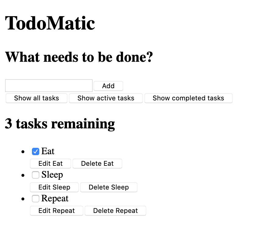
它很难看,而且还没有功能,但这没关系——我们一会儿就会为它设计样式。首先,考虑一下我们的 JSX,以及它是如何与我们的用户故事相对应的。
- 我们有一个
<form>元素,有一个<input type="text">用于写出一个新任务,还有一个按钮用于提交表单。 - 我们有一组按钮,用于筛选我们的任务。
- 我们有一个标题,用于告诉我们还有多少任务。
- 我们有三个任务,安排在一个无序的列表中。每项任务都是一个列表项(
<li>),有编辑和删除的按钮,还有一个复选框可以将其勾选为完成。
这些表格将允许我们添加任务;按钮让我们可以对任务进行筛选;我们通过标题和列表查看任务。用于编辑任务的 UI 目前很缺乏。这没关系——我们以后再写。
无障碍功能
你可能会注意到这里有一些不寻常的属性。比如说:
<button type="button" className="btn toggle-btn" aria-pressed="true">
  <span className="visually-hidden">Show </span>
  <span>all</span>
  <span className="visually-hidden"> tasks</span>
</button>
这里的 aria-pressed 告诉辅助技术(比如屏幕阅读器),该按钮可以有两种状态。按压 或 未按压 。可以把它们看作 开 和 关 。设置为 true 意味着该按钮默认是被按下的。
visually-hidden 这个类还没有效果,因为我们还没有包含任何 CSS。一旦我们把样式写好,任何带有这个类的元素都会被隐藏起来,视力正常的用户不会看到,而屏幕阅读器用户仍然可以使用——这是因为视力正常的用户不需要这些词;它们的存在是为了给没有额外视觉环境帮助的屏幕阅读器用户提供更多关于这个按钮的信息。
再往下,你可以找到我们的 <ul> 元素:
<ul
  role="list"
  className="todo-list stack-large stack-exception"
  aria-labelledby="list-heading"></ul>
role 属性帮助辅助技术解释一个标签代表哪种元素。默认情况下,<ul> 被视为一个列表,但我们即将添加的样式将改变它。添加 role 将恢复 ul 元素的“列表”含义。如果你想了解更多关于为什么要这样做,你可以看看 Scott O'Hara's article, "Fixing Lists".
aria-labelledby 属性告诉辅助技术,我们把列表标题当作标签,用来描述它下面的列表的目的。这种关联能让列表包含更多信息,这可以帮助屏幕阅读器用户更好地理解它的目的。
最后,我们列表项中的标签和输入有一些 JSX 特有的属性:
<input id="todo-0" type="checkbox" defaultChecked="{true}" />
<label className="todo-label" htmlFor="todo-0"> Eat </label>
<input /> 标签中的 defaultChecked 属性告诉 React 最初要检查这个复选框。如果我们像在普通的 HTML 中那样使用 checked,React 会在浏览器控制台中记录一些与处理复选框事件有关的警告,这是我们不想要的。现在不用太担心这个问题——我们将在以后使用事件的时候讨论这个问题。
htmlFor 属性对应于 HTML 中使用的 for 属性。因为 for 是一个保留词,我们不能在 JSX 中使用 for 作为属性,所以 React 使用 htmlFor 代替。
说明:
- 要在 JSX 属性中使用布尔值(
true和false),你必须用大括号把它们括起来。如果你写defaultChecked="true",defaultChecked的值将是"true"——一个字符串字面。记住——这实际上是 JavaScript,而不是 HTML! - 在前面的代码片段中使用的
aria-pressed属性的值是"true",因为aria-pressed不是像checked那样是一个真正的布尔属性。
实现样式
将下面的 CSS 代码粘贴到 src/index.css 中,使其取代当前的内容:
/* RESETS */
*,
*::before,
*::after {
  box-sizing: border-box;
}
*:focus {
  outline: 3px dashed #228bec;
  outline-offset: 0;
}
html {
  font: 62.5% / 1.15 sans-serif;
}
h1,
h2 {
  margin-bottom: 0;
}
ul {
  list-style: none;
  padding: 0;
}
button {
  border: none;
  margin: 0;
  padding: 0;
  width: auto;
  overflow: visible;
  background: transparent;
  color: inherit;
  font: inherit;
  line-height: normal;
  -webkit-font-smoothing: inherit;
  -moz-osx-font-smoothing: inherit;
  -webkit-appearance: none;
}
button::-moz-focus-inner {
  border: 0;
}
button,
input,
optgroup,
select,
textarea {
  font-family: inherit;
  font-size: 100%;
  line-height: 1.15;
  margin: 0;
}
button,
input {
  overflow: visible;
}
input[type="text"] {
  border-radius: 0;
}
body {
  width: 100%;
  max-width: 68rem;
  margin: 0 auto;
  font:
    1.6rem/1.25 Arial,
    sans-serif;
  background-color: #f5f5f5;
  color: #4d4d4d;
}
@media screen and (min-width: 620px) {
  body {
    font-size: 1.9rem;
    line-height: 1.31579;
  }
}
/*END RESETS*/
/* GLOBAL STYLES */
.form-group > input[type="text"] {
  display: inline-block;
  margin-top: 0.4rem;
}
.btn {
  padding: 0.8rem 1rem 0.7rem;
  border: 0.2rem solid #4d4d4d;
  cursor: pointer;
  text-transform: capitalize;
}
.btn.toggle-btn {
  border-width: 1px;
  border-color: #d3d3d3;
}
.btn.toggle-btn[aria-pressed="true"] {
  text-decoration: underline;
  border-color: #4d4d4d;
}
.btn__danger {
  color: #fff;
  background-color: #ca3c3c;
  border-color: #bd2130;
}
.btn__filter {
  border-color: lightgrey;
}
.btn__primary {
  color: #fff;
  background-color: #000;
}
.btn-group {
  display: flex;
  justify-content: space-between;
}
.btn-group > * {
  flex: 1 1 49%;
}
.btn-group > * + * {
  margin-left: 0.8rem;
}
.label-wrapper {
  margin: 0;
  flex: 0 0 100%;
  text-align: center;
}
.visually-hidden {
  position: absolute !important;
  height: 1px;
  width: 1px;
  overflow: hidden;
  clip: rect(1px 1px 1px 1px);
  clip: rect(1px, 1px, 1px, 1px);
  white-space: nowrap;
}
[class*="stack"] > * {
  margin-top: 0;
  margin-bottom: 0;
}
.stack-small > * + * {
  margin-top: 1.25rem;
}
.stack-large > * + * {
  margin-top: 2.5rem;
}
@media screen and (min-width: 550px) {
  .stack-small > * + * {
    margin-top: 1.4rem;
  }
  .stack-large > * + * {
    margin-top: 2.8rem;
  }
}
.stack-exception {
  margin-top: 1.2rem;
}
/* END GLOBAL STYLES */
.todoapp {
  background: #fff;
  margin: 2rem 0 4rem 0;
  padding: 1rem;
  position: relative;
  box-shadow:
    0 2px 4px 0 rgba(0, 0, 0, 0.2),
    0 2.5rem 5rem 0 rgba(0, 0, 0, 0.1);
}
@media screen and (min-width: 550px) {
  .todoapp {
    padding: 4rem;
  }
}
.todoapp > * {
  max-width: 50rem;
  margin-left: auto;
  margin-right: auto;
}
.todoapp > form {
  max-width: 100%;
}
.todoapp > h1 {
  display: block;
  max-width: 100%;
  text-align: center;
  margin: 0;
  margin-bottom: 1rem;
}
.label__lg {
  line-height: 1.01567;
  font-weight: 300;
  padding: 0.8rem;
  margin-bottom: 1rem;
  text-align: center;
}
.input__lg {
  padding: 2rem;
  border: 2px solid #000;
}
.input__lg:focus {
  border-color: #4d4d4d;
  box-shadow: inset 0 0 0 2px;
}
[class*="__lg"] {
  display: inline-block;
  width: 100%;
  font-size: 1.9rem;
}
[class*="__lg"]:not(:last-child) {
  margin-bottom: 1rem;
}
@media screen and (min-width: 620px) {
  [class*="__lg"] {
    font-size: 2.4rem;
  }
}
.filters {
  width: 100%;
  margin: unset auto;
}
/* Todo item styles */
.todo {
  display: flex;
  flex-direction: row;
  flex-wrap: wrap;
}
.todo > * {
  flex: 0 0 100%;
}
.todo-text {
  width: 100%;
  min-height: 4.4rem;
  padding: 0.4rem 0.8rem;
  border: 2px solid #565656;
}
.todo-text:focus {
  box-shadow: inset 0 0 0 2px;
}
/* CHECKBOX STYLES */
.c-cb {
  box-sizing: border-box;
  font-family: Arial, sans-serif;
  -webkit-font-smoothing: antialiased;
  font-weight: 400;
  font-size: 1.6rem;
  line-height: 1.25;
  display: block;
  position: relative;
  min-height: 44px;
  padding-left: 40px;
  clear: left;
}
.c-cb > label::before,
.c-cb > input[type="checkbox"] {
  box-sizing: border-box;
  top: -2px;
  left: -2px;
  width: 44px;
  height: 44px;
}
.c-cb > input[type="checkbox"] {
  -webkit-font-smoothing: antialiased;
  cursor: pointer;
  position: absolute;
  z-index: 1;
  margin: 0;
  opacity: 0;
}
.c-cb > label {
  font-size: inherit;
  font-family: inherit;
  line-height: inherit;
  display: inline-block;
  margin-bottom: 0;
  padding: 8px 15px 5px;
  cursor: pointer;
  touch-action: manipulation;
}
.c-cb > label::before {
  content: "";
  position: absolute;
  border: 2px solid currentcolor;
  background: transparent;
}
.c-cb > input[type="checkbox"]:focus + label::before {
  border-width: 4px;
  outline: 3px dashed #228bec;
}
.c-cb > label::after {
  box-sizing: content-box;
  content: "";
  position: absolute;
  top: 11px;
  left: 9px;
  width: 18px;
  height: 7px;
  transform: rotate(-45deg);
  border: solid;
  border-width: 0 0 5px 5px;
  border-top-color: transparent;
  opacity: 0;
  background: transparent;
}
.c-cb > input[type="checkbox"]:checked + label::after {
  opacity: 1;
}
保存并刷新浏览器,你的应用程序现在应该有正常的样式。