The box model
Tudo em CSS tem um quadro em torno de si, e entender estes quadros é chave para ser capaz de criar arranjos ( layouts ) com CSS, ou para alinhar itens com outros itens. Nesta lição, olharemos de modo apropiado para o modelo de caixas do CSS ( CSS Box Model ), de forma que você possa montar arranjos mais complexos com um melhor entendimento de como ele funciona e da terminologia relacionada.
| Pré-requisitos: | Familiaridade básica em utilizar computadores, ambiente de trabalho básico configurado conforme detalhado emsoftware básico instalado, conhecimento básico de como criar e gerenciar arquivos, básico de HTML ( Introdução ao HTML), e uma idéia de como o CSS funciona (ensinado em CSS primeiros passos.) |
|---|---|
| Objetivo: | Aprender sobre o Modelo de Caixa do CSS, o que faz o modelo de caixa e como trocar para um modelo alternativo. |
Caixas Block e Inline
No CSS, temos dois tipos, caixas box e caixas inline, O tipo de caixa influencia diretameente em como as mesmas irao interagir com o fluxo da pagina(page flow) e com as outras caixas da pagina:
Se for uma caixa definida como block, ela tera os seguintes comportamentos:
- A caixa irá quebrar em uma nova linha.
- A caixa irá se estender na direção horizontal (inline) para preeencher todo o espaço disponível no container. Na maioria dos casos isso significa que essa caixa será tão larga quanto seu recipiente.
- As propriedades
widtheheightserão respeitadas. padding,margineborderfarão com que outros elementos sejam empurrados para fora da caixa.
A menos que decidamos alterar o tipo de exibição para inline, alguns elementos como os cabeçalhos (ex: <h1>) e <p> são caixas do tipo block por padrão.
Se a caixa for do tipo inline, ela seguira os segintes comportamentos:
- Ela não quebrará em uma nova linha.
- As propriedades
widtheheightnão serão aplicadas. - Padding vertical, margens e bordas serão aplicados, mas não farão com que outras caixas embutidades se afastem.
- Padding horizontal, margens e bordas serão aplicadas e farão com que outras caixas embutidades se afastem da caixa.
O elemento <a> usado em links, <span>, <em> e <strong> são exemplos de elementos que sao inline por padrão.
O tipo de caixa aplicada em um elemento é definida pela propriedade display como block ou inline e está relacionada ao valor outer do display.
Além disto: Tipos de exibição ( display ) internos e externos
Nesse ponto, é melhor também explicar os tipos de exibição interna ( inner ) e externa ( outer ). Como mencionado acima, as caixas em CSS têm um tipo de exibição externa, que detalha se a caixa é em bloco ou em linha.
Caixas possuem também um tipo de display inner, que determina como elementos dentro da caixa são posicionados. Por default, os elementos dentro de uma caixa são posicionados em um fluxo normal ( normal flow ), significando que eles se comportam como qualquer outro bloco e elementos inline (como explicado acima).
Podemos, no entando, alterar o tipo de exibição (display) interna usando valores display como flex. Se definirmos display: flex; em um elemento, o tipo de exibição externo será block, mas o tipo de exibição interna será alterada para flex. Todos os filhos diretos desta caixa se tornarão itens flexíveis e serão dispostos de acordo com as regras estabelecidas na especificação Flexbox, que você aprenderá mais tarde.
Nota:
Para ler mais sobre valores de exibição (display) e como caixas funcionam nos layouts block e inline, dê uma olhada no guia MDN sobre Block e Inline Layout
Quando aprender sobre CSS Layout você encontrará flex e vários outros valores internos que suas caixas podem ter, como por exemplo grid.
O layout Block e inline, no entanto, é a forma padrão de como as coisas na web se comportam. Como dissemos acima, às vezes é chamado de normal flow, porque sem qualquer outra instrução, nossas caixas são dispostas como blocks ou inlines.
Examples of different display types
Let's move on and have a look at some examples. Below we have three different HTML elements, all of which have an outer display type of block. The first is a paragraph, which has a border added in CSS. The browser renders this as a block box, so the paragraph begins on a new line, and expands to the full width available to it.
The second is a list, which is laid out using display: flex. This establishes flex layout for the items inside the container, however, the list itself is a block box and — like the paragraph — expands to the full container width and breaks onto a new line.
Below this, we have a block-level paragraph, inside which are two <span> elements. These elements would normally be inline, however, one of the elements has a class of block, and we have set it to display: block.
We can see how inline elements behave in this next example. The <span> elements in the first paragraph are inline by default and so do not force line breaks.
We also have a <ul> element which is set to display: inline-flex, creating an inline box around some flex items.
Finally, we have two paragraphs both set to display: inline. The inline flex container and paragraphs all run together on one line rather than breaking onto new lines as they would do if they were displaying as block-level elements.
In the example, you can change display: inline to display: block or display: inline-flex to display: flex to toggle between these display modes.
You will encounter things like flex layout later in these lessons; the key thing to remember for now is that changing the value of the display property can change whether the outer display type of a box is block or inline, which changes the way it displays alongside other elements in the layout.
In the rest of the lesson, we will concentrate on the outer display type.
What is the CSS box model?
The full CSS box model applies to block boxes, inline boxes only use some of the behavior defined in the box model. The model defines how the different parts of a box — margin, border, padding, and content — work together to create a box that you can see on the page. To add some additional complexity, there is a standard and an alternate box model.
Parts of a box
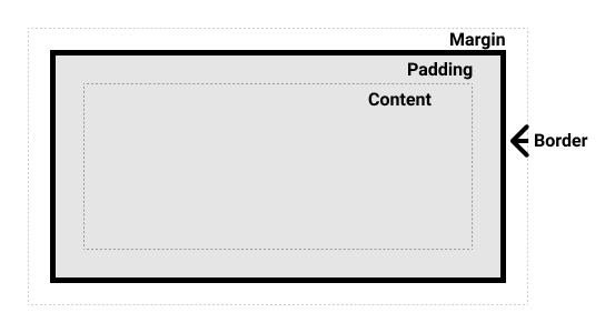
Making up a block box in CSS we have the:
- Content box: The area where your content is displayed, which can be sized using properties like
widthandheight. - Padding box: The padding sits around the content as white space; its size can be controlled using
paddingand related properties. - Border box: The border box wraps the content and any padding. Its size and style can be controlled using
borderand related properties. - Margin box: The margin is the outermost layer, wrapping the content, padding and border as whitespace between this box and other elements. Its size can be controlled using
marginand related properties.
The below diagram shows these layers:

The standard CSS box model
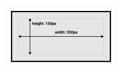
In the standard box model, if you give a box a width and a height attribute, this defines the width and height of the content box. Any padding and border is then added to that width and height to get the total size taken up by the box. This is shown in the image below.
If we assume that the box has the following CSS defining width, height, margin, border, and padding:
.box {
  width: 350px;
  height: 150px;
  margin: 10px;
  padding: 25px;
  border: 5px solid black;
}
The space taken up by our box using the standard box model will actually be 410px (350 + 25 + 25 + 5 + 5), and the height 210px (150 + 25 + 25 + 5 + 5), as the padding and border are added to the width used for the content box.

Nota: The margin is not counted towards the actual size of the box — sure, it affects the total space that the box will take up on the page, but only the space outside the box. The box's area stops at the border — it does not extend into the margin.
The alternative CSS box model
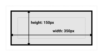
You might think it is rather inconvenient to have to add up the border and padding to get the real size of the box, and you would be right! For this reason, CSS had an alternative box model introduced some time after the standard box model. Using this model, any width is the width of the visible box on the page, therefore the content area width is that width minus the width for the padding and border. The same CSS as used above would give the below result (width = 350px, height = 150px).

By default, browsers use the standard box model. If you want to turn on the alternative model for an element you do so by setting box-sizing: border-box on it. By doing this you are telling the browser to take the border box as the area defined by any size you set.
.box {
  box-sizing: border-box;
}
If you want all of your elements to use the alternative box model, and this is a common choice among developers, set the box-sizing property on the <html> element, then set all other elements to inherit that value, as seen in the snippet below. If you want to understand the thinking behind this, see the CSS Tricks article on box-sizing.
html {
  box-sizing: border-box;
}
*,
*::before,
*::after {
  box-sizing: inherit;
}
Nota: An interesting bit of history — Internet Explorer used to default to the alternative box model, with no mechanism available to switch.
Playing with box models
In the below example, you can see two boxes. Both have a class of .box, which gives them the same width, height, margin, border, and padding. The only difference is that the second box has been set to use the alternative box model.
Can you change the size of the second box (by adding CSS to the .alternate class) to make it match the first box in width and height?
Nota: You can find a solution for this task here.
Use browser DevTools to view the box model
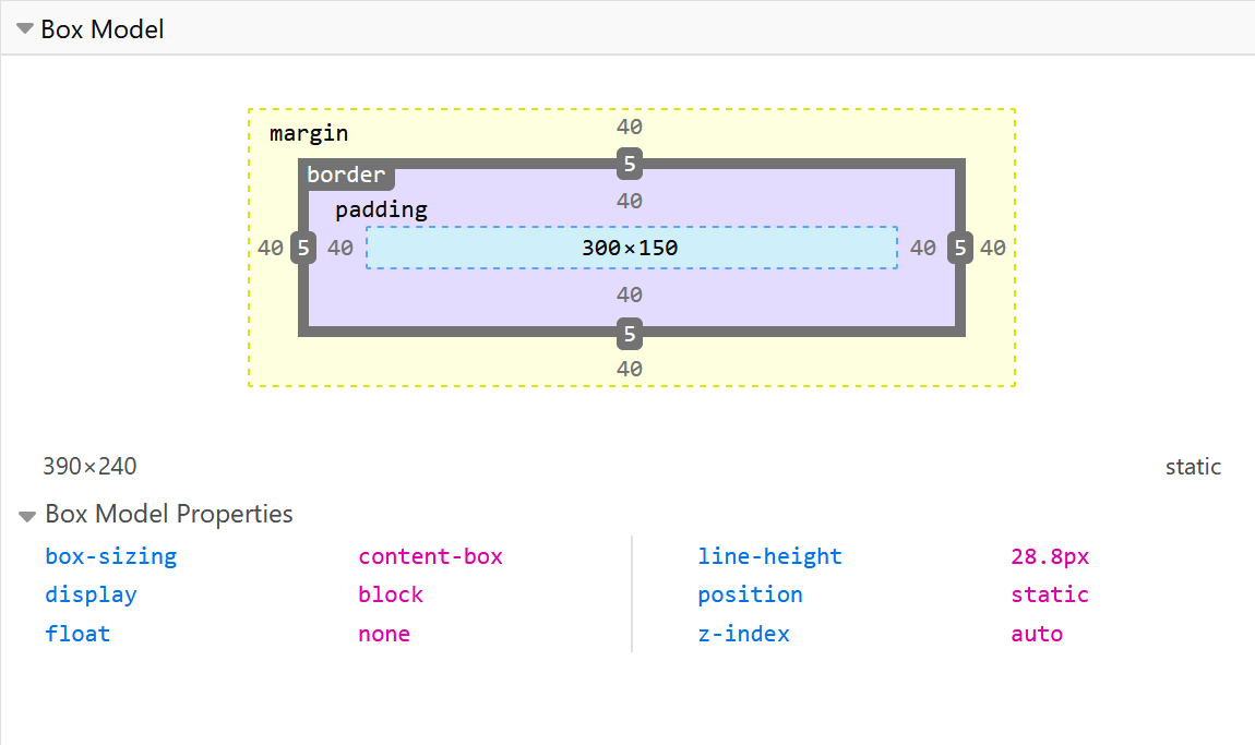
Your browser developer tools can make understanding the box model far easier. If you inspect an element in Firefox's DevTools, you can see the size of the element plus its margin, padding, and border. Inspecting an element in this way is a great way to find out if your box is really the size you think it is!

Margins, padding, and borders
You've already seen the margin, padding, and border properties at work in the example above. The properties used in that example are shorthands and allow us to set all four sides of the box at once. These shorthands also have equivalent longhand properties, which allow control over the different sides of the box individually.
Let's explore these properties in more detail.
Margin
The margin is an invisible space around your box. It pushes other elements away from the box. Margins can have positive or negative values. Setting a negative margin on one side of your box can cause it to overlap other things on the page. Whether you are using the standard or alternative box model, the margin is always added after the size of the visible box has been calculated.
We can control all margins of an element at once using the margin property, or each side individually using the equivalent longhand properties:
In the example below, try changing the margin values to see how the box is pushed around due to the margin creating or removing space (if it is a negative margin) between this element and the containing element.
Margin collapsing
A key thing to understand about margins is the concept of margin collapsing. If you have two elements whose margins touch, and both margins are positive, those margins will combine to become one margin, which is the size of the largest individual margin. If one or both margins are negative, the amount of negative value will subtract from the total.
In the example below, we have two paragraphs. The top paragraph has a margin-bottom of 50 pixels. The second paragraph has a margin-top of 30 pixels. The margins have collapsed together so the actual margin between the boxes is 50 pixels and not the total of the two margins.
You can test this by setting the margin-top of paragraph two to 0. The visible margin between the two paragraphs will not change — it retains the 50 pixels set in the bottom-margin of paragraph one. If you set it to -10px, you'll see that the overall margin becomes 40px — it subtracts from the 50px.
There are a number of rules that dictate when margins do and do not collapse. For further information see the detailed page on mastering margin collapsing. The main thing to remember for now is that margin collapsing is a thing that happens. If you are creating space with margins and don't get the space you expect, this is probably what is happening.
Borders
The border is drawn between the margin and the padding of a box. If you are using the standard box model, the size of the border is added to the width and height of the box. If you are using the alternative box model then the size of the border makes the content box smaller as it takes up some of that available width and height.
For styling borders, there are a large number of properties — there are four borders, and each border has a style, width and color that we might want to manipulate.
You can set the width, style, or color of all four borders at once using the border property.
To set the properties of each side individually, you can use:
To set the width, style, or color of all sides, use the following:
To set the width, style, or color of a single side, you can use one of the most granular longhand properties:
border-top-widthborder-top-styleborder-top-colorborder-right-widthborder-right-styleborder-right-colorborder-bottom-widthborder-bottom-styleborder-bottom-colorborder-left-widthborder-left-styleborder-left-color
In the example below we have used various shorthands and longhands to create borders. Have a play around with the different properties to check that you understand how they work. The MDN pages for the border properties give you information about the different styles of border you can choose from.
Padding
The padding sits between the border and the content area. Unlike margins you cannot have negative amounts of padding, so the value must be 0 or a positive value. Any background applied to your element will display behind the padding, and it is typically used to push the content away from the border.
We can control the padding on each side of an element individually using the padding property, or each side individually using the equivalent longhand properties:
If you change the values for padding on the class .box in the example below you can see that this changes where the text begins in relation to the box.
You can also change the padding on the class .container, which will make space between the container and the box. Padding can be changed on any element, and will make space between its border and whatever is inside the element.
The box model and inline boxes
All of the above applies fully to block boxes. Some of the properties can apply to inline boxes too, such as those created by a <span> element.
In the example below, we have a <span> inside a paragraph and have applied a width, height, margin, border, and padding to it. You can see that the width and height are ignored. The vertical margin, padding, and border are respected but they do not change the relationship of other content to our inline box and so the padding and border overlaps other words in the paragraph. Horizontal padding, margins, and borders are respected and will cause other content to move away from the box.
Using display: inline-block
There is a special value of display, which provides a middle ground between inline and block. This is useful for situations where you do not want an item to break onto a new line, but do want it to respect width and height and avoid the overlapping seen above.
An element with display: inline-block does a subset of the block things we already know about:
- The
widthandheightproperties are respected. padding,margin, andborderwill cause other elements to be pushed away from the box.
It does not, however, break onto a new line, and will only become larger than its content if you explicitly add width and height properties.
In this next example, we have added display: inline-block to our <span> element. Try changing this to display: block or removing the line completely to see the difference in display models.
Where this can be useful is when you want to give a link to a larger hit area by adding padding. <a> is an inline element like <span>; you can use display: inline-block to allow padding to be set on it, making it easier for a user to click the link.
You see this fairly frequently in navigation bars. The navigation below is displayed in a row using flexbox and we have added padding to the <a> element as we want to be able to change the background-color when the <a> is hovered. The padding appears to overlap the border on the <ul> element. This is because the <a> is an inline element.
Add display: inline-block to the rule with the .links-list a selector, and you will see how it fixes this issue by causing the padding to be respected by other elements.
Test your skills!
We have covered a lot in this article, but can you remember the most important information? You can find some further tests to verify that you've retained this information before you move on — see Test your skills: The Box Model.
Summary
That's most of what you need to understand about the box model. You may want to return to this lesson in the future if you ever find yourself confused about how big boxes are in your layout.
In the next lesson, we will take a look at how backgrounds and borders can be used to make your plain boxes look more interesting.