Scroll-linked animations can often add a touch of class to a website, but have long been the preserve of JavaScript. Now a brand new specification is being implemented to enable us to create rich scroll-driven experiences with CSS!
When we think of scroll-driven animations, we generally mean one of two things:
- An animation that occurs as the user scrolls, with the progress of the animation explicitly linked to the scroll progression. For example, a progress bar for a long article.
- An animation that occurs on an element as it enters, exits, or progresses through the visible area — often the viewport, but it could be the visible portion of another scrollable container (this is defined as the scrollport).
The Scroll-driven Animations specification covers both these types of animations. In this article, we're going to take a look at Scroll Progress Timeline first, which, as the name suggests, links an animation to the progress of scroll.
Note: The features in this post here have limited browser support at the time of writing.
It's best to use Chrome Canary but you can also enable experimental features in Chrome 115 or later to follow along with the examples and have a play around with scroll-linked animations yourself.
In this example, we'll implement a common feature: animating a simple progress bar to scale from left to right as the user scrolls a web page. Because we want to link our animation to the progress of the root scroller, we can use an anonymous scroll progress timeline.
First let's define the animation itself. We want our progress bar to scale from left to right, so we'll use a transform:
@keyframes scaleProgress {
  0% {
    transform: scaleX(0);
  }
  100% {
    transform: scaleX(1);
  }
}
To associate our progress bar element's animation with the progress of scroll, we've used the animation-timeline property and set the scroll() function as its value.
.progress {
  animation-timeline: scroll();
}
The scroll() function allows us to specify the scroll container and axis. The default value is scroll(nearest block), meaning that the animation will be linked to the nearest scrollable ancestor on the block axis. This is sufficient for our purposes, although we could optionally specify the root as the scroll container, since we want to explicitly link the animation to the progress of scroll of the viewport.
.progress {
  animation-timeline: scroll(root block);
}
Lastly, we need to add our animation to the progress bar element, with our keyframe animation as the animation-name. We need to set the animation duration to auto, as the duration will be determined by the scroll progress. We're also setting the easing (animation-timing-function) to linear so that it progresses smoothly in line with scroll. If we were to use the default value (ease), the animation would start off slowly before rapidly speeding up, then slowing down at the end — not what we want from a progress indicator!
.progress {
  animation-timeline: scroll(root);
  animation-name: scaleProgress;
  animation-duration: auto;
  animation-timing-function: linear;
}
We could condense this somewhat using the animation shorthand property:
.progress {
  animation: scaleProgress auto linear;
  animation-timeline: scroll(root);
}
Note: animation-timeline is not currently included in the shorthand. However, the animation property resets animation-timeline to auto (the default), so we need to declare animation-timeline after the animation shorthand.
* {
  box-sizing: border-box;
}

body {
  font-family: "Helvetica", sans-serif;
  line-height: 1.6;
  min-height: 300vh;
  margin: 0;
  font-size: clamp(1rem, 1rem + 1vw, 1.5rem);
}

h1 {
  line-height: 1.25;
}

.container {
  max-width: 800px;
  margin: 0 auto;
  padding: clamp(1rem, 2vw, 5rem);
}

.progress {
  height: 1rem;
  background: blue;
  position: fixed;
  top: 0;
  left: 0;
  width: 100%;
  transform-origin: 0 50%;
  animation: scaleProgress auto linear;
  animation-timeline: scroll(root);
}

@keyframes scaleProgress {
  0% {
    transform: scaleX(0);
  }
  100% {
    transform: scaleX(1);
  }
}
<div class="progress"></div>
<div class="container">
  <h1>Anonymous scroll timeline</h1>
  <p>
    Lorem ipsum dolor sit amet, consectetur adipiscing elit, sed do eiusmod
    tempor incididunt ut labore et dolore magna aliqua. Commodo viverra maecenas
    accumsan lacus. Orci sagittis eu volutpat odio facilisis mauris. Eu nisl
    nunc mi ipsum faucibus vitae aliquet nec. Amet nisl purus in mollis nunc
    sed. Egestas tellus rutrum tellus pellentesque eu tincidunt tortor aliquam.
    Lorem sed risus ultricies tristique nulla. Commodo sed egestas egestas
    fringilla phasellus faucibus. Semper eget duis at tellus at urna condimentum
    mattis pellentesque. Porta lorem mollis aliquam ut porttitor leo a diam. At
    lectus urna duis convallis convallis tellus id interdum velit. Placerat orci
    nulla pellentesque dignissim enim sit amet venenatis urna. Rutrum tellus
    pellentesque eu tincidunt tortor. Nulla facilisi cras fermentum odio eu
    feugiat. Aliquet risus feugiat in ante metus. Quis imperdiet massa tincidunt
    nunc pulvinar sapien et. Vel pharetra vel turpis nunc.
  </p>
  <p>
    Potenti nullam ac tortor vitae purus. Tempor orci dapibus ultrices in
    iaculis nunc sed augue. Adipiscing elit duis tristique sollicitudin nibh.
    Luctus accumsan tortor posuere ac ut consequat semper. Enim nulla aliquet
    porttitor lacus. Netus et malesuada fames ac. Aliquam ultrices sagittis orci
    a scelerisque. Fringilla phasellus faucibus scelerisque eleifend donec
    pretium vulputate sapien. Nibh praesent tristique magna sit amet purus
    gravida quis. Mi proin sed libero enim sed faucibus turpis in eu. Natoque
    penatibus et magnis dis parturient montes nascetur ridiculus. Pellentesque
    elit ullamcorper dignissim cras tincidunt lobortis. Nunc faucibus a
    pellentesque sit amet porttitor eget dolor. Luctus accumsan tortor posuere
    ac ut. Et molestie ac feugiat sed lectus vestibulum mattis ullamcorper
    velit. Ac odio tempor orci dapibus ultrices in iaculis nunc sed.
  </p>
  <p>
    Molestie ac feugiat sed lectus vestibulum mattis. Elementum curabitur vitae
    nunc sed velit dignissim sodales ut. Netus et malesuada fames ac turpis
    egestas sed tempus. Viverra nam libero justo laoreet sit amet cursus sit
    amet. Maecenas sed enim ut sem viverra aliquet eget. Et netus et malesuada
    fames ac turpis egestas maecenas pharetra. Imperdiet proin fermentum leo vel
    orci porta. Nunc eget lorem dolor sed viverra ipsum nunc aliquet. Facilisis
    mauris sit amet massa vitae. Cras semper auctor neque vitae. Adipiscing diam
    donec adipiscing tristique risus. Scelerisque eu ultrices vitae auctor eu.
    Adipiscing vitae proin sagittis nisl rhoncus mattis rhoncus urna. Egestas
    quis ipsum suspendisse ultrices gravida. Semper quis lectus nulla at
    volutpat diam. Egestas congue quisque egestas diam in arcu.
  </p>
  <p>
    Est velit egestas dui id ornare arcu odio ut sem. Tortor consequat id porta
    nibh venenatis. Proin sagittis nisl rhoncus mattis rhoncus urna neque. Porta
    non pulvinar neque laoreet suspendisse interdum. Lacus vel facilisis
    volutpat est velit egestas dui. Facilisi morbi tempus iaculis urna id
    volutpat. Venenatis urna cursus eget nunc scelerisque viverra. Ultrices
    gravida dictum fusce ut. Eu augue ut lectus arcu. Orci dapibus ultrices in
    iaculis. Rhoncus mattis rhoncus urna neque viverra justo nec ultrices. Odio
    eu feugiat pretium nibh ipsum consequat. Accumsan in nisl nisi scelerisque
    eu ultrices vitae. Nunc faucibus a pellentesque sit. Ultricies integer quis
    auctor elit sed vulputate mi. Nulla aliquet enim tortor at auctor urna nunc
    id cursus.
  </p>
  <p>
    Integer enim neque volutpat ac tincidunt vitae semper. Condimentum lacinia
    quis vel eros donec ac odio tempor orci. Imperdiet dui accumsan sit amet
    nulla facilisi morbi tempus. Suspendisse potenti nullam ac tortor vitae. Non
    sodales neque sodales ut. Elementum eu facilisis sed odio. Aliquet nec
    ullamcorper sit amet risus nullam eget felis eget. Diam phasellus vestibulum
    lorem sed risus ultricies tristique. Facilisis sed odio morbi quis. Diam
    quis enim lobortis scelerisque fermentum dui faucibus. Ullamcorper dignissim
    cras tincidunt lobortis feugiat vivamus at augue eget. Platea dictumst
    vestibulum rhoncus est pellentesque elit ullamcorper dignissim.
  </p>
</div>
Just like regular keyframe animations, we can apply more than one scroll timeline animation simultaneously, such as changing the color of our progress bar.
.progress {
  animation:
    scaleProgress auto linear,
    colorChange auto linear;
  animation-timeline: scroll(root);
}

@keyframes scaleProgress {
  0% {
    transform: scaleX(0);
  }
  100% {
    transform: scaleX(1);
  }
}

@keyframes colorChange {
  0% {
    background-color: red;
  }
  50% {
    background-color: yellow;
  }
  100% {
    background-color: lime;
  }
}
<div class="progress"></div>

<div class="container">
  <h1>Anonymous scroll timeline</h1>
  <p>
    Lorem ipsum dolor sit amet, consectetur adipiscing elit, sed do eiusmod
    tempor incididunt ut labore et dolore magna aliqua. Commodo viverra maecenas
    accumsan lacus. Orci sagittis eu volutpat odio facilisis mauris. Eu nisl
    nunc mi ipsum faucibus vitae aliquet nec. Amet nisl purus in mollis nunc
    sed. Egestas tellus rutrum tellus pellentesque eu tincidunt tortor aliquam.
    Lorem sed risus ultricies tristique nulla. Commodo sed egestas egestas
    fringilla phasellus faucibus. Semper eget duis at tellus at urna condimentum
    mattis pellentesque. Porta lorem mollis aliquam ut porttitor leo a diam. At
    lectus urna duis convallis convallis tellus id interdum velit. Placerat orci
    nulla pellentesque dignissim enim sit amet venenatis urna. Rutrum tellus
    pellentesque eu tincidunt tortor. Nulla facilisi cras fermentum odio eu
    feugiat. Aliquet risus feugiat in ante metus. Quis imperdiet massa tincidunt
    nunc pulvinar sapien et. Vel pharetra vel turpis nunc.
  </p>
  <p>
    Potenti nullam ac tortor vitae purus. Tempor orci dapibus ultrices in
    iaculis nunc sed augue. Adipiscing elit duis tristique sollicitudin nibh.
    Luctus accumsan tortor posuere ac ut consequat semper. Enim nulla aliquet
    porttitor lacus. Netus et malesuada fames ac. Aliquam ultrices sagittis orci
    a scelerisque. Fringilla phasellus faucibus scelerisque eleifend donec
    pretium vulputate sapien. Nibh praesent tristique magna sit amet purus
    gravida quis. Mi proin sed libero enim sed faucibus turpis in eu. Natoque
    penatibus et magnis dis parturient montes nascetur ridiculus. Pellentesque
    elit ullamcorper dignissim cras tincidunt lobortis. Nunc faucibus a
    pellentesque sit amet porttitor eget dolor. Luctus accumsan tortor posuere
    ac ut. Et molestie ac feugiat sed lectus vestibulum mattis ullamcorper
    velit. Ac odio tempor orci dapibus ultrices in iaculis nunc sed.
  </p>
  <p>
    Molestie ac feugiat sed lectus vestibulum mattis. Elementum curabitur vitae
    nunc sed velit dignissim sodales ut. Netus et malesuada fames ac turpis
    egestas sed tempus. Viverra nam libero justo laoreet sit amet cursus sit
    amet. Maecenas sed enim ut sem viverra aliquet eget. Et netus et malesuada
    fames ac turpis egestas maecenas pharetra. Imperdiet proin fermentum leo vel
    orci porta. Nunc eget lorem dolor sed viverra ipsum nunc aliquet. Facilisis
    mauris sit amet massa vitae. Cras semper auctor neque vitae. Adipiscing diam
    donec adipiscing tristique risus. Scelerisque eu ultrices vitae auctor eu.
    Adipiscing vitae proin sagittis nisl rhoncus mattis rhoncus urna. Egestas
    quis ipsum suspendisse ultrices gravida. Semper quis lectus nulla at
    volutpat diam. Egestas congue quisque egestas diam in arcu.
  </p>
  <p>
    Est velit egestas dui id ornare arcu odio ut sem. Tortor consequat id porta
    nibh venenatis. Proin sagittis nisl rhoncus mattis rhoncus urna neque. Porta
    non pulvinar neque laoreet suspendisse interdum. Lacus vel facilisis
    volutpat est velit egestas dui. Facilisi morbi tempus iaculis urna id
    volutpat. Venenatis urna cursus eget nunc scelerisque viverra. Ultrices
    gravida dictum fusce ut. Eu augue ut lectus arcu. Orci dapibus ultrices in
    iaculis. Rhoncus mattis rhoncus urna neque viverra justo nec ultrices. Odio
    eu feugiat pretium nibh ipsum consequat. Accumsan in nisl nisi scelerisque
    eu ultrices vitae. Nunc faucibus a pellentesque sit. Ultricies integer quis
    auctor elit sed vulputate mi. Nulla aliquet enim tortor at auctor urna nunc
    id cursus.
  </p>
  <p>
    Integer enim neque volutpat ac tincidunt vitae semper. Condimentum lacinia
    quis vel eros donec ac odio tempor orci. Imperdiet dui accumsan sit amet
    nulla facilisi morbi tempus. Suspendisse potenti nullam ac tortor vitae. Non
    sodales neque sodales ut. Elementum eu facilisis sed odio. Aliquet nec
    ullamcorper sit amet risus nullam eget felis eget. Diam phasellus vestibulum
    lorem sed risus ultricies tristique. Facilisis sed odio morbi quis. Diam
    quis enim lobortis scelerisque fermentum dui faucibus. Ullamcorper dignissim
    cras tincidunt lobortis feugiat vivamus at augue eget. Platea dictumst
    vestibulum rhoncus est pellentesque elit ullamcorper dignissim.
  </p>
</div>
* {
  box-sizing: border-box;
}

body {
  font-family: "Helvetica", sans-serif;
  line-height: 1.6;
  min-height: 300vh;
  margin: 0;
  font-size: clamp(1rem, 1rem + 1vw, 1.5rem);
}

h1 {
  line-height: 1.25;
}

.container {
  max-width: 800px;
  margin: 0 auto;
  padding: clamp(1rem, 2vw, 5rem);
}

.progress {
  height: 1rem;
  background: blue;
  position: fixed;
  top: 0;
  left: 0;
  width: 100%;
  transform-origin: 0 50%;
  animation:
    scaleProgress auto linear forwards,
    colorChange auto linear forwards;
  animation-timeline: scroll(root);
}

@keyframes scaleProgress {
  0% {
    transform: scaleX(0);
  }
  100% {
    transform: scaleX(1);
  }
}

@keyframes colorChange {
  0% {
    background-color: red;
  }
  50% {
    background-color: yellow;
  }
  100% {
    background-color: lime;
  }
}
Although we deliberately chose a linear ease in the previous example, we can also achieve some interesting effects with steps() easing. This example shows a different kind of progress bar, one that employs discrete steps instead of smooth linear scaling. We're setting a linear gradient background on the progress bar element for the color segments, then animating the clip-path to reveal each one in turn:
.progress {
  background: linear-gradient(
    to right,
    red 20%,
    orange 0,
    orange 40%,
    yellow 0,
    yellow 60%,
    lime 0,
    lime 80%,
    green 0
  );
  animation: clip auto steps(5) forwards;
  animation-timeline: scroll(root);
}

@keyframes clip {
  0% {
    clip-path: polygon(0 0, 0 0, 0 100%, 0 100%);
  }
  100% {
    clip-path: polygon(0 0, 100% 0, 100% 100%, 0 100%);
  }
}
* {
  box-sizing: border-box;
}

body {
  font-family: "Helvetica", sans-serif;
  line-height: 1.6;
  min-height: 300vh;
  margin: 0;
  font-size: clamp(1rem, 1rem + 1vw, 1.5rem);
}

h1 {
  line-height: 1.25;
}

.container {
  max-width: 800px;
  margin: 0 auto;
  padding: clamp(1rem, 2vw, 5rem);
}

.progress {
  height: 1rem;
  background: linear-gradient(
    to right,
    red 20%,
    orange 0,
    orange 40%,
    yellow 0,
    yellow 60%,
    lime 0,
    lime 80%,
    green 0
  );
  position: fixed;
  top: 0;
  left: 0;
  width: 100%;
  transform-origin: 0 50%;
  animation: clip auto steps(5) forwards;
  animation-timeline: scroll(root);
}

@keyframes clip {
  0% {
    clip-path: polygon(0 0, 0 0, 0 100%, 0 100%);
  }
  100% {
    clip-path: polygon(0 0, 100% 0, 100% 100%, 0 100%);
  }
}
<div class="progress"></div>

<div class="container">
  <h1>Anonymous scroll timeline</h1>
  <p>
    Lorem ipsum dolor sit amet, consectetur adipiscing elit, sed do eiusmod
    tempor incididunt ut labore et dolore magna aliqua. Commodo viverra maecenas
    accumsan lacus. Orci sagittis eu volutpat odio facilisis mauris. Eu nisl
    nunc mi ipsum faucibus vitae aliquet nec. Amet nisl purus in mollis nunc
    sed. Egestas tellus rutrum tellus pellentesque eu tincidunt tortor aliquam.
    Lorem sed risus ultricies tristique nulla. Commodo sed egestas egestas
    fringilla phasellus faucibus. Semper eget duis at tellus at urna condimentum
    mattis pellentesque. Porta lorem mollis aliquam ut porttitor leo a diam. At
    lectus urna duis convallis convallis tellus id interdum velit. Placerat orci
    nulla pellentesque dignissim enim sit amet venenatis urna. Rutrum tellus
    pellentesque eu tincidunt tortor. Nulla facilisi cras fermentum odio eu
    feugiat. Aliquet risus feugiat in ante metus. Quis imperdiet massa tincidunt
    nunc pulvinar sapien et. Vel pharetra vel turpis nunc.
  </p>
  <p>
    Potenti nullam ac tortor vitae purus. Tempor orci dapibus ultrices in
    iaculis nunc sed augue. Adipiscing elit duis tristique sollicitudin nibh.
    Luctus accumsan tortor posuere ac ut consequat semper. Enim nulla aliquet
    porttitor lacus. Netus et malesuada fames ac. Aliquam ultrices sagittis orci
    a scelerisque. Fringilla phasellus faucibus scelerisque eleifend donec
    pretium vulputate sapien. Nibh praesent tristique magna sit amet purus
    gravida quis. Mi proin sed libero enim sed faucibus turpis in eu. Natoque
    penatibus et magnis dis parturient montes nascetur ridiculus. Pellentesque
    elit ullamcorper dignissim cras tincidunt lobortis. Nunc faucibus a
    pellentesque sit amet porttitor eget dolor. Luctus accumsan tortor posuere
    ac ut. Et molestie ac feugiat sed lectus vestibulum mattis ullamcorper
    velit. Ac odio tempor orci dapibus ultrices in iaculis nunc sed.
  </p>
  <p>
    Molestie ac feugiat sed lectus vestibulum mattis. Elementum curabitur vitae
    nunc sed velit dignissim sodales ut. Netus et malesuada fames ac turpis
    egestas sed tempus. Viverra nam libero justo laoreet sit amet cursus sit
    amet. Maecenas sed enim ut sem viverra aliquet eget. Et netus et malesuada
    fames ac turpis egestas maecenas pharetra. Imperdiet proin fermentum leo vel
    orci porta. Nunc eget lorem dolor sed viverra ipsum nunc aliquet. Facilisis
    mauris sit amet massa vitae. Cras semper auctor neque vitae. Adipiscing diam
    donec adipiscing tristique risus. Scelerisque eu ultrices vitae auctor eu.
    Adipiscing vitae proin sagittis nisl rhoncus mattis rhoncus urna. Egestas
    quis ipsum suspendisse ultrices gravida. Semper quis lectus nulla at
    volutpat diam. Egestas congue quisque egestas diam in arcu.
  </p>
  <p>
    Est velit egestas dui id ornare arcu odio ut sem. Tortor consequat id porta
    nibh venenatis. Proin sagittis nisl rhoncus mattis rhoncus urna neque. Porta
    non pulvinar neque laoreet suspendisse interdum. Lacus vel facilisis
    volutpat est velit egestas dui. Facilisi morbi tempus iaculis urna id
    volutpat. Venenatis urna cursus eget nunc scelerisque viverra. Ultrices
    gravida dictum fusce ut. Eu augue ut lectus arcu. Orci dapibus ultrices in
    iaculis. Rhoncus mattis rhoncus urna neque viverra justo nec ultrices. Odio
    eu feugiat pretium nibh ipsum consequat. Accumsan in nisl nisi scelerisque
    eu ultrices vitae. Nunc faucibus a pellentesque sit. Ultricies integer quis
    auctor elit sed vulputate mi. Nulla aliquet enim tortor at auctor urna nunc
    id cursus.
  </p>
  <p>
    Integer enim neque volutpat ac tincidunt vitae semper. Condimentum lacinia
    quis vel eros donec ac odio tempor orci. Imperdiet dui accumsan sit amet
    nulla facilisi morbi tempus. Suspendisse potenti nullam ac tortor vitae. Non
    sodales neque sodales ut. Elementum eu facilisis sed odio. Aliquet nec
    ullamcorper sit amet risus nullam eget felis eget. Diam phasellus vestibulum
    lorem sed risus ultricies tristique. Facilisis sed odio morbi quis. Diam
    quis enim lobortis scelerisque fermentum dui faucibus. Ullamcorper dignissim
    cras tincidunt lobortis feugiat vivamus at augue eget. Platea dictumst
    vestibulum rhoncus est pellentesque elit ullamcorper dignissim.
  </p>
</div>
Scroll progress animations can be used in conjunction with existing animation-direction and animation-iteration-count properties. So we can make our animation repeat a number of times throughout our scroll timeline, or play in reverse. Here the "ball" bounces several times as we scroll.
.progress {
  animation: bounce auto linear 6 alternate;
  animation-timeline: scroll(root);
}

@keyframes bounce {
  100% {
    transform: translateY(-50vh);
  }
}
<div class="progress"></div>

<div class="container">
  <h1>Anonymous scroll timeline</h1>
  <p>
    Lorem ipsum dolor sit amet, consectetur adipiscing elit, sed do eiusmod
    tempor incididunt ut labore et dolore magna aliqua. Commodo viverra maecenas
    accumsan lacus. Orci sagittis eu volutpat odio facilisis mauris. Eu nisl
    nunc mi ipsum faucibus vitae aliquet nec. Amet nisl purus in mollis nunc
    sed. Egestas tellus rutrum tellus pellentesque eu tincidunt tortor aliquam.
    Lorem sed risus ultricies tristique nulla. Commodo sed egestas egestas
    fringilla phasellus faucibus. Semper eget duis at tellus at urna condimentum
    mattis pellentesque. Porta lorem mollis aliquam ut porttitor leo a diam. At
    lectus urna duis convallis convallis tellus id interdum velit. Placerat orci
    nulla pellentesque dignissim enim sit amet venenatis urna. Rutrum tellus
    pellentesque eu tincidunt tortor. Nulla facilisi cras fermentum odio eu
    feugiat. Aliquet risus feugiat in ante metus. Quis imperdiet massa tincidunt
    nunc pulvinar sapien et. Vel pharetra vel turpis nunc.
  </p>
  <p>
    Potenti nullam ac tortor vitae purus. Tempor orci dapibus ultrices in
    iaculis nunc sed augue. Adipiscing elit duis tristique sollicitudin nibh.
    Luctus accumsan tortor posuere ac ut consequat semper. Enim nulla aliquet
    porttitor lacus. Netus et malesuada fames ac. Aliquam ultrices sagittis orci
    a scelerisque. Fringilla phasellus faucibus scelerisque eleifend donec
    pretium vulputate sapien. Nibh praesent tristique magna sit amet purus
    gravida quis. Mi proin sed libero enim sed faucibus turpis in eu. Natoque
    penatibus et magnis dis parturient montes nascetur ridiculus. Pellentesque
    elit ullamcorper dignissim cras tincidunt lobortis. Nunc faucibus a
    pellentesque sit amet porttitor eget dolor. Luctus accumsan tortor posuere
    ac ut. Et molestie ac feugiat sed lectus vestibulum mattis ullamcorper
    velit. Ac odio tempor orci dapibus ultrices in iaculis nunc sed.
  </p>
  <p>
    Molestie ac feugiat sed lectus vestibulum mattis. Elementum curabitur vitae
    nunc sed velit dignissim sodales ut. Netus et malesuada fames ac turpis
    egestas sed tempus. Viverra nam libero justo laoreet sit amet cursus sit
    amet. Maecenas sed enim ut sem viverra aliquet eget. Et netus et malesuada
    fames ac turpis egestas maecenas pharetra. Imperdiet proin fermentum leo vel
    orci porta. Nunc eget lorem dolor sed viverra ipsum nunc aliquet. Facilisis
    mauris sit amet massa vitae. Cras semper auctor neque vitae. Adipiscing diam
    donec adipiscing tristique risus. Scelerisque eu ultrices vitae auctor eu.
    Adipiscing vitae proin sagittis nisl rhoncus mattis rhoncus urna. Egestas
    quis ipsum suspendisse ultrices gravida. Semper quis lectus nulla at
    volutpat diam. Egestas congue quisque egestas diam in arcu.
  </p>
  <p>
    Est velit egestas dui id ornare arcu odio ut sem. Tortor consequat id porta
    nibh venenatis. Proin sagittis nisl rhoncus mattis rhoncus urna neque. Porta
    non pulvinar neque laoreet suspendisse interdum. Lacus vel facilisis
    volutpat est velit egestas dui. Facilisi morbi tempus iaculis urna id
    volutpat. Venenatis urna cursus eget nunc scelerisque viverra. Ultrices
    gravida dictum fusce ut. Eu augue ut lectus arcu. Orci dapibus ultrices in
    iaculis. Rhoncus mattis rhoncus urna neque viverra justo nec ultrices. Odio
    eu feugiat pretium nibh ipsum consequat. Accumsan in nisl nisi scelerisque
    eu ultrices vitae. Nunc faucibus a pellentesque sit. Ultricies integer quis
    auctor elit sed vulputate mi. Nulla aliquet enim tortor at auctor urna nunc
    id cursus.
  </p>
  <p>
    Integer enim neque volutpat ac tincidunt vitae semper. Condimentum lacinia
    quis vel eros donec ac odio tempor orci. Imperdiet dui accumsan sit amet
    nulla facilisi morbi tempus. Suspendisse potenti nullam ac tortor vitae. Non
    sodales neque sodales ut. Elementum eu facilisis sed odio. Aliquet nec
    ullamcorper sit amet risus nullam eget felis eget. Diam phasellus vestibulum
    lorem sed risus ultricies tristique. Facilisis sed odio morbi quis. Diam
    quis enim lobortis scelerisque fermentum dui faucibus. Ullamcorper dignissim
    cras tincidunt lobortis feugiat vivamus at augue eget. Platea dictumst
    vestibulum rhoncus est pellentesque elit ullamcorper dignissim.
  </p>
</div>
* {
  box-sizing: border-box;
}

body {
  font-family: "Helvetica", sans-serif;
  line-height: 1.6;
  min-height: 300vh;
  margin: 0;
  font-size: clamp(1rem, 1rem + 1vw, 1.5rem);
}

h1 {
  line-height: 1.25;
}

.container {
  max-width: 800px;
  margin: 0 auto;
  padding: 0 clamp(1rem, 2vw, 5rem) 0 6rem;
}

.progress {
  width: 3rem;
  height: 3rem;
  position: fixed;
  top: calc(100vh - 4rem);
  left: 1rem;
  background: blue;
  border-radius: 50%;
  animation: bounce auto linear 6 alternate;
  animation-timeline: scroll(root);
}

@keyframes bounce {
  100% {
    transform: translateY(-50vh);
  }
}
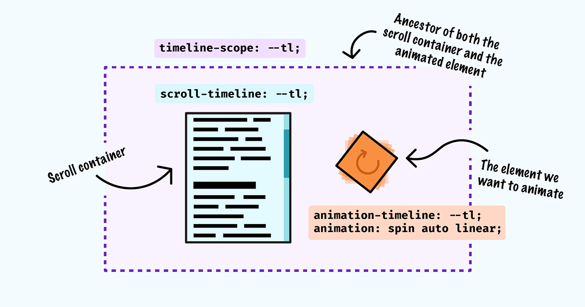
Sometimes, we might want to animate an element that is not a descendant of the scroll container, but still link that element's animation to the scroll container's progress. In order to do this, we need to create a named scroll progress timeline. We'll declare the timeline's name and axis on our scroll container by using the shorthand scroll-timeline property (shorthand for scroll-timeline-name and scroll-timeline-axis). Again, the block axis is the default. The timeline name must be prefixed with two dashes (similar to custom properties), which ensures that it will not conflict with other property values.
The scroll container must be an element that has the ability to scroll.
.scroller {
  max-height: 300px;
  overflow: scroll;
  scroll-timeline: --scale-progress block;
}
We can link the element we want to animate to the scroll timeline using the animation-timeline property.
/* Sibling of .scroller */
.progress {
  animation: scaleProgress auto linear;
  animation-timeline: --scale-progress;
}

@keyframes scaleProgress {
  0% {
    transform: scaleX(0);
  }
  100% {
    transform: scaleX(1);
  }
}
* {
  box-sizing: border-box;
}

body {
  line-height: 1.5;
}

.wrapper {
  min-height: 100vh;
  display: grid;
  gap: 1rem;
  grid-template-columns: auto auto;
  justify-content: center;
  align-content: center;
  timeline-scope: --scale-progress;
  animation: colorChange auto linear;
}

.scroller {
  position: relative;
  max-width: 300px;
  max-height: 300px;
  overflow: scroll;
  border: 1px solid;
  padding: 1rem;
  scroll-timeline: --scale-progress;
}

.progress {
  width: 5rem;
  background: deeppink;
  transform-origin: center 100%;
  animation: scaleProgress auto linear forwards;
  animation-timeline: --scale-progress;
}

@keyframes colorChange {
  0% {
    background-color: deeppink;
  }
  100% {
    background-color: turquoise;
  }
}

@keyframes scaleProgress {
  0% {
    scale: 1 0;
  }

  100% {
    scale: 1 1;
  }
}
<div class="wrapper">
  <div class="scroller">
    <h1>Scroll this</h1>
    <p>
      Lorem ipsum dolor, sit amet consectetur adipisicing elit. Hic vitae
      voluptatem, in ipsa, magnam explicabo vero modi fuga recusandae voluptate
      reprehenderit neque sequi labore delectus odio consequuntur illo cum
      minus.
    </p>
    <p>
      Lorem ipsum dolor, sit amet consectetur adipisicing elit. Hic vitae
      voluptatem, in ipsa, magnam explicabo vero modi fuga recusandae voluptate
      reprehenderit neque sequi labore delectus odio consequuntur illo cum
      minus.
    </p>
    <p>
      Lorem ipsum dolor, sit amet consectetur adipisicing elit. Hic vitae
      voluptatem, in ipsa, magnam explicabo vero modi fuga recusandae voluptate
      reprehenderit neque sequi labore delectus odio consequuntur illo cum
      minus.
    </p>
    <p>
      Lorem ipsum dolor, sit amet consectetur adipisicing elit. Reprehenderit
      porro at officiis, voluptas delectus ratione vitae natus cum excepturi
      eaque. Culpa ut cupiditate aspernatur expedita minima suscipit et quis
      illo.
    </p>
    <p>
      Lorem ipsum dolor, sit amet consectetur adipisicing elit. Reprehenderit
      porro at officiis, voluptas delectus ratione vitae natus cum excepturi
      eaque. Culpa ut cupiditate aspernatur expedita minima suscipit et quis
      illo.
    </p>
  </div>
  <div class="progress"></div>
</div>
This works provided the element we want to animate is a sibling of the scroll container. What if we want to animate an ancestor, or the descendant of a sibling?
We need one more CSS property, timeline-scope, which allows us to modify the scope of a named timeline to include the element on which it is set. If we set this property on the body, for example, we can now animate that element's background color, despite it being an ancestor of the scroll container.
Let's have a look at the code:
/* Ancestor element: We want to scope the scroll timeline to include this element and its descendants */
body {
  timeline-scope: --scale-progress;

  /* Apply the animation */
  animation: colorChange auto linear forwards;
  animation-timeline: --scale-progress;
}

/* The scroll container on which we declare our timeline */
.scroller {
  max-height: 300px;
  overflow: scroll;
  scroll-timeline: --scale-progress block;
}

/* Apply the animation on the sibling as before */
.progress {
  animation: scaleProgress auto linear;
  animation-timeline: --scale-progress;
}
Note: timeline-scope is currently only supported in Chrome Canary and Chrome 116 with experimental web platform features enabled.
* {
  box-sizing: border-box;
}

body {
  line-height: 1.5;
  min-height: 100vh;
  display: grid;
  gap: 1rem;
  grid-template-columns: auto auto;
  justify-content: center;
  align-content: center;

  timeline-scope: --scale-progress;
  animation: colorChange auto linear forwards;
  animation-timeline: --scale-progress;
}

.scroller {
  position: relative;
  max-width: 300px;
  max-height: 300px;
  overflow: scroll;
  border: 1px solid;
  padding: 1rem;
  background: white;
  scroll-timeline: --scale-progress;
}

.progress-wrapper {
  border: 2px solid black;
  padding: 0.5rem;
}

.progress {
  width: 5rem;
  height: 100%;
  background: black;
  transform-origin: center 100%;
  animation: scaleProgress auto linear forwards;
  animation-timeline: --scale-progress;
}

@keyframes colorChange {
  0% {
    background-color: deeppink;
  }
  100% {
    background-color: turquoise;
  }
}

@keyframes scaleProgress {
  0% {
    scale: 1 0;
  }

  100% {
    scale: 1 1;
  }
}
<div class="scroller">
  <h1>Scroll this</h1>
  <p>
    Lorem ipsum dolor, sit amet consectetur adipisicing elit. Hic vitae
    voluptatem, in ipsa, magnam explicabo vero modi fuga recusandae voluptate
    reprehenderit neque sequi labore delectus odio consequuntur illo cum minus.
  </p>
  <p>
    Lorem ipsum dolor, sit amet consectetur adipisicing elit. Hic vitae
    voluptatem, in ipsa, magnam explicabo vero modi fuga recusandae voluptate
    reprehenderit neque sequi labore delectus odio consequuntur illo cum minus.
  </p>
  <p>
    Lorem ipsum dolor, sit amet consectetur adipisicing elit. Hic vitae
    voluptatem, in ipsa, magnam explicabo vero modi fuga recusandae voluptate
    reprehenderit neque sequi labore delectus odio consequuntur illo cum minus.
  </p>
  <p>
    Lorem ipsum dolor, sit amet consectetur adipisicing elit. Reprehenderit
    porro at officiis, voluptas delectus ratione vitae natus cum excepturi
    eaque. Culpa ut cupiditate aspernatur expedita minima suscipit et quis illo.
  </p>
  <p>
    Lorem ipsum dolor, sit amet consectetur adipisicing elit. Reprehenderit
    porro at officiis, voluptas delectus ratione vitae natus cum excepturi
    eaque. Culpa ut cupiditate aspernatur expedita minima suscipit et quis illo.
  </p>
</div>
<div class="progress-wrapper">
  <div class="progress"></div>
</div>
So far, we've created some fairly basic progress bar animations — perhaps one of the more obvious use cases for scroll progress timelines. But there's nothing stopping us getting creative with our scroll animations.
Animating elements horizontally while the user scrolls vertically can make a web page feel more dynamic and less linear. Here we're animating a row of images so they slide in from the left as the user scrolls vertically.
@layer reset;

body {
  font-family: "Helvetica", sans-serif;
  min-height: 300vh;
  color: white;
}

.wrapper {
  display: flex;
  position: fixed;
  top: 0;
  left: 0;
  height: 100vh;
  animation: slide auto linear;
  animation-timeline: scroll();
}

@keyframes slide {
  0% {
    translate: 0;
  }
  100% {
    translate: calc(-100% - 100vw);
  }
}

section {
  min-height: 100vh;
  position: relative;
  z-index: 1;
}

.container {
  background: rgba(46, 42, 181, 0.45);
  min-height: 100vh;
  padding: 1em clamp(1rem, 2vw, 4vw);
  backdrop-filter: grayscale(100%);
}

figure {
  flex: 0 0 100vw;
}

img {
  height: 100%;
  object-fit: cover;
}

@layer reset {
  *,
  *::before,
  *::after {
    box-sizing: border-box;
  }

  body {
    margin: 0;
    font-size: 1.2rem;
  }

  @media (min-width: 1200px) {
    html {
      font-size: 20px;
    }
  }

  img {
    display: block;
    width: 100%;
  }

  figure {
    margin: 0;
    position: relative;
  }
}
<div class="wrapper">
  <figure>
    <img
      src="https://images.unsplash.com/photo-1550098612-4838745601bf?crop=entropy&cs=srgb&fm=jpg&ixid=M3wzMjM4NDZ8MHwxfHJhbmRvbXx8fHx8fHx8fDE2ODcyNzAxMjV8&ixlib=rb-4.0.3&q=85"
      alt="" />
  </figure>
  <figure>
    <img
      src="https://images.unsplash.com/photo-1607240367835-bdbf309c1e06?crop=entropy&cs=srgb&fm=jpg&ixid=M3wzMjM4NDZ8MHwxfHJhbmRvbXx8fHx8fHx8fDE2ODcyNzAxMjV8&ixlib=rb-4.0.3&q=85"
      alt="" />
  </figure>
  <figure>
    <img
      src="https://images.unsplash.com/photo-1616010107983-b006a14939f2?crop=entropy&cs=srgb&fm=jpg&ixid=M3wzMjM4NDZ8MHwxfHJhbmRvbXx8fHx8fHx8fDE2ODcyNzAxMjV8&ixlib=rb-4.0.3&q=85"
      alt="" />
  </figure>
</div>

<section>
  <div class="container">
    <h1>Section 1</h1>
    <p>Scroll vertically and the images move horizontally</p>
  </div>
</section>

<section>
  <div class="container">
    <h2>Section 2</h2>
  </div>
</section>

<section>
  <div class="container">
    <h2>Section 3</h2>
  </div>
</section>
See the full example on CodePen
We can position and animate elements along a path in CSS using offset-path to define a motion path for the element to follow.
This is a much more fun way to indicate progress than a rectangular progress bar!
* {
  box-sizing: border-box;
}

body {
  width: 100%;
  min-height: 300vh;
  margin: 0;
  background: linear-gradient(to bottom, #2d2a82, lightblue);
  background-size: 100% 300vh;
}

.progress {
  position: fixed;
  top: 3rem;
  left: 3rem;
  width: 3rem;
  height: auto;
  fill: currentColor;
  z-index: 1;
  offset-path: path(
    "M.5 122.7s24.7-275 276.9 0c327.1 356.7 266.1-330.3 548-33.3 256.9 270.7 271.1 0 271.1 0"
  );
  animation: move auto linear;
  animation-timeline: scroll(root);
}

.cloud {
  width: 12vw;
  height: auto;
  position: absolute;
  top: 5vh;
  left: 60vw;
  fill: rgb(255 255 255 / 0.5);
}

.cloud:nth-child(2n) {
  top: 100vh;
  left: 15vw;
}

.cloud:nth-child(3n) {
  top: 160vh;
  left: 70vw;
}

@keyframes move {
  0% {
    offset-distance: 0%;
  }
  100% {
    offset-distance: 100%;
  }
}
<svg viewBox="0 0 640 512" width="100" title="fighter-jet" class="progress">
  <path
    d="M544 224l-128-16-48-16h-24L227.158 44h39.509C278.333 44 288 41.375 288 38s-9.667-6-21.333-6H152v12h16v164h-48l-66.667-80H18.667L8 138.667V208h8v16h48v2.666l-64 8v42.667l64 8V288H16v16H8v69.333L18.667 384h34.667L120 304h48v164h-16v12h114.667c11.667 0 21.333-2.625 21.333-6s-9.667-6-21.333-6h-39.509L344 320h24l48-16 128-16c96-21.333 96-26.583 96-32 0-5.417 0-10.667-96-32z" />
</svg>

<svg viewBox="0 0 640 512" width="0" height="0" title="cloud">
  <defs>
    <path
      id="cloud"
      d="M537.6 226.6c4.1-10.7 6.4-22.4 6.4-34.6 0-53-43-96-96-96-19.7 0-38.1 6-53.3 16.2C367 64.2 315.3 32 256 32c-88.4 0-160 71.6-160 160 0 2.7.1 5.4.2 8.1C40.2 219.8 0 273.2 0 336c0 79.5 64.5 144 144 144h368c70.7 0 128-57.3 128-128 0-61.9-44-113.6-102.4-125.4z" />
  </defs>
</svg>

<svg viewBox="0 0 640 512" width="100" title="cloud" class="cloud">
  <use href="#cloud"></use>
</svg>

<svg viewBox="0 0 640 512" width="100" title="cloud" class="cloud">
  <use href="#cloud"></use>
</svg>

<svg viewBox="0 0 640 512" width="100" title="cloud" class="cloud">
  <use href="#cloud"></use>
</svg>
See the full example on CodePen
In this demo, we're animating multiple elements on scroll: the text is revealed, while the box slides and somersaults from left to right. To simplify our code and avoid having to create multiple keyframes, we're animating a custom property and calculating the translateY value using a trigonometric function, which are supported in the latest releases of all major browsers. Unlike transform properties, custom properties are animated on the main thread, which means your website could suffer from poor performance if you're tempted to animate a lot of them.
* {
  box-sizing: border-box;
}

body {
  --offset: max(1rem, 3vw);
  --boxSize: clamp(2.5rem, 10vw, 200px);
  --boxSize: 15vw;
  margin: 0;
  padding: var(--offset);
  min-height: 300vh;
  background-color: pink;
  font-family: "Helvetica", sans-serif;
  animation: colorChange auto linear;
  animation-timeline: scroll(root block);
}

.wrapper {
  min-height: 100vh;
  position: fixed;
  top: 0;
  left: 0;
  padding: var(--offset);
  display: flex;
  flex-wrap: wrap;
  align-items: center;
  align-content: center;
}

h1 {
  flex: 1 0 100%;
  animation: clip auto linear;
  animation-timeline: scroll(root block);
  font-size: clamp(2rem, 4vw + 1rem, 6rem);
}

@property --i {
  syntax: "<number>";
  inherits: true;
  initial-value: 0;
}

.box {
  --i: 1;
  --angle: calc((var(--i) - 1) * (360deg / 5));
  --amplitude: 9vw;
  --x: calc(var(--i) * var(--boxSize));

  width: var(--boxSize);
  aspect-ratio: 1;
  background:
    radial-gradient(circle at 25% 50%, black 10%, transparent 0),
    radial-gradient(circle at 75% 50%, black 10%, transparent 0),
    radial-gradient(circle at 50% 0, black 10%, transparent 0) deeppink;
  background-position:
    center center,
    center center,
    center calc(var(--boxSize) * 0.6),
    center center;
  background-size:
    100% 100%,
    100% 100%,
    100% 100%;
  background-repeat: no-repeat;
  border-radius: max(10%, 0.2rem);
  border: min(5px, 1vw) solid;
  animation:
    move auto linear,
    spin auto linear;
  animation-timeline: scroll(root block);
  translate: calc(var(--x) - var(--boxSize))
    calc(sin(var(--angle)) * var(--amplitude));
}

@keyframes move {
  0% {
    --i: 1;
  }
  100% {
    --i: 6;
  }
}

@keyframes spin {
  100% {
    rotate: 360deg;
  }
}

@keyframes colorChange {
  100% {
    background-color: turquoise;
  }
}

@keyframes clip {
  0% {
    clip-path: polygon(0 0, 0 0, 0 100%, 0 100%);
  }
  100% {
    clip-path: polygon(0 0, 100% 0, 100% 100%, 0 100%);
  }
}
<div class="wrapper">
  <h1>We love to scroll!</h1>
  <div class="box"></div>
</div>
See the full example on CodePen
As with any intrusive animation, we should always prioritise accessibility and ensure we turn off animations for those who would rather do without them. This can be particularly important for scroll-driven animations, which can cause feelings of motion sickness even in users who don't generally suffer from vestibular disorders.
If you'd like to know more, check out Respecting users' motion preferences to see how to use the prefers-reduced-motion media query to ensure your animations are accessible.
So, how do scroll timeline animations in CSS compare to JS libraries (once they're universally supported)? If you're creating especially complex animations, you might still need to reach for a library like GSAP, which is especially well-equipped to handle complex orchestration. Libraries may also supply us with features like custom easing, and GSAP's Inertia plugin (which allows an animation to glide to a stop once scrolling has finished, rather than coming to an abrupt halt). At the moment, we don't have a way to detect whether an element is currently scrolling in CSS.
Likewise if your animation is crucial for user experience, you might need to hold off for now, as it may be some time before scroll-linked animations are universally supported.
If on the other hand, you need a few relatively straightforward scroll-driven animations, CSS could save you (and your users) a big JS payload, giving you a great performance win!
I hope you enjoyed reading the post and exploring the examples. Feel free to leave your feedback, thoughts, or questions on Discord or on GitHub.
 Michelle Barker
7 minutes read
Michelle Barker
7 minutes read