As of this year, container queries are supported in all major browsers. But what are they, and how can we use them to build more robust, flexible layouts? Do we still need media queries? Let's find out.
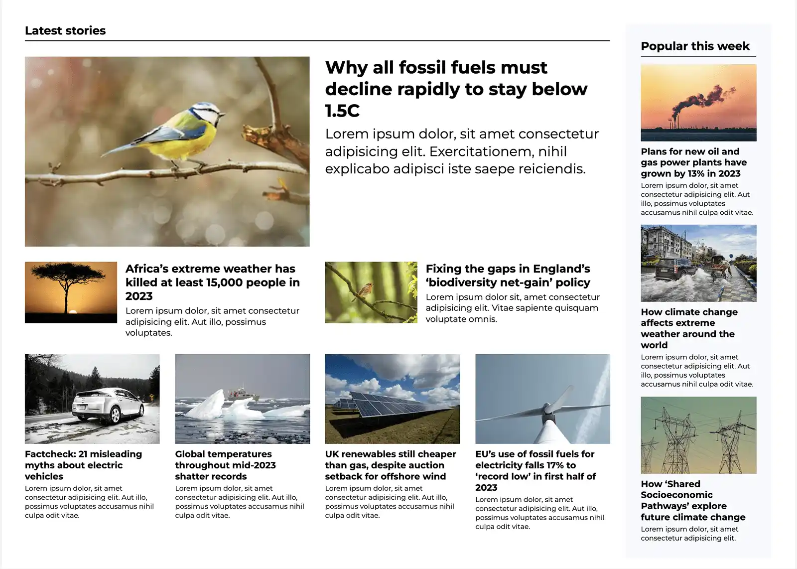
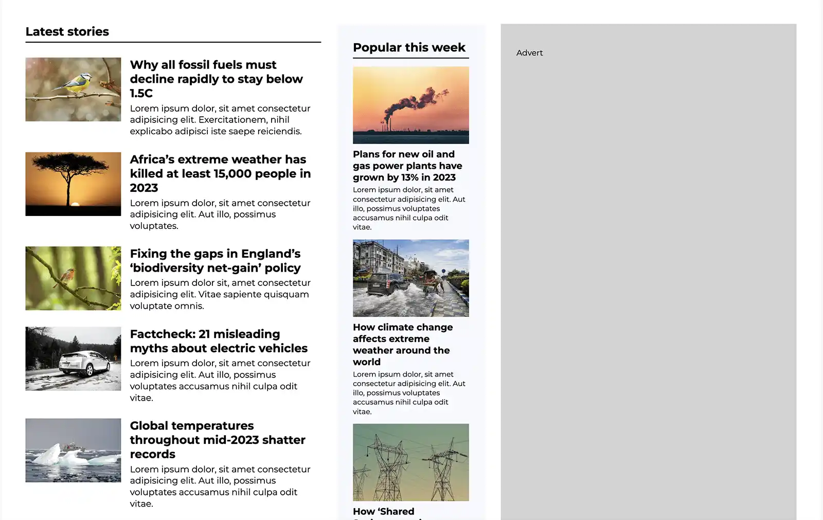
To understand how container queries are helpful, let's look at an example news feed layout and see where we could apply them. The news feed is a collection of articles, each with an image, a headline, and a text summary. There's also a sidebar on the right side of the page listing popular articles.
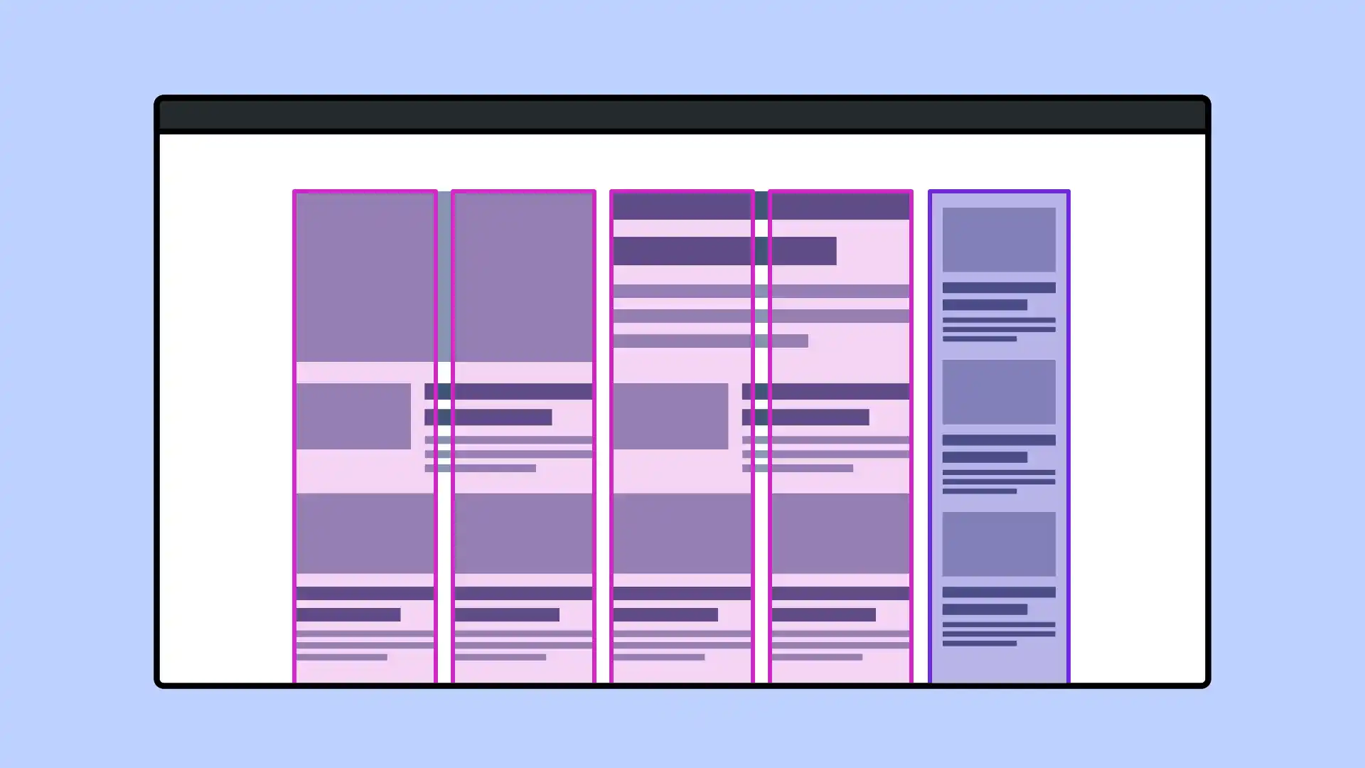
We can divide this into two grids: a 4-column grid on the left, and a single column on the right (the sidebar).
On the left, we have a large featured article spanning four columns. Below this, two articles span two columns each. These have a horizontal layout, with the images on the left and text on the right. Below that are four smaller articles, each spanning a single column. A column of articles in the same style also appears on the right as a sidebar.
We might look at this layout and see three distinct styles of articles, all to be developed as separate components. But let's see what happens to the design on smaller viewports.
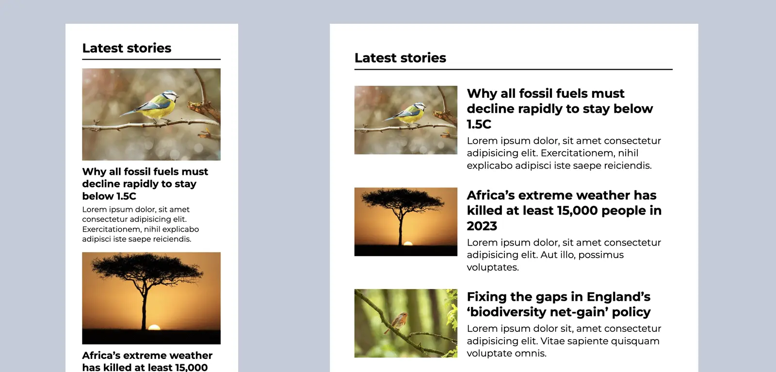
At mobile sizes, the images are stacked above the text for all articles, including the featured article. Their layouts are indistinguishable. At slightly larger sizes, the articles take on a horizontal layout. On yet larger viewports (ones we might think of as approximately tablet-sized), there are two horizontal articles under the featured article, with four stacked articles below. In total, there are three different layouts for individual articles.
If we were to code this layout using media queries to query the viewport size, we might need to create separate components to deal with the behaviour of each of the different article layouts for various breakpoints. Our code can easily become a little unwieldy, and difficult to maintain.
Imagine an editor comes along and wants to place different content alongside our news feed. Our 5-column layout no longer looks good in the available space and must be redesigned. In this case, we could stack some of the articles vertically.
Using media queries to detect the width of the viewport, our layout cannot respond to the change in available space. Far better if we can query the width of a parent element — or container.
Container queries allow us to query the size of an element, as opposed to the viewport, and style its descendants accordingly. We can use them in a similar way to media queries, but they provide us with far more flexibility when it comes to layout — and have the potential to greatly simplify our code.
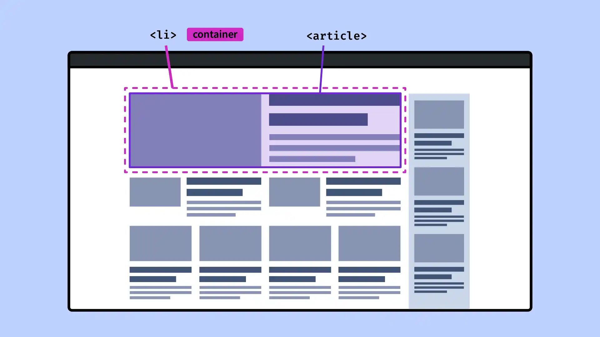
Before we write a container query, we need a container element to query! In the case of our news feed layout, we need a container element that wraps each article to act as the container. As our grid is a list of articles, the container element for each article will be the <li>. We'll give it a class of article-container, to avoid any confusion.
We create a container using two CSS properties: container-name and container-type. container-name is optional, but it can be useful if we have multiple containers on a page, as it leaves us in no doubt as to which container we're referring to. The container name can be anything we like. We'll call this one "article".
For size-based container queries, the container-type should be inline-size. inline-size is a logical value, so it refers to the width when using a horizontal writing mode (the default), or the height for a vertical writing mode. size is the other possible value, but this refers to the CSS containment module, and as Stephanie Eckles explains in her Smashing Magazine article, it's not relevant to us here.
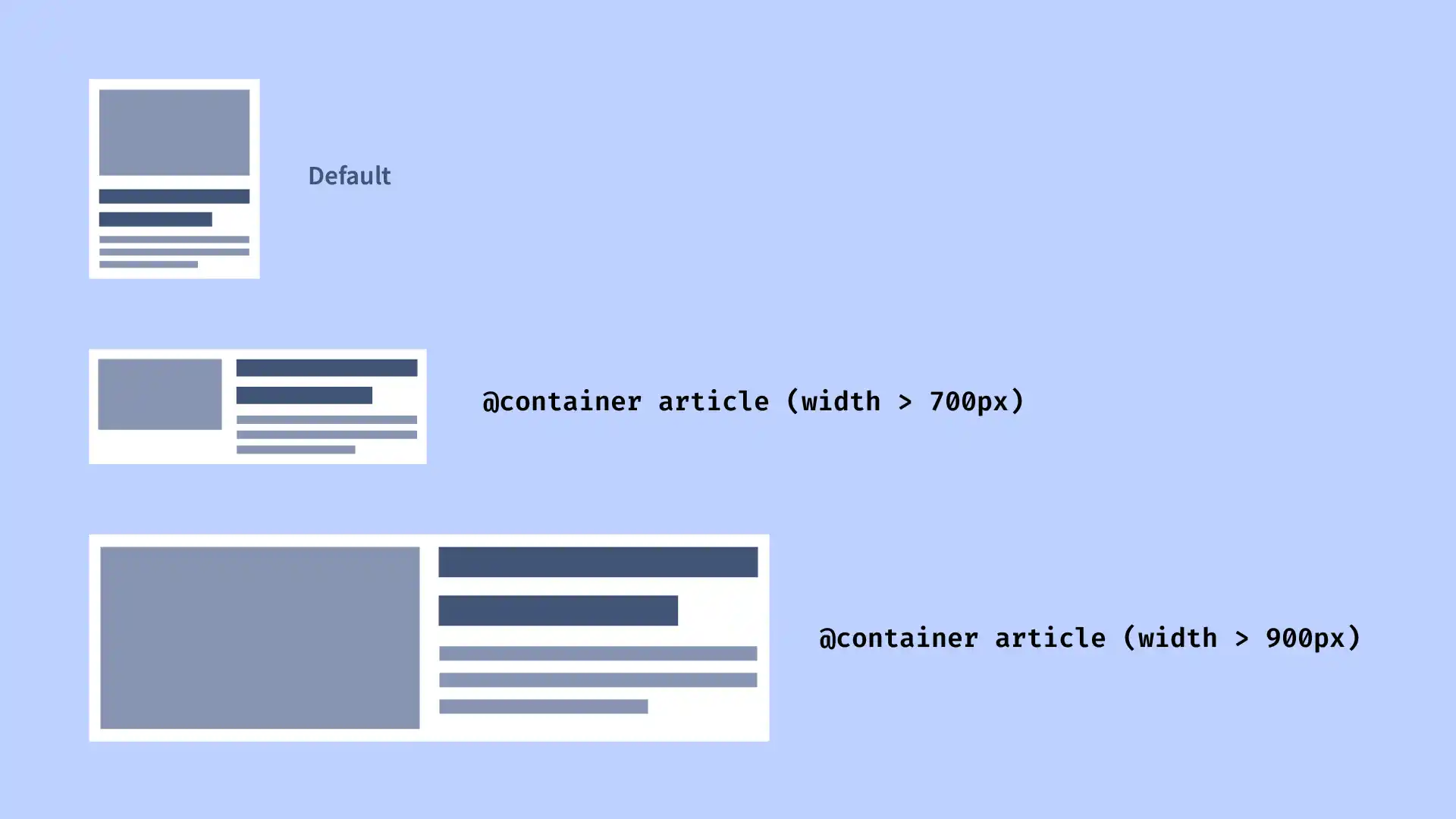
Once we have defined our container, writing a container query is similar to writing a media query. When writing the query, we can choose to specify a name container, or we can omit this, in which case the query will use the closest container by default. If we haven't defined a container, then our container query will behave a lot like a media query — which is to say, it will query the viewport size.
We may it helpful to specify a named container so we can be sure of which container we are querying. This is particularly useful for layouts where we might have several nested containers.
css
/* Without a named container */
@container (width > 700px) {
  /* Styles applied to elements within any container when the container is over 700px wide  */
}

/* Specifying a named container */
@container article (width > 700px) {
  /* Styles applied to elements within the 'article' container when the container is over 700px wide  */
}
Just like media queries, we can use as many as we like.
<div class="article-container">
  <article>
    <img
      src="https://images.unsplash.com/photo-1550098612-4838745601bf?crop=entropy&cs=tinysrgb&fit=max&fm=jpg&ixid=M3wzMjM4NDZ8MHwxfHJhbmRvbXx8fHx8fHx8fDE2OTg3NTQ1ODh8&ixlib=rb-4.0.3&q=80&w=400"
      alt="Bluetit on a branch" />
    <div>
      <h3>Why all fossil fuels must decline rapidly to stay below 1.5C</h3>
      <p>
        Lorem ipsum dolor, sit amet consectetur adipisicing elit.
        Exercitationem, nihil explicabo adipisci iste saepe reiciendis.
      </p>
    </div>
  </article>
</div>
You might notice a slight difference in the way we have written these container queries compared with traditional media queries. Instead of min-width and max-width, we are using the media query range syntax. This has the advantage of making our queries more concise.
css
/* Old syntax for styles between 700px and 900px */
@container (min-width: 700px) and (max-width: 900px) {
}

/* New syntax */
@container (700px <= width <= 900px) {
}
It's also more conducive to use of logical properties. Rather than writing styles dependent on a minimum or maximum width, we can say "if the inline size is great than (or is less than) x, apply these styles".
Our previous container query example could be re-written to use inline-size instead of min-width.
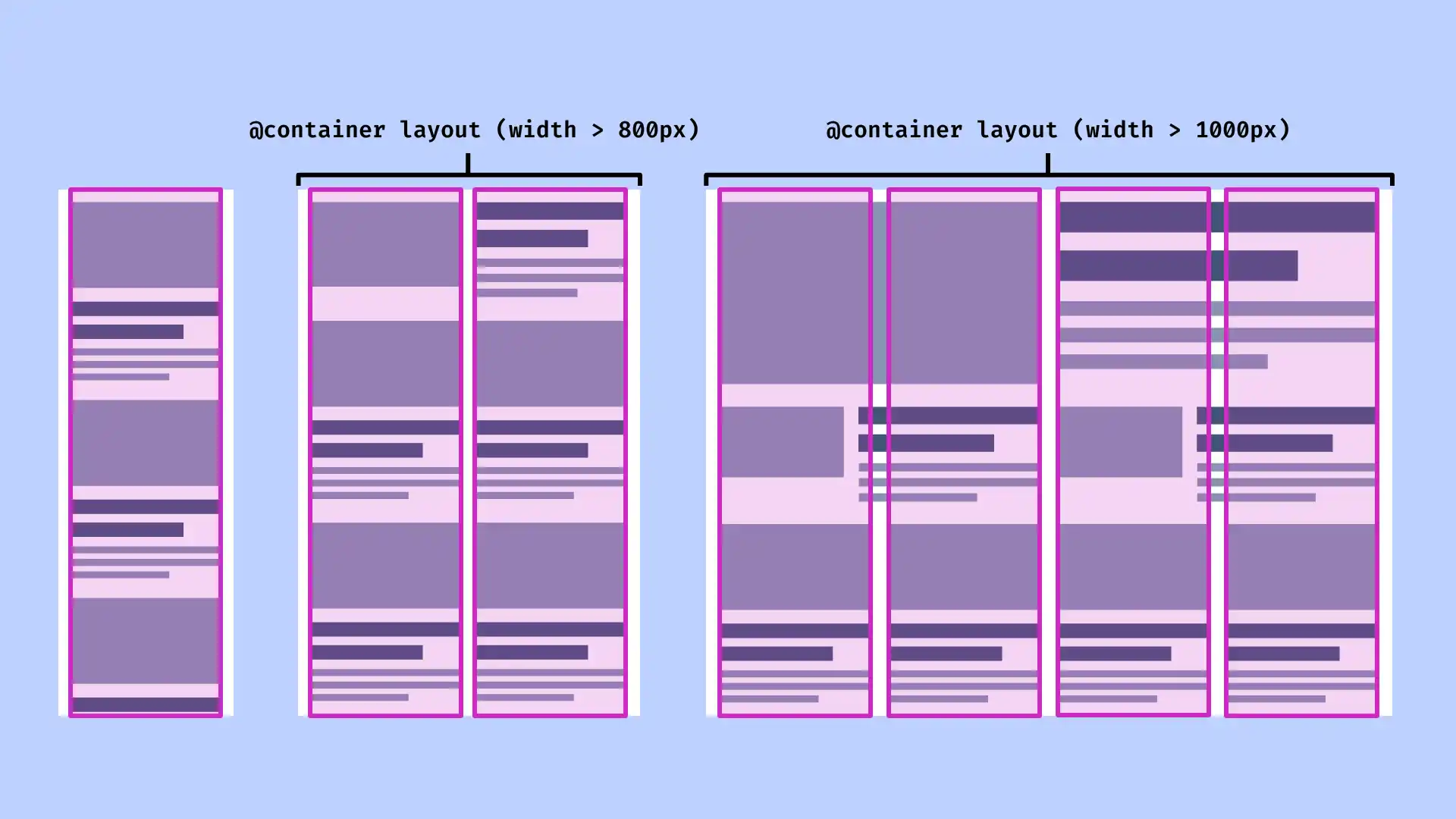
We'll write container queries to specify a two-column layout and four-column layout for our grid respectively, when there is enough space.
<div class="grid-container">
  <ul class="grid">
    <li class="article-container">
      <article>
        <img
          src="https://images.unsplash.com/photo-1550098612-4838745601bf?crop=entropy&cs=tinysrgb&fit=max&fm=jpg&ixid=M3wzMjM4NDZ8MHwxfHJhbmRvbXx8fHx8fHx8fDE2OTg3NTQ1ODh8&ixlib=rb-4.0.3&q=80&w=400"
          alt="Bluetit on a branch" />
        <div>
          <h3>Why all fossil fuels must decline rapidly to stay below 1.5C</h3>
          <p>
            Lorem ipsum dolor, sit amet consectetur adipisicing elit.
            Exercitationem, nihil explicabo adipisci iste saepe reiciendis.
          </p>
        </div>
      </article>
    </li>
  </ul>
</div>
You may already be familiar with viewport units, which can be used for sizing elements relative to the viewport. Container units enable us to instead size elements relative to the container.
Container units are useful for styling our article components. We could use them to specify padding and font size, reducing the need to adjust these for different breakpoints.
The unit cqi is used to specify a percentage of the container's inline size.
css
article {
  padding: 4cqi;
}
(We don't need to write these styles inside a container query. They will respond to the container, as long as one is defined.)
To prevent the padding becoming too large or two small, we can use the clamp() function. This resolves to the middle value, so by passing in two fixed values in addition to our flexible cqi value we can ensure that the padding will never be smaller than 1rem or larger than 3rem.
css
article {
  padding: clamp(1rem, 4cqi, 2rem);
}
Similarly, we can set the font size with the clamp function and container units.
<div class="grid-container">
  <ul class="grid">
    <li class="article-container">
      <article>
        <img
          src="https://images.unsplash.com/photo-1550098612-4838745601bf?crop=entropy&cs=tinysrgb&fit=max&fm=jpg&ixid=M3wzMjM4NDZ8MHwxfHJhbmRvbXx8fHx8fHx8fDE2OTg3NTQ1ODh8&ixlib=rb-4.0.3&q=80&w=400"
          alt="Bluetit on a branch" />
        <div>
          <h3>Why all fossil fuels must decline rapidly to stay below 1.5C</h3>
          <p>
            Lorem ipsum dolor, sit amet consectetur adipisicing elit.
            Exercitationem, nihil explicabo adipisci iste saepe reiciendis.
          </p>
        </div>
      </article>
    </li>
    <li class="article-container">
      <article>
        <img
          src="https://images.unsplash.com/photo-1550098612-4838745601bf?crop=entropy&cs=tinysrgb&fit=max&fm=jpg&ixid=M3wzMjM4NDZ8MHwxfHJhbmRvbXx8fHx8fHx8fDE2OTg3NTQ1ODh8&ixlib=rb-4.0.3&q=80&w=400"
          alt="Bluetit on a branch" />
        <div>
          <h3>Why all fossil fuels must decline rapidly to stay below 1.5C</h3>
          <p>
            Lorem ipsum dolor, sit amet consectetur adipisicing elit.
            Exercitationem, nihil explicabo adipisci iste saepe reiciendis.
          </p>
        </div>
      </article>
    </li>
    <li class="article-container">
      <article>
        <img
          src="https://images.unsplash.com/photo-1550098612-4838745601bf?crop=entropy&cs=tinysrgb&fit=max&fm=jpg&ixid=M3wzMjM4NDZ8MHwxfHJhbmRvbXx8fHx8fHx8fDE2OTg3NTQ1ODh8&ixlib=rb-4.0.3&q=80&w=400"
          alt="Bluetit on a branch" />
        <div>
          <h3>Why all fossil fuels must decline rapidly to stay below 1.5C</h3>
          <p>
            Lorem ipsum dolor, sit amet consectetur adipisicing elit.
            Exercitationem, nihil explicabo adipisci iste saepe reiciendis.
          </p>
        </div>
      </article>
    </li>
    <li class="article-container">
      <article>
        <img
          src="https://images.unsplash.com/photo-1550098612-4838745601bf?crop=entropy&cs=tinysrgb&fit=max&fm=jpg&ixid=M3wzMjM4NDZ8MHwxfHJhbmRvbXx8fHx8fHx8fDE2OTg3NTQ1ODh8&ixlib=rb-4.0.3&q=80&w=400"
          alt="Bluetit on a branch" />
        <div>
          <h3>Why all fossil fuels must decline rapidly to stay below 1.5C</h3>
          <p>
            Lorem ipsum dolor, sit amet consectetur adipisicing elit.
            Exercitationem, nihil explicabo adipisci iste saepe reiciendis.
          </p>
        </div>
      </article>
    </li>
    <li class="article-container">
      <article>
        <img
          src="https://images.unsplash.com/photo-1550098612-4838745601bf?crop=entropy&cs=tinysrgb&fit=max&fm=jpg&ixid=M3wzMjM4NDZ8MHwxfHJhbmRvbXx8fHx8fHx8fDE2OTg3NTQ1ODh8&ixlib=rb-4.0.3&q=80&w=400"
          alt="Bluetit on a branch" />
        <div>
          <h3>Why all fossil fuels must decline rapidly to stay below 1.5C</h3>
          <p>
            Lorem ipsum dolor, sit amet consectetur adipisicing elit.
            Exercitationem, nihil explicabo adipisci iste saepe reiciendis.
          </p>
        </div>
      </article>
    </li>
    <li class="article-container">
      <article>
        <img
          src="https://images.unsplash.com/photo-1550098612-4838745601bf?crop=entropy&cs=tinysrgb&fit=max&fm=jpg&ixid=M3wzMjM4NDZ8MHwxfHJhbmRvbXx8fHx8fHx8fDE2OTg3NTQ1ODh8&ixlib=rb-4.0.3&q=80&w=400"
          alt="Bluetit on a branch" />
        <div>
          <h3>Why all fossil fuels must decline rapidly to stay below 1.5C</h3>
          <p>
            Lorem ipsum dolor, sit amet consectetur adipisicing elit.
            Exercitationem, nihil explicabo adipisci iste saepe reiciendis.
          </p>
        </div>
      </article>
    </li>
    <li class="article-container">
      <article>
        <img
          src="https://images.unsplash.com/photo-1550098612-4838745601bf?crop=entropy&cs=tinysrgb&fit=max&fm=jpg&ixid=M3wzMjM4NDZ8MHwxfHJhbmRvbXx8fHx8fHx8fDE2OTg3NTQ1ODh8&ixlib=rb-4.0.3&q=80&w=400"
          alt="Bluetit on a branch" />
        <div>
          <h3>Why all fossil fuels must decline rapidly to stay below 1.5C</h3>
          <p>
            Lorem ipsum dolor, sit amet consectetur adipisicing elit.
            Exercitationem, nihil explicabo adipisci iste saepe reiciendis.
          </p>
        </div>
      </article>
    </li>
  </ul>
</div>
As of 2023, container queries are supported in all major browsers. We should be aware that not all users will have the latest browsers, however. If you need to cater for users of older browsers, there is an easy-to-use polyfill by the Chrome team.
So far we've covered building a layout using container queries to query the inline size of an element. But container queries can apply to even more than that. We can also query an element's styles applied with custom properties.
In our example layout we might want to draw attention to "featured" articles with different styles. Setting a custom property in our markup, we can then apply styles to elements with a particular custom property value.
We don't need to define a container, as every element automatically has style containment.
Read more about style container queries in Una Kravets' article.
At the time of writing, Chrome and Edge support container style queries. They are not currently supported in Safari or Firefox.
There is provision in the CSS Containment Module Level 3 specification for any property-value pairs to be queried, not just custom properties. No browsers yet support this, however.
If we can query viewport size and element size using container queries, do we still need media queries at all? Absolutely! Media queries are used for querying so much more than size. We can detect users' preferences with prefers-reduced-motion and prefers-color-scheme, to name just two.
There could still be occasions where we need to style an element within a nested container according to the viewport size, and a media query might be the simplest way. But I predict that in the not too distant future, container queries will largely take the place of media queries when it comes to layout, while media queries will be largely reserved for other media features like the ones mentioned above.
Container queries give us more control over our responsive layouts, as well as helping us write more concise, robust and maintainable CSS. Now that they enjoy widespread browser support, it's a great time to give them a try. The great thing is you don't have to go all-in straight away: if there's a component you're struggling to build with media queries it's worth taking a look at container queries, as they could be the answer you're looking for.
<div class="wrapper-container">
  <div class="wrapper">
    <main class="grid-container">
      <h2>Latest stories</h2>
      <ul class="grid">
        <li class="article-container">
          <article>
            <img
              src="https://images.unsplash.com/photo-1550098612-4838745601bf?crop=entropy&cs=tinysrgb&fit=max&fm=jpg&ixid=M3wzMjM4NDZ8MHwxfHJhbmRvbXx8fHx8fHx8fDE2OTg3NTQ1ODh8&ixlib=rb-4.0.3&q=80&w=400"
              alt="Bluetit on a branch" />
            <div>
              <h3>
                Why all fossil fuels must decline rapidly to stay below 1.5C
              </h3>
              <p>
                Lorem ipsum dolor, sit amet consectetur adipisicing elit.
                Exercitationem, nihil explicabo adipisci iste saepe reiciendis.
              </p>
            </div>
          </article>
        </li>
        <li class="article-container">
          <article>
            <img
              src="https://images.unsplash.com/photo-1551802230-22c087b11df2?crop=entropy&cs=tinysrgb&fit=max&fm=jpg&ixid=M3wzMjM4NDZ8MHwxfHJhbmRvbXx8fHx8fHx8fDE2OTg3NjE2MDN8&ixlib=rb-4.0.3&q=80&w=400"
              alt="Tree at sunset" />
            <div>
              <h3>
                Africa's extreme weather has killed at least 15,000 people in
                2023
              </h3>
              <p>
                Lorem ipsum dolor, sit amet consectetur adipisicing elit. Aut
                illo, possimus voluptates.
              </p>
            </div>
          </article>
        </li>
        <li class="article-container" style="--featured: true">
          <article>
            <img
              src="https://images.unsplash.com/photo-1589787787683-59c1409124c7?crop=entropy&cs=tinysrgb&fit=max&fm=jpg&ixid=M3wzMjM4NDZ8MHwxfHJhbmRvbXx8fHx8fHx8fDE2OTg3NjE2NTB8&ixlib=rb-4.0.3&q=80&w=400"
              alt="Robin on a branch" />
            <div>
              <h3>
                Fixing the gaps in England's ‘biodiversity net-gain' policy
              </h3>
              <p>
                Lorem ipsum dolor sit, amet consectetur adipisicing elit. Vitae
                sapiente quisquam voluptate omnis.
              </p>
            </div>
          </article>
        </li>
        <li class="article-container">
          <article>
            <img
              src="https://images.unsplash.com/photo-1546367564-e9be23af3d14?crop=entropy&cs=tinysrgb&fit=max&fm=jpg&ixid=M3wzMjM4NDZ8MHwxfHJhbmRvbXx8fHx8fHx8fDE2OTg3NjE5NzV8&ixlib=rb-4.0.3&q=80&w=400"
              alt="Car driving in snow" />
            <div>
              <h3>Factcheck: 21 misleading myths about electric vehicles</h3>
              <p>
                Lorem ipsum dolor, sit amet consectetur adipisicing elit. Aut
                illo, possimus voluptates accusamus nihil culpa odit vitae.
              </p>
            </div>
          </article>
        </li>
        <li class="article-container">
          <article>
            <img
              src="https://images.unsplash.com/photo-1582032951374-314efb7ccb76?crop=entropy&cs=tinysrgb&fit=max&fm=jpg&ixid=M3wzMjM4NDZ8MHwxfHJhbmRvbXx8fHx8fHx8fDE2OTg3NjE0Njd8&ixlib=rb-4.0.3&q=80&w=400"
              alt="Arctic sea ice" />
            <div>
              <h3>Global temperatures throughout mid-2023 shatter records</h3>
              <p>
                Lorem ipsum dolor, sit amet consectetur adipisicing elit. Aut
                illo, possimus voluptates accusamus nihil culpa odit vitae.
              </p>
            </div>
          </article>
        </li>
        <li class="article-container">
          <article>
            <img
              src="https://images.unsplash.com/photo-1509391366360-2e959784a276?crop=entropy&cs=tinysrgb&fit=max&fm=jpg&ixid=M3wzMjM4NDZ8MHwxfHJhbmRvbXx8fHx8fHx8fDE2OTg3NjE3MDR8&ixlib=rb-4.0.3&q=80&w=400"
              alt="Solar panels" />
            <div>
              <h3>
                UK renewables still cheaper than gas, despite auction setback
                for offshore wind
              </h3>
              <p>
                Lorem ipsum dolor, sit amet consectetur adipisicing elit. Aut
                illo, possimus voluptates accusamus nihil culpa odit vitae.
              </p>
            </div>
          </article>
        </li>
        <li class="article-container">
          <article>
            <img
              src="https://images.unsplash.com/photo-1679820024011-d7c428c47a36?crop=entropy&cs=tinysrgb&fit=max&fm=jpg&ixid=M3wzMjM4NDZ8MHwxfHJhbmRvbXx8fHx8fHx8fDE2OTg3NjE4MjZ8&ixlib=rb-4.0.3&q=80&w=400"
              alt="Wind turbine from below" />
            <div>
              <h3>
                EU's use of fossil fuels for electricity falls 17% to ‘record
                low' in first half of 2023
              </h3>
              <p>
                Lorem ipsum dolor, sit amet consectetur adipisicing elit. Aut
                illo, possimus voluptates accusamus nihil culpa odit vitae.
              </p>
            </div>
          </article>
        </li>
      </ul>
    </main>

    <aside class="grid-container">
      <h2>Popular this week</h2>
      <ul class="grid">
        <li class="article-container">
          <article>
            <img
              src="https://images.unsplash.com/photo-1615053835734-7752878e939e?crop=entropy&cs=tinysrgb&fit=max&fm=jpg&ixid=M3wzMjM4NDZ8MHwxfHJhbmRvbXx8fHx8fHx8fDE2OTg3NjE5MDh8&ixlib=rb-4.0.3&q=80&w=400"
              alt="Power plant" />
            <div>
              <h3>
                Plans for new oil and gas power plants have grown by 13% in 2023
              </h3>
              <p>
                Lorem ipsum dolor, sit amet consectetur adipisicing elit. Aut
                illo, possimus voluptates accusamus nihil culpa odit vitae.
              </p>
            </div>
          </article>
        </li>
        <li class="article-container">
          <article>
            <img
              src="https://images.unsplash.com/photo-1635351235165-23b8cd066ea6?crop=entropy&cs=tinysrgb&fit=max&fm=jpg&ixid=M3wzMjM4NDZ8MHwxfHJhbmRvbXx8fHx8fHx8fDE2OTg3NjIwMjN8&ixlib=rb-4.0.3&q=80&w=400"
              alt="Flooded city street" />
            <div>
              <h3>
                How climate change affects extreme weather around the world
              </h3>
              <p>
                Lorem ipsum dolor, sit amet consectetur adipisicing elit. Aut
                illo, possimus voluptates accusamus nihil culpa odit vitae.
              </p>
            </div>
          </article>
        </li>
        <li class="article-container" style="--featured: true">
          <article>
            <img
              src="https://images.unsplash.com/photo-1413882353314-73389f63b6fd?crop=entropy&cs=tinysrgb&fit=max&fm=jpg&ixid=M3wzMjM4NDZ8MHwxfHJhbmRvbXx8fHx8fHx8fDE2OTg3NjE3NjR8&ixlib=rb-4.0.3&q=80&w=400"
              alt="Electricity pylons" />
            <div>
              <h3>
                How ‘Shared Socioeconomic Pathways' explore future climate
                change
              </h3>
              <p>Lorem ipsum dolor, sit amet consectetur adipisicing elit.</p>
            </div>
          </article>
        </li>
      </ul>
    </aside>
  </div>
</div>
 Michelle Barker
8 minutes read
Michelle Barker
8 minutes read