Creating custom easing effects in CSS animations using the linear() function
 Michelle Barker
10 minutes read
Michelle Barker
10 minutes read
An animation is about more than just moving things from one place to another. How something moves (or changes in some way) is just as important for conveying a sense of purpose. In the animation world, the way an object transitions from one state to another over a period of time is known as easing.
In this post, we'll compare different easing functions in CSS. The linear() function in CSS is a new easing function that gives us more control over crafting our animations. We'll explore how linear() function works and also look at some practical examples of where it can be used.
Easing in CSS
The right kind of easing is crucial for making animations look natural and life-like. Imagine rolling a ball across a floor. It wouldn't move at the same speed the whole time: it would probably accelerate rapidly to its maximum velocity, before gradually slowing down and coming to a stop (known as cubic-bezier easing). Compare this to a ball that moves at the same speed throughout the entire animation timeline (known as linear easing). It doesn't feel very natural, does it?
Controlling easing in CSS animations
In CSS, we use the animation-timing-function property to apply easing to an element's animation.
.box {
  animation-name: move;
  animation-duration: 2000ms;
  animation-timing-function: ease-in;
}
Let's recap on some established CSS easing techniques. If you're already familiar with these, you can safely skip over this section and move on to the section about applying custom easing using the linear() function
Easing keywords
We can choose from a number of keywords when crafting animations in CSS: ease-in, ease-out, ease-in-out, ease (the default), and linear. They can also be applied via the shorthand animation property:
.box {
  animation: move 2000ms ease-in;
}
Ease-in
The animation starts slowly and builds up speed, ending at its maximum velocity. An example could be a car pulling away.

Ease-out
The animation starts fast and decreases its speed over the period of time — a bit like the ball rolling across the floor. The difference here is that ease-out doesn't show us the initial acceleration.

Ease-in-out
The animation uses both of the above principles: a gradual acceleration at the beginning, followed by a deceleration toward the end.

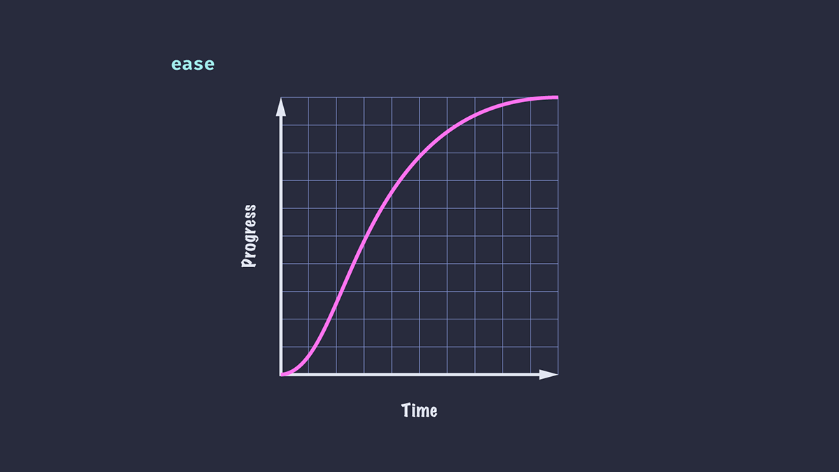
Ease
This is the default value. Like ease-in-out, there is both an acceleration and deceleration, but they are not uniform. The animation in this case can sometimes look more natural than ease-in-out.
Here's the effect of the two keywords compared side-by-side:
Linear
There is no change in speed throughout the animation. Although not very life-like in general, linear easing can be useful in UI animation, such as a scrolling row of logos or images.

Easing functions
Easing keywords can be useful for simple UI elements (e.g., a hover state applied to a button), but they aren't always sufficient for more complex animations or where we want greater control over the speed. CSS provides us with some functions for crafting custom easing: steps() and cubic-bezier().
Steps
The steps() function divides the input time into the specified number of intervals — so our animation will "jump" from one value to the next. We can specify the number of steps and a jump position (optional) with a number of possible values. It's not the goal of this article to explore steps() easing in depth, but I recommend reading about Steps easing function to understand the affects of different values.
.box {
  animation-timing-function: steps(3, jump-none);
}

Cubic-bezier
The cubic-bezier() function affords us much more control over easing in our animations in CSS. The function takes four values, which correspond to two control points of a cubic bézier curve.
We can create even more life-like effects with cubic-bezier(), like making an element overshoot its end position slightly before coming to rest.
.ball {
  animation-timing-function: cubic-bezier(0.57, 0.4, 0.55, 1.17);
}

If you understand the math behind it, it's possible to get very creative defining your own custom curves, like in this article Advanced CSS Animation Using cubic-bezier() by Temani Afif!
Luckily, we don't need to be math geniuses in order to craft pleasant easings with cubic-bezier(): Lea Verou's Cubic Bezier tool lets us adjust and visualise custom easing curves and export the result.
Limitations of cubic-bezier easing function
Although cubic-bezier() is very versatile, it has its limitations, as we're only in control of the two points of a cubic bézier curve.
Suppose we want to have our element slide from left to right, then bounce a few times with decreasing distance and velocity before it comes to a stop. If we look at easings.net, we can see a whole range of easing curves that might suit our needs for different scenarios (or could be tweaked to do so). Unfortunately, it is not possible to recreate all of these with cubic-bezier().
Using keyframes to apply custom easing
One way to achieve custom easing is with a keyframe animation. We can define a number of keyframes for the exact position of our element, and apply a linear easing overall (as our easing is effectively determined by the keyframes).
@keyframes easeOutElastic {
  0% { transform: translateX(0%); }
  16% { transform: translateX(-132.27%); }
  28% { transform: translateX(-86.88%); }
  44% { transform: translateX(-104.63%); }
  59% { transform: translateX(-98.36%); }
  73% { transform: translateX(-100.58%); }
  88% { transform: translateX(-99.8%); }
  100% { transform: translateX(-100%); }
}
Note: This keyframe example is the "easeOutElastic" example taken from easings.net.
This feels somewhat cumbersome and is not so easy to tweak and adjust to suit our needs. There is another problem: our animation can only play in one direction. If we wanted to apply the same animation from right to left, we'd need to create a whole other set of keyframes.
Introducing the linear timing function
Rather than building our easing into our animation with keyframes, we can use the new CSS linear() function to create something entirely custom.
The linear() function (not to be confused with the linear keyword covered above) requires a list of comma-separated stops ranging in value from 0 to 1. These are spread equidistantly along the timeline. A value of linear(0, 1) is equivalent to the linear keyword, where there is no change in the rate of progress of the animation throughout the duration.
Passing in three stops with values of 0, 0.75 and 1 means that at 50% of the time period, the animation will have completed 75% of its progress.
.box {
  animation-timing-function: linear(0, 0.75, 1);
}

The result of applying this ease on a translate animation is that the element will appear to move faster for the first half of the animation duration than for the second half.
Alternatively, let's try passing a negative value to our easing function.
.box {
  animation-timing-function: linear(0, -0.1, 0.75, 1);
}

We see that our animated element moves in the reverse direction a little way before being propelled towards the end. The time it takes to go from 0 to -0.1 is the same amount of time it takes to go from -0.1 to 0.75.
We've also added an additional stop, meaning that the time taken to reach each stop is reduced compared to the previous example: in an animation with a duration of 1 second, each stop will take 1/3 of a second, as opposed to 0.5 seconds for the first example.
Start and end stops
Our list of stops doesn't have to go from 0 to 1. We can start our animation from a later position on the timeline, and the animation will play from that position with the same duration. Here you can see that the second and third boxes take the same amount of time to travel half the distance of the first box, starting and ending from different positions on their timeline.
.box {
  animation: slide 3000ms linear(0, 1);
}

.box:nth-child(2) {
  animation-timing-function: linear(0.5, 1);
}

.box:nth-child(3) {
  animation-timing-function: linear(0, 0.5);
}
Stop lengths
We can control the stop position within the animation's duration by additionally passing in stop lengths. If we want our element to reach the second stop value not at 33.33% (when there are four stops) but at 20% of the duration, we can specify that value within the linear() function.
.box {
  animation-timing-function: linear(0, -0.1 20%, 0.75, 1);
}

We can also give our stop an optional end value.
.box {
  animation-timing-function: linear(0, -0.1 20% 40%, 0.75, 1);
}
Our animation will reach the second stop value at 20% of the duration, pause until 40%, then progress to the end.
The easing curve now looks like this:

You might notice that once we add stop lengths, the remaining stops are distributed evenly throughout the remaining duration. For a value of linear(0, -0.1 20%, 0.75, 1), stop 0.75 will no longer occur at 2/3 of the duration, but will instead be at 60%; this is because the last 80% of the duration is distributed evenly between the last three stops.

Creating smooth curves using linear easing function
Our animation's easing still looks, well, quite linear. No one could say this is a "life-like" animation just yet! In the first example, the element moves rapidly to the 0.75 position, then abruptly switches to a slower speed. If we want to create a smoother deceleration, we need to add more stops.
animation-timing-function: linear(0, -0.1 20%, 0.4, 0.63, 0.75, 0.84, 0.92, 0.97, 1);
Now our element's deceleration is not completely smooth, but it's likely to be smooth enough for a quick animation. If our animation has a longer duration, the changes in value may be more noticeable.
As a rule, the more stops we use, the smoother our animation will be, as the changes between stops will be imperceptible.

Recreating popular eases with JavaScript
Of course, creating all these stops manually could be something of a headache! If we know the function required to create our easing curve, we can use JavaScript to create a smooth curve with a large number of points.
The easeOutBounce function in this example is adapted from easings.net. We can set these eases as custom properties to use in our code.
const easeOutBounce = (x) => {
  const n1 = 7.5625;
  const d1 = 2.75;

  if (x < 1 / d1) {
    return n1 * x * x;
  } else if (x < 2 / d1) {
    return n1 * (x -= 1.5 / d1) * x + 0.75;
  } else if (x < 2.5 / d1) {
    return n1 * (x -= 2.25 / d1) * x + 0.9375;
  } else {
    return n1 * (x -= 2.625 / d1) * x + 0.984375;
  }
};

const createEase = (fn, points = 50) => {
  const result = [...new Array(points)]
    .map((d, i) => {
      const x = i * (1 / points);
      return fn(x);
    })
    .join(",");

  return `linear(${result})`;
};

document.body.style.setProperty("--easeOutBounce", createEase(easeOutBounce));
.bounce {
  animation-timing-function: var(--easeOutBounce);
}
Using linear easing function with SVG paths
Wouldn't it be great if we could give the linear() function an SVG path value instead?
Although we can't do that directly, there is a tool that can help. Linear() generator converts SVG paths to add stops for our linear() function and allows us to preview the result. Pretty useful, right!
The same tool also allows us to visualize a JavaScript function and output it as CSS, so we could create the stops from a function similar to the one above, without shipping any client-side JavaScript. The "bounce" function is already available in the tool's presets, resulting in the following CSS:
:root {
  --bounce-easing: linear(0, 0.004, 0.016, 0.035, 0.063, 0.098, 0.141 13.6%, 0.25, 0.391, 0.563, 0.765, 1, 0.891 40.9%, 0.848, 0.813, 0.785, 0.766, 0.754, 0.75, 0.754, 0.766, 0.785, 0.813, 0.848, 0.891 68.2%, 1 72.7%, 0.973, 0.953, 0.941, 0.938, 0.941, 0.953, 0.973, 1, 0.988, 0.984, 0.988, 1);
}
Browser support
The linear() function is not currently supported in Safari. However, falling back to the default ease keyword (or some other well-supported animation) is simple, provided we use animation-timing-function as a standalone property, as opposed to using the shorthand. Browsers that do not support the linear() function will fall back to the value declared, as browsers ignore any property/value pairs that they don't recognize.
/* Using the shorthand, the animation will not be applied in browsers that do not support `linear()` */
.box {
  animation: slide 3000ms linear(0, 0.75, 1);
}

/* This way, non-supporting browsers will fall back to `ease-out` */
.box {
  animation: slide 3000ms ease-out;
  animation-timing-function: linear(0, 0.75, 1);
}
Alternatively, we can use a feature query to detect support for linear(), and provide an alternative.
/* Fallback animation. You could define an alternative animation with keyframes if you choose. */
.box {
  animation: alternativeSlide 3000ms;
}

/* Browsers that support `linear()` will get these styles */
@supports (animation-timing-function: linear(0, 1)) {
  .box {
    animation: slide 3000ms linear(0, 0.75, 1);
  }
}
Summary
I hope you enjoyed reading the post and exploring the examples. Feel free to leave your feedback, thoughts, or questions on Discord or on GitHub.