Box alignment in CSS Grid Layout
Si estás familiarizado con flexbox Entonces ya habrás encontrado la forma en que los items flexibles pueden ser alineados correctamente dentro de un contendor flex. Estas propiedades de alineación que encontramos por primera vez en la especificación de flexbox se han trasladado a una nueva especificación llamada Box Alignment Level 3. Esta especificación tiene detalles de cómo debería funcionar la alineación en todos los diferentes métodos de diseño.
Cada método de diseño que implemente Box Alignment tendrá algunas diferencias debido a que cada método tiene características y restricciones diferentes (y acciones heredadas), por lo que es imposible hacer la alineación exactamente de la misma forma en todos los ámbitos. La especificación Box Alignment tiene detalles para cada método, sin embargo, te decepcionaría si intentaras alinear en muchos métodos en este momento, pues el soporte aún no está disponible para todos los navegadores. Donde sí tenemos soporte de navegador para las propiedades de alineación y distribución de espacio de la especificación Box Alignment es en grid layout.
Esta guía muestra la forma cómo funciona la alineación de cajas (box alignment) en el diseño de cuadriculas (Grid Layout). Verás mucha similitud en cómo funcionan estás propiedades y valores en flexbox. Debido a que la cuadrícula (grid) es bidimensional y flexbox es unidimensional, existen algunas pequeñas diferencias con las que debes tener cuidado. Así que comenzaremos mirando los dos ejes con los que tratamos cuando alineamos cosas en una cuadricula.
Los 2 ejes de un diseño Grid
Al trabajar con el diseño de cuadrícula, tienes dos ejes disponibles para alinear las cosas: el eje del bloque (block axis) y el eje en línea (inline axis). El eje de bloque es el eje sobre el cual se disponen los bloques en el diseño del bloque. Si tienes dos párrafos en tu página, se mostrara uno debajo del otro, entonces es ésta la dirección que describimos como el eje de bloque (también llamadas columnas, eje "y", eje vertical).
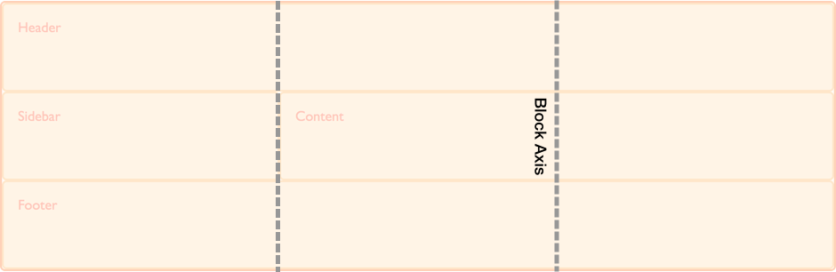
El eje en línea (inline axis) se ejecuta a través del eje del bloque, es la dirección en la que se ejecuta el texto en el flujo regular en línea (también llamadas filas, Eje "x", eje horizontal).
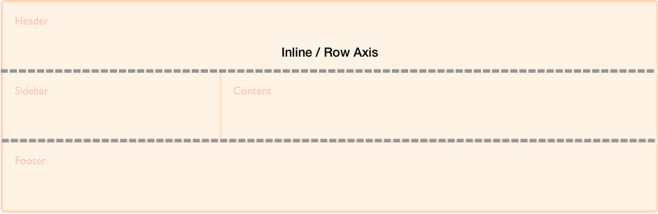
Podemos alinear el contenido dentro de las áreas de la cuadrícula o rejilla , y los tracks en estos dos ejes.
Alineación de elementos en el Eje de Bloque
Las propiedades align-self y align-items controlan la alineación en el eje de bloque. Cuando usamos estas propiedades, estamos cambiando la alineación del elemento dentro del área de la cuadricula (grid) que se ha colocado.
En el siguiente ejemplo, tengo 4 áreas dentro de mi cuadricula (grid). Puedo usar la propiedad align-items en el contenedor de la cuadricula (grid container), para alinear los elementos usando uno de los siguientes valores:
autonormalstartendcenterstretchbaselinefirst baselinelast baseline
.wrapper {
  display: grid;
  grid-template-columns: repeat(8, 1fr);
  grid-gap: 10px;
  grid-auto-rows: 100px;
  grid-template-areas:
    "a a a a b b b b"
    "a a a a b b b b"
    "c c c c d d d d"
    "c c c c d d d d";
  align-items: start;
}
.item1 {
  grid-area: a;
}
.item2 {
  grid-area: b;
}
.item3 {
  grid-area: c;
}
.item4 {
  grid-area: d;
}
<div class="wrapper">
  <div class="item1">Item 1</div>
  <div class="item2">Item 2</div>
  <div class="item3">Item 3</div>
  <div class="item4">Item 4</div>
</div>
Ten en mente que una vez establezcas align-self: start, la altura de cada hijo <div> será determinada por el contenido del <div>. Esto está en contraste de omitir align-self completamente, en el cual la altura de cada <div> se extendería hasta llenar el área de la cuadricula.
La propiedad align-items establece la propiedad align-self para todos los elementos hijos de la cuadricula. Esto significa que puedes establecer la propiedad individualmente, usando align-self en cada elemento de la cuadricula.
En el siguiente ejemplo, estoy usando la propiedad align-self para demostrar los diferentes valores de alineación. La primer área está mostrando la acción por defecto de align-self, el cual es extenderse. El segundo elemento tiene un valor en align-self de start, el tercero end y el cuarto center.
.wrapper {
  display: grid;
  grid-template-columns: repeat(8, 1fr);
  grid-gap: 10px;
  grid-auto-rows: 100px;
  grid-template-areas:
    "a a a a b b b b"
    "a a a a b b b b"
    "c c c c d d d d"
    "c c c c d d d d";
}
.item1 {
  grid-area: a;
}
.item2 {
  grid-area: b;
  align-self: start;
}
.item3 {
  grid-area: c;
  align-self: end;
}
.item4 {
  grid-area: d;
  align-self: center;
}
<div class="wrapper">
  <div class="item1">Item 1</div>
  <div class="item2">Item 2</div>
  <div class="item3">Item 3</div>
  <div class="item4">Item 4</div>
</div>
Elementos con una relación de aspecto intrínseco
La especificación determina que la acción por defecto en align-self es estirarse, excepto para los elementos que tienen una relación de aspecto intrínseco, en este caso ellos funcionan como start. La razón para esto, es que si elemento con una relación de aspecto intrínseco es establecido para estirarse, este por defecto pueda distorsionarlo.
Esta acción ahora ha sido clarificada en la especificación, con navegadores aún hay que implementar la acción correcta. Hasta que eso pase, te puedes asegurar de que los elementos no se extiendan, como en imagenes, las cuales son hijos directos de la cuadricula, estableciendo align-self y justify-self al empezar. Esto se asemejará a la acción correcta una vez implementado.
Justifying Items on the Inline Axis
As align-items and align-self deal with the alignment of items on the block axis, justify-items and justify-self do the same job on the inline axis. The values you can choose from are the same as for align-self.
autonormalstartendcenterstretchbaselinefirst baselinelast baseline
You can see the same example as used for align-items, below. This time we are applying the justify-self property.
Once again the default is stretch, other than for items with an intrinsic aspect ratio. This means that by default, grid items will cover their grid area, unless you change that by setting alignment. The first item in the example demonstrates this default alignment:
.wrapper {
  display: grid;
  grid-template-columns: repeat(8, 1fr);
  grid-gap: 10px;
  grid-auto-rows: 100px;
  grid-template-areas:
    "a a a a b b b b"
    "a a a a b b b b"
    "c c c c d d d d"
    "c c c c d d d d";
}
.item1 {
  grid-area: a;
}
.item2 {
  grid-area: b;
  justify-self: start;
}
.item3 {
  grid-area: c;
  justify-self: end;
}
.item4 {
  grid-area: d;
  justify-self: center;
}
<div class="wrapper">
  <div class="item1">Item 1</div>
  <div class="item2">Item 2</div>
  <div class="item3">Item 3</div>
  <div class="item4">Item 4</div>
</div>
As with align-self and align-items, you can apply justify-items to the grid container, to set the justify-self value for all items.
The justify-self and justify-items properties are not implemented in flexbox. This is due to the one-dimensional nature of flexbox, and that there may be multiple items along the axis, making it impossible to justify a single item. To align items along the main, inline axis in flexbox you use the justify-content property.
Center an item in the area
By combining the align and justify properties we can easily center an item inside a grid area.
.wrapper {
  display: grid;
  grid-template-columns: repeat(4, 1fr);
  grid-gap: 10px;
  grid-auto-rows: 200px;
  grid-template-areas:
    ". a a ."
    ". a a .";
}
.item1 {
  grid-area: a;
  align-self: center;
  justify-self: center;
}
<div class="wrapper">
  <div class="item1">Item 1</div>
</div>
Aligning the grid tracks on the block axis
If you have a situation where your grid tracks use an area that is smaller than the grid container, then you can align the grid tracks themselves, inside that container. Once again, this operates on the block and inline axes, with align-content aligning tracks on the block axis, and justify-content performing alignment on the inline axis. The values for align-content and justify-content are:
normalstartendcenterstretchspace-aroundspace-betweenspace-evenlybaselinefirst baselinelast baseline
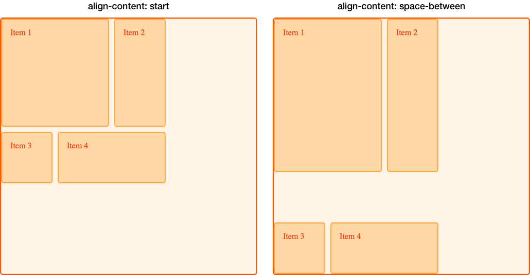
In the below example I have a grid container of 500 pixels by 500 pixels. I have defined 3 row and column tracks each of 100 pixels with a 10 pixel gutter. This means that there is space inside the grid container both in the block and inline directions.
The align-content property is applied to the grid container as it works on the entire grid. The default behavior in grid layout is start, which is why our grid tracks are in the top left corner of the grid, aligned against the start grid lines:
.wrapper {
  display: grid;
  grid-template-columns: repeat(3, 100px);
  grid-template-rows: repeat(3, 100px);
  height: 500px;
  width: 500px;
  grid-gap: 10px;
  grid-template-areas:
    "a a b"
    "a a b"
    "c d d";
}
.item1 {
  grid-area: a;
}
.item2 {
  grid-area: b;
}
.item3 {
  grid-area: c;
}
.item4 {
  grid-area: d;
}
<div class="wrapper">
  <div class="item1">Item 1</div>
  <div class="item2">Item 2</div>
  <div class="item3">Item 3</div>
  <div class="item4">Item 4</div>
</div>
If I add align-content to my container, with a value of end, the tracks all move to the end line of the grid container in the block dimension:
.wrapper {
  display: grid;
  grid-template-columns: repeat(3, 100px);
  grid-template-rows: repeat(3, 100px);
  height: 500px;
  width: 500px;
  grid-gap: 10px;
  grid-template-areas:
    "a a b"
    "a a b"
    "c d d";
  align-content: end;
}
.item1 {
  grid-area: a;
}
.item2 {
  grid-area: b;
}
.item3 {
  grid-area: c;
}
.item4 {
  grid-area: d;
}
<div class="wrapper">
  <div class="item1">Item 1</div>
  <div class="item2">Item 2</div>
  <div class="item3">Item 3</div>
  <div class="item4">Item 4</div>
</div>
We can also use values for this property that you may be familiar with from flexbox; the space distribution values of space-between, space-around and space-evenly. If we update align-content to space-between, you can see how the elements on our grid space out:
.wrapper {
  display: grid;
  grid-template-columns: repeat(3, 100px);
  grid-template-rows: repeat(3, 100px);
  height: 500px;
  width: 500px;
  grid-gap: 10px;
  grid-template-areas:
    "a a b"
    "a a b"
    "c d d";
  align-content: space-between;
}
.item1 {
  grid-area: a;
}
.item2 {
  grid-area: b;
}
.item3 {
  grid-area: c;
}
.item4 {
  grid-area: d;
}
<div class="wrapper">
  <div class="item1">Item 1</div>
  <div class="item2">Item 2</div>
  <div class="item3">Item 3</div>
  <div class="item4">Item 4</div>
</div>
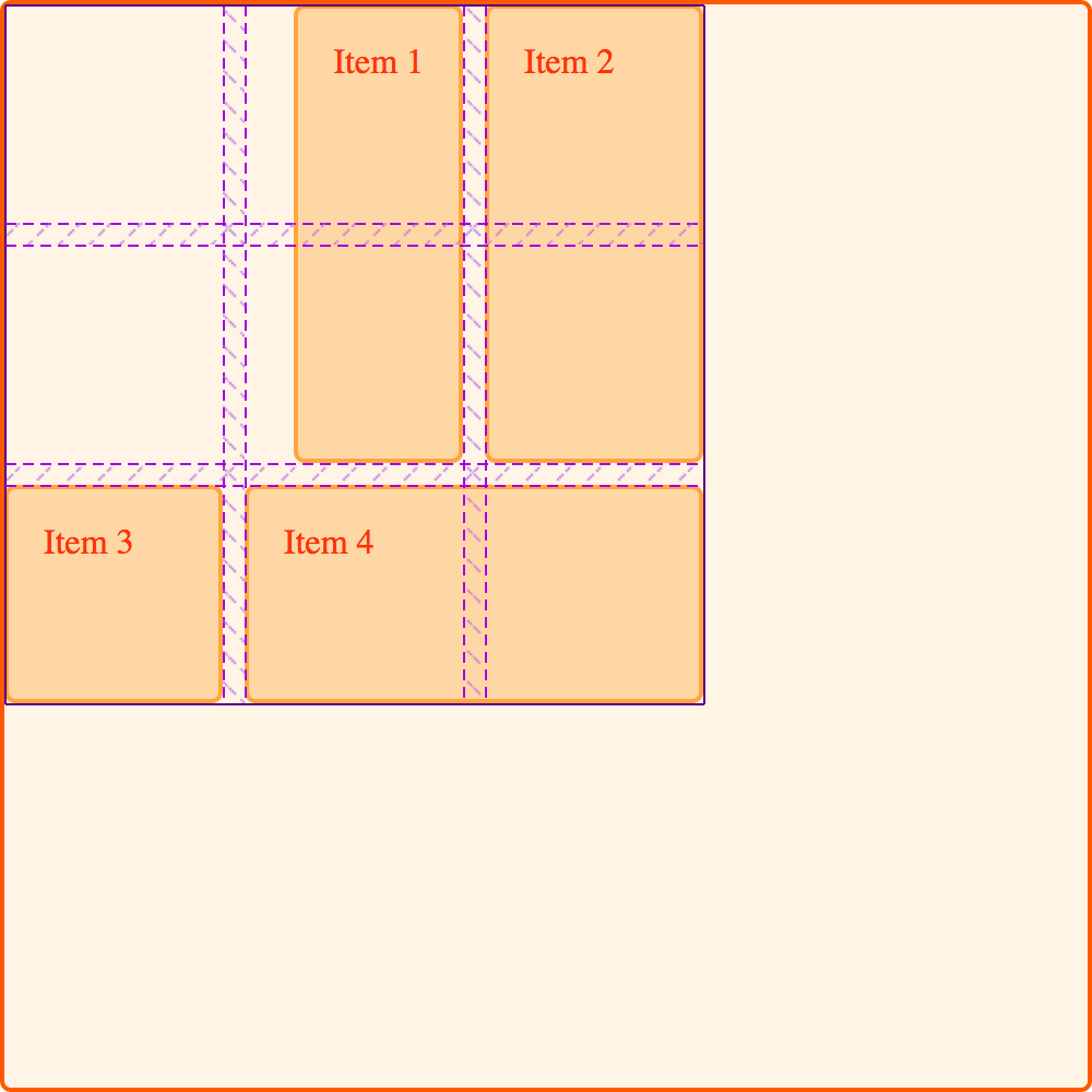
It is worth noting, that using these space distribution values may cause items on your grid to become larger. If an item spans more than one grid track, as further space is added between the tracks, that item needs to become large to absorb the space. We're always working in a strict grid. Therefore, if you decide to use these values, ensure that the content of your tracks can cope with the extra space, or that you have used alignment properties on the items, to cause them to move to the start rather than stretch.
In the below image I have placed the grid with align-content, with a value of start alongside the grid when align-content has a value of space-between. You can see how items 1 and 2, which span two row tracks have taken on extra height as they gain the additional space added to the gap between those two tracks:
Justifying the grid tracks on the row axis
On the inline axis, we can use justify-content to perform the same type of alignment that we used align-content for in the block axis.
Using the same example, I am setting justify-content to space-around. This once again causes tracks which span more than one column track to gain extra space:
.wrapper {
  display: grid;
  grid-template-columns: repeat(3, 100px);
  grid-template-rows: repeat(3, 100px);
  height: 500px;
  width: 500px;
  grid-gap: 10px;
  grid-template-areas:
    "a a b"
    "a a b"
    "c d d";
  align-content: space-between;
  justify-content: space-around;
}
.item1 {
  grid-area: a;
}
.item2 {
  grid-area: b;
}
.item3 {
  grid-area: c;
}
.item4 {
  grid-area: d;
}
<div class="wrapper">
  <div class="item1">Item 1</div>
  <div class="item2">Item 2</div>
  <div class="item3">Item 3</div>
  <div class="item4">Item 4</div>
</div>
Alignment and auto margins
Another way to align items inside their area, is to use auto margins. If you have ever centered your layout in the viewport, by setting the right and left margin of the container block to auto, you know that an auto margin absorbs all of the available space. By setting the margin to auto on both sides, it pushes the block into the middle as both margins attempt to take all of the space.
In this next example, I have given item 1 a left margin of auto. You can see how the content is now pushed over to the right side of the area, as the auto margin takes up remaining space, after room for the content of that item has been assigned:
.wrapper {
  display: grid;
  grid-template-columns: repeat(3, 100px);
  grid-template-rows: repeat(3, 100px);
  height: 500px;
  width: 500px;
  grid-gap: 10px;
  grid-template-areas:
    "a a b"
    "a a b"
    "c d d";
}
.item1 {
  grid-area: a;
  margin-left: auto;
}
.item2 {
  grid-area: b;
}
.item3 {
  grid-area: c;
}
.item4 {
  grid-area: d;
}
<div class="wrapper">
  <div class="item1">Item 1</div>
  <div class="item2">Item 2</div>
  <div class="item3">Item 3</div>
  <div class="item4">Item 4</div>
</div>
You can see how the item is aligned by using the Firefox Grid Highlighter:
Alignment and Writing Modes
In all of these examples I have been working in English, which is a left-to-right language. This means that our start lines are top and left of our grid when thinking in physical directions.
CSS Grid Layout, and the Box Alignment specification are designed to work with writing modes in CSS. This means that if you are working in a right to left language, such as Arabic, the start of the grid would be the top and right, so the default of justify-content: start would be for grid tracks to start on the right hand side of the grid.
Setting auto margins, using margin-right or margin-left however, or absolutely positioning items using the top, right, bottom and left offsets would not honor writing modes. In the next guide, we will look further into this interaction between CSS grid layout, box alignment and writing modes. This will be important to understand, if you develop sites that are then displayed in multiple languages, or if you want to mix languages or writing modes in a design.
-
Guides
- Basics concepts of grid layout
- Relationship to other layout methods
- Line-based placement
- Grid template areas
- Layout using named grid lines
- Auto-placement in grid layout
- Box alignment in grid layout
- Grids, logical values and writing modes
- CSS Grid Layout and Accessibility
- CSS Grid Layout and Progressive Enhancement
- Realizing common layouts using grids
-
Properties
-
Glossary