Test your skills: Responsive web design and media queries
The aim of this skill test is to assess whether you understand how to use media queries and get you working with responsive web design with a practical task. Everything you need to know to complete this task is covered in the layout lessons in the CSS layout module.
Note: Because you need to test your design in multiple screen sizes, we do not have interactive editors on this page. Download the code and work locally, or use an online editor such as CodePen, JSFiddle, or Glitch.
If you get stuck, you can reach out to us in one of our communication channels.
Task
Download the starting point for this task. Open the downloaded HTML file in your browser and you will find a wireframed site which will load in a mobile device in a readable manner. You can drag your window smaller or use the responsive design view in Firefox DevTools to view this as if on a phone.
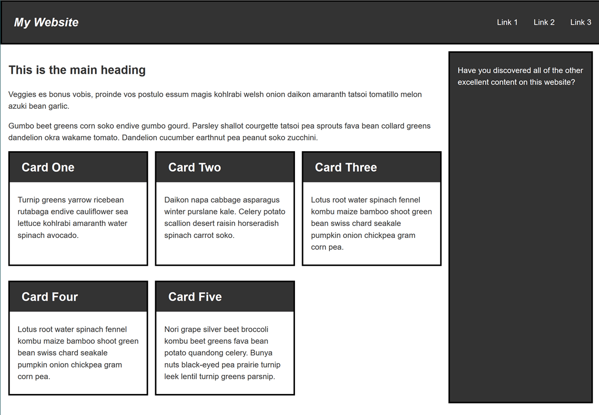
Your task is to create a desktop version of this layout which displays when there is enough screen width to accommodate it. Your final result should look like the image below:
There are a number of ways that you could create the desktop layout, enjoy experimenting. You could also add a second breakpoint perhaps creating a layout that would work well on a tablet in portrait mode.