Grids
CSS grid layout is a two-dimensional layout system for the web. It lets you organize content into rows and columns and offers many features to simplify the creation of complex layouts. This article will explain all you need to know to get started with grid layout.
| Prerequisites: | HTML basics (study Introduction to HTML) and an idea of how CSS works (study Introduction to CSS and Styling boxes.) |
|---|---|
| Objective: | To understand the fundamental concepts of grid layout as well as how to implement it with CSS Grid. |
What is grid layout?
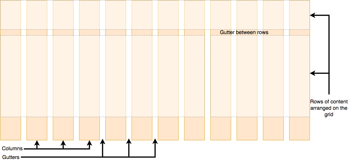
A grid is a collection of horizontal and vertical lines creating a pattern against which we can line up our design elements. They help us to create layouts in which our elements won't jump around or change width as we move from page to page, providing greater consistency on our websites.
A grid will typically have columns, rows, and then gaps between each row and column. The gaps are commonly referred to as gutters.
Creating your grid in CSS
Having decided on the grid that your design needs, you can use CSS Grid Layout to create it. We'll look at the basic features of Grid Layout first and then explore how to create a simple grid system for your project. The following video provides a nice visual explanation of using CSS Grid:
Defining a grid
Let's try out grid layouts with the help of an example. Download and open the starting point file in your text editor and browser (you can also see it live here). You will see an example with a container, which has some child items. By default, these items are displayed in a normal flow, causing them to appear one below the other. For the initial part of this lesson, we'll be using this file to see how its grid behaves.
Similar to how you define flexbox, you define a grid layout by setting the value of the display property to grid. As in the case of flexbox, the display: grid property transforms all the direct children of the container into grid items. Add the following CSS to your file:
.container {
  display: grid;
}
Unlike Flexbox, the items will not immediately look any different. Declaring display: grid gives you a one column grid, so your items will continue to display one below the other as they do in normal flow.
To see something that looks more grid-like, we'll need to add some columns to the grid. Let's add three 200-pixel columns. You can use any length unit or percentage to create these column tracks.
.container {
  display: grid;
  grid-template-columns: 200px 200px 200px;
}
Add the second declaration to your CSS rule, then reload the page. You should see that the items have rearranged themselves such that there's one in each cell of the grid.
Flexible grids with the fr unit
In addition to creating grids using lengths and percentages, we can use fr. The fr unit represents one fraction of the available space in the grid container to flexibly size grid rows and columns.
Change your track listing to the following definition, creating three 1fr tracks:
.container {
  display: grid;
  grid-template-columns: 1fr 1fr 1fr;
}
You now have flexible tracks. The fr unit distributes space proportionally. You can specify different positive values for your tracks like so:
.container {
  display: grid;
  grid-template-columns: 2fr 1fr 1fr;
}
The first track gets 2fr of the available space and the other two tracks get 1fr, making the first track larger. You can mix fr units with fixed length units. In this case, the space needed for the fixed tracks is used up first before the remaining space is distributed to the other tracks.
Note: The fr unit distributes available space, not all space. Therefore, if one of your tracks has something large inside it, there will be less free space to share.
Gaps between tracks
To create gaps between tracks, we use the properties:
column-gapfor gaps between columnsrow-gapfor gaps between rowsgapas a shorthand for both
.container {
  display: grid;
  grid-template-columns: 2fr 1fr 1fr;
  gap: 20px;
}
These gaps can be any length unit or percentage, but not an fr unit.
Note: The gap properties (column-gap, row-gap and gap) used to be prefixed by grid-. The spec has changed but the prefixed versions will be maintained as an alias. To be on the safe side and make your code more bulletproof, you can add both properties:
.container {
  display: grid;
  grid-template-columns: 2fr 1fr 1fr;
  grid-gap: 20px;
  gap: 20px;
}
Repeating track listings
You can repeat all or merely a section of your track listing using the CSS repeat() function.
Change your track listing to the following:
.container {
  display: grid;
  grid-template-columns: repeat(3, 1fr);
  gap: 20px;
}
You'll now get three 1fr tracks just as before. The first value passed to the repeat() function specifies the number of times you want the listing to repeat, while the second value is a track listing, which may be one or more tracks that you want to repeat.
Implicit and explicit grids
Up to this point, we've specified only column tracks, but rows are automatically created to hold the content. This concept highlights the distinction between explicit and implicit grids. Here's a bit more about the difference between the two types of grids:
- Explicit grid is created using
grid-template-columnsorgrid-template-rows. - Implicit grid extends the defined explicit grid when content is placed outside of that grid, such as into the rows by drawing additional grid lines.
By default, tracks created in the implicit grid are auto sized, which in general means that they're large enough to contain their content. If you wish to give implicit grid tracks a size, you can use the grid-auto-rows and grid-auto-columns properties. If you add grid-auto-rows with a value of 100px to your CSS, you'll see that those created rows are now 100 pixels tall.
.container {
  display: grid;
  grid-template-columns: repeat(3, 1fr);
  grid-auto-rows: 100px;
  gap: 20px;
}
The minmax() function
Our 100-pixel tall tracks won't be very useful if we add content into those tracks that is taller than 100 pixels, in which case it would cause an overflow. It might be better to have tracks that are at least 100 pixels tall and can still expand if more content becomes added. A fairly basic fact about the web is that you never really know how tall something is going to be — additional content or larger font sizes can cause problems with designs that attempt to be pixel perfect in every dimension.
The minmax() function lets us set a minimum and maximum size for a track, for example, minmax(100px, auto). The minimum size is 100 pixels, but the maximum is auto, which will expand to accommodate more content. Try changing grid-auto-rows to use a minmax value:
.container {
  display: grid;
  grid-template-columns: repeat(3, 1fr);
  grid-auto-rows: minmax(100px, auto);
  gap: 20px;
}
If you add extra content, you'll see that the track expands to allow it to fit. Note that the expansion happens right along the row.
As many columns as will fit
We can combine some of the lessons we've learned about track listing, repeat notation, and minmax() to create a useful pattern. Sometimes it's helpful to be able to ask grid to create as many columns as will fit into the container. We do this by setting the value of grid-template-columns using the repeat() function, but instead of passing in a number, pass in the keyword auto-fit. For the second parameter of the function we use minmax() with a minimum value equal to the minimum track size that we would like to have and a maximum of 1fr.
Try this in your file now using the CSS below:
.container {
  display: grid;
  grid-template-columns: repeat(auto-fit, minmax(200px, 1fr));
  grid-auto-rows: minmax(100px, auto);
  gap: 20px;
}
This works because grid is creating as many 200-pixel columns as will fit into the container, then sharing whatever space is leftover among all the columns. The maximum is 1fr which, as we already know, distributes space evenly between tracks.
Line-based placement
We now move on from creating a grid to placing things on the grid. Our grid always has lines — these are numbered beginning with 1 and relate to the writing mode of the document. For example, column line 1 in English (written left-to-right) would be on the left-hand side of the grid and row line 1 at the top, while in Arabic (written right-to-left), column line 1 would be on the right-hand side.
To position items along these lines, we can specify the start and end lines of the grid area where an item should be placed. There are four properties we can use to do this:
These properties accept line numbers as their values, so we can specify that an item should start on line 1 and end on line 3, for example.
Alternatively, you can also use shorthand properties that let you specify the start and end lines simultaneously, separated by a forward slash /:
grid-columnshorthand forgrid-column-startandgrid-column-endgrid-rowshorthand forgrid-row-startandgrid-row-end
To see this in action, download the line-based placement starting point file or see it live here. It has a defined grid and a simple article outlined. You can see that auto-placement is placing each item into its own cell in the grid.
Let's arrange all of the elements for our site by using the grid lines. Add the following rules to the bottom of your CSS:
header {
  grid-column: 1 / 3;
  grid-row: 1;
}

article {
  grid-column: 2;
  grid-row: 2;
}

aside {
  grid-column: 1;
  grid-row: 2;
}

footer {
  grid-column: 1 / 3;
  grid-row: 3;
}
Note: You can also use the value -1 to target the end column or row line, then count inwards from the end using negative values. Note also that lines count always from the edges of the explicit grid, not the implicit grid.
Positioning with grid-template-areas
An alternative way to arrange items on your grid is to use the grid-template-areas property and give the various elements of your design a name.
Remove the line-based positioning from the last example (or re-download the file to have a fresh starting point) and add the following CSS.
.container {
  display: grid;
  grid-template-areas:
    "header header"
    "sidebar content"
    "footer footer";
  grid-template-columns: 1fr 3fr;
  gap: 20px;
}

header {
  grid-area: header;
}

article {
  grid-area: content;
}

aside {
  grid-area: sidebar;
}

footer {
  grid-area: footer;
}
Reload the page and you will see that your items have been placed just as before without us needing to use any line numbers!
The rules for grid-template-areas are as follows:
- You need to have every cell of the grid filled.
- To span across two cells, repeat the name.
- To leave a cell empty, use a
.(period). - Areas must be rectangular — for example, you can't have an L-shaped area.
- Areas can't be repeated in different locations.
You can play around with our layout, changing the footer to only sit underneath the article and the sidebar to span all the way down. This is a very nice way to describe a layout because it's clear just from looking at the CSS to know exactly what's happening.
Nesting grids and subgrid
It's possible to nest a grid within another grid, creating a "subgrid".
You can do this by setting the display: grid property on a grid item.
Let's expand on the previous example by adding a container for articles and using a nested grid to control the layout of multiple articles.
While we're using only one column in the nested grid, we can define the rows to be split in a 2:1:1 ratio by using the grid-template-rows property.
This approach allows us to create a layout where one article at the top of the page has a large display, while the others have a smaller, preview-like layout.
.articles {
  display: grid;
  grid-template-rows: 2fr 1fr 1fr;
  gap: inherit;
}

article {
  padding: 10px;
  border: 2px solid rgb(79 185 227);
  border-radius: 5px;
}
To make it easier to work with layouts in nested grids, you can use subgrid on grid-template-rows and grid-template-columns properties. This allows you to leverage the tracks defined in the parent grid.
In the following example, we're using line-based placement, enabling the nested grid to span multiple columns and rows of the parent grid.
We've added subgrid to inherit the parent grid's column tracks while adding a different layout for the rows within the nested grid.
<div class="container">
  <div>One</div>
  <div>Two</div>
  <div>Three</div>
  <div>Four</div>
  <div id="subgrid">
    <div>Five</div>
    <div>Six</div>
    <div>Seven</div>
    <div>Eight</div>
  </div>
  <div>Nine</div>
  <div>Ten</div>
</div>
.container {
  display: grid;
  grid-template-columns: repeat(4, 1fr);
  grid-template-rows: repeat(1, 1fr);
  gap: 10px;
}

#subgrid {
  grid-column: 1 / 4;
  grid-row: 2 / 4;
  display: grid;
  gap: inherit;
  grid-template-columns: subgrid;
  grid-template-rows: 2fr 1fr;
}
Grid frameworks
Numerous grid frameworks are available, offering a 12 or 16-column grid, to help with laying out your content. The good news is that you probably won't need any third-party frameworks to help you create grid-based layouts — grid functionality is already included in the specification and is supported by most modern browsers.
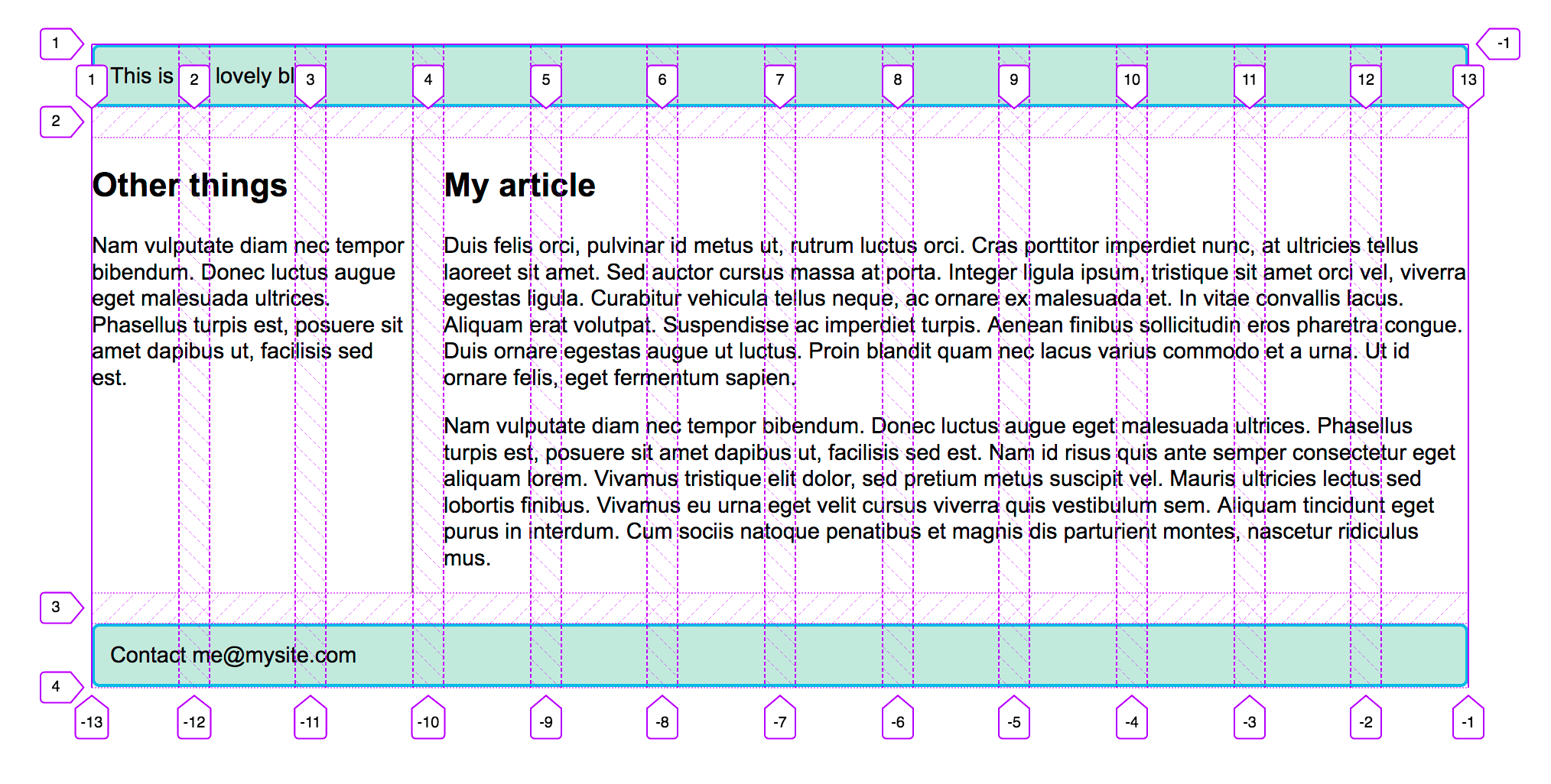
Download the starting point file. This has a container with a 12-column grid defined and the same markup we used in the previous two examples. We can now use line-based placement to place our content on the 12-column grid.
header {
  grid-column: 1 / 13;
  grid-row: 1;
}

article {
  grid-column: 4 / 13;
  grid-row: 2;
}

aside {
  grid-column: 1 / 4;
  grid-row: 2;
}

footer {
  grid-column: 1 / 13;
  grid-row: 3;
}
If you use the Firefox Grid Inspector to overlay the grid lines on your design, you can see how our 12-column grid works.
Test your skills!
You've reached the end of this article, but can you remember the most important information? You can find some further tests to verify that you've retained this information before you move on — see Test your skills: Grid.
Summary
In this overview, we've toured the main features of CSS Grid Layout. You should be able to start using it in your designs. To dig further into the specification, read our guides on Grid Layout, which can be found below.
See also
- A list of guides related to the CSS grid layout
- Subgrid guide
- CSS grid inspector: Examine grid layouts on firefox-source-docs
- A complete guide to CSS grid, a visual guide on CSS-Tricks (2023)
- Grid Garden, an educational game to learn and better understand the basics of grid on cssgridgarden.com